popover
Since Jmix 3.1
popover is an overlay that opens next to another component, called the target. Unlike tooltip, a popover can contain any components, such as fields, buttons and layouts, and users can work with them.
XML Element |
|
|---|---|
Java Class |
|
Basics
Declare popover in the view layout and set the target attribute to the id of a component:
<button id="infoButton" text="About" icon="INFO_CIRCLE_O"/>
<popover id="infoPopover" target="infoButton" width="20em">
    <vbox padding="false">
        <h4 text="Onboarding"/>
        <span text="New employees complete the onboarding steps during their first weeks."/>
        <button id="closeButton" text="Close"/>
    </vbox>
</popover>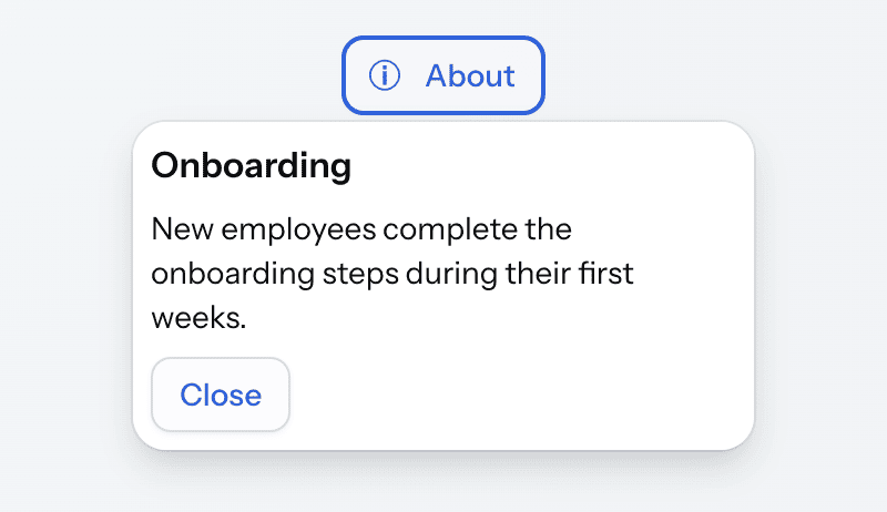
The popover does not take space in the layout. Its content is shown only when the popover opens. By default, the popover opens when the user clicks the target. It closes when the user clicks the target again, clicks outside the popover, or presses Esc.
The popover and its content are regular components of the view. You can inject them into the view controller and subscribe to their events. In the example above, the button in the popover closes it using the close() method:
@ViewComponent
private Popover infoPopover;

@Subscribe(id = "closeButton", subject = "clickListener")
public void onCloseButtonClick(final ClickEvent<JmixButton> event) {
    infoPopover.close();
}
Target
The target attribute contains the id of a component in the same view or fragment. The target can be declared before or after the popover. If there is no component with this id, the view fails to open with a GuiDevelopmentException.
The target attribute is optional. If the target component is created in the view controller, declare the popover without target:
<textField id="emailField" label="Email"/>
<popover id="emailHelpPopover" width="16em">
    <span text="Use your corporate address."/>
</popover>
Then set the target using the setTarget() method:
@ViewComponent
private Popover emailHelpPopover;
@ViewComponent
private TypedTextField<String> emailField;
@Autowired
private UiComponents uiComponents;

@Subscribe
public void onInit(final InitEvent event) {
    JmixButton helpButton = uiComponents.create(JmixButton.class);
    helpButton.setIcon(VaadinIcon.QUESTION_CIRCLE.create());
    helpButton.addThemeVariants(ButtonVariant.TERTIARY);
    emailField.setSuffixComponent(helpButton);

    emailHelpPopover.setTarget(helpButton);
}
A popover without a target does not open on user actions. If you open it with the open() method, it is shown in the center of the screen.
Opening and Closing
The openOnClick, openOnHover and openOnFocus attributes define which user actions open the popover. Only openOnClick is enabled by default. You can enable several of them.
Opening on Hover
The following popover opens when the user moves the pointer over an avatar:
<avatar id="userAvatar" name="Alice Brown"/>
<popover target="userAvatar"
         openOnClick="false"
         openOnHover="true"
         hoverDelay="300"
         hideDelay="300">
    <vbox padding="false" spacing="false">
        <h5 text="Alice Brown"/>
        <span text="HR manager"/>
        <anchor href="mailto:alice@company.com" text="alice@company.com"/>
    </vbox>
</popover>
The popover closes when the pointer leaves both the target and the popover, so the user can move the pointer to the popover and click the link in it.
The hoverDelay attribute sets the delay before the popover opens, and hideDelay sets the delay before it closes. Both delays are in milliseconds, and both are 500 by default.
Opening on Focus
The following popover opens when the password field receives focus:
<passwordField id="passwordField" label="Password"/>
<popover target="passwordField"
         openOnClick="false"
         openOnFocus="true"
         position="END">
    <span text="Use at least 8 characters, including a letter and a digit."/>
</popover>
The popover closes when the focus leaves both the target and the popover. The focusDelay attribute sets the delay before the popover opens, 500 milliseconds by default.
Opening Programmatically
If all three attributes are false, user actions on the target do not open the popover. Open it in the view controller instead:
<hbox alignItems="BASELINE">
    <textField id="promoCodeField" label="Promo code"/>
    <button id="promoCodeHelpButton" text="Where do I find it?" themeNames="tertiary"/>
</hbox>
<popover id="promoCodePopover"
         target="promoCodeField"
         openOnClick="false"
         width="16em">
    <span text="The promo code is printed on the back of your loyalty card."/>
</popover>
@ViewComponent
private Popover promoCodePopover;
@Subscribe(id = "promoCodeHelpButton", subject = "clickListener")
public void onPromoCodeHelpButtonClick(final ClickEvent<JmixButton> event) {
promoCodePopover.open();
}The open() and close() methods open and close the popover, and isOpened() returns its current state.
Closing
However the popover was opened, a click outside it and the Esc key close it. Set the closeOnOutsideClick and closeOnEsc attributes to false to turn this off.
Positioning
The position attribute defines where the popover opens relative to the target: above (TOP_START, TOP, TOP_END), below (BOTTOM_START, BOTTOM, BOTTOM_END), before (START_TOP, START, START_BOTTOM) or after (END_TOP, END, END_BOTTOM) it. The default is BOTTOM. If there is not enough space on that side, the popover opens on the opposite side.
The following popover opens after the button and shows an arrow that points to it:
<button id="statusButton" text="Status"/>
<popover target="statusButton" position="END" themeNames="arrow">
    <span text="3 of 5 steps completed"/>
</popover>
Modal Popover
A modal popover works as a small dialog next to its target. When it is open, users cannot interact with the rest of the UI, and the focus stays in the popover. Set modal="true" to make the popover modal and backdropVisible="true" to dim the UI behind it.
A click outside a modal popover closes it by default. The following popover sets closeOnOutsideClick="false", so it stays open until the user clicks a button in it:
<h3 id="reportTitle" text="Quarterly report"/>
<button id="renameButton" text="Rename"/>
<popover id="renamePopover"
         target="renameButton"
         modal="true"
         backdropVisible="true"
         closeOnOutsideClick="false"
         width="18em">
    <vbox padding="false">
        <textField id="titleField" label="Title" width="100%"/>
        <hbox>
            <button id="saveButton" text="Save" themeNames="primary"/>
            <button id="cancelButton" text="Cancel"/>
        </hbox>
    </vbox>
</popover>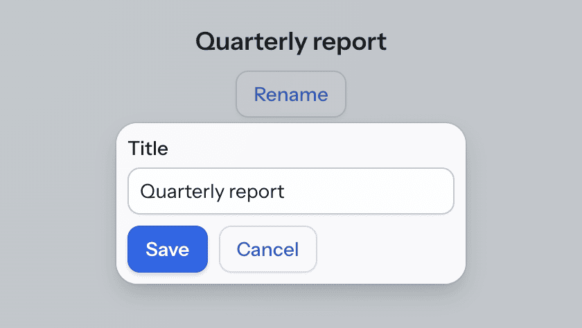
The controller fills the field when the popover opens and saves the value when the user clicks Save:
@ViewComponent
private Popover renamePopover;
@ViewComponent
private H3 reportTitle;
@ViewComponent
private TypedTextField<String> titleField;

@Subscribe("renamePopover")
public void onRenamePopoverOpenedChange(final Popover.OpenedChangeEvent event) {
    if (event.isOpened()) {
        titleField.setValue(reportTitle.getText());
    }
}

@Subscribe(id = "saveButton", subject = "clickListener")
public void onSaveButtonClick(final ClickEvent<JmixButton> event) {
    reportTitle.setText(titleField.getValue());
    renamePopover.close();
}

@Subscribe(id = "cancelButton", subject = "clickListener")
public void onCancelButtonClick(final ClickEvent<JmixButton> event) {
    renamePopover.close();
}
Size and Styling
The width and height attributes set the size of the popover content. Use absolute units, such as px or em. Relative units, such as %, give unexpected results. Without these attributes, the popover takes the size of its content. The minWidth, maxWidth, minHeight and maxHeight attributes are not supported.
The popover is shown outside the view layout, so it does not support the css attribute. In Java, getStyle() throws UnsupportedOperationException. To style a popover, add class names to it with the classNames attribute and define the styles in the application theme.
Theme Variants
Use the themeNames attribute to set a component theme.
| Variant | Description | Supported By |
|---|---|---|
|
Shows an arrow that points to the target. |
Aura, Lumo |
|
Removes the padding around the content. |
Aura, Lumo |
Attributes
The following attributes are specific to popover:
| Name | Description | Default |
|---|---|---|
Sets the ARIA role of the popover, which screen readers use. |
|
|
When |
|
|
When |
|
|
When |
|
|
When |
|
|
Sets the delay in milliseconds before the popover opens when the target receives focus. See Opening on Focus. |
|
|
Sets the height of the popover content. See Size and Styling. |
— |
|
Sets the delay in milliseconds before the popover closes when the pointer leaves the target and the popover. When the target loses focus, the popover closes at once. See Opening on Hover. |
|
|
Sets the delay in milliseconds before the popover opens when the pointer moves over the target. See Opening on Hover. |
|
|
When |
|
|
When |
|
|
When |
|
|
When |
|
|
Sets the position of the popover relative to the target. See Positioning. |
|
|
When |
|
|
Sets the id of the target component. See Target. |
— |
|
Applies one or more variants listed in Theme Variants. |
— |
|
Sets the width of the popover content. See Size and Styling. |
— |
The following shared attributes are supported by popover:
id - ariaLabel - ariaLabelledBy - classNames - enabled - visible
Handlers
| Name | Description |
|---|---|
Fires when the popover is attached to the UI. |
|
Fires when the popover is detached from the UI. |
|
Fires when the popover opens or closes. Use |