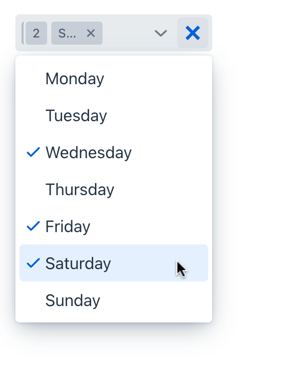
multiSelectComboBoxPicker
multiSelectComboBoxPicker allows users to choose one or more items from a drop-down list or a list of actions. This component supports the all features from the regular multiSelectComboBox.
XML Element |
|
|---|---|
Java Class |
|
Attributes |
id - alignSelf - allowCustomValue - allowedCharPattern - ariaLabel - ariaLabelledBy - autoExpand - autoOpen - autofocus - classNames - clearButtonVisible - colspan - css - dataContainer - enabled - errorMessage - focusShortcut - height - helperText - itemsContainer - itemsEnum - label - maxHeight - maxWidth - metaClass - minHeight - minWidth - opened - overlayClass - pageSize - placeholder - property - readOnly - required - requiredMessage - selectedItemsOnTop - tabIndex - themeNames - title - visible - width |
Handlers |
AttachEvent - BlurEvent - ClientValidatedEvent - ComponentValueChangeEvent - CustomValueSetEvent - DetachEvent - FocusEvent - TypedValueChangeEvent - itemLabelGenerator - itemsFetchCallback - renderer - validator |
Elements |
actions - fragmentRenderer - itemsQuery - tooltip - validators |
Basics
The drop-down list opens when the user clicks the field using a pointing device. Using the Up and Down keys or typing a character when the field is focused also opens the drop-down list.
For multiSelectComboBoxPicker, you can define an arbitrary number of actions, displayed as buttons on the right. It can be done either in the XML descriptor using the actions nested element, or programmatically in the controller using addAction().

<multiSelectComboBoxPicker id="multiSelectComboBoxPicker"
                           itemsEnum="com.company.onboarding.entity.DayOfWeek">
    <actions>
        <action id="clearAction" type="entity_clear"/>
    </actions>
</multiSelectComboBoxPicker>
Data Binding
Data binding refers to linking a visual component to a data container. Changes in the visual component or corresponding data container can trigger updates to one another. See Using Data Components for more details.
To create multiSelectComboBoxPicker connected to data, use the dataContainer and property attributes. The itemsContainer attribute is used to create a list of items. The following example produces a data-aware multiSelectComboBoxPicker.
<data>
    <instance id="userDc" class="com.company.onboarding.entity.User"> (1)
        <fetchPlan extends="_base"> (2)
            <property name="hobbies" fetchPlan="_base"/>
        </fetchPlan>
        <loader id="userDl"/>
    </instance>
    <collection id="hobbiesDc" class="com.company.onboarding.entity.Hobby"> (3)
        <loader id="hobbiesDl" readOnly="true">
            <query>
                <![CDATA[select e from Hobby e]]>
            </query>
        </loader>
        <fetchPlan extends="_base"/>
    </collection>
</data>
<facets>
    <dataLoadCoordinator auto="true"/> (4)
</facets>
<layout>
    <multiSelectComboBoxPicker id="hobbiesPicker"
                               dataContainer="userDc"
                               property="hobbies"
                               itemsContainer="hobbiesDc"> (5)
        <actions>
            <action id="entityClear" type="entity_clear"/> (6)
            <action id="entityLookup" type="entity_lookup"/> (7)
        </actions>
    </multiSelectComboBoxPicker>
</layout>| 1 | Data container to hold the User instance which is currently being edited. |
| 2 | Fetch plan extended to retrieve a collection of Hobby instances that will be available for selection. |
| 3 | CollectionContainer for the Hobby entity. |
| 4 | Data load coordinator to automatically supply the component with instances to select from. |
| 5 | multiSelectComboBoxPicker gets hobbiesDc as an items container to show a drop-down list of hobbies. |
| 6 | Adding a predefined action to clear the selection. |
| 7 | Adding a predefined action to open the lookup view. |
The component’s value returns the list of selected items.
Using MetaClass
You can use multiSelectComboBoxPicker without directly referencing data, meaning you don’t need to specify dataContainer or property attributes. In this case, use the metaClass attribute to specify the entity type for multiSelectComboBoxPicker. To specify a collection of instances for selection use the itemsContainer attribute.
For example, the component can work with the Hobby entity, which has the metadata class name Hobby.
<multiSelectComboBoxPicker metaClass="Hobby"
                           itemsContainer="hobbiesDc">
    <actions>
        <action id="clear" type="entity_clear"/>
    </actions>
</multiSelectComboBoxPicker>
Basic Features
The following features, common to comboBox or multiSelectComboBox components, are supported:
