simplePagination
simplePagination loads data in pages and provides controls for navigating between them.
XML Element |
|
|---|---|
Java Class |
|
Basics
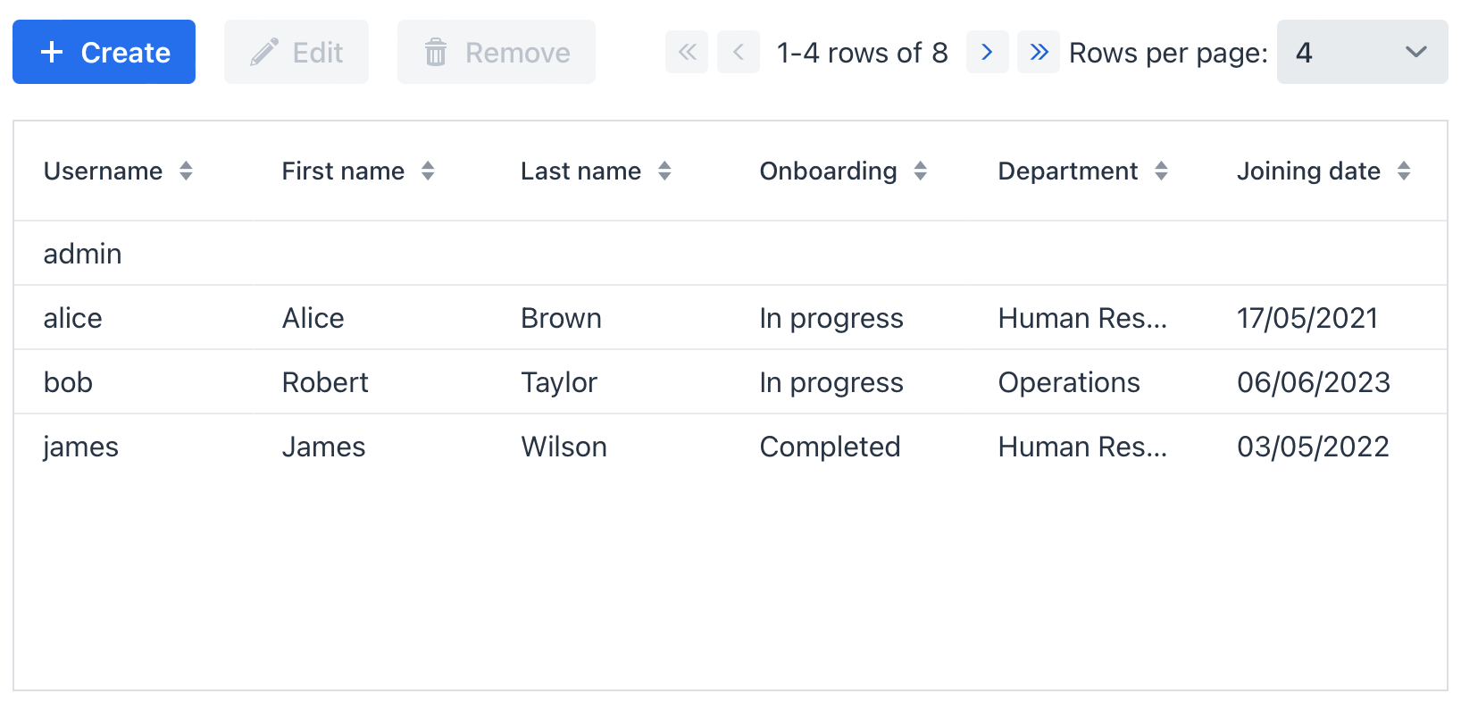
simplePagination has a simple view with a count of rows and navigation buttons.
It can also have a drop-down list for the number of items per page.
By default, Jmix Studio generates simplePagination when creating StandardListView for an entity.
<data>
    <collection id="customersDc"
                class="io.jmix.uisamples.entity.Customer">
        <fetchPlan extends="_local"/>
        <loader id="customersDl">
            <query>
                <![CDATA[select e from Customer e]]>
            </query>
        </loader>
    </collection>
</data>
<facets>
    <dataLoadCoordinator auto="true"/>
</facets>
<layout>
    <simplePagination alignSelf="CENTER" itemsPerPageDefaultValue="5"
                      dataLoader="customersDl"/>
    <dataGrid id="customersDataGrid"
              dataContainer="customersDc"
              width="100%"
              minHeight="15em">
        <columns>
            <column property="name"/>
            <column property="lastName"/>
        </columns>
    </dataGrid>
</layout>
Items per Page
simplePagination has a special comboBox with options to limit the number of items for one page. To make it visible, set the itemsPerPageVisible attribute to the true value. The default value is false.
The default value of this list is specified in the jmix.ui.component.pagination-items-per-page-items property.
You can configure a custom list of options using the itemsPerPageItems attribute. The value of the attribute should be a comma-separated list of options:
<data>
    <collection id="customersDc"
                class="io.jmix.uisamples.entity.Customer">
        <fetchPlan extends="_local"/>
        <loader id="customersDl">
            <query>
                <![CDATA[select e from Customer e]]>
            </query>
        </loader>
    </collection>
</data>
<facets>
    <dataLoadCoordinator auto="true"/>
</facets>
<layout>
    <simplePagination alignSelf="CENTER"
                      itemsPerPageVisible="true"
                      itemsPerPageItems="5, 10, 15"
                      itemsPerPageDefaultValue="5"
                      dataLoader="customersDl"/>
    <dataGrid id="customersDataGrid"
              dataContainer="customersDc"
              width="100%"
              minHeight="15em">
        <columns>
            <column property="name"/>
            <column property="lastName"/>
        </columns>
    </dataGrid>
</layout>
Options that are less than or equal to 0 are ignored. Options that are greater than entity’s maximum fetch size are replaced by that maximum value.
Use the itemsPerPageDefaultValue attribute to set a default value from the list of options:
<data>
    <collection id="customersDc"
                class="io.jmix.uisamples.entity.Customer">
        <fetchPlan extends="_local"/>
        <loader id="customersDl">
            <query>
                <![CDATA[select e from Customer e]]>
            </query>
        </loader>
    </collection>
</data>
<facets>
    <dataLoadCoordinator auto="true"/>
</facets>
<layout>
    <simplePagination alignSelf="CENTER"
                      itemsPerPageVisible="true"
                      itemsPerPageItems="5, 10, 15"
                      itemsPerPageDefaultValue="5"
                      dataLoader="customersDl"/>
    <dataGrid id="customersDataGrid"
              dataContainer="customersDc"
              width="100%"
              minHeight="15em">
        <columns>
            <column property="name"/>
            <column property="lastName"/>
        </columns>
    </dataGrid>
</layout>
The itemsPerPageUnlimitedItemVisible attribute sets the visibility of unlimited (null) option value in the items per page comboBox. The default value is true.
When the null option is selected in the comboBox, the component will try to load all data it can with the current maximum fetch size limitation.
|
The maximum fetch size for all entities is defined by jmix.ui.default-max-fetch-size UI property. Its default value is 10000. A particular entity may have different maximum fetch size, set with jmix.ui.entity-max-fetch-size. |
Empty Item Label
When itemsPerPageUnlimitedItemVisible="true", the dropdown list shows an empty item that allows loading all data (limited by the maximum fetch size). By default, this item is displayed as an empty string.
You can customize the label for this empty item by adding a message key to your message bundle:
pagination.itemsPerPage.emptySelectionCaption=Show all|
If the message key |
Preventing a Refresh
BeforeRefreshEvent is fired before the associated data loader loads another page. A handler can call preventRefresh() to cancel the operation.
<data>
    <collection id="customersDc"
                class="io.jmix.uisamples.entity.Customer">
        <fetchPlan extends="_local"/>
        <loader id="customersDl">
            <query>
                <![CDATA[select e from Customer e]]>
            </query>
        </loader>
    </collection>
</data>
<facets>
    <dataLoadCoordinator auto="true"/>
</facets>
<layout>
    <simplePagination id="simplePagination"
                      alignSelf="CENTER"
                      itemsPerPageDefaultValue="5"
                      dataLoader="customersDl"/>
    <dataGrid id="customersDataGrid"
              dataContainer="customersDc"
              width="100%"
              minHeight="15em">
        <columns>
            <column property="name"/>
            <column property="lastName"/>
        </columns>
    </dataGrid>
</layout>@Autowired
protected Notifications notifications;
@Subscribe("simplePagination")
protected void onSimplePaginationBeforeRefresh(PaginationComponent.BeforeRefreshEvent<SimplePagination> event) {
notifications.show("Before data refresh");
}Handling a Completed Refresh
AfterRefreshEvent is fired after the component successfully refreshes data, provided that the operation was not prevented.
<data>
    <collection id="customersDc"
                class="io.jmix.uisamples.entity.Customer">
        <fetchPlan extends="_local"/>
        <loader id="customersDl">
            <query>
                <![CDATA[select e from Customer e]]>
            </query>
        </loader>
    </collection>
</data>
<facets>
    <dataLoadCoordinator auto="true"/>
</facets>
<layout>
    <simplePagination id="simplePagination"
                      alignSelf="CENTER"
                      itemsPerPageDefaultValue="5"
                      dataLoader="customersDl"/>
    <dataGrid id="customersDataGrid"
              dataContainer="customersDc"
              width="100%"
              minHeight="15em">
        <columns>
            <column property="name"/>
            <column property="lastName"/>
        </columns>
    </dataGrid>
</layout>@Autowired
protected Notifications notifications;
@Subscribe("simplePagination")
protected void onSimplePaginationAfterRefresh(PaginationComponent.AfterRefreshEvent<SimplePagination> event) {
notifications.show("After data refresh");
}Attributes
The following attributes are specific to simplePagination:
| Name | Description | Default |
|---|---|---|
The |
— |
|
To create |
— |
|
|
Sets the items per page default value. See Items per Page. |
— |
|
Sets the items per page items. See Items per Page. |
— |
|
Controls whether the items-per-page list includes an option to load all available items. See Items per Page. |
— |
|
Controls whether the items-per-page selector is displayed. See Items per Page. |
— |
The following shared attributes are supported by simplePagination:
Handlers
The following handlers are specific to simplePagination:
| Name | Description |
|---|---|
|
|
|
|
Sets delegate which is used to get the total count of items. |
The following shared handlers are supported by simplePagination: