tooltip
Tooltips are small pop-ups that can provide additional information about a UI element on hover and keyboard focus.
XML Element |
|
|---|---|
Attributes |
focusDelay - hideDelay - hoverDelay - manual - opened - position - text |
Basics
tooltip is a nested element of almost all components and layouts.
To add a nested tooltip element in Jmix Studio, select the UI element in the view descriptor XML or in the Jmix UI structure panel and click on the Add→Tooltip button in the Jmix UI inspector panel.
|
An example of defining a button with a tooltip:
<button icon="CREDIT_CARD">
    <tooltip text="Add a credit card" position="END_TOP"/>
</button>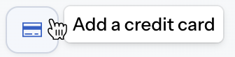
Programmatic Definition
The tooltip component can be defined programmatically within your application code. Here’s an example of how you can define and use tooltip programmatically for the textField component:
@ViewComponent
private TypedTextField<String> programmaticField;

@Subscribe
public void onInit(final InitEvent event) {
    programmaticField.setTooltipText("This is a tooltip")
            .setPosition(Tooltip.TooltipPosition.START);
}
Positioning
tooltip, by default, positions itself relative to the target component it’s attached to. It automatically calculates the best location for the tooltip to appear, taking into account the available space on the screen and avoiding overlaps with other elements.
The position attribute directly affects the tooltip’s location on the screen, allowing you to control where the tooltip appears. The position attribute accepts values from the TooltipPosition enumeration.
You can set the position attribute using the setPosition() method in your code:
programmaticField.getTooltip()
        .setPosition(Tooltip.TooltipPosition.START);
In the view descriptor XML, you can specify the position attribute:
<textField id="textField">
    <tooltip text="Basics tooltip"
             position="END_BOTTOM"/>
</textField>
Configuring Delays
tooltip provides the ability to configure delays for its appearance and disappearance, allowing you to control the timing of the tooltip’s interaction with the user.
Focus Delay
The focusDelay attribute controls the delay, in milliseconds, before the tooltip appears when the mouse hovers over the component with the tooltip element.
In this example, the tooltip will appear after a 500-millisecond delay when the mouse hovers over the text field:
<textField label="Text Field">
    <tooltip text="This is a tooltip"
             focusDelay="500"/>
</textField>
Hide Delay
The hideDelay attribute controls the delay, in milliseconds, before the tooltip hides when the mouse leaves the component with the tooltip element.
In this example, the tooltip will remain visible for 1 second after the mouse leaves the text field before disappearing:
<textField label="Text Field">
    <tooltip text="This is a tooltip"
             hideDelay="1000"/>
</textField>
Hover Delay
The hoverDelay attribute controls the delay, in milliseconds, before the tooltip appears when the mouse hovers over the component with the tooltip element.
In this example, the tooltip will appear after a 500-millisecond delay when the mouse hovers over the text field:
<textField label="Text Field">
    <tooltip text="This is a tooltip"
             hoverDelay="500"/>
</textField>
Triggering Manually
You can configure tooltips to appear programmatically, meaning they won’t show on hover or focus, but only when triggered by your code. This is particularly useful when:
-
You need to display the tooltip based on specific conditions or user interactions.
-
The tooltip content needs to be dynamically generated or updated.
In the view descriptor XML, set the manual attribute to true. This indicates that the tooltip will not be displayed automatically and requires manual control.
<textField id="manualTextField"
           label="Text Field">
    <tooltip text="This is a tooltip"
             manual="true"/>
</textField>
Then configure the tooltip within the view controller.
@ViewComponent
private TypedTextField<String> manualTextField;

@Autowired
private UiComponents uiComponents;

@Subscribe
public void onInit(final InitEvent event) {
    JmixButton helperButton = createHelperButton();
    Tooltip tooltip = manualTextField.getTooltip();
    helperButton.addClickListener(e ->
            tooltip.setOpened(!tooltip.isOpened())); (1)

    manualTextField.setSuffixComponent(helperButton);
}

protected JmixButton createHelperButton() {
    JmixButton helperButton = uiComponents.create(JmixButton.class);
    helperButton.setIcon(VaadinIcon.QUESTION_CIRCLE.create());
    helperButton.addThemeVariants(ButtonVariant.LUMO_ICON,
            ButtonVariant.LUMO_TERTIARY_INLINE);

    return helperButton;
}| 1 | The opened attribute controls whether the tooltip is currently visible. It’s a boolean value, with true indicating the tooltip is open and false indicating it’s closed. |
While opened can be set manually, it’s typically managed by the framework itself based on events such as mouse hover or focus. The attribute is useful for controlling tooltip visibility in scenarios where you need to programmatically open or close it.
|
Attributes
The following attributes are specific to tooltip:
Name |
Description |
Default |
|---|---|---|
Defines the delay in milliseconds before the tooltip is opened on keyboard focus, when not in manual mode. See Focus Delay. |
|
|
Defines the delay in milliseconds before the tooltip is closed on losing hover, when not in manual mode. On blur, the tooltip is closed immediately. See Hide Delay. |
|
|
Defines the delay in milliseconds before the tooltip is opened on hover, when not in manual mode. See Hover Delay. |
|
|
When |
|
|
When |
|
|
Defines the position of the tooltip with respect to its target. See Positioning. |
||
Defines the string used as a tooltip content. |
See Also
See the Vaadin Docs for more information.
