treeDataGrid
A table of data that features collapsible sections in one of its columns. It resembles dataGrid and supports most of its functionality, but is better suited for datasets that require intuitive navigation through hierarchical data.
XML Element |
|
|---|---|
Java Class |
|
Attributes |
id - alignSelf - allRowsVisible - classNames - colspan - columnReorderingAllowed - css - dataContainer - detailsVisibleOnClick - dropMode - editorBuffered - emptyStateText - enabled - height - hierarchyProperty - maxHeight - maxWidth - metaClass - minHeight - minWidth - multiSort - multiSortOnShiftClickOnly - multiSortPriority - nestedNullBehavior - pageSize - rowDraggable - selectionMode - showOrphans - tabIndex - themeNames - visible - width |
Handlers |
AttachEvent - BlurEvent - CellFocusEvent - CollapseEvent - ColumnReorderEvent - ColumnResizeEvent - DetachEvent - ExpandEvent - FocusEvent - GridDragEndEvent - GridDragStartEvent - GridDropEvent - ItemClickEvent - ItemDoubleClickEvent - SortEvent - dataGenerator - dragFilter - dropFilter - enterPressHandler - partNameGenerator - tooltipGenerator |
Elements |
actions - columns - column - contextMenu - emptyStateComponent |
Basics
treeDataGrid primarily replicates the functionality of the dataGrid component.
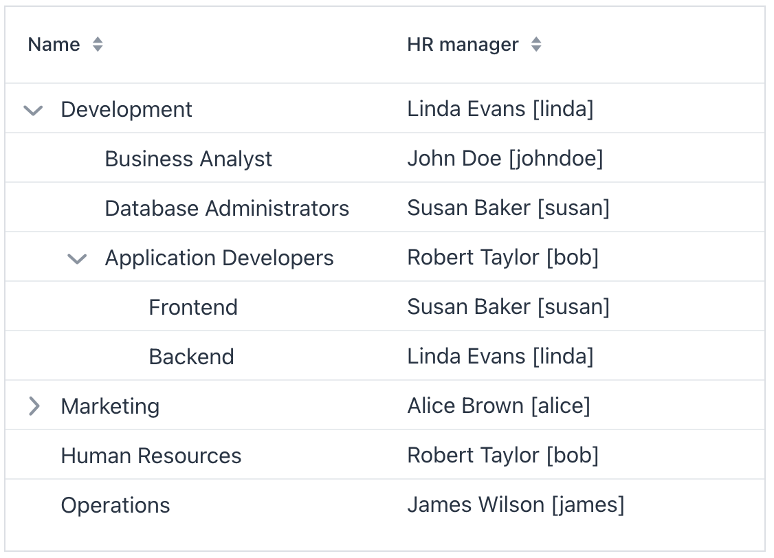
An example of treeDataGrid declaration in the XML view descriptor is shown below:
<data readOnly="true">
    <collection id="departmentsDc"
                class="com.company.onboarding.entity.Department"> (1)
        <fetchPlan extends="_base">
            <property name="hrManager" fetchPlan="_base"/>
            <property name="parentDepartment" fetchPlan="_base"/>
        </fetchPlan>
        <loader id="departmentsDl">
            <query>
                <![CDATA[select e from Department e]]>
            </query>
        </loader>
    </collection>
</data>
<layout>
            <treeDataGrid
                          hierarchyProperty="parentDepartment"
                          width="100%"
                          minHeight="20em"
                          dataContainer="departmentsDc"> (2)
                <columns> (3)
                    <column property="name"/>
                    <column property="hrManager"/>
                </columns>
            </treeDataGrid>
</layout>| 1 | Collection container for the Department entity. |
| 2 | treeDataGrid is bound to the departmentsDc container using the dataContainer attribute. |
| 3 | The columns element defines which entity attributes are shown in the tree data grid columns. |
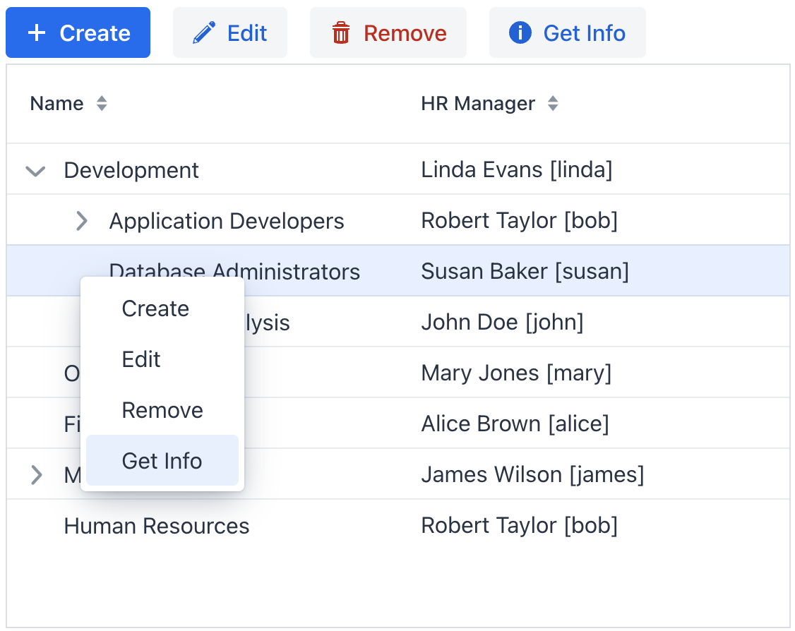
Actions
The treeDataGrid component implements the HasActions interface and can contain both standard list actions and custom actions. Actions are invoked by clicking designated buttons or from the context menu that appears on the right click.
|
To add |
Show code
<hbox id="buttonsPanel" classNames="buttons-panel"> (1)
    <button id="createBtn" action="departmentsTable.create"/>
    <button id="editBtn" action="departmentsTable.edit"/>
    <button id="removeBtn" action="departmentsTable.remove"/>
    <button id="infoBtn" action="departmentsTable.getInfo" icon="INFO_CIRCLE"/>
</hbox>
<treeDataGrid id="departmentsTable"
              hierarchyProperty="parentDepartment"
              width="100%"
              minHeight="20em"
              dataContainer="departmentsDc">
    <columns>
        <column property="name"/>
        <column property="hrManager"/>
    </columns>
    <actions>
        <action id="create" type="list_create"/> (2)
        <action id="edit" type="list_edit"/>
        <action id="remove" type="list_remove"/>
        <action id="getInfo" text="Get Info"/> (3)
    </actions>
</treeDataGrid>| 1 | Define hbox to contain action buttons. |
| 2 | Define the list_create standard action. |
| 3 | Define the getInfo custom action. Value of its text attribute represents the action in the context menu and is used as the button caption. |
Context Menu
The context menu offers an alternative way to access actions through a right click. Each action is represented by its own menu item.
Use the contextMenu element to refine the list of items in the menu, organizing them with separators and a hierarchical structure.
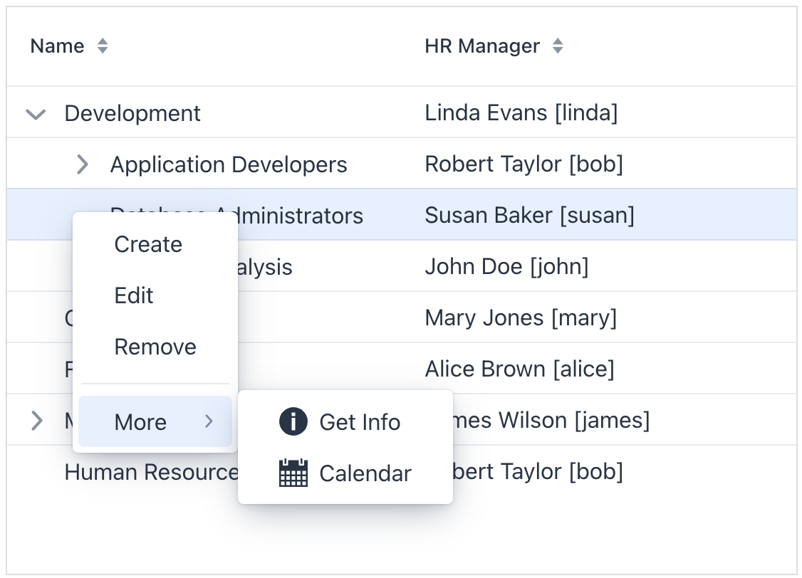
Show code
<treeDataGrid id="treeDataGrid"
              hierarchyProperty="parentDepartment"
              width="100%"
              minHeight="20em"
              dataContainer="departmentsDc">
    <columns>
        <column property="name"/>
        <column property="hrManager"/>
    </columns>
    <actions showInContextMenuEnabled="false"> (1)
        <action id="create" type="list_create"/>
        <action id="edit" type="list_edit"/>
        <action id="remove" type="list_remove"/>
        <action id="getInfo" text="Get Info"/>
        <action id="viewCalendar" text="Calendar"/>
    </actions>
    <contextMenu>
        <item action="treeDataGrid.create"/> (2)
        <item action="treeDataGrid.edit"/>
        <item action="treeDataGrid.remove"/>
        <separator/>
        <item text="More"> (3)
            <item action="treeDataGrid.getInfo" icon="INFO_CIRCLE"/>
            <item action="treeDataGrid.viewCalendar" icon="CALENDAR"/>
        </item>
    </contextMenu>
</treeDataGrid>| 1 | Hide all actions from the menu. Or hide a specific action using its visible attribute. |
| 2 | Add menu items explicitly for necessary actions. |
| 3 | Nest items within each other to create a hierarchy. |
Theme Variants
Use themeNames attribute to set a component theme.
| Variant | Description | Supported By |
|---|---|---|
|
Removes the outer border around the grid. |
Aura, Lumo |
|
Removes the horizontal borders between rows. |
Aura, Lumo |
|
Adds vertical borders between columns. |
Aura, Lumo |
|
Alternates row background colors to improve readability. |
Aura, Lumo |
|
Reduces row height and spacing. |
Aura, Lumo |
|
Allows cell content to wrap onto multiple lines instead of truncating. |
Aura, Lumo |
Attributes
Common attributes serve the same purpose for all components.
The following attributes are specific to treeDataGrid:
Name |
Description |
Default |
|---|---|---|
If Using this feature is discouraged for a large number of items as it may cause performance issues. |
|
|
If |
|
|
If |
|
|
Determines rows where a drop can happen. Possible values: |
– |
|
If |
|
|
Defines the name of the entity attribute, which refers to the same entity. |
- |
|
If |
|
|
If |
|
|
Determines whether the clicked column is added to the end or beginning of the sorted columns list. Possible values: |
|
|
Sets the behavior when parsing nested properties which may contain null values in the property chain. Possible values: |
|
|
Determines the page size or the number of items that will be fetched from the data provider at a time. |
|
|
If |
|
|
Sets the selection mode. Possible values: |
|
|
If An orphan record is a child record that refers to a non-existent parent, often occurring when data is loaded partially due to filtering or paging. While not showing orphans seems logical with filters, it can lead to empty or partially filled pages. It is discouraged to use the |
|
Handlers
Common handlers are configured in the same way for all components.
The following handlers are specific to treeDataGrid:
|
To generate a handler stub in Jmix Studio, use the Handlers tab of the Jmix UI inspector panel or the Generate Handler action available in the top panel of the view class and through the Code → Generate menu (Alt+Insert / Cmd+N). |
Name |
Description |
|---|---|
|
|
com.vaadin.flow.component.treegrid.CollapseEvent is fired when an item is collapsed. |
|
|
|
|
|
|
|
|
|
|
|
|
|
|
|
|
|
|
|
Adds a data generator for the data grid. If the generator was already added, does nothing. See the |
|
Allows to control which specific rows can be dragged, rather than making all rows draggable with rowDraggable. |
|
Allows to control which specific rows are valid drop targets. |
|
Handles the event when the user presses the Enter key. |
|
Generates parts of CSS class names for cells based on given conditions. This allows for customizing cell appearance based on the data displayed. |
|
Generates tooltip for the column cell based on given conditions. See live demo. |
Elements
Elements of dataGrid provide a wide range of options to control the appearance, behavior, and functionality of columns both collectively and individually.
|
To add an element to a selected component click the Add button in the Jmix UI inspector panel. |
columns
The columns element can specify a set of attributes to display and behaviors for all columns.
XML Element |
|
|---|---|
Attributes |
exclude - includeAll - resizable - sortable |
Elements |
Name |
Description |
Default |
|---|---|---|
Excludes specific attributes from being shown. Several attributes must be separated with a comma. For example: |
– |
|
If |
– |
|
If |
|
|
If |
|
column
The column element defines an individual column. Attributes set for an individual column override those set for all columns.
XML Element |
|
|---|---|
Attributes |
autowidth - editable - filterable - flexGrow - footer - frozen - header - key - property - resizable - sortable - textAlign - visible - width |
Handlers |
AttachEvent - DataGridColumnVisibilityChangedEvent - DetachEvent - partNameGenerator - renderer - tooltipGenerator |
Elements |
Name |
Description |
Default |
|---|---|---|
If |
|
|
If |
|
|
If |
|
|
Sets the flex grow ratio for this column. When set to |
|
|
Sets a footer text to the column. The attribute value can either be the text itself or a key in the message bundle. In case of a key, the value should begin with the |
– |
|
If |
|
|
Sets the column header text. The attribute value can either be the text itself or a key in the message bundle. In case of a key, the value should begin with the |
– |
|
Sets the user-defined identifier to map this column. The key can be used to fetch the column later with the The key has to be unique within the data grid, and it can’t be changed after set once. |
– |
|
Specifies the name of an entity attribute to be displayed in the column. This can be an attribute of the root entity |
– |
|
If |
|
|
If |
|
|
Specifies the alignment of the text with the following possible values: |
|
|
If |
|
|
Sets the width of the column as a CSS string. |
– |
Name |
Description |
|---|---|
Fired when the column visibility is changed through the gridColumnVisibility component. |
|
Generates parts of CSS class names for this column based on given conditions. This allows for customizing cell appearance based on the data displayed. See live demo. |
|
Renders column content using text or components. See text renderer and component renderer. |
|
Generates tooltip for the column cell based on given conditions. See live demo. |
contextMenu
The contextMenu element organizes items the right-click menu in a way that differs from their default arrangement. See the example.
XML Element |
|
|---|---|
Attributes |
id - classNames - css - enabled - visible |
Handlers |
AttachEvent - DetachEvent - GridContextMenuOpenedEvent - openedChangeEvent - dynamicContentHandler |
Elements |
item - separator |
Name |
Description |
|---|---|
Fired when the context menu opened state changes. May return the target item or the id of the target column allowing the menu to display items based on the clicked item. |
|
Fired when the context menu opened state changes. |
|
Handles dynamic updates to the menu when it opens, such as adding menu items or their content. See the relevant |
See Also
See the Vaadin Docs for more information.
