formLayout
A responsive layout that arranges components into columns. The number of columns changes depending on the layout width.
XML Element |
|
|---|---|
Java Class |
|
Attributes |
id - alignSelf - autoResponsive - autoRows - classNames - clickShortcut - colspan - columnSpacing - columnWidth - css - dataContainer - enabled - expandColumns - expandFields - height - labelsAside - labelSpacing - labelsPosition - labelWidth - maxColumns - maxHeight - maxWidth - minColumns - minHeight - minWidth - rowSpacing - visible - width |
Handlers |
AttachEvent - clickListener - doubleClickListener - singleClickListener - DetachEvent |
Elements |
Basics
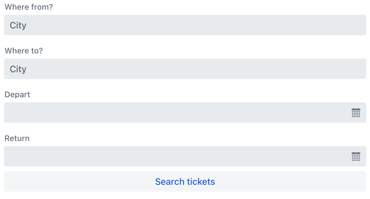
By default, components are arranged into two columns.
<formLayout>
    <textField placeholder="City" label="Where from?"/>
    <textField placeholder="City" label="Where to?"/>
    <datePicker label="Depart"/>
    <datePicker label="Return"/>
    <button text="Search tickets"/>
</formLayout>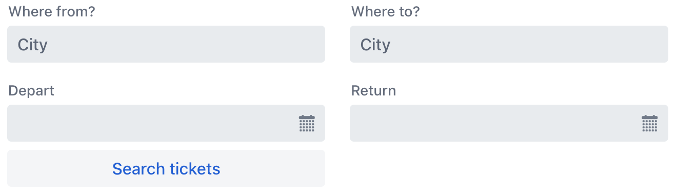
When the layout width is smaller, it automatically adjusts to a single column.
Data Binding
Data binding refers to linking a visual component to a data container.
In the formLayout component, this is achieved by setting the dataContainer attribute to reference a data container.
<data>
    <instance id="userDc"
              class="com.company.onboarding.entity.User"/> (1)
</data>
<layout>
    <formLayout dataContainer="userDc"> (2)
        <textField property="firstName"/> (3)
        <textField property="lastName"/>
        <textField property="username"/>
        <textField property="email"/>
    </formLayout>
</layout>| 1 | Instance container for the User entity. |
| 2 | Binding the component to a data container. The dataContainer attribute contains a link to the userDc data container. |
| 3 | Nested formLayout elements define visual components bound to entity attributes using the property XML attribute. Labels will be created automatically based on the localized names of entity attributes. |
Auto-Responsive Mode
When enabled, formLayout automatically determines the appropriate number of columns. This calculation considers column width, spacing, and the available horizontal space.
Enable this mode by setting the autoResponsive attribute to true.
| When auto-responsive mode is enabled, responsive steps are ignored. |
Form Rows
In auto-responsive mode, all fields are displayed in a single column by default.
To organize fields into multiple columns, use one of the following approaches:
-
Group fields manually: place related fields into a
formRowelement to create a deliberate multi-column group.<formLayout autoResponsive="true"> <formRow> <textField label="Where from?" placeholder="City"/> <textField placeholder="City" label="Where to?"/> <datePicker label="Depart"/> </formRow> <formRow> <datePicker label="Return"/> <button text="Search tickets"/> </formRow> </formLayout>Each
formRowalways starts on a new row. Fields that exceed the available columns wrap to a new row, which then remains reserved exclusively for the fields of thatformRow. -
Enable automatic distribution: set the autoRows attribute to
trueto let the layout automatically place fields into the available columns, wrapping to a new row when the current one is full.
The rowSpacing attribute controls the vertical gap between rows. This setting applies to the space between all rows, whether they are created manually via formRow or automatically via autoRows.
Label Positioning
By default, labels are rendered above their corresponding fields. To position labels beside fields, wrap the fields in formItem elements and enable the labelsAside="true" attribute on the formLayout.
|
When using labels-aside mode, apply the label to the |
The example below demonstrates how to position labels next to fields:
<formLayout autoResponsive="true" labelsAside="true">
    <formRow>
        <formItem label="Where from?">
            <textField placeholder="City"/>
        </formItem>
        <formItem label="Where to?">
            <textField placeholder="City"/>
        </formItem>
        <formItem label="Depart">
            <datePicker/>
        </formItem>
    </formRow>
    <formRow>
        <formItem label="Return">
            <datePicker/>
        </formItem>
        <button text="Search tickets"/>
    </formRow>
</formLayout>
If the formLayout’s width is insufficient to display labels beside fields, it automatically reverts to the default behavior of rendering labels above fields.
The labelSpacing attribute defines the gap between the label and the field when labels are positioned aside. Use this attribute to adjust the horizontal spacing for optimal layout.
Column Management
In auto-responsive mode, columns have a fixed width defined by the columnWidth attribute. The layout automatically creates columns up to the specified limits based on the available container width.
The layout dynamically adjusts the number of columns based on available space, constrained by the minColumns and maxColumns boundaries. The minColumns attribute ensures a minimum number of columns are always created, while maxColumns sets an upper limit to prevent excessive column proliferation. Between these columns, the columnSpacing attribute controls the visual separation using CSS length units.
For optimal space utilization, two expansion behaviors are available. When expandFields is enabled, fields — including those within formItem elements — stretch horizontally to fill their containing columns. Alternatively, expandColumns enables all columns to proportionally expand and collectively occupy any remaining available width in the layout after the initial column calculation.
<formLayout autoResponsive="true"
            columnWidth="150px"
            minColumns="2"
            maxColumns="4"
            columnSpacing="3em"
            expandColumns="true"
            expandFields="true">
    <formRow>
        <textField placeholder="City" label="Where to?"/>
        <textField placeholder="City" label="Where from?"/>
    </formRow>
    <formRow>
        <datePicker label="Return"/>
        <datePicker label="Depart"/>
    </formRow>
    <formRow>
        <button text="Search tickets"/>
    </formRow>
</formLayout>
Responsive Steps Mode
The responsiveSteps element provides a way to determine a number of columns based on the available space.
<formLayout>
    <responsiveSteps>
        <responsiveStep minWidth="0" columns="1"/>
        <responsiveStep minWidth="30em" columns="2"/>
        <responsiveStep minWidth="40em" columns="3"/>
        <responsiveStep minWidth="50em" columns="4"/>
        <responsiveStep minWidth="60em" columns="5"/>
    </responsiveSteps>
    <textField placeholder="City" label="Where from?"/>
    <textField placeholder="City" label="Where to?"/>
    <datePicker label="Depart"/>
    <datePicker label="Return"/>
    <button text="Search tickets"/>
</formLayout>
When the width is large enough, the layout above will automatically adjust to use all five columns:

Label Position
The layout enables side-positioned labels for nested components. Wrap a component with a formItem element, specifying its label, and set the desired position with labelsPosition attribute:
formItem can only wrap a single component.
|
<formLayout labelsPosition="ASIDE">
    <formItem label="Where from?">
        <textField placeholder="City"/>
    </formItem>
    <formItem label="Where to?">
        <textField placeholder="City"/>
    </formItem>
    <formItem label="Depart">
        <datePicker/>
    </formItem>
    <formItem label="Return">
        <datePicker/>
    </formItem>
    <formItem>
        <button text="Search tickets"/>
    </formItem>
</formLayout>
Responsive Label Position
Layouts that display labels on the side require more space than those with the default label position on top of the components. Similar to columns, the label position can be adjusted to fit the available space. Instead of adding the labelsPosition attribute to the layout, add it to its individual responsiveSteps elements:
<formLayout>
    <responsiveSteps>
        <responsiveStep minWidth="0" columns="1" labelsPosition="TOP"/>
        <responsiveStep minWidth="30em" columns="1" labelsPosition="ASIDE"/>
        <responsiveStep minWidth="40em" columns="2" labelsPosition="TOP"/>
        <responsiveStep minWidth="50em" columns="2" labelsPosition="ASIDE"/>
    </responsiveSteps>
    <formItem label="Where from?">
        <textField placeholder="City"/>
    </formItem>
    <formItem label="Where to?">
        <textField placeholder="City"/>
    </formItem>
    <formItem label="Depart">
        <datePicker/>
    </formItem>
    <formItem label="Return">
        <datePicker/>
    </formItem>
    <formItem colspan="2">
        <button text="Search tickets"/>
    </formItem>
</formLayout>
Changing the layout width will affect both the number of columns and the positioning of labels.
Column Span
Use the colspan attribute to control the number of columns a nested component should span.
For example, you can make a button to always span across two columns even when other components do not:
<formLayout id="abc">
    <textField placeholder="City" label="Where from?"/>
    <textField placeholder="City" label="Where to?"/>
    <datePicker label="Depart"/>
    <datePicker label="Return"/>
    <button text="Search tickets" colspan="2"/>
</formLayout>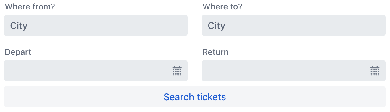
Attributes
Common attributes serve the same purpose for all components.
The following attributes are specific to formLayout.
Name |
Description |
Default |
|---|---|---|
Enables the layout to automatically calculate and adjust the number of columns based on the available width of its container. See Auto-Responsive Mode. |
|
|
Configures whether the layout should automatically distribute fields across columns, filling each row sequentially before wrapping to the next line. This attribute works only when autoResponsive is enabled. See Auto-Responsive Mode. |
|
|
Defines the fixed width for all columns. Value must be a valid CSS length unit (for example, |
|
|
Defines the gap between columns using CSS length units. This attribute works only when autoResponsive is enabled. See Column Management. |
||
When enabled, columns evenly distribute to fill any remaining horizontal space after the initial column calculation. This attribute works only when autoResponsive is enabled. See Column Management. |
|
|
When enabled, fields stretch to fill all available width within their containing column. This also applies to fields wrapped in |
|
|
Specifies whether |
|
|
Defines the spacing between the label and the corresponding field when labels are placed aside the field. This attribute works only when autoResponsive is enabled. See Label Positioning. The value must be provided in CSS length units, for example, |
||
Sets the label position for components within the layout. - - |
|
|
Sets the width of side-positioned label. See Label Positioning and Label Position. The value must be provided in CSS length units, for example, |
||
Sets the maximum number of columns the layout can create. The actual number will not exceed this limit, even if there is sufficient space. This attribute works only when autoResponsive is enabled. See Column Management. |
10 |
|
Sets the minimum number of columns the layout will create, regardless of container width. This attribute works only when autoResponsive is enabled. See Column Management. |
1 |
|
Defines the gap between rows using CSS length units. This attribute works only when autoResponsive is enabled. See Column Management. |
See Also
See Vaadin Docs for more information.
