span
span can be used to add a small piece of text. It enables using styles, such as color or font.
XML Element |
|
|---|---|
Java Class |
|
Attributes |
id - alignSelf - classNames - colspan - css - dataContainer - enabled - height - maxHeight - maxWidth - minHeight - minWidth - property - text - themeNames - title - visible - whiteSpace - width |
Handlers |
Basics
Like its HTML counterpart, the span component can be used to add and style text. However, the span XML element cannot be applied to a piece of text contained in another XML element.
| Use the html component to include native HTML directly. |
Use span to create a short text on the view when no other component is appropriate. Such text can accompany a component if it does not fit within the label or helperText attributes, or if it has some other meaning.
It is possible to combine span with div to allow for different positioning relative to the component.
<div>
    <div text="What is the largest planet in the Solar system?"/>
    <textField/>
    <span classNames="font-bold" text=" Correct! "/>
    <span text="Jupiter has both the greatest mass and volume."/>
</div>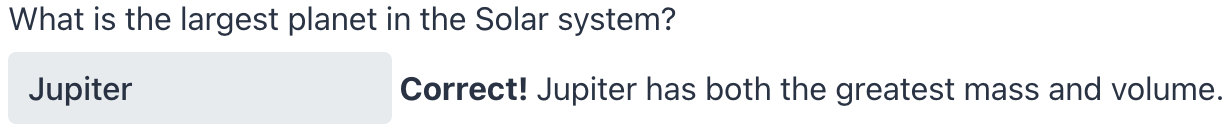
In the above example, the content of div is placed on top and takes up all available width. The text in span is placed on the side and only requires the necessary amount of space, allowing to place several differently styled span components on a single line.
Note that a parent layout can force a line break after span. For example, a root layout of a standard view arranges all components in a vertical column.
Themes
Use the themeNames attribute to customize component’s color, size, and shape. Start by transforming the component into a badge using themeNames = "badge". Then, apply supplementary themes to enhance different visual aspects.
Color
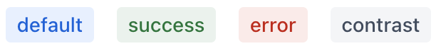
Choose among four color variants to convey the component’s visual intent: default, success, error, and contrast.
XML code
<span text="default" themeNames="badge"/>
<span text="success" themeNames="badge, success"/>
<span text="error" themeNames="badge, error"/>
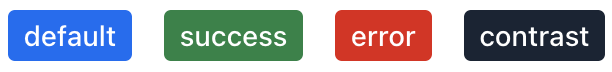
<span text="contrast" themeNames="badge, contrast"/>Combine the color variants with the primary theme to add extra emphasis:
XML code
<span text="default" themeNames="badge, primary"/>
<span text="success" themeNames="badge, success, primary"/>
<span text="error" themeNames="badge, error, primary"/>
<span text="contrast" themeNames="badge, contrast, primary"/>
Shape
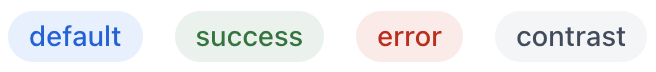
Applying the pill theme creates a badge with rounded corners. Use it independently or combine with color themes:
XML code
<span text="default" themeNames="badge, pill"/>
<span text="success" themeNames="badge, success, pill"/>
<span text="error" themeNames="badge, error, pill"/>
<span text="contrast" themeNames="badge, contrast, pill"/>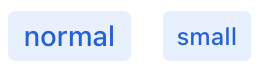
Attributes
Common attributes serve the same purpose for all components.
The following attributes are specific to span:
Name |
Description |
Default |
|---|---|---|
Adds a theme to the component. Possible values: Predefined themes are sets of CSS classes that may affect other styling options of the component or its nested components. |
- |
Handlers
Common handlers are configured in the same way for all components.
The following handlers are specific to span:
|
To generate a handler stub in Jmix Studio, use the Handlers tab of the Jmix UI inspector panel or the Generate Handler action available in the top panel of the view class and through the Code → Generate menu (Alt+Insert / Cmd+N). |
Name |
Description |
|---|---|
The click – fires the event whenever the component is clicked. singleClick – fires the event after a timeout to ensure it is not a double click. doubleClick – fires the event when the component is double-clicked. |
See Also
See MDN Docs for more information.
