Dialogs
The Dialogs interface is designed to display standard dialog windows. A dialog window is a small popup window that you can use to present information and user interface elements in an overlay.
The createMessageDialog(), createOptionDialog(), and createInputDialog() methods are the entry points to the fluent API that allows you to construct and show dialogs.
Message Dialog
A message dialog shows a message to the user.
In the following example, a message dialog is shown when the user clicks a button:
@Autowired
private Dialogs dialogs;
@Subscribe("messageDialogButton")
public void onHelloButtonClick(ClickEvent<Button> event) {
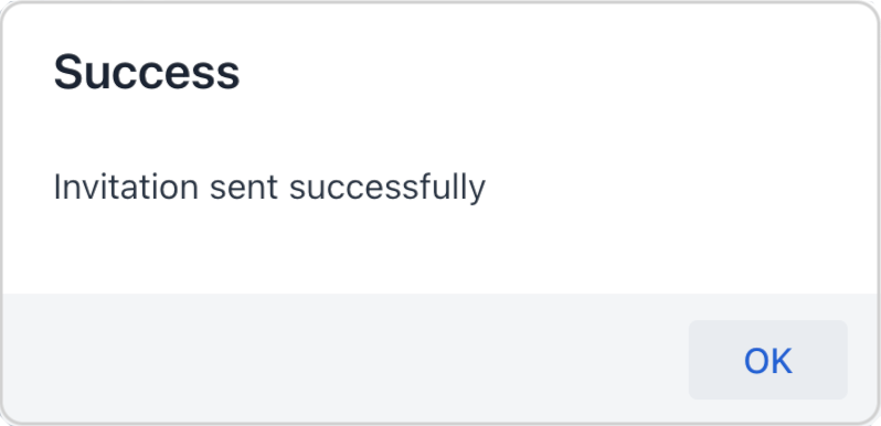
dialogs.createMessageDialog()
.withHeader("Success") (1)
.withText("Invitation sent successfully") (2)
.open();
}| 1 | Adds a dialog header. |
| 2 | Adds a text message to show in the dialog. |
The following methods allow you to customize the look and behavior of the message dialog:
withHeader - withWidth - withHeight - withLeft - withTop - withText - withContent - withModal - withThemeName - withClassName - withDraggable - withResizable - withMinWidth - withMaxWidth - withMaxWidth - withMaxHeight - withCloseOnOutsideClick - withCloseOnEsc - withDraggedListener - withResizeListener
Option Dialog
The option dialog displays a message and a set of buttons for user reaction.
Use the withActions() method to provide actions, each of which is represented by a button in the dialog. For example:
@Autowired
private Dialogs dialogs;
@Subscribe("selectOptionButton")
public void onSelectOptionButtonClick(ClickEvent<Button> event) {
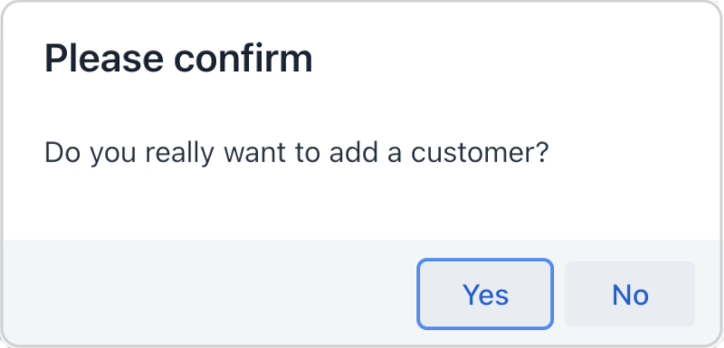
dialogs.createOptionDialog()
.withHeader("Please confirm")
.withText("Do you really want to add a customer?")
.withActions(
new DialogAction(DialogAction.Type.YES)
.withHandler(e -> addCustomer()), (1)
new DialogAction(DialogAction.Type.NO)
)
.open();
}| 1 | If you click Yes, the dialog closes and invokes the corresponding addCustomer() action method. |
The DialogAction base class is designed to create actions with standard names and icons. Five types of actions, defined by the DialogAction.Type enum, are supported: OK, CANCEL, YES, NO, CLOSE. Names of buttons are extracted from the message bundle.
The following methods allow you to customize the look and behavior of the option dialog:
Background Task Dialog
Background task dialog provides a user-friendly experience for long-running tasks, where the user can monitor progress and cancel the operation if needed.
| For more information on the background tasks mechanism, please see the Background Tasks article. |
To configure a dialog, provide it with a background task object:
@Autowired
private Dialogs dialogs;
@Subscribe(id = "backgroundTaskButton", subject = "singleClickListener")
public void onBackgroundTaskClick(final ClickEvent<JmixButton> event) {
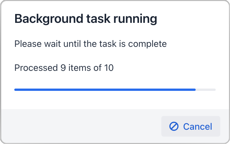
dialogs.createBackgroundTaskDialog(new SampleTask(15, this, 10)) (1)
.withHeader("Background task running")
.withText("Please wait until the task is complete")
.withTotal(10) (2)
.withCancelAllowed(true) (3)
.open();
}
protected class SampleTask extends BackgroundTask<Integer, Void> {
int count;
public SampleTask(long timeoutSeconds, View<?> view, int count) {
super(timeoutSeconds, view);
this.count = count;
}
@Override
public Void run(TaskLifeCycle<Integer> taskLifeCycle) throws Exception {
for (int i = 1; i < count + 1; i++) {
Thread.sleep(1000);
taskLifeCycle.publish(i);
}
return null;
}
}| 1 | Pass a background task object to the dialog. |
| 2 | Set the number of progress bar sections based on the number of tasks. |
| 3 | Allow user to interrupt the task. |
The following methods allow you to customize the look and behavior of the background task dialog:
Input Dialog
Input dialog is a versatile tool that allows you to construct input forms using API and often saves you from creating screens for trivial data input. It enables entering values of different types, validates the input, and provides different actions to be selected by the user.
The following methods allow you to customize the look and behavior of the input dialog:
withHeader - withWidth - withHeight - withLeft - withTop - withText - withDraggable - withDraggedListener
Let’s consider some examples.
Standard Parameters
Use the withParameters() method to add parameters, each of which will be represented by an input field in the dialog.
The following example creates an input dialog with parameters of standard types and standard OK/Cancel actions:
@Autowired
private Dialogs dialogs;
@Subscribe("standardParametersButton")
public void onStandardParametersButtonClick(ClickEvent<Button> event) {
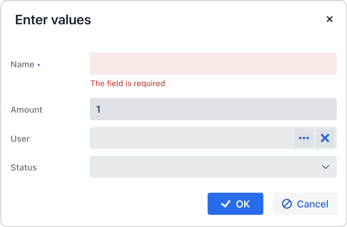
dialogs.createInputDialog(this)
.withHeader("Enter values")
.withParameters(
stringParameter("name").withLabel("Name").withRequired(true), (1)
intParameter("amount").withLabel("Amount").withDefaultValue(1), (2)
entityParameter("user", User.class).withLabel("User"), (3)
enumParameter("status", OnboardingStatus.class).withLabel("Status") (4)
)
.withActions(DialogActions.OK_CANCEL) (5)
.withCloseListener(closeEvent -> {
if (closeEvent.closedWith(DialogOutcome.OK)) { (6)
String name = closeEvent.getValue("name"); (7)
int amount = closeEvent.getValue("amount");
User user = closeEvent.getValue("user");
OnboardingStatus status = closeEvent.getValue("status");
// process entered values...
}
})
.open();
}| 1 | Specifies a mandatory string parameter. |
| 2 | Specifies an integer parameter with the default value. |
| 3 | Specifies an entity parameter. |
| 4 | Specifies an enumeration parameter. |
| 5 | Specifies standard OK/Cancel actions represented by buttons at the bottom of the dialog. |
| 6 | In the close listener, we can check what action was used by the user. |
| 7 | The close event contains entered values that can be obtained using parameter identifiers. |
Custom Parameters
The following example illustrates creating a custom parameter that lets the user select a value from a combobox:
@Autowired
private Dialogs dialogs;
@Autowired
private DataManager dataManager;
@Autowired
private UiComponents uiComponents;

@Subscribe("customParameterButton")
public void onCustomParameterButtonClick(ClickEvent<Button> event) {
    dialogs.createInputDialog(this)
            .withHeader("Enter values")
            .withParameters(
                    stringParameter("name").withLabel("Name").withRequired(true),
                    intParameter("amount").withLabel("Amount").withDefaultValue(1),
                    parameter("user") (1)
                            .withLabel("User")
                            .withField(() -> {
                                EntityComboBox<User> field = uiComponents.create(EntityComboBox.class); (2)
                                field.setItems(dataManager.load(User.class).all().list()); (3)
                                field.setWidthFull();
                                return field;
                            }),
                    enumParameter("status", OnboardingStatus.class).withLabel("Status")
            )
            .withActions(DialogActions.OK_CANCEL).withCloseListener(closeEvent -> {
                if (closeEvent.closedWith(DialogOutcome.OK)) {
                    String name = closeEvent.getValue("name");
                    int amount = closeEvent.getValue("amount");
                    User user = closeEvent.getValue("user");
                    OnboardingStatus status = closeEvent.getValue("status");
                    // process entered values...
                }
            })
            .open();
}| 1 | Specifies a custom parameter. |
| 2 | Creates a combobox within a custom parameter field. |
| 3 | Loads a list of options into the combobox. |
|
When using the The following
This is because you are fully responsible for manually creating and configuring the field inside the lambda. Therefore, all additional settings except for the In the example below, important attributes like If you do not need to customize the field manually, you can simply configure the attributes directly on the In this case, Jmix will automatically create the field and apply all specified attributes. |
Custom Validator
The dialog enables some basic validation from the start: it can validate the type of entered values or check that the required field is not empty. On top of it you can add more general, custom validators.
The following example adds a validator checking that at least one parameter is entered:
@Autowired
private Dialogs dialogs;
@Subscribe("validationButton")
public void onValidationButtonClick(ClickEvent<Button> event) {
    dialogs.createInputDialog(this)
            .withHeader("Enter at least one value")
            .withParameters(
                    stringParameter("name").withLabel("Name").withRequired(true),
                    entityParameter("User", User.class).withLabel("User")
            )
            .withValidator(context -> { (1)
                String name = context.getValue("name"); (2)
                User user = context.getValue("user");
                if (Strings.isNullOrEmpty(name) && user == null) {
                    return ValidationErrors.of("Enter name or select a customer"); (3)
                }
                return ValidationErrors.none();
            })
            .withActions(DialogActions.OK_CANCEL)
            .withCloseListener(closeEvent -> {
                if (closeEvent.closedWith(DialogOutcome.OK)) {
                    String name = closeEvent.getValue("name");
                    User user = closeEvent.getValue("user");
                    // process entered values...
                }
            })
            .open();
}| 1 | The custom validator adding logic to ensure at least one parameter is entered. |
| 2 | In the validator, parameter values can be obtained from the context object. |
| 3 | The validator returns validation errors if no parameters are entered. |
Side Dialog
A dialog that slides in from one side of the view.
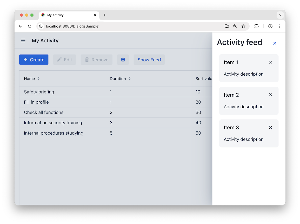
The dialog can be opened using the Dialogs bean:
@Autowired
private Dialogs dialogs;
@ViewComponent
private MessageBundle messageBundle;

@Subscribe(id = "sideDialogButton", subject = "clickListener")
public void onSimpleSideDialogButtonClick(final ClickEvent<JmixButton> event) {
    dialogs.createSideDialog()
            .withHorizontalSize("14em")
            .withHeaderProvider(this::createHeader)
            .withContentComponents(createContent())
            .open();
}

private HorizontalLayout createHeader(SideDialog sideDialog) {
    HorizontalLayout header = new HorizontalLayout();
    header.setWidthFull();
    header.add(new H2(messageBundle.getMessage("sideDialogHeader")));
    header.setJustifyContentMode(FlexComponent.JustifyContentMode.BETWEEN);
    Button closeButton = new Button(LumoIcon.CROSS.create(), event -> sideDialog.close());
    closeButton.addThemeVariants(ButtonVariant.LUMO_TERTIARY, ButtonVariant.LUMO_ICON);
    header.add(closeButton);

    return header;
}

private Component createContent() {
    VirtualList<String> list = new VirtualList<>();
    list.setWidthFull();
    list.setItems("Item 1", "Item 2", "Item 3");
    list.setRenderer(new ComponentRenderer<>((item -> {
        Card root = new Card();
        root.setTitle(item);
        root.setHeaderSuffix(LumoIcon.CROSS.create());
        root.add(messageBundle.getMessage("activityDescription"));
        root.addThemeVariants(CardVariant.LUMO_HORIZONTAL);
        root.addClassName(LumoUtility.Margin.Bottom.MEDIUM);
        return root;
    })));
    return list;
}
Position and Size
Use withSideDialogPosition() to define where the dialog appears. Possible values are RIGHT, TOP, BOTTOM, LEFT, INLINE_START, and INLINE_END. The default value is RIGHT. INLINE_START and INLINE_END follow the text direction (LTR/RTL).
The dialog size is configured differently depending on its orientation.
For horizontal dialogs (LEFT, RIGHT, INLINE_START, INLINE_END):
-
setHorizontalSize() -
setHorizontalMaxSize() -
setHorizontalMinSize()
For vertical dialogs (TOP, BOTTOM):
-
setVerticalSize() -
setVerticalMaxSize() -
setVerticalMinSize()
Content
You can define dialog content using providers:
Method |
Description |
|---|---|
|
Provides components for the dialog content area. |
|
Provides custom components for the header. |
|
Provides custom components for the footer. |
Events
The following events are available:
Event |
Description |
|---|---|
|
Fired when the dialog is opened or closed. |
|
Fired when the user presses |
Styling
Side dialog appearance and sizing can be customized using CSS.
Sizing
You can configure dialog size globally using CSS variables. These values are applied to all SideDialog instances.
| If sizes are set programmatically with Java API, they take precedence over CSS variables. |
Horizontal sizing (for LEFT, RIGHT, INLINE_START, INLINE_END):
Variable |
Description |
Default |
|---|---|---|
|
Base horizontal size of the dialog. |
|
|
Maximum horizontal size. |
|
|
Minimum horizontal size. |
|
Vertical sizing (for TOP, BOTTOM):
Variable |
Description |
Default |
|---|---|---|
|
Base vertical size of the dialog. |
|
|
Maximum vertical size. |
|
|
Minimum vertical size. |
|
Appearance
Variable |
Description |
Default |
|---|---|---|
|
Animation duration of dialog opening and closing. |
|
Parts
The side dialog exposes the following stylable parts:
Part |
Description |
|---|---|
|
Modality curtain (background overlay behind the dialog). |
|
Dialog overlay (main container). |
|
Header section of the dialog. |
|
Title wrapper element. |
|
Title element. |
|
Container for custom header content. |
|
Main content area. |
|
Footer section. |
States
The side dialog exposes the following states:
State |
Description |
|---|---|
|
Applied according to dialog position, for example |
|
Applied when the dialog is displayed in fullscreen mode on small devices. |
Dialog Configuration
You can customize the header, size, and position of all dialogs using the following methods:
-
withHeader()- sets the header text.
-
withWidth()- sets the dialog width.
-
withHeight()- sets the dialog height.
-
withLeft()- sets the dialog’s left offset from its container (unitless values are interpreted as pixels)
-
withTop()- sets the dialog’s top offset (unitless values are interpreted as pixels)
For example:
@Subscribe(id = "configDialogButton", subject = "clickListener")
public void onConfigDialogButtonClick(final ClickEvent<JmixButton> event) {
    dialogs.createMessageDialog()
            .withHeader("Information")
            .withWidth("600px")
            .withHeight("200px")
            .withTop("100px")
            .open();
}
Additional appearance and behavior configurations are available for specific dialog types:
-
withText()- sets the text message to be displayed in the dialog.
-
withContent()- sets the dialog’s content. This is text rendered within aParagraphcomponent. Note that this overrides any text previously set viawithText().Text formatting is available with HTML - the dialog can display HTML content using the
withContent()method. A given HTML fragment must be encapsulated in a component:@Autowired private Dialogs dialogs; Html htmlContent = new Html("<p>Here starts a paragraph. A new line starts after this.<br />" + "<b>This text is bold.</b> <i>This text is italic.</i></p>"); @Subscribe("htmlContentButton") public void onHtmlContentButtonClick(ClickEvent<Button> event) { dialogs.createMessageDialog() .withHeader("HTML Formatting") .withContent(htmlContent) .open(); }
-
withModal()- when set tofalse, displays the dialog as non-modal, allowing interaction with other application components. Dialogs are modal by default.
-
withThemeName()- sets the dialog’s theme name(s), replacing any previously set values.
-
withClassName()- sets the CSS class name(s) for the component, replacing all previously defined classes.
-
withDraggable()- sets whether dialog is enabled to be dragged by the user or not. Dialogs are draggable by default.
-
withResizable()- sets whether dialog can be resized by user or not. By default, the dialog is not resizable.
-
withMinWidth(),withMaxWidth(),withMaxWidth(),withMaxHeight()- set the dialog’s minimum/maximum width and height dimensions respectively.
-
withCloseOnOutsideClick()- controls whether clicking outside the dialog closes it. By default, the dialog is closable with an outside click.
-
withCloseOnEsc()- controls whether pressingESCcloses the dialog. By default, the dialog is closable withESC.
-
withDraggedListener()- registers a callback invoked after user dragging completes. It is called only if dragging is enabled.By default, the component will sync the top/left values after every dragging. For example:
@Subscribe(id = "dragDialogButton", subject = "clickListener")
public void onDragDialogButtonClick(final ClickEvent<JmixButton> event) {
    dialogs.createMessageDialog()
            .withHeader("Drag this dialog")
            .withDraggedListener(dialogDraggedEvent -> {
                String left = dialogDraggedEvent.getLeft();
                String top = dialogDraggedEvent.getTop();

                try {
                    int leftValue = Integer.parseInt(left.replace("px", ""));
                    int topValue = Integer.parseInt(top.replace("px", ""));

                    if (leftValue < 300 && topValue < 200) {
                        notifications.create("Dialog is in the upper left corner").show();
                    } else if (leftValue > 800 && topValue > 500) {
                        notifications.create("Dialog is in the lower right corner").show();
                    } else {
                        notifications.create("Dialog is in a neutral area").show();
                    }
                } catch (NumberFormatException e) {
                    notifications.create("Error: Invalid coordinates")
                            .withType(Notifications.Type.WARNING)
                            .show();
                }
            })
            .open();
}
-
withResizeListener()- registers a callback invoked after user resizing completes. It is called only if resizing is enabled.By default, the component will sync the width/height and top/left values after every resizing. For example:
@Subscribe(id = "resizeDialogButton", subject = "clickListener")
public void onResizeDialogButtonClick(final ClickEvent<JmixButton> event) {
    dialogs.createMessageDialog()
            .withHeader("Resize this dialog")
            .withResizable(true)
            .withResizeListener(dialogResizeEvent -> {
                String width = dialogResizeEvent.getWidth();
                String height = dialogResizeEvent.getHeight();
                try {
                    int widthValue = Integer.parseInt(width);
                    int heightValue = Integer.parseInt(height);

                    if (widthValue < 400 || heightValue < 300) {
                        notifications.create("Minimum size: 400×300")
                                .withType(Notifications.Type.WARNING)
                                .show();
                    }
                } catch (NumberFormatException e) {
                    notifications.create("Error: Invalid coordinates")
                            .withType(Notifications.Type.WARNING)
                            .show();
                }
            })
            .open();
}
