nativeLabel
nativeLabel represents the label HTML element that creates a caption for a component.
XML Element |
|
|---|---|
Java Class |
|
Attributes |
id - alignSelf - classNames - colspan - css - dataContainer - enabled - height - maxHeight - maxWidth - minHeight - minWidth - property - setFor - text - themeNames - title - visible - whiteSpace - width |
Handlers |
Basics
The nativeLabel component can serve as an alternative for the label attribute that is present in the majority of UI components in Jmix.
To set a label on a component, pass that component’s id to the setFor attribute of the label. For example, to set the label on a checkbox component:
<div>
    <checkbox id ="checkbox"/>
    <nativeLabel text="Enable Notifications" setFor="checkbox"/>
</div>
Having the label associated with a component makes the label text correctly interpreted by assistive technologies, such as screen readers.
To add text that is not associated with a component, use the span or div components.
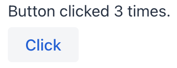
Dynamic Label
To dynamically set or update text in nativeLabel, first specify its id attribute:
<nativeLabel id="dynamicLabel" setFor="button"/>
<button id="button" text="Click"/>
Use this id to reference the label in the view controller and update the text with the setText() method:
@ViewComponent
private NativeLabel dynamicLabel;

@Subscribe("button")
public void onButtonClick(final ClickEvent<JmixButton> event) {
    dynamicLabel.setText("Button clicked " + event.getClickCount() + " times.");
}
Themes
Use the themeNames attribute to customize component’s color, size, and shape. Start by transforming the component into a badge using themeNames = "badge". Then, apply supplementary themes to enhance different visual aspects.
Color
Choose among four color variants to convey the component’s visual intent: default, success, error, and contrast.
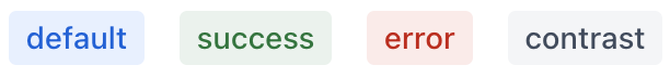
XML code
<nativeLabel text="default" themeNames="badge"/>
<nativeLabel text="success" themeNames="badge, success"/>
<nativeLabel text="success" themeNames="badge, warning"/>
<nativeLabel text="error" themeNames="badge, error"/>
<nativeLabel text="contrast" themeNames="badge, contrast"/>
Combine the color variants with the primary theme to add extra emphasis:
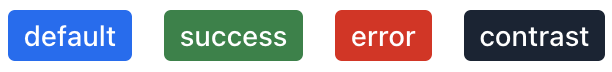
XML code
<nativeLabel text="default" themeNames="badge, primary"/>
<nativeLabel text="success" themeNames="badge, success, primary"/>
<nativeLabel text="success" themeNames="badge, warning, primary"/>
<nativeLabel text="error" themeNames="badge, error, primary"/>
<nativeLabel text="contrast" themeNames="badge, contrast, primary"/>
Shape
Applying the pill theme creates a badge with rounded corners. Use it independently or combine with color themes:
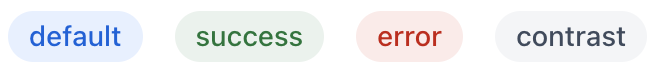
XML code
<nativeLabel text="default" themeNames="badge, pill"/>
<nativeLabel text="success" themeNames="badge, success, pill"/>
<nativeLabel text="success" themeNames="badge, warning, pill"/>
<nativeLabel text="error" themeNames="badge, error, pill"/>
<nativeLabel text="contrast" themeNames="badge, contrast, pill"/>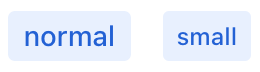
Attributes
Common attributes serve the same purpose for all components.
The following attributes are specific to nativeLabel:
Name |
Description |
Default |
|---|---|---|
Adds a theme to the component. Possible values: Predefined themes are sets of CSS classes that may affect other styling options of the component or its nested components. |
- |
|
Associates the label with a specific element by its id, enabling assistive technologies like screen readers to interpret it correctly. |
- |
See Also
See MDN Docs for more information.
