groupDataGrid
|
This component requires the commercial Grouping Data Grid add-on. |
The groupDataGrid component is a more capable version of the base data grid with powerful features for grouping rows. It can group rows by repeated column values into collapsible group blocks with support for multi-level grouping and drag-to-reorder controls.
XML Element |
|
|---|---|
Java Class |
|
Basics
Declare the groupg namespace in the view’s XML descriptor:
<view xmlns="http://jmix.io/schema/flowui/view"
xmlns:groupg="http://jmix.io/schema/groupgrid/ui">|
Studio adds the namespace automatically when you add the component using the Add Component action in the top actions panel. See Component Palette. |
The following example groups customers based on their respective values in the Grade column.
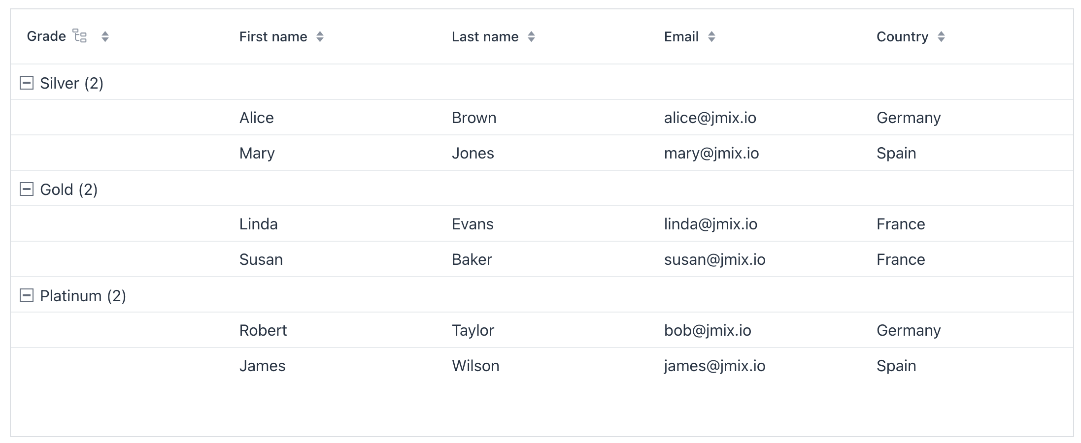
XML code
<view xmlns="http://jmix.io/schema/flowui/view" xmlns:groupg="http://jmix.io/schema/groupgrid/ui"
      title="msg://basicGroupGridView.title"> (1)
    <data>
        <collection id="customersDc"
                    class="com.company.groupdatagridex1.entity.Customer"
                    fetchPlan="_base">
            <loader id="customersDl">
                <query>
                    <![CDATA[select e from Customer e]]>
                </query>
            </loader>
        </collection>
    </data>
    <facets>
        <dataLoadCoordinator auto="true"/>
    </facets>
    <layout>
        <groupg:groupDataGrid id="customersGroupDataGrid"
                              dataContainer="customersDc"
                              minWidth="100px"
                              width="100%">
            <groupg:groupBy>
                <groupg:columnRef key="grade"/> (2)
            </groupg:groupBy>
            <groupg:columns>
                <groupg:groupColumn header="Grade"/> (3)
                <groupg:column property="firstName"/>
                <groupg:column property="lastName"/>
                <groupg:column property="email"/>
                <groupg:column property="country"/>
                <groupg:column property="grade"/>
            </groupg:columns>
        </groupg:groupDataGrid>
    </layout>
</view>| 1 | The view declares the groupg namespace used by the component. |
| 2 | Initial grouping is by the grade property; more groupings can be added. |
| 3 | Group column definition. |
Data Binding
Data binding refers to linking a visual component to a data container. To bind a component to data use the dataContainer attribute and reference collection container. See the example above.
Group Item
Group items are special records produced by grouping. They appear as rows that contain nothing but a group header.
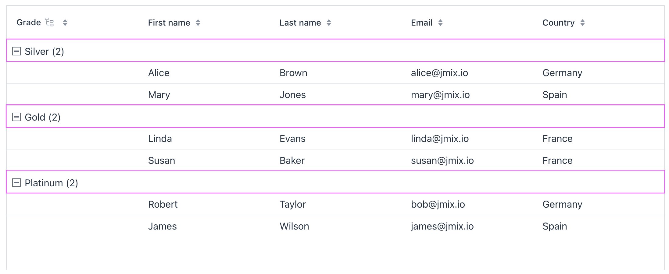
To render group items, the data-binding layer creates a temporary, empty entity or DTO instance. This instance is not added to the collection container and exists only in memory for the duration of the grouping.
Hide Group Item Count
By default, group items display the number of descendants. Use the displayItemsCount property of groupColumn to hide this number.
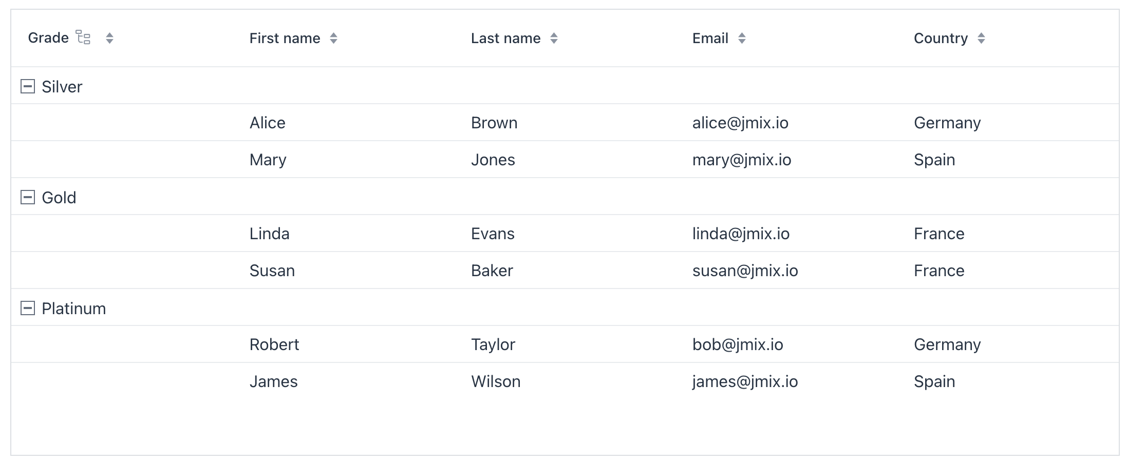
Multi-level Grouping
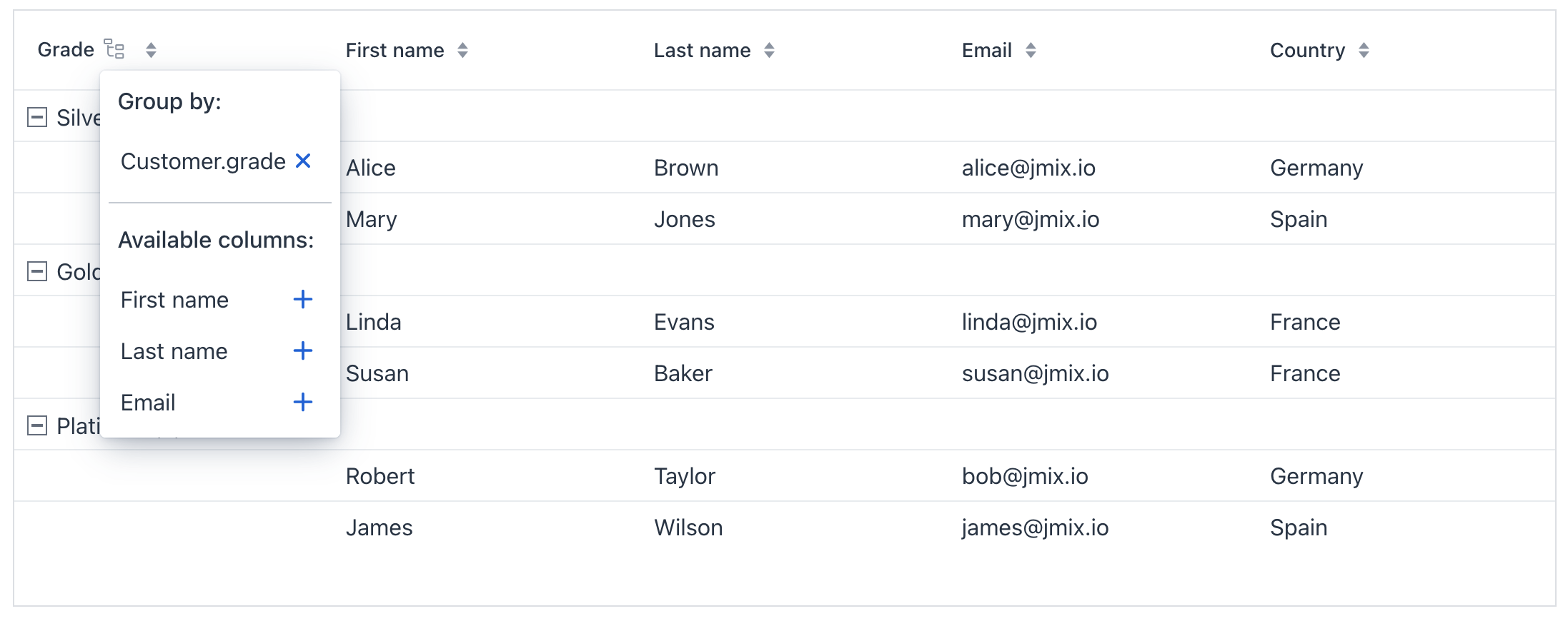
The component supports grouping by multiple columns. Click the grouping column icon to open the Group by dialog, then add or remove columns.
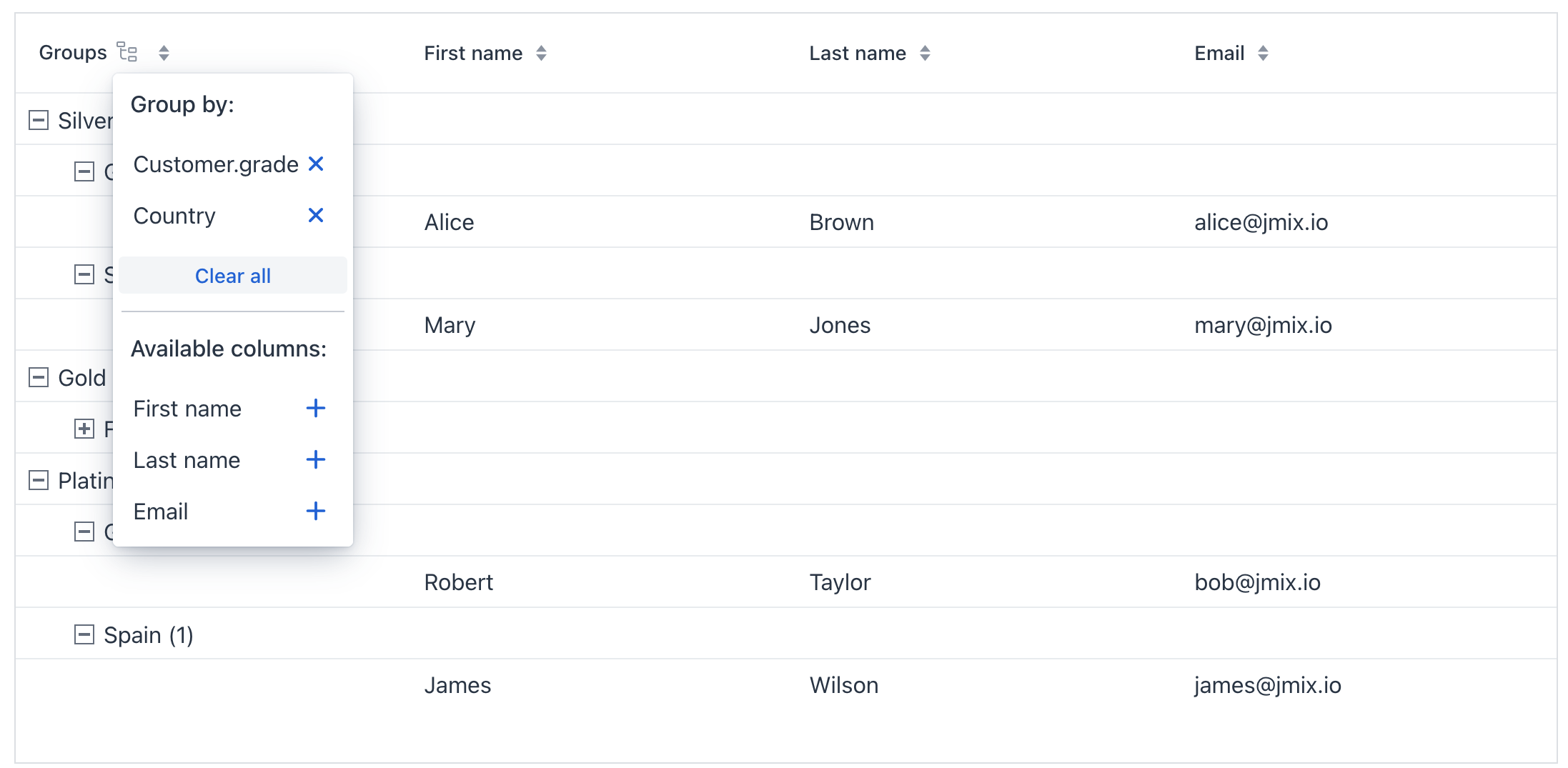
Sorting
Sorting configuration is the same as in dataGrid. The sortByGroupEnabled attribute defines whether sorting affects group order.
Column Header Filtering
You can filter data by individual columns using property filters embedded in column headers. Filterable columns display a funnel icon ( ) in their headers. Clicking the icon opens the filter dialog.
Set the filterable attribute to true on the columns element to enable filtering for all columns mapped to entity properties. To enable or disable filtering for an individual column, set filterable on its column element. The setting on column takes precedence over the setting on columns:
<groupg:groupDataGrid id="customersDataGrid"
                      width="100%"
                      minHeight="20em"
                      dataContainer="customersDc">
    <groupg:groupBy>
        <groupg:columnRef key="grade"/>
    </groupg:groupBy>
    <groupg:columns filterable="true">
        <groupg:groupColumn header="Grade"/>
        <groupg:column property="firstName"/>
        <groupg:column property="lastName"/>
        <groupg:column property="email"/>
        <groupg:column property="country"/>
        <groupg:column property="grade"/>
    </groupg:columns>
</groupg:groupDataGrid>
Like standalone propertyFilter and genericFilter components, column header filters add conditions to the data loader. In the standard data-loading flow, conditions are translated into JPQL and applied at the database level. Conditions from all filters are combined using logical AND.
|
Since Jmix 3.1 You can preserve the applied column header filters in the URL by adding the |
Disable Grouping
To prevent users from grouping by a specific column, set its groupAllowed property to false. This removes the column from the Group by dialog. In the example below, the Country column cannot be grouped:
XML code
<groupg:groupDataGrid id="customersGroupDataGrid"
                      dataContainer="customersDc"
                      minWidth="100px"
                      width="100%">
    <groupg:groupBy>
        <groupg:columnRef key="grade"/>
    </groupg:groupBy>
    <groupg:columns>
        <groupg:groupColumn header="Grade"/>
        <groupg:column property="firstName"/>
        <groupg:column property="lastName"/>
        <groupg:column property="email"/>
        <groupg:column property="country" groupAllowed="false"/>
        <groupg:column property="grade"/>
    </groupg:columns>
</groupg:groupDataGrid>
To turn off grouping entirely for users, set displayColumnsGrouperOnIconClick="false" on the groupColumn element.
Default grouping can still be declared with the groupBy element or applied programmatically via the groupBy() method.
|
Custom Grouping Column
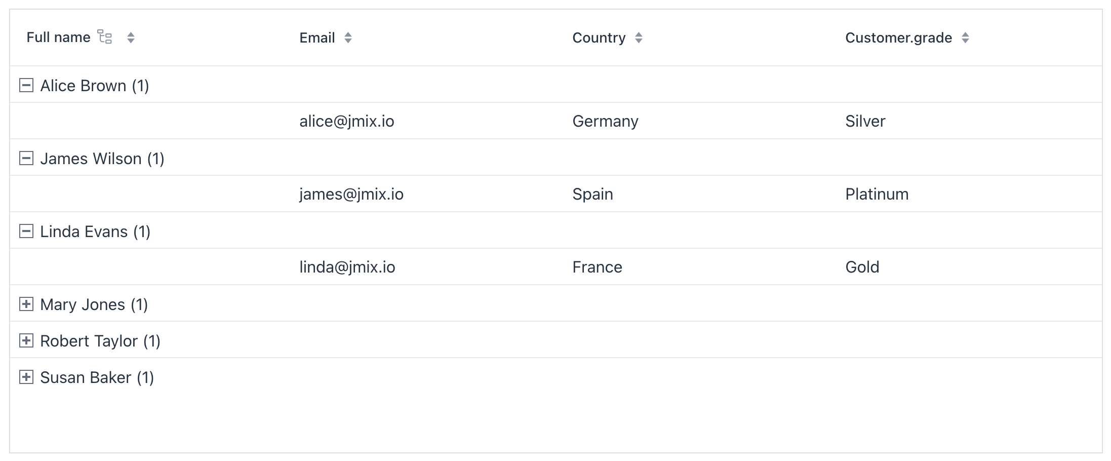
To use a custom grouping value, describe a new grouping property in the view controller. The following example introduces a new grouping property that combines first and last name.
Such a synthetic property is not sortable automatically. To make sorting work, specify sort properties in the group property descriptor using .withSortProperties(…).
XML code
<groupg:groupDataGrid id="customersGroupDataGrid"
                      dataContainer="customersDc"
                      minWidth="100px"
                      width="100%">
    <groupg:columns>
        <groupg:groupColumn key="group" header="Full name"/> <!-- 1 -->
        <groupg:column key="fullName" header="Full name"/>
        <groupg:column property="email"/>
        <groupg:column property="country"/>
        <groupg:column property="grade"/>
    </groupg:columns>
</groupg:groupDataGrid>
Java code
@ViewComponent
private GroupDataGrid<Customer> customersGroupDataGrid;

@Subscribe
public void onInit(InitEvent event) {
    GroupDataGridItems<Customer> items = customersGroupDataGrid.getItems();

    if (items != null) {
        items.addGroupPropertyDescriptor( (1)
                new BaseGroupPropertyDescriptor<Customer>("fullName",
                        context -> context.getItem().getFirstName() + " " + context.getItem().getLastName())
                        .withSortProperties(List.of("firstName", "lastName"))); (2)

        customersGroupDataGrid.groupByKeys("fullName"); (3)
    }
}
@Supply(to = "customersGroupDataGrid.fullName", subject = "renderer") (4)
protected Renderer<Customer> supplyRendererToFullNameColumn() {
    return new TextRenderer<>(item -> item.getFirstName() + " " + item.getLastName());
}| 1 | Describe a new grouping property that concatenates firstName and lastName. |
| 2 | .withSortProperties(List.of("firstName", "lastName")) tells the component how to sort the synthetic property. |
| 3 | Group by fullName by default. |
| 4 | Provide a render fallback for the Full Name column when it is not grouped; without this the column will appear empty. |
Export to Excel
Exporting functionality is provided by free Grid Export Actions add-on which supports all grid types: groupDataGrid, dataGrid, and treeDataGrid.
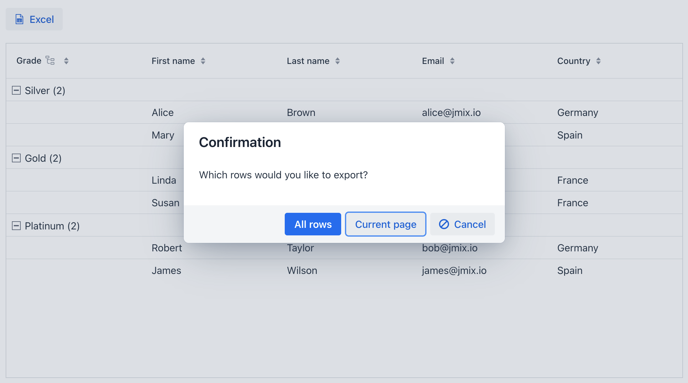
The add-on provides three export options. It affects both the scope and the generated spreadsheet formatting:
-
All Rows – Exports all rows and flattens the grouping.
-
Current Page – Exports only the visible rows while preserving the grouping structure as seen in the grid.
-
Selected Rows – Exports the currently selected rows and flattens the grouping.
Styling
Themes
Configure themes with the themeNames property. Multiple themes can be applied simultaneously. The themes are the same ones as in dataGrid.
Group Icon
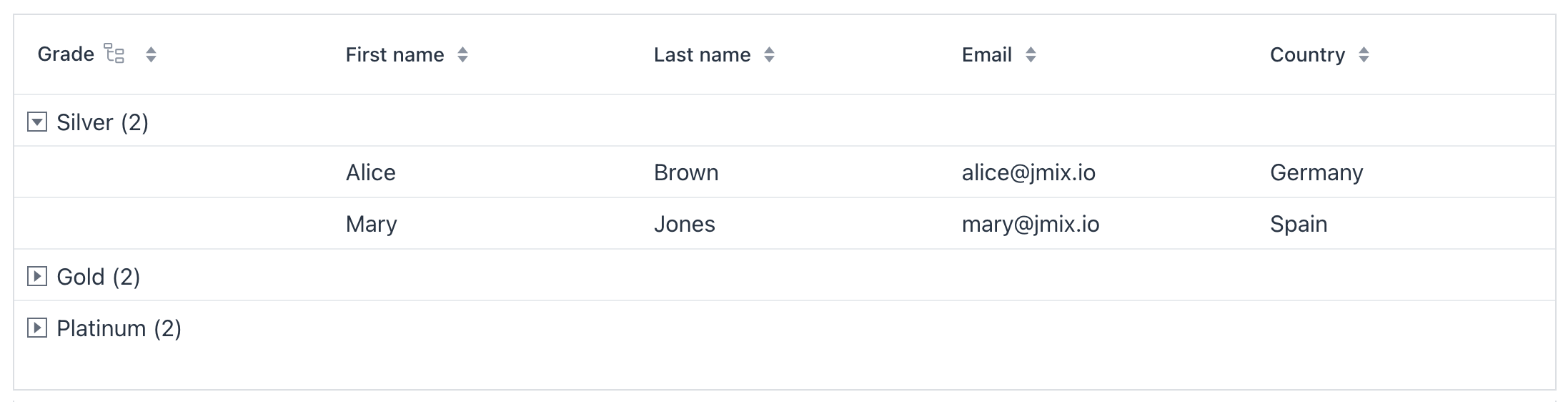
The component shows + for a collapsed group and - for an expanded group. To customize, add your preferred icons to the application stylesheet. Replace the default content values for the desired icon character codes (e.g., e7c1 and e7bf taken from vaadin font icons collection):
vaadin-grid-tree-toggle.jmix-group-toggle {
    &::part(toggle)::before {
        content: "\e7c1";
    }

    &[expanded]::part(toggle)::before {
        content: "\e7bf";
    }
}
| Learn more about stylable parts of components. |
Group Column Icon
The group column icon is customizable via the groupIcon attribute of the groupColumn element. To hide the icon, set groupIconVisible to false.
Attributes
The following attributes are specific to groupDataGrid:
| Name | Description | Default |
|---|---|---|
If |
|
|
If |
|
|
The text to display when the table is empty. Use null to remove the current empty state content. See Empty State. |
– |
|
Sets the selection mode. Possible values: |
|
|
If the data in the component is aggregatable, determines whether the aggregation row is displayed above or below the other rows. Possible values: |
|
|
If Using this feature is discouraged for a large number of items as it may cause performance issues. |
|
|
Sets the column rendering mode. In |
|
|
If |
|
|
Determines rows where a drop can happen. Possible values: |
– |
|
If |
|
|
If |
|
|
If |
|
|
Determines whether the clicked column is added to the end or beginning of the sorted columns list. Possible values: |
|
|
Sets the behavior when parsing nested properties which may contain null values in the property chain. Possible values: |
|
|
Determines the page size or the number of items that will be fetched from the data provider at a time. |
|
|
If |
|
|
If
If
|
|
The following shared attributes are supported by groupDataGrid:
id - alignSelf - ariaLabel - classNames - colspan - css - dataContainer - enabled - focusShortcut - height - justifySelf - maxHeight - maxWidth - metaClass - minHeight - minWidth - tabIndex - themeNames - visible - width
Handlers
The following handlers are specific to groupDataGrid:
|
To generate a handler stub in Jmix Studio, use the Handlers tab of the Jmix UI inspector panel or the Generate Handler action available in the top panel of the view class and through the Code → Generate menu (Alt+Insert / Cmd+N). |
| Name | Description |
|---|---|
|
|
Fired when a group is collapsed. |
|
|
|
|
|
Fired when a group is expanded. |
|
|
|
|
|
|
|
Fired when a row that corresponds to a group item is clicked |
|
Fired when a row that corresponds to a group item is double-clicked. |
|
Fired when grouping changes — columns added or removed. |
|
|
|
|
|
A selection event that unifies the way to access to selection event for multi selection and single selection components (in case when only one selected item is required). |
|
|
|
Adds a data generator for the data grid. If the generator was already added, does nothing. See the |
|
Allows to control which specific rows can be dragged, rather than making all rows draggable with rowsDraggable. |
|
Allows to control which specific rows are valid drop targets. |
|
Handles the event when the user presses the Enter key. |
|
Generates parts of CSS class names for group items based on given conditions. This allows for customizing group items. |
|
Generates tooltip for the group based on given conditions. |
|
Sets a predicate to check whether a specific item in the grid may be selected or deselected by the user. The predicate receives an item instance and should return |
|
Generates parts of CSS class names for cells based on given conditions. This allows for customizing cell appearance based on the data displayed. |
|
Builds a |
|
Generates tooltip for the column cell based on given conditions. See live demo. |
The following shared handlers are supported by groupDataGrid:
Elements
A groupDataGrid can include actions, groupBy, columns, contextMenu, and emptyStateComponent as its direct nested elements. The columns element can contain column, groupColumn, and editorActionsColumn. The shared grid elements work as described for actions, contextMenu, and emptyStateComponent.
|
To add an element to a selected component click the Add button in the Jmix UI inspector panel. |
groupBy
The groupBy element contains one or more columnRef elements specifying which columns to group by.
columnRef
The columnRef element identifies a column to use for grouping. Its required key attribute must match the key of a declared column.
columns
The columns element contains individual column elements and defines a set of attributes shared by those columns. It supports includeAll, exclude, sortable, resizable, and filterable as described for dataGrid columns.
column
The column element declares an individual column. Attributes set for an individual column override those set for columns. It supports the dataGrid column configuration and adds the groupAllowed attribute, which controls whether users can group by that column. See Disable Grouping.
groupColumn
The groupColumn element declares the column used for grouping and its relative position among other columns. It can include a nested groupIcon element to provide a custom icon component.
| Name | Description | Default |
|---|---|---|
Sets whether the group column is hidden automatically when there are no grouped properties. |
— |
|
Sets whether the column width is calculated from its content. |
— |
|
Sets whether clicking the group icon opens the Group by dialog. |
— |
|
Sets whether a group header displays the number of descendant items. See Hide Group Item Count. |
— |
|
Sets how the column grows relative to other columns. |
— |
|
Sets the column footer text. |
— |
|
Freezes the column at the start edge of the grid. |
— |
|
Freezes the column at the end edge of the grid. |
— |
|
Sets the group icon using a Vaadin icon name. A nested |
— |
|
Sets whether the group icon is visible. |
— |
|
Sets the column header text. |
— |
|
Sets the column key used to identify the group column. |
— |
|
Sets whether users can resize the column. |
— |
|
Sets whether users can sort by the group column. |
— |
|
Sets whether the column is visible. |
— |
|
Sets the width of the column as a CSS string using units such as |
— |