markdownEditor
markdownEditor is a field for writing and previewing Markdown content. It behaves like a standard input field, so it supports label, helper text, required indicator, validation message, tooltip, and data binding.
XML Element |
|
|---|---|
Java Class |
|
Attributes |
id - alignSelf - ariaLabel - ariaLabelledBy - autofocus - classNames - colspan - css - dataContainer - enabled - errorMessage - focusShortcut - height - helperText - justifySelf - label - maxHeight - maxWidth - minHeight - minWidth - mode - placeholder - property - readOnly - required - requiredMessage - tabIndex - themeNames - valueChangeMode - valueChangeTimeout - visible - width |
Handlers |
AttachEvent - BlurEvent - ComponentValueChangeEvent - DetachEvent - FocusEvent - ModeChangeEvent - statusChangeHandler - validator |
Elements |
Basics
Use markdownEditor when users need to enter Markdown with quick formatting controls and an instant preview.
<markdownEditor id="markdownEditor"
                themeNames="toolbar-align-end"
                label="Markdown Editor"
                helperText="Markdown is supported. Use the toolbar or keyboard shortcuts to format text."
                placeholder="Write your content here..."/>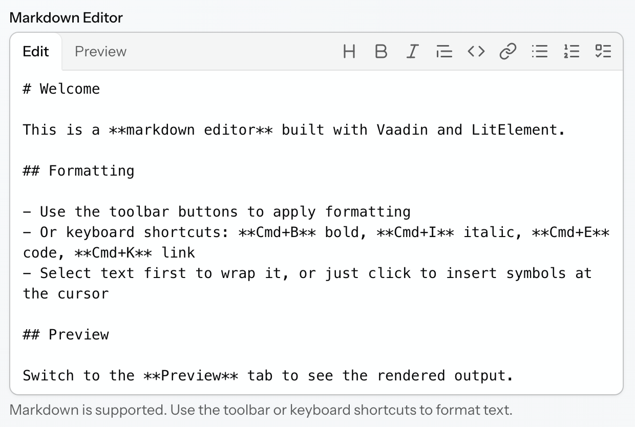
The component value is a String containing raw Markdown markup.
Data Binding
Like other field components, markdownEditor can be bound to an entity attribute using the dataContainer and property attributes.
<markdownEditor id="descriptionField"
                dataContainer="orderDc"
                property="description"
                label="Description"/>
Bind the component to a String entity attribute that stores Markdown text.
Modes
The editor has two modes selectable in the header:
-
Editlets users enter and format Markdown text. -
Previewrenders the current value as formatted HTML.
The default mode is Edit.
You can set the initial mode declaratively using the mode XML attribute.
<markdownEditor id="markdownEditorField"
                mode="PREVIEW"/>
If readOnly = true, the component shows only the rendered preview. The toolbar and mode tabs are hidden, and the value cannot be changed.
The current mode can also be read and changed programmatically using the server-side API. When the mode changes, the component fires a ModeChangeEvent containing the new mode and a flag indicating whether the change was initiated by the user or by the application.
Toolbar Actions
In Edit mode, the mode tabs and formatting toolbar share the same header row. If there is not enough horizontal space, extra toolbar actions are moved to the overflow menu at the end of the row.
Toolbar buttons reflect the formatting active at the current caret position. Clicking an already active formatting button removes the corresponding formatting.
Wrap Formats
These actions operate on the current selection, or on the caret position when nothing is selected.
| Action | Shortcut | Apply | Remove |
|---|---|---|---|
Bold |
|
Wraps the selected text with |
Removes surrounding |
Italic |
|
Wraps the selected text with |
Removes surrounding |
Code |
|
Wraps the selected text with a single backtick. If nothing is selected, inserts two backticks and places the caret between them. |
Removes surrounding backticks. |
Link |
|
Wraps the selection as |
Removes the surrounding Markdown link markup. |
Line Formats
These actions work with the current line, or with every selected line when multiple lines are selected.
| Action | Apply | Remove |
|---|---|---|
Heading |
Adds the |
Removes the |
Quote |
Adds the |
Removes the |
Unordered list |
Adds the |
Removes the |
Ordered list |
Adds the |
Removes the numeric list prefix. |
Task list |
Adds the |
Removes the |
When multiple lines are selected and all of them already have the target format, clicking the toolbar button removes it from all selected lines. Otherwise, the format is applied to all selected lines that do not already have it.
Keyboard Navigation
The component supports keyboard navigation across three logical focus areas:
-
Mode tabs
-
Toolbar
-
Text area
Tab moves focus between these areas. Arrow keys navigate inside the active area. Press Escape in the toolbar to return focus to the text area.
If some toolbar actions are moved into the overflow ··· menu, the first menu item receives focus when the menu opens. In the menu, ArrowUp and ArrowDown move between items, while Escape and Tab close the menu and return focus to the overflow button.
Formatting changes integrate with the browser undo stack, so standard shortcuts work as expected:
-
Cmd/Ctrl+Zundoes formatting and typing changes. -
Cmd/Ctrl+Shift+ZorCtrl+Yredoes formatting and typing changes.
Theme Variants
Use themeNames attribute to set a component theme.
| Variant | Description | Supported By |
|---|---|---|
|
Renders the helper above the field, below the label. |
Aura, Lumo |
|
Aligns toolbar buttons to the start side of the header, taking the current text direction into account. |
Aura, Lumo |
|
Centers toolbar buttons within the header and hides the divider. |
Aura, Lumo |
|
Aligns toolbar buttons to the end side of the header, taking the current text direction into account, and hides the divider. |
Aura, Lumo |
CSS Properties
You can customize the component using CSS custom properties in the application theme or by setting them through the css attribute.
<markdownEditor id="markdownEditCss"
                css="--jmix-markdown-editor-default-width: 32rem;
--jmix-markdown-editor-header-background: var(--lumo-contrast-5pct);"/>| Property | Description | Supported By |
|---|---|---|
|
Sets the default component width. |
Aura, Lumo |
|
Sets the background of the shared header row containing tabs and the toolbar. |
Aura, Lumo |
|
Controls toolbar button padding. |
Aura, Lumo |
|
Controls toolbar button border width. |
Aura, Lumo |
|
Controls toolbar button border color. |
Aura, Lumo |
|
Controls toolbar button border radius. |
Aura, Lumo |
|
Controls toolbar button text color. |
Aura, Lumo |
|
Controls toolbar button background. |
Aura, Lumo |
|
Controls tab padding. |
Aura, Lumo |
|
Controls tab text color. |
Aura, Lumo |
|
Controls tab background. |
Aura, Lumo |
Internationalization
All user-visible strings have English defaults and can be overridden independently.
The component provides default captions for:
-
Tabs:
Edit,Preview -
Toolbar actions:
Heading,Bold,Italic,Quote,Code,Link,Unordered list,Ordered list,Task list -
Overflow menu button
-
Toolbar accessible name
If the application overrides only part of these strings, all other captions continue to use their default values.
Validation
To check values entered into the markdownEditor component, you can use a validator in a nested validators element.
Because the component value is stored as a raw Markdown string, validators such as notBlank and size are useful for checking whether the content is present and within the expected length.
The following predefined validators are available for markdownEditor:
XML Element |
|
|---|---|
Predefined validators |
Attributes
Common attributes serve the same purpose for all components.
The following attributes are specific to markdownEditor:
Name |
Description |
Default |
|---|---|---|
Sets the editor mode. |
|
Handlers
Common handlers are configured in the same way for all components.
The following handlers are specific to markdownEditor.
|
To generate a handler stub in Jmix Studio, use the Handlers tab of the Jmix UI inspector panel or the Generate Handler action available in the top panel of the view class and through the Code → Generate menu (Alt+Insert / Cmd+N). |
Name |
Description |
|---|---|
|
See Also
See also markdown for rendering Markdown content without editing capabilities.
