codeEditor
codeEditor is a multi-line source editor with syntax highlighting and optional code-editing aids.
XML Element |
|
|---|---|
Java Class |
|
Basics
The following example combines codeEditor with controls for its common display options:
<hbox width="100%" wrap="true">
    <checkbox id="highlightCheckbox" label="Highlight active line" value="true"/>
    <checkbox id="highlightGutterCheckbox" label="Highlight gutter line" value="true"/>
    <checkbox id="gutterCheckbox" label="Show Gutter" value="true"/>
    <checkbox id="lineNumbersCheckbox" label="Line numbers" value="true"/>
    <checkbox id="printMarginCheckbox" label="Print margin" value="true"/>
    <checkbox id="useSoftTabsCheckbox" label="Use soft tabs" value="true"/>
    <checkbox id="textWrapCheckbox" label="Text wrap" value="false"/>
</hbox>
<codeEditor id="codeEditor"/>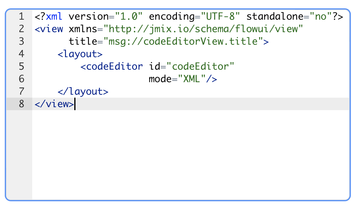
@ViewComponent
protected CodeEditor codeEditor;

@Subscribe("highlightCheckbox")
protected void onHighlightCheckboxValueChange(ComponentValueChangeEvent<JmixCheckbox, Boolean> event) {
    codeEditor.setHighlightActiveLine(event.getValue());
}

@Subscribe("highlightGutterCheckbox")
protected void onHighlightGutterCheckboxValueChange(ComponentValueChangeEvent<JmixCheckbox, Boolean> event) {
    codeEditor.setHighlightGutterLine(event.getValue());
}

@Subscribe("gutterCheckbox")
protected void onGutterCheckboxValueChange(ComponentValueChangeEvent<JmixCheckbox, Boolean> event) {
    codeEditor.setShowGutter(event.getValue());
}

@Subscribe("lineNumbersCheckbox")
protected void onLineNumbersCheckboxValueChange(ComponentValueChangeEvent<JmixCheckbox, Boolean> event) {
    codeEditor.setShowLineNumbers(event.getValue());
}

@Subscribe("printMarginCheckbox")
protected void onPrintMarginCheckboxValueChange(ComponentValueChangeEvent<JmixCheckbox, Boolean> event) {
    codeEditor.setShowPrintMargin(event.getValue());
}

@Subscribe("useSoftTabsCheckbox")
protected void onUseSoftTabsCheckboxValueChange(ComponentValueChangeEvent<JmixCheckbox, Boolean> event) {
    codeEditor.setUseSoftTabs(event.getValue());
}

@Subscribe("textWrapCheckbox")
protected void onTextWrapCheckboxValueChange(ComponentValueChangeEvent<JmixCheckbox, Boolean> event) {
    codeEditor.setTextWrap(event.getValue());
}
Data-aware codeEditor
Data binding refers to linking a visual component to a data container. Changes in the visual component or corresponding data container can trigger updates to one another. See Using Data Components for more details.
The following example produces a data-aware codeEditor.
<data>
    <instance id="orderReportDc"
              class="com.company.onboarding.entity.OrderReport"> (1)
        <loader id="orderReportDl"/>
        <fetchPlan extends="_base"/> (2)
    </instance>
</data>
    <codeEditor mode="XML"
                dataContainer="orderReportDc"
property="code"/> (3)| 1 | InstanceContainer for the OrderReport entity. |
| 2 | Inline fetch plan of the entity instance located in the container. |
| 3 | Binding the component to a data container and property. The dataContainer attribute contains a link to the orderReportDc data container, and the property attribute refers to the code entity attribute. |
Mode
The mode attribute specifies the programming language or markup language that the editor should be configured for. This setting determines the syntax highlighting that is relevant to the chosen language.
The default syntax highlighting mode is CodeEditorMode.PLAIN_TEXT.
Example:
<hbox width="100%" wrap="true">
    <select id="modeComboBox" label="Mode"/>
    <select id="themeComboBox" label="Theme"/>
</hbox>
<codeEditor id="codeEditor"/>@ViewComponent
protected CodeEditor codeEditor;
@Subscribe("modeComboBox")
protected void onModeComboBoxValueChange(
ComponentValueChangeEvent<JmixSelect<CodeEditorMode>, CodeEditorMode> event) {
codeEditor.setMode(event.getValue());
codeEditor.setValue(resources.getResourceAsString(DEFAULT_FILE_PATH + event.getValue()));
}This example changes the mode programmatically and loads content for the selected language.
Theme
The theme attribute is used to define the visual appearance and style of the editor. It lets you choose a pre-defined theme that alters the color scheme, font, and other aesthetic elements of the code editor.
The list of supported themes is defined in the CodeEditorTheme enumeration.
@ViewComponent
protected CodeEditor codeEditor;
@Subscribe("themeComboBox")
protected void onThemeComboBoxValueChange(
        ComponentValueChangeEvent<JmixSelect<CodeEditorTheme>, CodeEditorTheme> event) {
    codeEditor.setTheme(event.getValue());
}
Suggestion
The codeEditor component supports autocompletion features.
Autocompletion can suggest default options depending on the language mode if you set the defaultSuggestionsEnabled attribute to true:
<hbox width="100%" wrap="true" alignItems="BASELINE">
    <select id="modeSelect" label="Mode"/>
    <checkbox id="defaultSuggestionsCheckbox" label="Default suggestions" value="true"/>
    <checkbox id="liveSuggestionsCheckbox" label="Live suggestions" value="true"/>
</hbox>
<codeEditor id="codeEditor" height="100%" minHeight="15em"
            defaultSuggestionsEnabled="true"
liveSuggestionsEnabled="true"/>private static final String DEFAULT_FILE_PATH = "io/jmix/uisamples/codeeditorexample/";
@ViewComponent
private CodeEditor codeEditor;
@ViewComponent
private JmixSelect<CodeEditorMode> modeSelect;
@Autowired
private Resources resources;
@Subscribe
public void onInit(InitEvent event) {
ComponentUtils.setItemsMap(modeSelect, getModeItemsMap());
modeSelect.setValue(CodeEditorMode.SQL);
}
@Subscribe("defaultSuggestionsCheckbox")
public void onDefaultSuggestionsCheckboxValueChange(ComponentValueChangeEvent<JmixCheckbox, Boolean> event) {
codeEditor.setDefaultSuggestionsEnabled(event.getValue());
}
@Subscribe("liveSuggestionsCheckbox")
public void liveSuggestionsCheckboxValueChange(ComponentValueChangeEvent<JmixCheckbox, Boolean> event) {
codeEditor.setLiveSuggestionsEnabled(event.getValue());
}
@Subscribe("modeSelect")
public void onModeSelectValueChange(
ComponentValueChangeEvent<JmixSelect<CodeEditorMode>, CodeEditorMode> event) {
codeEditor.setMode(event.getValue());
codeEditor.setValue(resources.getResourceAsString(DEFAULT_FILE_PATH + event.getValue()));
}
private Map<CodeEditorMode, String> getModeItemsMap() {
LinkedHashMap<CodeEditorMode, String> map = new LinkedHashMap<>();
map.put(CodeEditorMode.JAVA, "Java");
map.put(CodeEditorMode.CSS, "CSS");
map.put(CodeEditorMode.XML, "XML");
map.put(CodeEditorMode.JSON, "JSON");
map.put(CodeEditorMode.JAVASCRIPT, "JavaScript");
map.put(CodeEditorMode.HTML, "HTML");
map.put(CodeEditorMode.TEXT, "Text");
map.put(CodeEditorMode.GROOVY, "Groovy");
map.put(CodeEditorMode.PROPERTIES, "Properties");
map.put(CodeEditorMode.SQL, "SQL");
map.put(CodeEditorMode.PYTHON, "Python");
map.put(CodeEditorMode.SWIFT, "Swift");
map.put(CodeEditorMode.C_CPP, "C++");
return map;
}You can provide your own options using the suggester handler, for example:
<codeEditor id="codeEditor" height="100%" minHeight="15em"
suggestOn="\."/>@Autowired
private DataManager dataManager;
@Install(to = "codeEditor", subject = "suggester")
public List<Suggestion> codeEditorSuggestions(Suggester.SuggestionContext context) {
return loadCustomers().stream()
.map(customer -> new Suggestion(customer.getInstanceName(), customer.getInstanceName(), "Customer"))
.toList();
}
private List<Customer> loadCustomers() {
return dataManager.load(Customer.class)
.all()
.fetchPlan(FetchPlan.INSTANCE_NAME)
.list();
}By default, autocompletion popup is opened when the user presses a shortcut:
-
Windows and Linux: Ctrl-Space
-
macOS: ⌥-Space or ⌃-Space, depending on system settings
If the suggestOn attribute is set to a regular expression, the autocompletion popup opens automatically when the user enters a matching string. For example, if suggestOn="\.", the autocompletion will trigger after the user enters a dot.
If the liveSuggestionsEnabled attribute is set to true, suggestions will appear automatically as the user types, without requiring a manual trigger or setting the suggestOn attribute. All suggesters will be requested for options as soon as the user enters a word character. Note that live autocompletion can be resource-intensive with large content or with complex suggesters, so liveSuggestionsEnabled is false by default.
Attributes
The following attributes are specific to codeEditor:
| Name | Description | Default |
|---|---|---|
Autocompletion suggests default options depending on the language mode. |
|
|
Sets the font size for code in the editor. |
|
|
Sets the highlight of the active line. If the highlighting is enabled, the line the cursor is on will be highlighted. |
|
|
Sets the highlight of the current gutter line. If the highlighting is enabled, the gutter line the cursor is on will be highlighted. |
|
|
Open suggestions popup automatically as the user types. |
|
|
Sets syntax highlighting for a specific mode. The list of supported modes is defined in the |
|
|
Controls the position of the print margin column. This column is a visual vertical line that helps with code formatting and readability, particularly during printing. |
|
|
Determines whether the gutter (the vertical area on the left side of the editor) is displayed. The gutter typically shows line numbers, making it easier to navigate and reference specific lines in the code. |
|
|
Controls whether line numbers are displayed in the editor. This feature helps with navigation and referencing specific lines within the code. |
|
|
Is used to control the visibility of the print margin line. This line is a vertical guideline that appears in the code editor and helps developers visually separate the code that will fit on a printed page from the code that will be cut off. |
|
|
A regular expression to trigger autocompletion when the user enters a matching string. |
— |
|
It determines whether long lines of code should be wrapped (broken into multiple lines) to fit within the editor’s viewable area or if they should be displayed as a single line that extends beyond the window’s width. |
|
|
Sets the visual theme of |
|
|
Sets the tab character representing mode. In soft tabs mode, the tab character is displayed as a series of spaces. In hard tabs mode, the tab character is displayed as the special |
|
The following shared attributes are supported by codeEditor:
id - alignSelf - classNames - colspan - css - dataContainer - enabled - errorMessage - focusShortcut - height - helperText - label - maxHeight - maxWidth - minHeight - minWidth - property - readOnly - required - requiredMessage - tabIndex - title - visible - width
Handlers
The following handlers are specific to codeEditor:
| Name | Description |
|---|---|
Validates the component value. |
The following shared handlers are supported by codeEditor: