chart
|
This component requires the free Charts add-on. |
chart visualizes data using Apache ECharts.
XML Element |
|
|---|---|
Java Class |
|
Basics
Declare the charts namespace in the view’s XML descriptor:
<view xmlns="http://jmix.io/schema/flowui/view"
xmlns:charts="http://jmix.io/schema/charts/ui"/>|
Studio adds the namespace automatically when you add the component using the Add Component action in the top actions panel. See Component Palette. |
Then declare and configure the chart using nested XML elements and attributes:
<charts:chart id="chart">
    <charts:dataSet>
        <charts:source dataContainer="vehiclesDc"
                       categoryField="year"
                       valueFields="cars motorcycles bicycles"/>
    </charts:dataSet>
    <charts:series>
        <charts:bar name="Cars"/>
        <charts:bar name="Motorcycles" stack="stack"/>
        <charts:bar name="Bicycles" stack="stack"/>
    </charts:series>
    <charts:xAxes>
        <charts:xAxis/>
    </charts:xAxes>
    <charts:yAxes>
        <charts:yAxis>
            <charts:axisLabel formatter="{value}"/>
        </charts:yAxis>
    </charts:yAxes>
</charts:chart>
After that, additional properties are set programmatically in Java:
@ViewComponent
private Chart chart;

@Subscribe
public void onInit(final InitEvent event) {
    chart.setLegend(new Legend().withTop("0"));
    chart.setTitle(new Title().withText("Vehicles").withSubtext("By Year"));
}
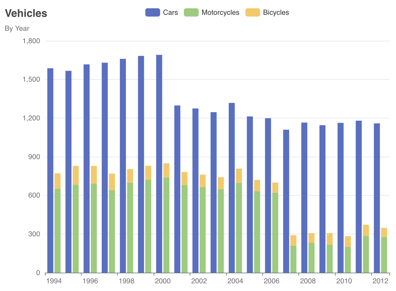
The resulting chart looks as follows:
|
When configuring a chart, you can refer to the official Apache ECharts documentation to find the properties you need, and then use corresponding Jmix Chart properties. Most of the time, you will find exact matches between JavaScript and Jmix APIs. |
Responsive Sizing
The chart component is rendered by Apache ECharts and needs a calculable non-zero size when it is rendered or re-rendered. This is important when charts are placed in responsive layouts, hidden containers, or containers whose size changes dynamically, for example when the application menu is collapsed or expanded.
If several charts are placed next to each other, avoid relying only on width="100%" for their parent containers. A chart can expand when the available area grows, but it may not shrink correctly when the surrounding container becomes narrower. In such cases, use a flex layout and apply flex-grow to the chart containers:
<hbox width="100%">
    <vbox classNames="flex-grow">
        <charts:chart id="barChart" width="100%" minHeight="30em">
            <!-- chart configuration -->
        </charts:chart>
    </vbox>
    <vbox classNames="flex-grow">
        <charts:chart id="pieChart" width="100%" minHeight="30em">
            <!-- chart configuration -->
        </charts:chart>
    </vbox>
</hbox>
Also make sure that the chart or its parent container has an explicit height or minHeight. If a chart is placed into a container with height="100%", but none of the parent containers has a calculable height, the chart may be rendered with zero height.
This is especially important for charts or containers that are initially hidden with visible="false" and later shown programmatically.
Data Set
The dataSet property defines the data source for the chart’s series and enables data reuse across multiple series within one charts tag.
In the following example, a data set is configured in XML and connects a chart to the vehiclesDc data container:
<charts:dataSet>
    <charts:source dataContainer="vehiclesDc"
                   categoryField="year"
                   valueFields="cars motorcycles bicycles"/>
</charts:dataSet>
The chart will use the year attribute of the entity to get a category name and cars, motorcycles and bicycles attributes to get values.
The same data set can be configured in Java as follows:
chart.setDataSet(
        new DataSet().withSource(
                new DataSet.Source<EntityDataItem>()
                        .withDataProvider(new ContainerChartItems<>(vehiclesDc))
                        .withCategoryField("year")
                        .withValueFields("cars", "motorcycles", "bicycles")
        )
);
The chart element can include only one dataSet configuration.
|
Series
The series element defines the type of chart to display (e.g., line, bar, scatter). Each chart type can be configured differently within the series element.
The basic chart types supported by Jmix include:
In the following example, the series element defines a pie chart:
<charts:chart>
    <charts:dataSet>
        <charts:source dataContainer="vehiclesIn2012Dc"
                       categoryField="name"
                       valueFields="value"/>
    </charts:dataSet>
    <charts:series>
        <charts:pie>
            <charts:label formatter="{b}: {d}%"/>
        </charts:pie>
    </charts:series>
</charts:chart>
The label element configures text labels of pie segments. Its formatter attribute defines a pattern which can include the data item name and value. See more about label and formatter in the ECharts documentation.
The resulting pie chart looks as follows:
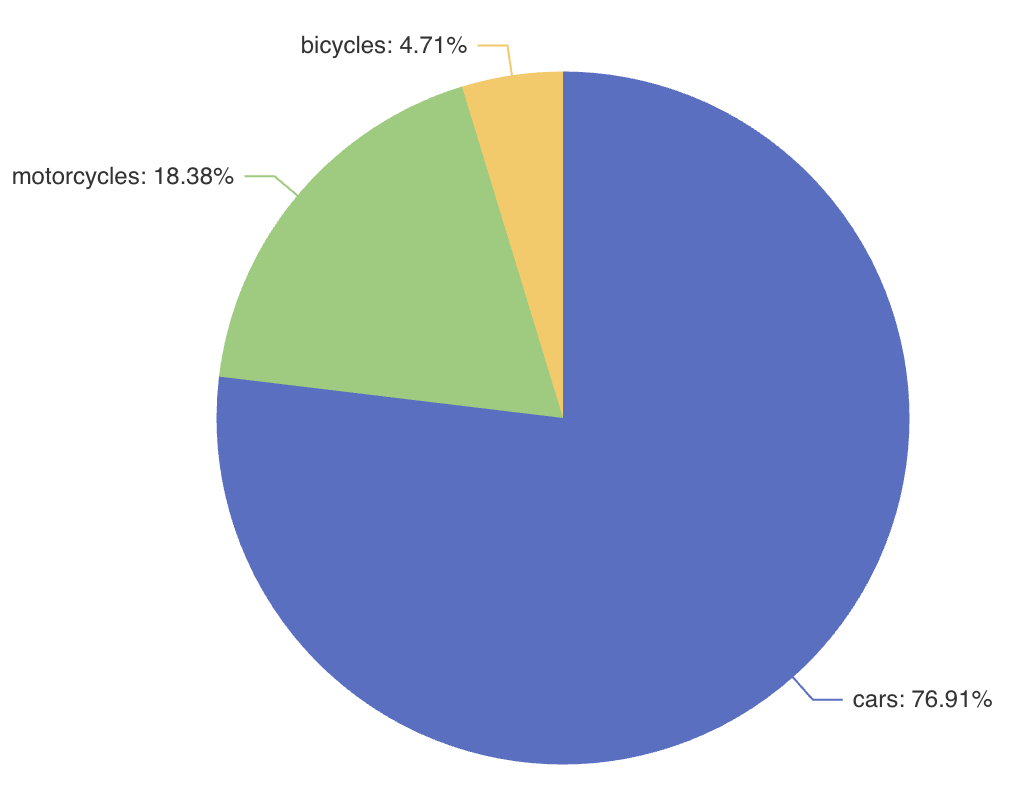
The chart element can include multiple series configurations, in which case the data will be shared across all chart types.
|
Title
The title property displays the chart’s main title and subtitle, customizable in text content, positioning, alignment, and style.
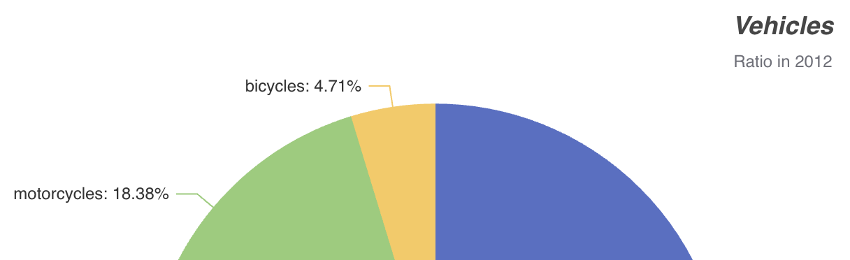
For example:
<charts:chart>
    <charts:title text="Vehicles" subtext="Ratio in 2012"
                  top="0" right="0" textAlign="CENTER">
        <charts:textStyle fontStyle="ITALIC"/>
    </charts:title>
This configuration specifies both the main title and a subtitle for the chart, positioned in the top right corner with centered text alignment and italic text style:
Legend
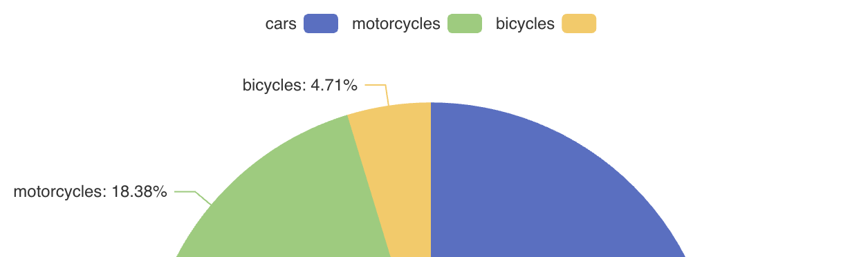
The legend property shows the symbol, color, and name of different series. Legends can be clicked to toggle the display of the chart series. The legend is automatically generated based on the provided data.
<charts:chart>
    <charts:legend align="RIGHT"/>
This example displays a legend with symbols on the right:
Data Zoom
The dataZoom property provides two primary features:
-
Inside data zoom enables users to zoom or roam within coordinate systems through mouse dragging, mouse wheel movements, or finger touch gestures on touch screens.
-
Slider type data zoom offers features like data thumbnails for a quick overview, zooming in/out, selection brushing, drag to move, and click to locate within the chart’s data range.
For example:
<charts:chart>
    <charts:dataZoom>
        <charts:insideDataZoom/>
        <charts:sliderDataZoom orientation="HORIZONTAL"/>
        <charts:sliderDataZoom orientation="VERTICAL" right="5%"/>
    </charts:dataZoom>
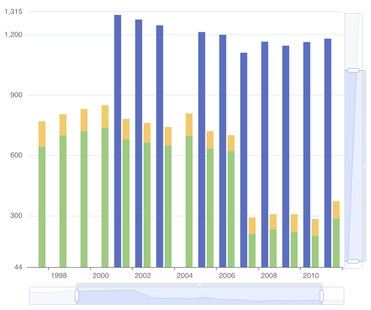
Notice the horizontal and vertical sliders displayed on the chart:
Native JSON
The nativeJson property allows you to configure the chart using a direct JSON string as an alternative when the component’s Java API or XML attributes do not meet specific customization requirements. This feature provides access to the full range of ECharts' configuration options.
For example:
<charts:chart>
    <charts:nativeJson>
        <![CDATA[{
            "title": {
                "text": "Vehicles",
                "subtext": "Ratio in 2012",
                "top": "0",
                "right": "0",
                "textAlign": "CENTER",
                "textStyle": {
                  "fontStyle": "italic"
                }
            }
        }]]>
    </charts:nativeJson>
Here the nativeJson element configures the chart title in the same way as in the XML configuration above.
nativeJson configuration is merged with existing properties and overrides corresponding properties defined in XML.
|
Toolbox
The toolbox property provides a group of utility tools, which includes export, data view, dynamic type switching, data area zooming, and reset configurations.
For example, the following configuration adds ability to export the chart as a PNG image:
<charts:chart>
    <charts:toolbox>
        <charts:features>
            <charts:saveAsImage title="Export to PNG" type="PNG"/>
        </charts:features>
    </charts:toolbox>
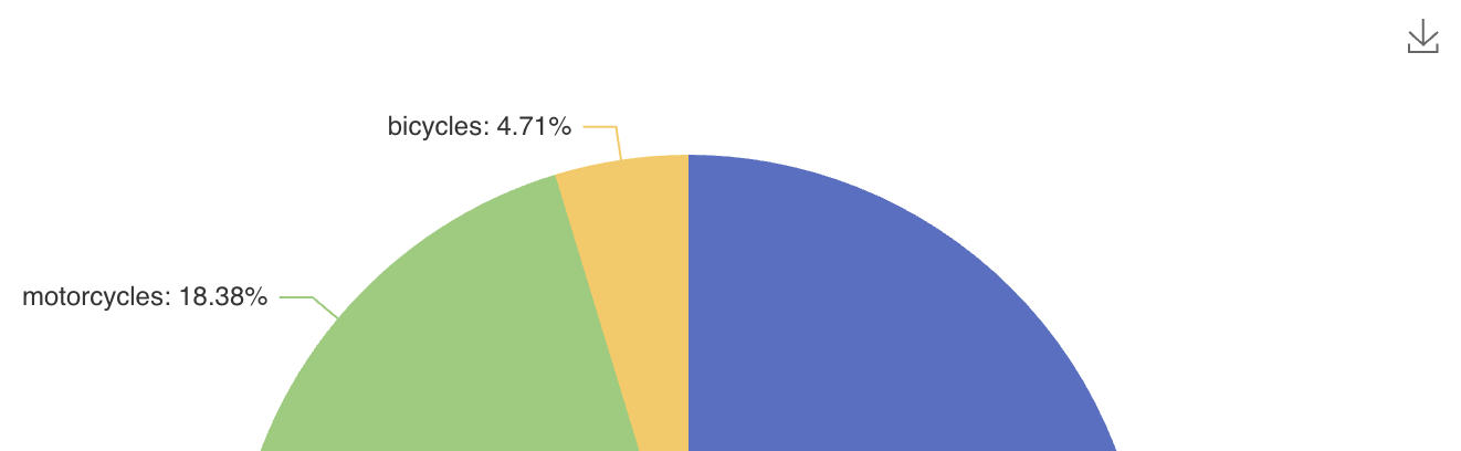
Notice the download icon in the top right corner of the chart:
Attributes
The following attributes are specific to chart:
| Name | Description | Default |
|---|---|---|
Enables or disables chart animation. |
|
|
Sets the delay before the initial animation, in milliseconds. |
— |
|
Sets the delay before an update animation, in milliseconds. |
— |
|
Sets the duration of the initial animation, in milliseconds. |
— |
|
Sets the duration of an update animation, in milliseconds. |
— |
|
Sets the easing function for the initial animation. |
— |
|
Sets the easing function for an update animation. |
— |
|
Sets the maximum number of graphic elements for which animation remains enabled. |
— |
|
Sets the chart background color as a CSS color. |
— |
|
Sets the global blend mode. Possible values are |
|
|
Sets a comma-separated palette of CSS colors used by the chart series. |
— |
|
Sets the element-count threshold above which hovered elements are rendered on a separate layer. |
— |
|
Selects the client-side renderer. Possible values are |
|
|
Sets whether ECharts should parse and display time values in UTC. |
— |
The following shared attributes are supported by chart:
Handlers
The following events are specific to chart:
|
To generate a handler stub in Jmix Studio, use the Handlers tab of the Jmix UI inspector panel or the Generate Handler action available in the top panel of the view class and through the Code → Generate menu (Alt+Insert / Cmd+N). |
| Name | Description |
|---|---|
Fired when the user clicks a chart element. |
|
Fired when a data zoom operation changes the visible data range. |
|
Fired when the user double-clicks a chart element. |
|
Fired when rendering and all animations have finished. |
|
Fired when a toolbox interaction takes control of the global cursor. |
|
Fired when the pointer leaves the chart area. |
|
Fired when the legend selection is inverted. |
|
Fired when a scrollable legend changes page. |
|
Fired when all legend items are selected. |
|
Fired when a legend item changes its selected state. |
|
Fired when the toolbox changes the chart series type. |
|
Fired when a pointer button is pressed over the chart. |
|
Fired when the pointer moves over the chart. |
|
Fired when the pointer leaves a chart element. |
|
Fired when the pointer enters a chart element. |
|
Fired when a pointer button is released over the chart. |
|
Fired after the chart has rendered or rerendered. |
|
Fired when the toolbox restore action resets the chart configuration. |
The following shared handlers are supported by chart:
Elements
A chart can include title, legend, scrollableLegend, tooltip, toolbox, brush, grid, aria, xAxes, yAxes, polar, radiusAxis, angleAxis, radar, dataZoom, visualMap, axisPointer, dataSet, series, textStyle, stateAnimation, and nativeJson as its nested elements. These elements correspond to the options of the Apache ECharts configuration model.