Integrating into Jmix UI
After creating the client-side and server-side parts of the component, it can be used in views by creating an instance of its Java class and adding it to a parent component.
Usually, the content of a view is defined in an XML descriptor. This section describes how to provide the ability to use the new component in XML and in Studio visual designer in the same way as standard Jmix UI components.
Support in XML Descriptors
Below is an example of implementing XML support for the Slider component created in the previous section.
-
Create the
app-ui-components.xsdfile and define the XML markup for the component:<xs:schema xmlns="http://company.com/schema/app-ui-components" elementFormDefault="qualified" targetNamespace="http://company.com/schema/app-ui-components" xmlns:xs="http://www.w3.org/2001/XMLSchema" xmlns:layout="http://jmix.io/schema/flowui/layout"> <xs:element name="slider"> <xs:complexType> <xs:complexContent> <xs:extension base="layout:baseComponent"> <xs:attribute name="min" type="xs:integer"/> <xs:attribute name="max" type="xs:integer"/> <xs:attribute name="value" type="xs:integer"/> <xs:attributeGroup ref="layout:hasSize"/> </xs:extension> </xs:complexContent> </xs:complexType> </xs:element> </xs:schema> -
Create a component loader that is needed to initialize the component when it is used in the view XML descriptors.
import io.jmix.flowui.xml.layout.loader.AbstractComponentLoader;

public class SliderLoader extends AbstractComponentLoader<Slider> {

    @Override
    protected Slider createComponent() {
        return factory.create(Slider.class);
    }

    @Override
    public void loadComponent() {
        loadInteger(element, "min", resultComponent::setMin); (1)
        loadInteger(element, "max", resultComponent::setMax);
        loadInteger(element, "value", resultComponent::setValue);

        componentLoader().loadSizeAttributes(resultComponent, element); (2)
    }
}
1 The base class provides helper methods for loading attribute values. 2 The componentLoader()method returns an instance of theComponentLoaderSupportbean that provides methods for loading common attributes. -
To register the component and its loader with the framework, you need to create a Spring configuration class using the
@Configurationannotation:@Configuration public class ComponentRegistrationConfiguration { @Bean public ComponentRegistration slider() { return ComponentRegistrationBuilder.create(Slider.class) .withComponentLoader("slider", SliderLoader.class) .build(); } @Bean public ComponentRegistration datePicker() { return ComponentRegistrationBuilder.create(ExtendedDatePicker.class) .withComponentLoader("datePicker", DatePickerLoader.class) .replaceComponent(TypedDatePicker.class) .build(); } }
After that, the Slider component can be defined in the view’s descriptor:
<view xmlns="http://jmix.io/schema/flowui/view"
      xmlns:app="http://company.com/schema/app-ui-components"> (1)
    <layout>
        <app:slider id="slider"
                    width="20em"
                    min="10" max="100" value="50"/> (2)
    </layout>
</view>| 1 | Define a namespace with the same value as in xmlns and targetNamespace attributes of the component’s XSD. |
| 2 | The slider element is added with namespace prefix. |
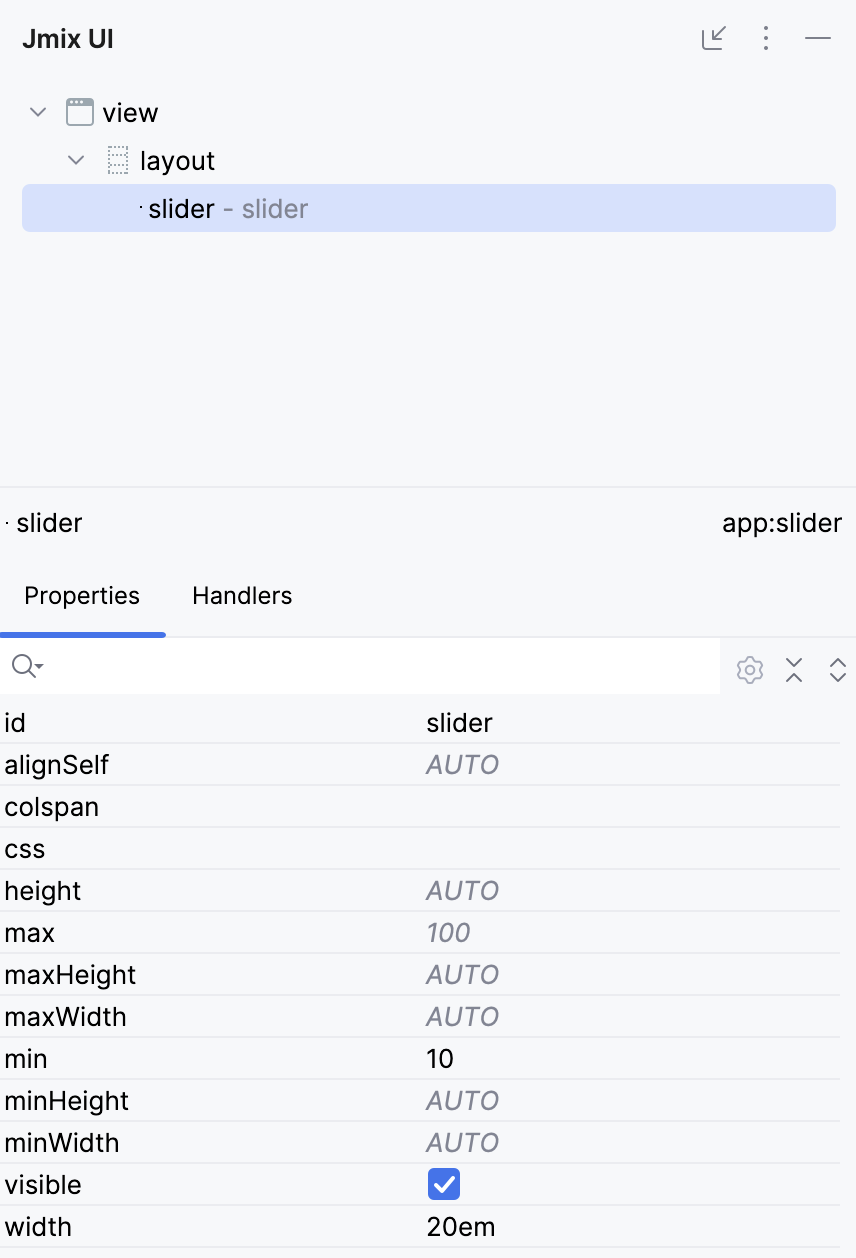
Studio Support
To support the new component in Studio you need to create an interface annotated with @StudioUiKit and a method annotated with @StudioComponent:
import io.jmix.flowui.kit.meta.StudioComponent;
import io.jmix.flowui.kit.meta.StudioProperty;
import io.jmix.flowui.kit.meta.StudioPropertyType;
import io.jmix.flowui.kit.meta.StudioUiKit;
@StudioUiKit
public interface StudioComponents {
@StudioComponent(
name = "Slider",
classFqn = "com.company.onboarding.component.Slider",
category = "Components",
xmlElement = "slider",
xmlns = "http://company.com/schema/app-ui-components",
xmlnsAlias = "app",
properties = {
/* Common attributes */
@StudioProperty(xmlAttribute = "id", type = StudioPropertyType.COMPONENT_ID),
@StudioProperty(xmlAttribute = "alignSelf", type = StudioPropertyType.ENUMERATION,
classFqn = "com.vaadin.flow.component.orderedlayout.FlexComponent$Alignment",
defaultValue = "AUTO",
options = {"START", "END", "CENTER", "STRETCH", "BASELINE", "AUTO"}),
@StudioProperty(xmlAttribute = "css", type = StudioPropertyType.STRING),
@StudioProperty(xmlAttribute = "colspan", type = StudioPropertyType.INTEGER),
@StudioProperty(xmlAttribute = "visible", type = StudioPropertyType.BOOLEAN,
defaultValue = "true"),
/* Size attributes */
@StudioProperty(xmlAttribute = "height", type = StudioPropertyType.SIZE),
@StudioProperty(xmlAttribute = "width", type = StudioPropertyType.SIZE),
@StudioProperty(xmlAttribute = "maxHeight", type = StudioPropertyType.SIZE),
@StudioProperty(xmlAttribute = "maxWidth", type = StudioPropertyType.SIZE),
@StudioProperty(xmlAttribute = "minHeight", type = StudioPropertyType.SIZE),
@StudioProperty(xmlAttribute = "minWidth", type = StudioPropertyType.SIZE),
/* Slider attributes */
@StudioProperty(xmlAttribute = "min", type = StudioPropertyType.INTEGER,
defaultValue = "0"),
@StudioProperty(xmlAttribute = "max", type = StudioPropertyType.INTEGER,
defaultValue = "100")
}
)
void slider();
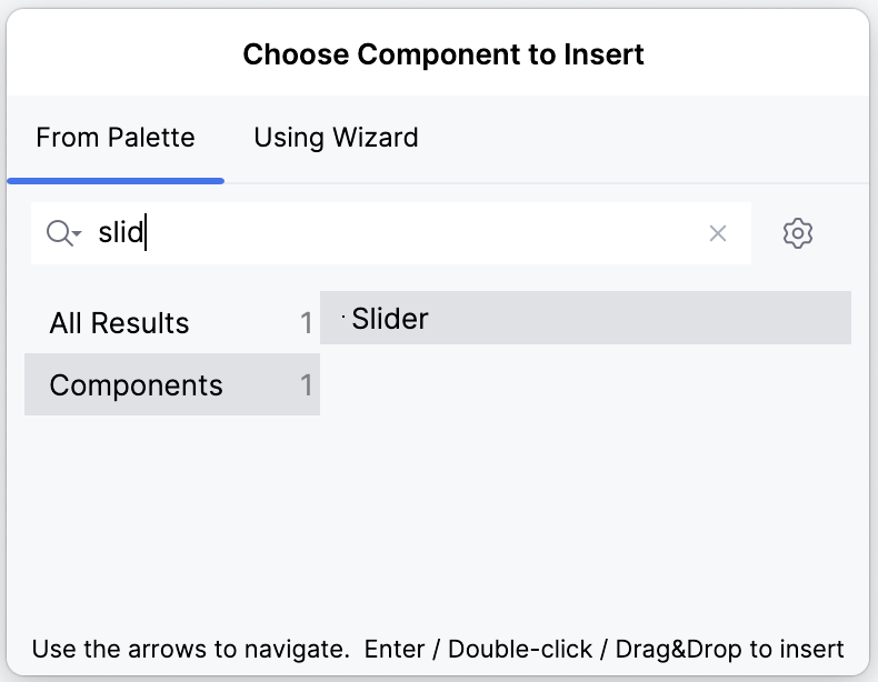
}After that, Studio will show the new component in the Add Component palette:
And display available component properties in the inspector: