dataGrid
A table of data that can be edited, sorted, filtered, and aggregated based on a column. It performs lazy loading while scrolling to ensure efficiency with large datasets.
XML Element |
|
|---|---|
Java Class |
|
Attributes |
General: id - aggregatable - columnReorderingAllowed - emptyStateText - enabled - selectionMode - visible |
Data Binding: dataContainer - metaClass |
|
Size: height - maxHeight - maxWidth - minHeight - minWidth - width |
|
Look & Feel: classNames - css - themeNames |
|
Other: aggregationPosition - allRowsVisible - ariaLabel - detailsVisibleOnClick - dropMode - editorBuffered - focusShortcut - multiSort - multiSortOnShiftClickOnly - multiSortPriority - nestedNullBehavior - pageSize - rowsDraggable - tabIndex |
|
Handlers |
AttachEvent - BlurEvent - CellFocusEvent - ColumnReorderEvent - ColumnResizeEvent - DetachEvent - FocusEvent - GridDragEndEvent - GridDragStartEvent - GridDropEvent - ItemClickEvent - ItemDoubleClickEvent - SortEvent - dataGenerator - dragFilter - dropFilter enterPressHandler - itemSelectableProvider - tooltipGenerator |
Elements |
actions - columns - column - contextMenu - emptyStateComponent |
Basics
To create the component, use the dataGrid XML element and bind it to a data container. The component supports both collection and key-value containers. Then, specify which attributes from the container you want to display:
-
To display all attributes as specified in the fetch plan, add the columns element with
includeAll = true. To exclude unnecessary attributes, list them in theexcludeattribute separated by commas. -
To display only certain attributes, add the columns element nesting individual column elements for each attribute you want to include.
-
If the fetch plan contains a reference attribute, this attribute will be displayed according to its instance name. To display a specific attribute, add it explicitly to the fetch plan as well as in the
columnelement.
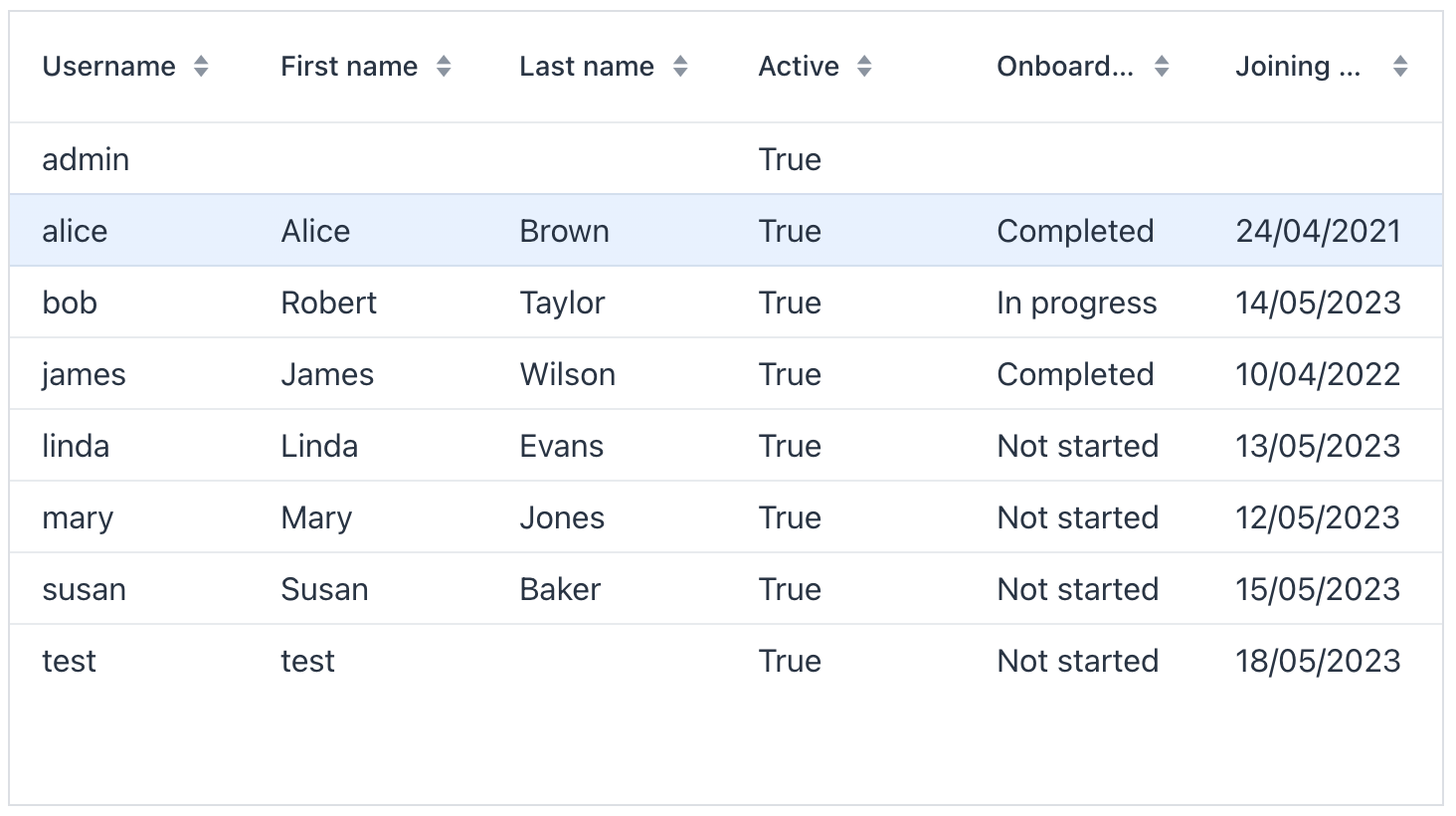
The following example demonstrates how a basic dataGrid is created:
<data readOnly="true">
    <collection id="usersDc"
                class="com.company.onboarding.entity.User">
        <fetchPlan extends="_base">
            <property name="department">
                <property name="name"/> (1)
            </property>
        </fetchPlan>
        <loader id="usersDl">
            <query>
                <![CDATA[select e from User e order by e.username]]>
            </query>
        </loader>
    </collection>
</data>
<layout>
    <dataGrid id="usersTable"
              width="100%"
              minHeight="20em"
              dataContainer="usersDc">
        <columns>
            <column property="username"/> (2)
            <column property="firstName"/>
            <column property="lastName"/>
            <column property="active"/>
            <column property="onboardingStatus"/>
            <column property="department.name"/> (3)
        </columns>
    </dataGrid>
</layout>| 1 | Reference attribute. |
| 2 | Column to display the attribute from the root entity. |
| 3 | Column to display the reference attribute accessed using dot notation. |
Data Binding
Data binding refers to linking a visual component to a data container. Data grid can display data loaded to either collection container or key-value container.
Collection Container
Typically, you bind a dataGrid to data declaratively in the XML descriptor using the dataContainer attribute. This attribute should refer to a collection container, that holds the data you want to display. Please see the relevant example in the previous section.
Key-Value Container
It is also possible to bind the DataGrid to a key-value container. This allows you to display the results of a query that returns scalar values and/or aggregates. For example:
<data readOnly="true">
    <keyValueCollection id="statusesDc">
        <loader id="statusesLoader">
            <query>
                <![CDATA[select o.department, o.onboardingStatus,
                count(o.onboardingStatus) from
                User o group by o.department, o.onboardingStatus]]>
            </query>
        </loader>
        <properties>
            <property name="department" datatype="string"/>
            <property name="onboardingStatus" datatype="int"/>
            <property name="count" datatype="int"/>
        </properties>
    </keyValueCollection>
</data>
<layout>
    <dataGrid width="100%" dataContainer="statusesDc">
        <columns>
            <column property="department"/>
            <column property="onboardingStatus"/>
            <column property="count"/>
        </columns>
    </dataGrid>
</layout>
Programmatic Binding
If you need to define a data container programmatically, use the metaClass attribute instead of dataContainer:
<dataGrid width="100%" id="dataGrid" metaClass="User">
    <columns>
        <column property="firstName"/>
        <column property="lastName"/>
        <column property="username"/>
        <column property="joiningDate"/>
        <column property="onboardingStatus"/>
    </columns>
</dataGrid>
After that, in the view controller, use the ContainerDataGridItems class to bind the data grid to a data container:
@ViewComponent
private DataGrid<User> dataGrid;

@ViewComponent
private CollectionContainer<User> usersDc;

@Subscribe
public void onInit(InitEvent event) {
    dataGrid.setItems(new ContainerDataGridItems<>(usersDc));
}
Programmatic Columns
addColumn() and addComponentColumn() let you create columns in Java instead of XML.
Use addColumn() with renderer instances such as the LocalDateRenderer shown in Local Date Renderer. Use addComponentColumn() when each cell should contain a UI component.
The following example uses addComponentColumn() to add a column that displays the user’s picture:
import com.company.onboarding.entity.User;
import com.vaadin.flow.component.grid.Grid;
import com.vaadin.flow.component.html.Image;
import com.vaadin.flow.component.html.Span;
import com.vaadin.flow.server.streams.DownloadHandler;
import com.vaadin.flow.server.streams.DownloadResponse;
import com.vaadin.flow.server.streams.InputStreamDownloadHandler;
import io.jmix.core.FileRef;
import io.jmix.core.FileStorageLocator;
import io.jmix.flowui.UiComponents;
import io.jmix.flowui.component.grid.DataGrid;
import java.io.InputStream;

// class declaration and annotations omitted

    @ViewComponent
    private DataGrid<User> usersDtGr;

    @Autowired
    private UiComponents uiComponents;

    @Autowired
    private FileStorageLocator fileStorageLocator;

    @Subscribe
    public void onInit(InitEvent event) {
        Grid.Column<User> pictureColumn = usersDtGr.addComponentColumn(user -> { (1)
            FileRef fileRef = user.getPicture();
            if (fileRef != null) {
                Image image = uiComponents.create(Image.class); (2)
                image.setWidth("30px");
                image.setHeight("30px");
                image.setClassName("user-picture");
                InputStreamDownloadHandler handler = (3)
                        DownloadHandler.fromInputStream(e -> {
                            InputStream inputStream = fileStorageLocator.getByName(
                                    fileRef.getStorageName()).openStream(fileRef);
                            return new DownloadResponse(
                                    inputStream, fileRef.getFileName(), fileRef.getContentType(), -1);
                        });
                image.setSrc(handler); (4)

                return image; (5)
            } else {
                return new Span();
            }
        })
                .setHeader("Picture")
                .setAutoWidth(true)
                .setFlexGrow(0);
        usersDtGr.setColumnPosition(pictureColumn,0);
}| 1 | Adds a new column that shows the image component. |
| 2 | The Image component instance is created using the UiComponents factory. |
| 3 | Creates a DownloadHandler that opens an input stream for the file referenced by the picture attribute of the User entity. |
| 4 | Sets the DownloadHandler as the source of the Image component. |
| 5 | The addComponentColumn() method returns the visual component to be shown in the column cells. |
Multi-Select Mode
By default, the component operates in single‑selection mode. When you set selectionMode to MULTI, a checkbox column appears, allowing you to select any number of rows. To select every row, click the checkbox in the header row.
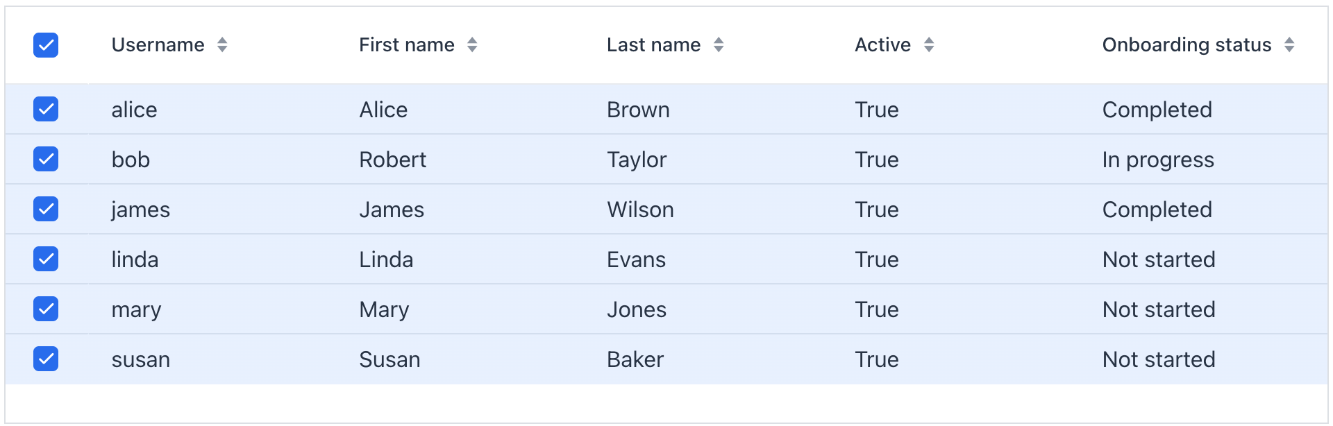
| Range selection using Shift + click or other shortcuts is not currently supported. |
Inline Editing
The component supports inline editing, allowing users to switch between reading and editing table data. Inline editing can be activated through buttons in the actions column or on double click.
|
Inline editing updates entity attributes in memory. To save changes to the database, use the following methods:
|
Actions Column
Use editorActionsColumn to provide Edit and Close buttons next to each row. These enable users to start and stop editing respectively.
The actions column is added relatively to other columns. When includeAll="true" is set, the editor column is placed at the far right.
|
Show code
<dataGrid width="100%" dataContainer="usersDc" id="editableUsersTable">
    <columns>
        <column property="username"/>
        <column property="firstName" editable="true"/> (1)
        <column property="lastName" editable="true"/>
        <column property="active" editable="true"/>
        <column property="onboardingStatus"/>
        <editorActionsColumn>
            <editButton text="Edit" icon="PENCIL"/> (2)
            <closeButton text="Close" icon="CLOSE"/> (3)
        </editorActionsColumn>
    </columns>
</dataGrid>| 1 | Make appropriate columns editable. |
| 2 | Button to initiate editing. |
| 3 | Button to stop editing. |
Buffered Mode
With buffered mode on, users will have to confirm or cancel their edits reducing the risk of accidental modifications. Clicking on a different row discards edits.
Show code
<dataGrid width="100%" dataContainer="usersDc" editorBuffered="true"> (1)
    <columns>
        <column property="username"/>
        <column property="firstName" editable="true"/> (2)
        <column property="lastName" editable="true"/>
        <column property="active" editable="true"/>
        <column property="onboardingStatus"/>
        <editorActionsColumn>
            <editButton text="Edit" icon="PENCIL"/> (3)
            <saveButton icon="CHECK" themeNames="success"/> (4)
            <cancelButton icon="CLOSE" themeNames="error"/> (5)
        </editorActionsColumn>
    </columns>
</dataGrid>| 1 | Enable buffered mode. |
| 2 | Make appropriate columns editable. |
| 3 | Button to initiate editing. |
| 4 | Button to confirm changes. |
| 5 | Button to cancel changes. |
Edit on Double Click
Sometimes it is more convenient to start inline editing by double-clicking the item.
Show code
<dataGrid width="100%" dataContainer="usersDc" id="dblClickTable">
    <columns>
        <column property="username"/>
        <column property="firstName" editable="true"/>
        <column property="lastName" editable="true"/>
        <column property="active" editable="true"/>
        <column property="onboardingStatus"/>
    </columns>
</dataGrid>
@ViewComponent
private DataGrid<User> dblClickTable;
@ViewComponent
private GridMenuItem<Object> emailItem;
@Subscribe
public void onInit(InitEvent event) {
DataGridEditor<User> tableEditor = dblClickTable.getEditor();
dblClickTable.addItemDoubleClickListener(e -> {
tableEditor.editItem(e.getItem());
Component editorComponent = e.getColumn().getEditorComponent();
if (editorComponent instanceof Focusable) {
((Focusable) editorComponent).focus();
}
});
}Auto-Save Edits
In a typical list view, loaded entities are not merged into DataContext (if the loader XML element has the readOnly="true" attribute). Besides, list views usually do not include confirmation actions such as OK or Save. Therefore, modified entities should be saved to the database explicitly.
In non-buffered mode, you can do it by using DataManager in an EditorCloseEvent as follows:
@ViewComponent
private CollectionContainer<User> usersDc;

@Install(to = "usersDataGrid.@editor", subject = "closeListener")
private void usersDataGridEditorCloseListener(final EditorCloseEvent<User> event) {
    User user = event.getItem();
    User savedUser = dataManager.save(user); (1)
    usersDc.replaceItem(savedUser); (2)
}| 1 | Save the entity and get the saved instance. |
| 2 | Replace the current instance with the saved one in the data container. Further edits will be performed on the latest version of the entity. |
In buffered mode, do the same in the EditorSaveEvent listener:
@Install(to = "usersDataGrid.@editor", subject = "saveListener")
private void usersDataGridEditorSaveListener(final EditorSaveEvent<User> event) {
    User user = event.getItem();
    User savedUser = dataManager.save(user);
    usersDc.replaceItem(savedUser);
}|
To generate listeners as annotated methods, use the Handlers tab of the Jmix Studio’s Component Inspector, where editor event listeners are marked with The listeners can also be added programmatically via |
DataGridEditor
The io.jmix.flowui.component.grid.editor.DataGridEditor interface provides additional editor functionality: configure an editor, open the editor, save and cancel a row editing, register listeners, and utility methods for defining column edit components.
To support framework mechanisms like data containers, value sources, etc., the column editor component must be added using DataGridEditor methods (DataGridEditor#setColumnEditorComponent()) instead of direct column API Column#setEditorComponent().
|
See the example:
@Autowired
private UiComponents uiComponents;

@ViewComponent
private DataGrid<User> editableUserTable;

@Subscribe
public void onInit(InitEvent event) {
    DataGridEditor<User> editor = editableUserTable.getEditor(); (1)

    editor.setColumnEditorComponent("timeZoneId", generationContext -> {
        //noinspection unchecked
        JmixComboBox<String> timeZoneField = uiComponents.create(JmixComboBox.class); (2)
        timeZoneField.setItems(List.of(TimeZone.getAvailableIDs()));
        timeZoneField.setValueSource(generationContext.getValueSourceProvider().getValueSource("timeZoneId"));
        timeZoneField.setWidthFull();
        timeZoneField.setClearButtonVisible(true);
        timeZoneField.setRequired(true);
        //noinspection unchecked,rawtypes
        timeZoneField.setStatusChangeHandler(((Consumer) generationContext.getStatusHandler())); (3)

        return timeZoneField; (4)
    });
}| 1 | Get the instance of DataGridEditor. |
| 2 | The JmixComboBox component instance is created using the UiComponents factory. |
| 3 | Set StatusChangeHandler. |
| 4 | The setColumnEditorComponent() method returns the visual component to be shown as the column editor component. |
SupportsStatusChangeHandler
By default, field components (for example, textField, comboBox) display error messages in a label above them. Such behaviour has disadvantages in case of limited area of edit cell. The io.jmix.flowui.component.SupportsStatusChangeHandler interface enables to define different way of displaying error messages. Components that implement this interface support error handling delegation.
By default, the inline editor uses StatusChangeHandler to set error message of a component as its title.
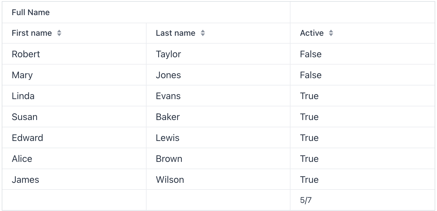
Header and Footer
The component can include header and footer sections to show supplementary information. Each section can contain one or more rows, which you can add using the following methods:
Method |
Description |
|---|---|
|
Adds a new row at the bottom of the header section. |
|
Adds a new row at the top of the header section. |
|
Adds a new row at the bottom of the footer section. |
|
Adds a new row at the top of the footer section. |
The following example demonstrates a dataGrid that includes merged cells in its header and a computed value in the footer:
Show code
<dataGrid id="dataGrid"
          width="100%"
          dataContainer="usersDc"
          themeNames="column-borders">
    <columns>
        <column property="firstName"/>
        <column property="lastName"/>
        <column property="active"/>
    </columns>
</dataGrid>
@ViewComponent
private DataGrid<User> dataGrid;
@ViewComponent
private CollectionContainer<User> usersDc;
@ViewComponent
private CollectionLoader<User> usersDl;
@Autowired
private DataManager dataManager;
@Autowired
private UiComponents uiComponents;
@Autowired
private Notifications notifications;
@ViewComponent
private DataContext dataContext;
@Subscribe
protected void onInit(final InitEvent event) {
usersDl.load();
initHeader();
initFooter();
}
protected void initHeader() {
HeaderRow headerRow = dataGrid.prependHeaderRow();
HeaderRow.HeaderCell headerCell = headerRow.join(
dataGrid.getColumnByKey("firstName"),
dataGrid.getColumnByKey("lastName")); (1)
headerCell.setText("Full Name");
}
protected void initFooter() {
FooterRow footerRow = dataGrid.appendFooterRow();
FooterRow.FooterCell activeCell = footerRow.getCell(dataGrid.getColumnByKey("active"));
activeCell.setText(getActiveCount() + "/" + usersDc.getItems().size());
}
protected int getActiveCount() {
int activeCount = 0;
Collection<User> items = dataGrid.getGenericDataView().getItems().toList();
for (User user : items) {
if (user.getActive()) {
activeCount++;
}
}
return activeCount;
}| 1 | Cells within the header can be merged together. This helps to provide general information about related columns. |
| Both the header and footer can contain rich content and components. See live demo. |
Column Headers Filtering
| This is a preview feature. Its look and feel, as well as implementation details, may change significantly in future releases. |
Data in dataGrid can be filtered using property filters embedded into column headers.
You can define which columns should have a filter using the filterable XML attribute. Filterable columns have the "funnel" icon ( ) in their headers. If the user clicks this icon, a dialog with the property filter condition appears. If a condition is set, the icon in that column is highlighted.
To make sure the filter icon is always visible, set an appropriate width for the column using the width or autoWidth attribute. Don’t make the column resizable, otherwise users will be able to shrink the column width and lose the filter icon.
For example:
<dataGrid dataContainer="usersDc"
          width="100%">
    <columns>
        <column property="firstName" filterable="true"
                width="15em"/>
        <column property="lastName" filterable="true"
                autoWidth="true"/>
        <column property="username"/>
        <column property="active"/>
        <column property="joiningDate"/>
        <column property="onboardingStatus"/>
    </columns>
</dataGrid>
Property filters in column headers work in the same way as standalone property filters and genericFilter - they add conditions to the data loader. In the standard flow, the conditions are translated to the JPQL query and filter data on the database level.
Filterable columns can be used together with propertyFilter and genericFilter components. Conditions of all filters are combined by logical AND.
Currently, column filter conditions are not bound to the page URL. It means that if a user applies a filter and then navigates to a detail view and back, the filter will be cleared.
Actions
The dataGrid component implements the HasActions interface and can contain both standard list actions and custom actions. Actions are invoked by clicking designated buttons or from the context menu that appears on the right click.
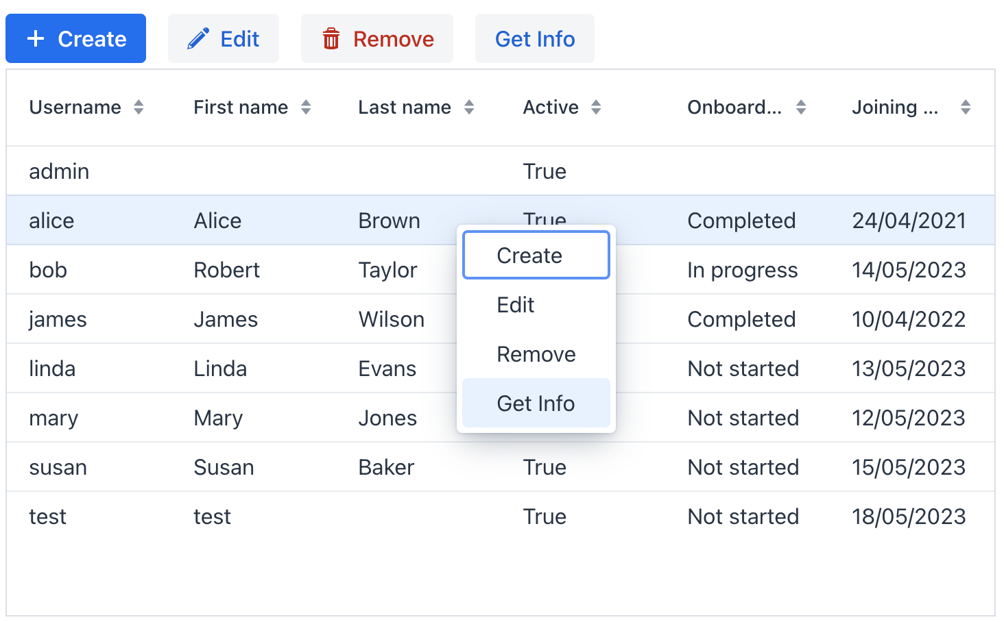
|
To add |
Show code
<hbox id="buttonsPanel" classNames="buttons-panel"> (1)
    <button id="createBtn" action="usersDataGrid.create"/>
    <button id="editBtn" action="usersDataGrid.edit"/>
    <button id="removeBtn" action="usersDataGrid.remove"/>
    <button id="infoBtn" action="usersDataGrid.getInfo"/>
</hbox>
<dataGrid width="100%" dataContainer="usersDc" id="usersDataGrid">
    <columns>
        <column property="username"/>
        <column property="firstName"/>
        <column property="lastName"/>
        <column property="active"/>
        <column property="onboardingStatus"/>
        <column property="joiningDate"/>
    </columns>
    <actions>
        <action id="create" type="list_create"/> (2)
        <action id="edit" type="list_edit"/>
        <action id="remove" type="list_remove"/>
        <action id="getInfo" text="Get Info"/> (3)
    </actions>
</dataGrid>| 1 | Define hbox to contain action buttons. |
| 2 | Define the list_create standard action. |
| 3 | Define the getInfo custom action. Value of its text attribute represents the action in the context menu and is used as the button caption. |
Context Menu
The context menu offers an alternative way to access actions through a right click. Each action is represented by its own menu item.
Use the contextMenu element to refine the list of items in the menu, organizing them with separators and a hierarchical structure.
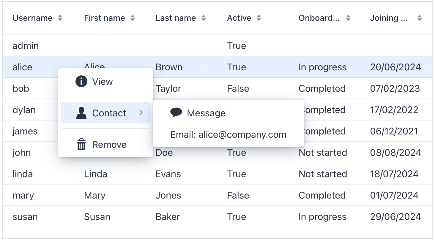
Show code
<dataGrid width="100%" dataContainer="usersDc" id="menuDataGrid">
    <columns>
        <column property="username"/>
        <column property="firstName"/>
        <column property="lastName"/>
        <column property="active"/>
        <column property="onboardingStatus"/>
        <column property="joiningDate"/>
    </columns>
    <actions showInContextMenuEnabled="false"> (1)
        <action id="create" type="list_create"/>
        <action id="edit" type="list_edit"/>
        <action id="remove" type="list_remove"/>
        <action id="getInfo" text="View"/>
        <action id="sendMessage" text="Message"/>
    </actions>
    <contextMenu id="contextMenu">
        <item action="menuDataGrid.getInfo" icon="INFO_CIRCLE"/> (2)
        <separator/>
        <item text="Contact" icon="USER"> (3)
            <item action="menuDataGrid.sendMessage" icon="COMMENT"/>
            <item id="emailItem"/> (4)
        </item>
        <separator/>
        <item action="menuDataGrid.remove" icon="TRASH"/>
    </contextMenu>
</dataGrid>| 1 | Hide all actions from the menu. Or hide a specific action using its visible attribute. |
| 2 | Add menu items explicitly for necessary actions. |
| 3 | Nest items within each other to create a hierarchy. |
| 4 | The item with content added dynamically via dynamicContentHandler. |
@ViewComponent
private GridMenuItem<Object> emailItem;

@Install(to = "contextMenu", subject = "dynamicContentHandler")
private boolean contextMenuDynamicContentHandler(final User user) {
    if (user == null) {
        return false;
    }
        emailItem.setText("Email: " + user.getEmail());
    return true;
}
Renderers
Renderers customize how column cells are displayed. This section covers renderer options specific to dataGrid columns. Shared renderer APIs such as ComponentRenderer, LitRenderer, and FragmentRenderer are described in Renderers.
Renderers can be defined in the following ways:
-
Declaratively in XML: use predefined renderers such as
numberRenderer,localDateRenderer,localDateTimeRenderer,detailLinkRenderer, anddetailButtonRendererinside acolumnelement. -
Using
@Supplyannotation: provide a custom renderer from the view controller. -
Using
fragmentRenderer: use the shared fragment-based renderer mechanism described in Fragment Renderer. -
Using
addColumn()andaddComponentColumn(): create columns in Java and configure renderers programmatically. See Programmatic Columns.
|
To add a renderer in Jmix Studio, select the |
Local Date Renderer
Renders LocalDate values in a column.
<column property="joiningDate">
    <localDateRenderer format="MMM dd, yyyy"/>
</column>
Use the required format attribute to define the output format. Use the optional nullRepresentation attribute to specify how null values are displayed.
For Java configuration, use LocalDateRenderer with addColumn():
@ViewComponent
private DataGrid<User> usersDtGr;

@Subscribe
public void onInit(InitEvent event) {
    usersDtGr.addColumn(new LocalDateRenderer<>(
                    User::getJoiningDate,
                    () -> DateTimeFormatter.ofLocalizedDate(
                            FormatStyle.MEDIUM)))
            .setHeader("Joining date");
}
Local Date Time Renderer
Renders LocalDateTime values in a column.
<column property="passwordExpiration">
    <localDateTimeRenderer format="dd/MM/YYYY HH:mm:ss"/>
</column>
Use the required format attribute to define the output format. Use the optional nullRepresentation attribute to specify how null values are displayed.
Number Renderer
Renders numeric values in a column.
<column property="factor">
    <numberRenderer numberFormat="#,#00.0000"/>
</column>
Specify exactly one of format or numberFormat. If neither is specified, or if both are specified together, the framework throws a GuiDevelopmentException. Use the optional nullRepresentation attribute to specify how null values are displayed. numberFormat uses java.text.DecimalFormat syntax.
Detail Link Renderer
Renders a link that opens the detail view of the current entity.
<dataGrid width="100%" dataContainer="usersDc">
    <columns>
        <column property="username">
            <detailLinkRenderer viewId="User.detail"
                                target="BLANK"
                                classNames="detail-link"
                                css="font-weight: 600;"/>
        </column>
        <column property="firstName"/>
        <column property="lastName"/>
    </columns>
</dataGrid>
Supported attributes:
-
viewClass,viewIdspecify the target view. The renderer resolves the view in the following order:viewClass,viewId, default detail view. -
textsets the link text. If omitted, the renderer uses the formatted value of the bound column property. -
targetsets the link target. -
classNames,cssapply styles.
The target view must have a registered route with exactly one route parameter, and the entity instance must already have a non-null id. For routes with zero or multiple route parameters, configure the renderer from Java code and provide a custom URL using DetailLinkRenderer.withHrefProvider().
Detail Button Renderer
Renders a button that opens the detail view of the current entity.
<dataGrid width="100%" dataContainer="stepsDc">
    <columns>
        <column property="name">
            <detailButtonRenderer viewId="Step.detail"
                                  icon="vaadin:edit"
                                  openMode="DIALOG"
                                  themeNames="tertiary-inline small"
                                  classNames="detail-button"
                                  css="color: var(--lumo-primary-text-color);"/>
        </column>
        <column property="duration"/>
        <column property="sortValue"/>
    </columns>
</dataGrid>
Supported attributes:
-
viewClass,viewIdspecify the target view. The renderer resolves the view in the following order:viewClass,viewId, default detail view. -
openModecontrols how the view is opened:NAVIGATION(default) orDIALOG. -
textsets the button text. If omitted, the renderer uses the formatted value of the bound column property. Set it explicitly for key-only columns. -
iconsets the button icon. You can define it through the attribute or a nestediconelement. -
themeNames,classNames,cssapply styles.
Detail Renderers in Key-Only Columns
You can use detail renderers in a column with key instead of the property attribute:
<dataGrid width="100%" dataContainer="usersDc">
    <columns>
        <column property="username"/>
        <column key="openUser" header="Open">
            <detailButtonRenderer viewId="User.detail"
                                  text="Edit"
                                  openMode="DIALOG"/>
        </column>
    </columns>
</dataGrid>
In this case, set the link or button text explicitly, because there is no bound property value.
Text Renderer
Renders plain text provided from Java code.
<column key="status" header="Status"/>@Supply(to = "userStepsDataGrid.status", subject = "renderer")
private Renderer<UserStep> userStepsDataGridStatusRenderer() {
return new TextRenderer<>(userStep ->
isOverdue(userStep) ? "Overdue!" : "");
}This renderer is typically supplied from Java code by using the renderer handler or @Supply.
Component Renderer
Renders a custom component in each cell. Use this renderer when a cell must contain rich or interactive content, such as a checkbox, image, or button.
| See Component Renderer for available constructors, general behavior, and performance considerations. |
The following example renders a read-only checkbox in the completed column based on whether completedDate is set.
<column key="completed" width="4em" flexGrow="0"/>@Supply(to = "userStepsDataGrid.completed", subject = "renderer")
private Renderer<UserStep> userStepsDataGridCompletedRenderer() {
return new ComponentRenderer<>(userStep -> {
JmixCheckbox checkbox = uiComponents.create(JmixCheckbox.class);
checkbox.setValue(userStep.getCompletedDate() != null);
checkbox.addValueChangeListener(e -> {
// ...
});
return checkbox;
});
}Item Details
This component allows rows to expand, revealing additional information about each item. To implement this functionality, use the setItemDetailsRenderer() method. This method takes a ComponentRenderer as an argument, which specifies how the details are rendered.
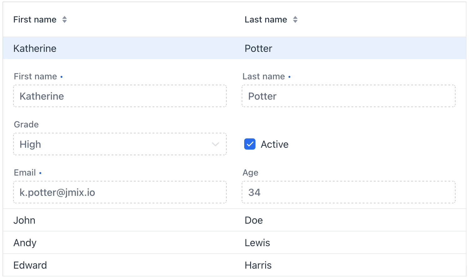
The detailsVisibleOnClick attribute allows you to control whether these details appear when the row is clicked. If you prefer the details to be triggered by an event other than clicking, set this attribute to false.
Sorting
This section demonstrates sorting customization for individual dataGrid component. For application-wide sorting customization, see Sorting.
|
Any column can be used for sorting the data displayed. Clicking on the column header activates a special control in the grid that shows which column is currently being sorted and the sorting direction (ascending or descending). Each subsequent click on the same header will toggle the sorting direction.
|
Enumeration attributes are sorted by their As a result, the sorting order can differ from the visible order of enum values in a |
Sorting by Multiple Columns
It is possible to sort by multiple columns simultaneously. When sorting by multiple columns, the first selected column determines the primary sorting criterion, the second column sets the secondary criterion, and so on. You can configure it using multiSort, multiSortOnShiftClickOnly, and multiSortPriority attributes.
For example:
<dataGrid width="100%"
          dataContainer="usersDc"
          multiSort="true"
          multiSortOnShiftClickOnly="true"
          multiSortPriority="APPEND">
Column Comparator
Use DataGridColumn#setComparator() to define custom sorting logic for a specific column when sorting is performed in memory. In-memory sorting is used when the container has no loader, or when only the first page is loaded and the number of loaded items is less than the page size.
The following example sorts the Department.num attribute as numbers even though the attribute type is String:
<dataGrid id="inMemoryDepartmentsDataGrid"
          width="100%"
          dataContainer="inMemoryDepartmentsDc">
    <columns>
        <column property="name"/>
        <column property="num"/>
    </columns>
</dataGrid>
private void initInMemoryComparator() {
inMemoryDepartmentsDc.setItems(dataManager.load(Department.class)
.query("select e from Department e")
.list());
inMemoryDepartmentsDataGrid.getColumnByKey("num")
.setComparator(Comparator.comparing(
department -> department.getNum() == null ? null : Integer.valueOf(department.getNum()),
Comparator.nullsFirst(Integer::compareTo)));
}Sort Builder Delegate
If the grid reloads data from the database, configure Sort Builder Delegate. The delegate receives sorting instructions from the grid and returns a DataGridSort object, allowing you to override in-memory sorting, database sorting, or both in one place.
The following example customizes sorting so that Department.num values are compared as numbers, not strings:
<dataGrid id="delegateDepartmentsDataGrid"
          width="100%"
          dataContainer="delegateDepartmentsDc">
    <columns>
        <column property="name"/>
        <column property="num"/>
    </columns>
</dataGrid>
private void initBoundPropertySortBuilder() {
delegateDepartmentsDataGrid.setSortBuilderDelegate(sortContext ->
DataGridSortBuilder.create(sortContext)
.replaceSort("num", "CAST({E}.num BIGINT)", (1)
Comparator.comparing(
department -> department.getNum() == null
? null
: Integer.valueOf(department.getNum()),
Comparator.nullsFirst(Integer::compareTo))) (2)
.build());
}| 1 | If the grid reloads data from the database, the CAST({E}.num BIGINT) expression is added to ORDER BY, so the database also sorts numerically instead of lexicographically. |
| 2 | If the grid sorts in memory, the comparator converts num to Integer and compares numeric values. |
Sorting a Computed Column
Sort Builder Delegate is also useful for columns that are not bound to an entity property. In the example below, the fullName column is rendered from firstName and lastName, and the sort builder delegate maps this synthetic column to both JPQL expressions and an in-memory comparator:
<dataGrid id="fullNameUsersDataGrid"
          width="100%"
          dataContainer="usersDc">
    <columns>
        <column key="fullName" header="Full name" sortable="true"/>
        <column property="username"/>
        <column property="department.name"/>
        <column property="onboardingStatus"/>
    </columns>
</dataGrid>
private void initComputedColumnSortBuilder() {
fullNameUsersDataGrid.setSortBuilderDelegate(sortContext ->
DataGridSortBuilder.create(sortContext)
.replaceSort("fullName",
List.of("{E}.firstName", "{E}.lastName"),
Comparator.comparing(User::getFirstName,
Comparator.nullsFirst(String::compareTo))
.thenComparing(User::getLastName,
Comparator.nullsFirst(String::compareTo)))
.build());
}
@Supply(to = "fullNameUsersDataGrid.fullName", subject = "renderer")
protected Renderer<User> fullNameUsersDataGridFullNameRenderer() {
return new TextRenderer<>(user ->
((user.getFirstName() == null ? "" : user.getFirstName()) + " "
+ (user.getLastName() == null ? "" : user.getLastName())).trim());
}Aggregating
The component supports aggregating values in its rows. When aggregation is enabled, it will display an additional row containing aggregated values. For example:
<dataGrid width="100%"
          dataContainer="stepsDc"
          aggregatable="true"
          aggregationPosition="TOP"> (1)
    <columns>
        <column property="name"/>
        <column property="duration">
            <aggregation type="AVG"
                         cellTitle="msg://aggregation.cellTitle"/> (2)
        </column>
        <column property="sortValue"/>
        <column property="factor">
            <aggregation type="AVG">
                <formatter>
                    <number format="#,##0.00"/> (3)
                </formatter>
            </aggregation>
        </column>
    </columns>
</dataGrid>| 1 | Set the aggregatable attribute to true. |
| 2 | Add the aggregation element for columns you want to aggregate. Add optional cellTitle attribute to display a hint when the user hovers aggregated value. |
| 3 | Specify formatter to display the aggregated value in the format other than the standard for this data type. |
The aggregation element can specify a class with custom aggregation logic through strategyClass attribute:
<dataGrid width="100%"
          dataContainer="usersDc"
          aggregatable="true"
          aggregationPosition="TOP">
    <columns>
        <column property="firstName"/>
        <column property="lastName"/>
        <column property="onboardingStatus">
            <aggregation
                    strategyClass="com.company.onboarding.view.component.datagrid.DataGridUserStatusAggregation"/>
        </column>
    </columns>
</dataGrid>
Such class must implement AggregationStrategy interface. For example:
public class DataGridUserStatusAggregation implements AggregationStrategy<OnboardingStatus, String> {

    @Autowired
    public Messages messages;

    @Override
    public String aggregate(Collection<OnboardingStatus> propertyValues) {
        OnboardingStatus mostFrequent = null;
        long max = 0;

        if (CollectionUtils.isNotEmpty(propertyValues)) {
            for (OnboardingStatus status : OnboardingStatus.values()) {
                long current = propertyValues.stream()
                        .filter(status :: equals)
                        .count();

                if (current > max) {
                    mostFrequent = status;
                    max = current;
                }
            }
        }

        if (mostFrequent != null) {
            String key = OnboardingStatus.class.getSimpleName() + "." + mostFrequent.name();
            return String.format("%s: %d/%d", messages.getMessage(OnboardingStatus.class, key), max, propertyValues.size());
        }

        return null;
    }

    @Override
    public Class<String> getResultClass() {
        return String.class;
    }
}
Empty State
When a data grid has no data to display, the area between the header and footer is blank by default. Use the empty state feature to display a message or UI component informing the user that there are no items to show.
-
Use the
emptyStateTextattribute to define the text that appears when the data grid is empty.<dataGrid id="dataGridEmptyState" dataContainer="customersDc" width="100%" emptyStateText="No customers found"> <columns> <column property="firstName"/> <column property="lastName"/> <column property="age"/> <column property="martialStatus"/> </columns> </dataGrid>This attribute takes precedence over any empty state component configured using the setEmptyStateComponent(Component)method in the view controller or theemptyStateComponentelement in the view XML-descriptor. SettingemptyStateTextwill remove any existing component. -
Use the
emptyStateComponentelement to define the component that appears when the grid is empty.<dataGrid id="dataGridEmptyStateComp" dataContainer="customersDc" width="100%"> <columns> <column property="firstName"/> <column property="lastName"/> <column property="age"/> <column property="martialStatus"/> </columns> <emptyStateComponent> <button id="newCustomerBtn" text="Create customer" width="100%"/> </emptyStateComponent> </dataGrid>Once you’ve set
emptyStateComponent, you can interact with the nested component as usual. This includes customizing its styling and creating event handlers.Setting this element overrides any empty state text defined using the setEmptyStateText(String)method in the view controller or theemptyStateTextattribute in the view XML-descriptor.
Theme Variants
Use themeNames attribute to set a component theme.
| Variant | Description | Supported By |
|---|---|---|
|
Adds vertical borders between columns. |
Aura, Lumo |
|
Reduces row height and spacing. |
Lumo |
|
Removes the outer border around the grid. |
Aura, Lumo |
|
Removes the horizontal borders between rows. |
Aura, Lumo |
|
Alternates row background colors to improve readability. |
Aura, Lumo |
|
Allows cell content to wrap onto multiple lines instead of truncating. |
Aura, Lumo |
Attributes
Common attributes serve the same purpose for all components.
The following attributes are specific to dataGrid:
Name |
Description |
Default |
|---|---|---|
If Using this feature is discouraged for a large number of items as it may cause performance issues. |
|
|
If |
|
|
If the data in the component is aggregatable, determines whether the aggregation row is displayed above or below the other rows. Possible values: |
|
|
If |
|
|
If |
|
|
Determines rows where a drop can happen. Possible values: |
– |
|
If |
|
|
The text to display when the data grid is empty. Use null to remove the current empty state content. See Empty State. |
– |
|
If |
|
|
If |
|
|
Determines whether the clicked column is added to the end or beginning of the sorted columns list. Possible values: |
|
|
Sets the behavior when parsing nested properties which may contain null values in the property chain. Possible values: |
|
|
Determines the page size or the number of items that will be fetched from the data provider at a time. |
|
|
If |
|
|
Sets the selection mode. Possible values: |
|
Handlers
Common handlers are configured in the same way for all components.
The following handlers are specific to dataGrid:
|
To generate a handler stub in Jmix Studio, use the Handlers tab of the Jmix UI inspector panel or the Generate Handler action available in the top panel of the view class and through the Code → Generate menu (Alt+Insert / Cmd+N). |
Name |
Description |
|---|---|
|
|
|
|
|
|
|
|
|
|
|
|
|
|
|
|
|
|
Adds a data generator for the data grid. If the generator was already added, does nothing. See the |
|
Allows to control which specific rows can be dragged, rather than making all rows draggable with rowsDraggable. |
|
Allows to control which specific rows are valid drop targets. |
|
Handles the event when the user presses the Enter key. |
|
Sets a predicate to check whether a specific item in the grid may be selected or deselected by the user. The predicate receives an item instance and should return |
|
Generates tooltip for the column cell based on given conditions. See live demo. |
Elements
Elements of dataGrid provide a wide range of options to control the appearance, behavior, and functionality of columns both collectively and individually.
|
To add an element to a selected component click the Add button in the Jmix UI inspector panel. |
columns
The columns element can specify a set of attributes to display and behaviors for all columns.
XML Element |
|
|---|---|
Attributes |
exclude - includeAll - resizable - sortable |
Elements |
Name |
Description |
Default |
|---|---|---|
Excludes specific attributes from being shown. Several attributes must be separated with a comma. For example: |
– |
|
If |
– |
|
If |
|
|
If |
|
column
The column element defines an individual column. Attributes set for an individual column override those set for all columns.
XML Element |
|
|---|---|
Attributes |
autowidth - editable - filterable - flexGrow - footer - frozen - header - key - property - resizable - sortable - textAlign - visible - width |
Handlers |
AttachEvent - DataGridColumnVisibilityChangedEvent - DetachEvent - partNameGenerator - renderer - tooltipGenerator |
Elements |
Aggregation - FragmentRenderer - LocalDateRenderer - LocalDateTimeRenderer - NumberRenderer - DetailLinkRenderer - DetailButtonRenderer |
Name |
Description |
Default |
|---|---|---|
If |
|
|
If |
|
|
If |
|
|
Sets the flex grow ratio for this column. When set to |
|
|
Sets a footer text to the column. The attribute value can either be the text itself or a key in the message bundle. In case of a key, the value should begin with the |
– |
|
If |
|
|
Sets the column header text. The attribute value can either be the text itself or a key in the message bundle. In case of a key, the value should begin with the |
– |
|
Sets the user-defined identifier to map this column. The key can be used to fetch the column later with the The key has to be unique within the data grid, and it can’t be changed after set once. |
– |
|
Specifies the name of an entity attribute to be displayed in the column. This can be an attribute of the root entity |
– |
|
If |
|
|
If |
|
|
Specifies the alignment of the text with the following possible values: |
|
|
If |
|
|
Sets the width of the column as a CSS string. |
– |
Name |
Description |
|---|---|
Fired when the column visibility is changed through the gridColumnVisibility component. |
|
Generates parts of CSS class names for this column based on given conditions. This allows for customizing cell appearance based on the data displayed. See live demo. |
|
Renders column content using text or components. See text renderer and component renderer. |
|
Generates tooltip for the column cell based on given conditions. See live demo. |
contextMenu
The contextMenu element organizes items the right-click menu in a way that differs from their default arrangement. See the example.
XML Element |
|
|---|---|
Attributes |
id - classNames - css - enabled - visible |
Handlers |
AttachEvent - DetachEvent - GridContextMenuOpenedEvent - openedChangeEvent - dynamicContentHandler |
Elements |
item - separator |
Name |
Description |
|---|---|
Fired when the context menu opened state changes. May return the target item or the id of the target column allowing the menu to display items based on the clicked item. |
|
Fired when the context menu opened state changes. |
|
Handles dynamic updates to the menu when it opens, such as adding menu items or their content. See the example. |
emptyStateComponent
The emptyStateComponent element defines the component to display when the grid is empty. Use null to remove the current empty state content. See Empty State.
See Also
See the Vaadin Docs for more information.
