gridLayout
The gridLayout component arranges child components in a responsive, two-dimensional grid system based on the CSS Grid Layout.
XML Element |
|
|---|---|
Java Class |
|
Attributes |
id - alignSelf - classNames - columnMinWidth - css - enabled - gap - height - itemsContainer - itemsEnum - justifySelf - maxHeight - maxWidth - minHeight - minWidth - visible - width |
Handlers |
|
Elements |
Basics
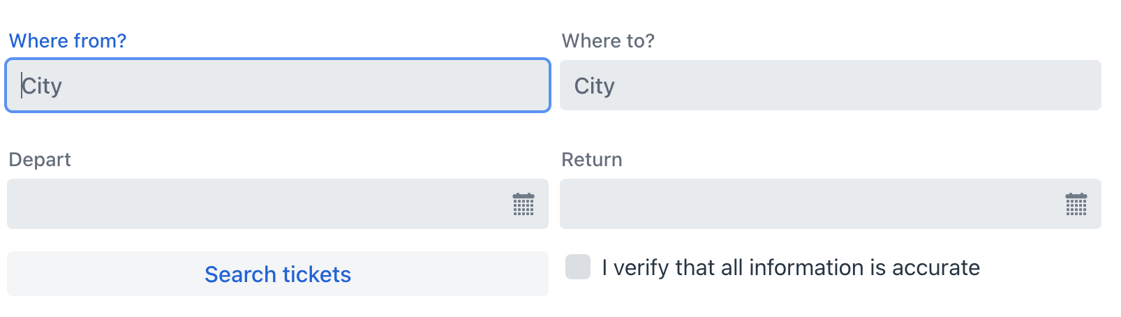
You can populate gridLayout with components either declaratively in the XML descriptor or programmatically in a controller using the gridLayout.add() method.
Example of declarative addition:
<gridLayout id="gridLayout" width="100%">
    <textField placeholder="City" label="Where from?"/>
    <textField placeholder="City" label="Where to?"/>
    <datePicker label="Depart"/>
    <datePicker label="Return"/>
    <button text="Search tickets" height="AUTO"/>
</gridLayout>
Example of adding in a view controller:
@ViewComponent
private GridLayout<Object> gridLayout;

@Autowired
private UiComponents uiComponents;

@Subscribe
public void onInit(final InitEvent event) {
    Checkbox checkbox = uiComponents.create(Checkbox.class);
    checkbox.setLabel("I verify that all information is accurate");
    checkbox.setValue(false);
    gridLayout.add(checkbox);
}
Data Binding
Data binding refers to linking a visual component to a data container.
In the gridLayout component, this is achieved by setting the itemsContainer attribute to reference a data container.
<data>
    <collection id="usersDc" class="com.company.onboarding.entity.User"> (1)
        <fetchPlan extends="_base">
            <property name="department" fetchPlan="_base"/>
        </fetchPlan>
        <loader id="usersDl" readOnly="true">
            <query>
                <![CDATA[select e from User e]]>
            </query>
        </loader>
    </collection>
</data>
<facets>
    <dataLoadCoordinator auto="true"/> (2)
</facets>
<layout>
    <gridLayout width="100%"
                itemsContainer="usersDc"/> (3)
</layout>| 1 | Data container to hold a collection of all existing User instances. |
| 2 | Data load coordinator to automatically supply the component with instances to display from. |
| 3 | Specifying the container that holds the list of items to be displayed. |
By default, the component displays the instance name of the entity.
| You can override the default display by configuring a custom renderer. |
The component also supports displaying enumeration values using the itemsEnum property.
<gridLayout itemsEnum="com.company.onboarding.entity.DayOfWeek"
            width="100%"/>
Rendering Items
It is possible to customize the render of items. The renderer is applied to each item to create a component which represents the item.
This customization can be achieved using two distinct methods.
Programmatic Approach
In the view controller, use either:
-
The
setRenderer()method; -
The
@Supplyannotation.
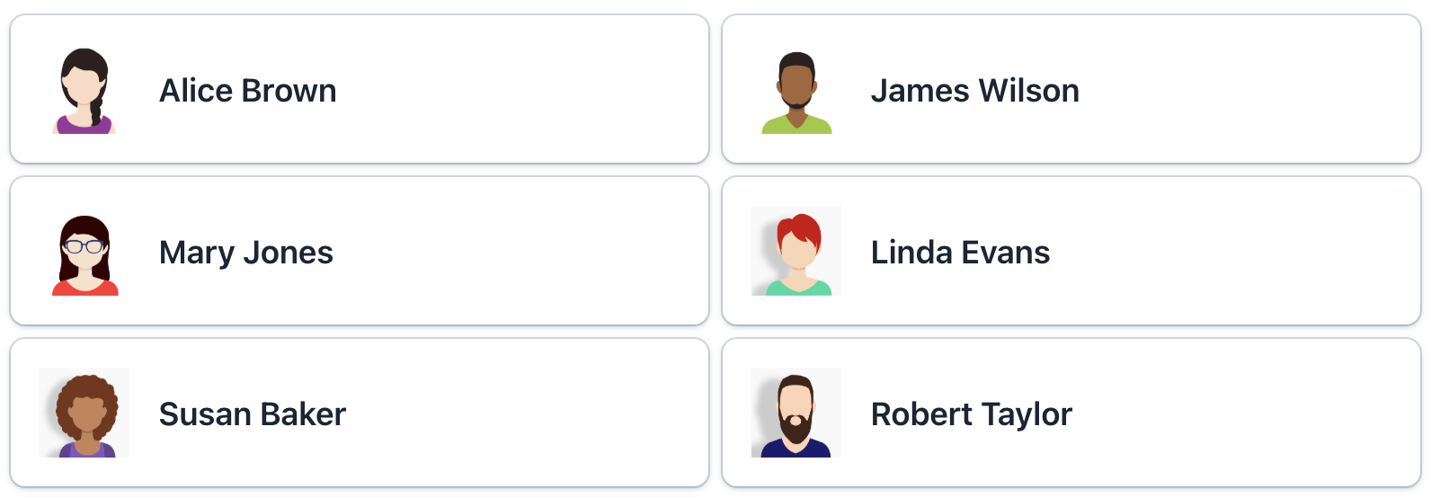
Building on the previous example, we can generate a renderer to display each user as a custom Card component.
Show code
@Supply(to = "gridLtUsers", subject = "renderer")
private ComponentRenderer<Card, User> gridLtUsersRenderer() { (1)
    return new ComponentRenderer<>(this::createCard, this::initCard);
}

private Card createCard() { (2)
    Card card = uiComponents.create(Card.class);
    card.setWidthFull();
    card.addThemeVariants(CardVariant.LUMO_OUTLINED, CardVariant.LUMO_ELEVATED);
    return card;
}

private void initCard(Card card, User user) { (3)
    card.setHeaderPrefix(createAvatar(user));
    card.setTitle(user.getFirstName() + " " + user.getLastName());
    card.setSubtitle(createSubtitle(user));
    card.setHeaderSuffix(createHeaderSuffix(user));
}

private Image createAvatar(User user) { (4)
    Image image = uiComponents.create(Image.class);
    FileRef fileRef = user.getPicture();
    if (fileRef != null) {
        image.setWidth("50px");
        image.setHeight("50px");
        InputStreamDownloadHandler handler = DownloadHandler.fromInputStream(event -> {
            InputStream inputStream = fileStorageLocator.getByName(fileRef.getStorageName()).openStream(fileRef);
            return new DownloadResponse(inputStream, fileRef.getFileName(), fileRef.getContentType(), -1);
        });
        image.setSrc(handler);
    }
    return image;
}

private Span createSubtitle(User user) {
    Span span = uiComponents.create(Span.class);
    span.setText("%s: %s".formatted(
            getPropertyCaption(user, "department"),
            (user.getDepartment() != null ?
                    user.getDepartment().getName() :
                    "Not assigned")));
    return span;
}

private String getPropertyCaption(User user, String property) {
    MetaClass metaClass = metadata.getClass(user);
    return messageTools.getPropertyCaption(metaClass, property);
}

private Span createHeaderSuffix(User user) {
    Span span = uiComponents.create(Span.class);
    if (user.getActive()) {
        span.setText("Active");
        span.getElement().getThemeList().add("badge success");
    }
    else {
        span.setText("Inactive");
        span.getElement().getThemeList().add("badge error");
    }
    return span;
}| 1 | Supplies a custom renderer to display each User as a Card. |
| 2 | Creates a base Card component with common styling. |
| 3 | Initializes card content with user-specific data. Called for each card instance with the corresponding User entity. |
| 4 | Creates an avatar image component from the user’s picture. |
Declarative Approach
Alternatively, you can render items using a nested fragmentRenderer element.
-
Create
FragmentRendererXML-descriptor:<?xml version="1.0" encoding="UTF-8" standalone="no"?> <fragment xmlns="http://jmix.io/schema/flowui/fragment"> <data> <instance id="userDc" class="com.company.onboarding.entity.User"> <loader id="userDl"/> <fetchPlan extends="_base"/> </instance> </data> <content> <vbox id="root" padding="false"/> </content> </fragment> -
Create
FragmentRendererJava ControllerThe fragment renderer class should extend the
FragmentRendererbase class with type parameters indicating the root component and rendered entity, for example:Show code
@FragmentDescriptor("card-fragment.xml") @RendererItemContainer("userDc") public class CardFragment extends FragmentRenderer<VerticalLayout, User> { @Autowired private FileStorageLocator fileStorageLocator; @Autowired private Metadata metadata; @Autowired private MessageTools messageTools; @Override protected void onAttach(AttachEvent attachEvent) { super.onAttach(attachEvent); initLayout(); } private void initLayout() { Card card = uiComponents.create(Card.class); card.setWidthFull(); card.addThemeVariants(CardVariant.LUMO_OUTLINED, CardVariant.LUMO_ELEVATED); card.setHeaderPrefix(createAvatar(getItem())); card.setTitle(getItem().getFirstName() + " " + getItem().getLastName()); card.setSubtitle(createSubtitle(getItem())); card.setHeaderSuffix(createHeaderSuffix(getItem())); getContent().add(card); } private Image createAvatar(User user) { Image image = uiComponents.create(Image.class); FileRef fileRef = user.getPicture(); if (fileRef != null) { image.setWidth("50px"); image.setHeight("50px"); InputStreamDownloadHandler handler = DownloadHandler.fromInputStream(event -> { InputStream inputStream = fileStorageLocator.getByName(fileRef.getStorageName()).openStream(fileRef); return new DownloadResponse(inputStream, fileRef.getFileName(), fileRef.getContentType(), -1); }); image.setSrc(handler); } return image; } private Span createSubtitle(User user) { Span span = uiComponents.create(Span.class); span.setText("%s: %s".formatted( getPropertyCaption(user, "department"), (user.getDepartment() != null ? user.getDepartment().getName() : "Not assigned"))); return span; } private String getPropertyCaption(User user, String property) { MetaClass metaClass = metadata.getClass(user); return messageTools.getPropertyCaption(metaClass, property); } private Span createHeaderSuffix(User user) { Span span = uiComponents.create(Span.class); if (user.getActive()) { span.setText("Active"); span.getElement().getThemeList().add("badge success"); } else { span.setText("Inactive"); span.getElement().getThemeList().add("badge error"); } return span; } } -
Use
fragmentRendererfor agridLayoutcomponent:<gridLayout id="gridUsers" width="100%" itemsContainer="usersDc" gap="var(--lumo-space-m)"> <fragmentRenderer class="com.company.onboarding.view.layout.gridlayout.CardFragment"/> </gridLayout>
Attributes
Common attributes serve the same purpose for all components.
The following attributes are specific to gridLayout:
Name |
Description |
Default |
|---|---|---|
Controls the vertical alignment of a component within its grid cell along the block (column) axis. This corresponds to the CSS align-self property. See also alignSelf. Available for projects with version 2.7.2+. |
|
|
Sets the minimum width for the grid columns in |
|
|
Controls the spacing between grid cells (both row and column gaps). This creates visual separation between components. The value represented as a CSS length value (for example, |
|
|
Controls the horizontal alignment of a component within its grid cell along the inline (row) axis. This corresponds to the CSS justify-self property. Available for projects with version 2.7.2+. |
|
Handlers
Common handlers are configured in the same way for all components.
The following handlers are specific to gridLayout.
|
To generate a handler stub in Jmix Studio, use the Handlers tab of the Jmix UI inspector panel or the Generate Handler action available in the top panel of the view class and through the Code → Generate menu (Alt+Insert / Cmd+N). |
Name |
Description |
|---|---|
Allows you to customize the labels displayed for each item. See Customizing Item Labels. |
|
Sets the item renderer for |
