tabs
Basics
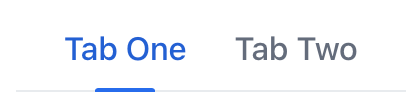
By default, tabs are displayed in a horizontal row, with the tab labels arranged one after another. This row of tabs is typically positioned at the top or bottom of the associated content area.
The following example demonstrates basic tabs functionality.
XML code
<tabs id="tabs">
    <tab id="tab1" label="Tab One"/>
    <tab id="tab2" label="Tab Two"/>
</tabs>
In this example, the component contains two nested tab elements. To update the content associated with the selected tab, define an event handler that listens for the SelectedChangeEvent. When a tab is selected, this event is fired, allowing you to update the displayed content accordingly.
Orientation
While horizontal orientation is default, vertical orientation can be alternative option in certain scenarios. For example, with a larger number of tabs, this orientation may provide additional space for their labels.

Use the orientation attribute to change the orientation of tabs.
States
A tab can be selected, unselected, or disabled:
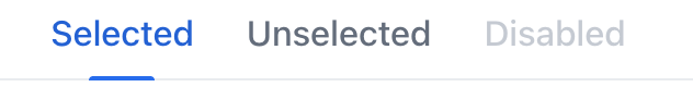
These states allow users to easily determine which tab is currently active and which tabs may be temporarily unavailable or disabled.
Labels
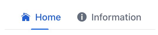
Individual tabs can nest almost any components within them. This allows you to compose visually distinctive tab labels:
XML code
<tabs>
    <tab id="profileTab">
        <icon icon="USER"/>
        <span text="Profile"/>
    </tab>
    <tab id="notificationsTab">
        <icon icon="BELL"/>
        <span text="Notifications"/>
    </tab>
    <tab id="settingsTab">
        <icon icon="COG"/>
        <span text="Settings"/>
    </tab>
</tabs>
Theme Variants
Use themeNames attribute to set a component theme.
| Variant | Description | Supported By |
|---|---|---|
|
Applies to an individual |
Lumo |
|
Centers the tabs within the container. |
Lumo |
|
Makes the tabs smaller. |
Aura, Lumo |
|
Reduces the visual style to emphasize labels only. |
Lumo |
|
Hides the scroll buttons used to navigate overflown tabs. |
Aura, Lumo |
|
Allocates equal width to all tabs and disables scrolling. |
Lumo |
Attributes
id - alignSelf - classNames - colspan - css - height - maxHeight - maxWidth - minHeight - minWidth - orientation - themeNames - visible - width
Handlers
|
To generate a handler stub in Jmix Studio, use the Handlers tab of the Jmix UI inspector panel or the Generate Handler action available in the top panel of the view class and through the Code → Generate menu (Alt+Insert / Cmd+N). |
SelectedChangeEvent
com.vaadin.flow.component.tabs.Tabs.SelectedChangeEvent is fired when another tab is selected.
The following example adds a label when a tab is selected:
@ViewComponent
private VerticalLayout content;

@Subscribe("tabs")
public void onTabsSelectedChange(final Tabs.SelectedChangeEvent event) {
    setTabContent(event.getSelectedTab());
}
private void setTabContent(Tab tab) {
    content.removeAll();
    Div tabLabel = uiComponents.create(Div.class);
    if ("tab1".equals(tab.getId().orElse(null))) {
        tabLabel.setText("Tab One is selected");
        content.add(tabLabel);
    } else {
        tabLabel.setText("Tab Two is selected");
        content.add(tabLabel);
    }
}
Elements
|
To add an element in Jmix Studio, select the component in the view descriptor XML or in the Jmix UI structure panel and click on the Add button in the Component Inspector panel. |
tab
Individual tabs are defined with nested tab elements.
tab attributes
id - ariaLabel - ariaLabelledBy - classNames - colspan - css - enabled - flexGrow - label - themeNames - visible
tab handlers
See Also
See the Vaadin Docs for more information.
