multiSelectListBox
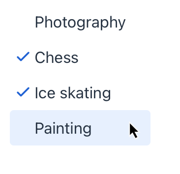
multiSelectListBox allows users to select multiple values from a scrollable list of items using checkboxes.
XML Element |
|
|---|---|
Java Class |
|
Attributes |
id - alignSelf - ariaLabel - ariaLabelledBy - classNames - colspan - css - enabled - height - itemsContainer - itemsEnum - maxHeight - maxWidth - minHeight - minWidth - readOnly - visible - width |
Handlers |
AttachEvent - ComponentValueChangeEvent - itemEnabledProvider - itemLabelGenerator - renderer |
Elements |
Basics
Use the itemsContainer or itemsEnum attribute to create a list of items:
<data>
    <collection class="com.company.onboarding.entity.Hobby" id="hobbiesDc"> (1)
        <fetchPlan extends="_base"/>
        <loader id="hobbiesDl">
            <query>
                <![CDATA[select e from Hobby e]]>
            </query>
        </loader>
    </collection>
</data>
<layout>
    <multiSelectListBox itemsContainer="hobbiesDc"/> (2)
</layout>| 1 | CollectionContainer for the Hobby entity. |
| 2 | multiSelectListBox gets hobbiesDc as an items container so that the list of hobbies displayed. |
Item Enabled Provider
itemEnabledProvider allows you to dynamically control the enabled state of individual items based on specific conditions. Disabled items appear grayed out and cannot be selected by the user. All items are enabled by default.
@Install(to = "multiSelectListBox", subject = "itemEnabledProvider")
private boolean multiSelectListBoxItemEnabledProvider(final User user) {
    if (user != null) {
        return user.getActive();
    }
    return true;
}
Customizing Item Labels
itemLabelGenerator allows you to customize how items are displayed in the multiSelectListBox component. This gives you control over the text that users see, enabling you to present information in a more user-friendly or context-specific manner.
@Install(to = "multiSelectListBox", subject = "itemLabelGenerator")
private String multiSelectListBoxItemLabelGenerator(final User item) {
    return metadataTools.format(item.getDisplayName()).toUpperCase();
}
Rendering Items
It is possible to customize the render of items. The renderer is applied to each item to create a component which represents the item.
You can use the setRenderer() method or the @Supply annotation for it.
@Supply(to = "mSelectListBox", subject = "renderer")
private ComponentRenderer<Span, User> mSelectListBoxRenderer() {
    return new ComponentRenderer<>(user -> {
        Span span = uiComponents.create(Span.class);
        span.setText(user.getDisplayName());
        span.setClassName("font-bold");
        return span;
    });
}
Alternatively, you can render items using a nested fragmentRenderer element. Refer to the Fragment Renderer section for more information.
Handlers
Common handlers are configured in the same way for all components.
The following handlers are specific to multiSelectListBox.
|
To generate a handler stub in Jmix Studio, use the Handlers tab of the Jmix UI inspector panel or the Generate Handler action available in the top panel of the view class and through the Code → Generate menu (Alt+Insert / Cmd+N). |
Name |
Description |
|---|---|
|
|
Allows you to customize the labels displayed for each item in |
|
Sets the item renderer for this |
See Also
See the Vaadin Docs for more information.
