Renderers
This page describes shared renderer APIs such as ComponentRenderer, LitRenderer, and FragmentRenderer, used by UI components. For predefined XML renderers, supported attributes, and component-specific examples, see the corresponding component documentation.
Renderers are particularly useful for:
-
Enhanced visual representation: They enable the inclusion of visual elements beyond plain text, such as icons, images, progress bars, or others, to make data more easily understandable and engaging. This can improve the overall user experience and clarity of the UI.
-
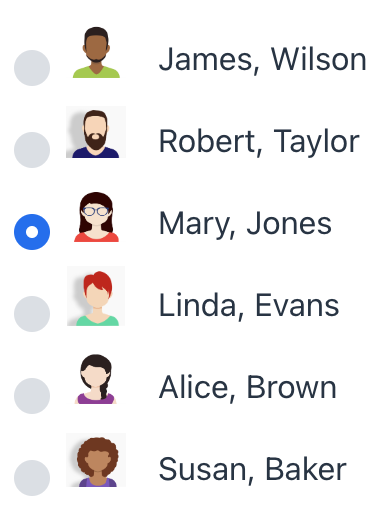
Conditional rendering: Renderers can implement logic to change the visual appearance based on the data’s value or other contextual information. For instance, a renderer might display a green checkmark for successful records and a red checkmark for failed ones.
-
Complex layouts: For situations requiring more complex visual layouts than the default rendering offers, custom renderers provide the flexibility to arrange and display data in non-standard ways. This could involve combining several UI elements within a single component cell or creating entirely custom layouts.
| If you only need to change how a value is displayed, for example how a date or number appears, use a formatter. |
Component Renderer
ComponentRenderer renders items using UI components instead of plain text. Assign it programmatically with setRenderer() or provide it from a controller using @Supply.
ComponentRenderer creates UI components for rendered items and can affect performance on large datasets. If you only need to render HTML-like content, use LitRenderer.
|
ComponentRenderer can be created in different ways, depending on how you want to create and update components. The examples below show the available options.
Single Callback
Use this when a single function can generate a new component instance directly from the model item.
@Supply(to = "selectWithRenderer", subject = "renderer") (1)
private ComponentRenderer<Button, Department> selectWithRendererRenderer() {
    return new ComponentRenderer<>(item -> { (2)
        Button button = uiComponents.create(Button.class); (3)
        button.setText(item.getName());
        button.setIcon(VaadinIcon.DESKTOP.create());
        return button; (4)
    });
}| 1 | @Supply binds the renderer to selectWithRenderer. |
| 2 | The function receives the current item. |
| 3 | The component instance is created and configured inside the same callback. |
| 4 | The function returns the component for the current item. |
Separate Creation And Binding
Use this when component creation and item binding should be handled separately.
@Supply(to = "dataGridCheckbox.active", subject = "renderer") (1)
private Renderer<User> dataGridCheckboxActiveRenderer() {
    return new ComponentRenderer<>(
            () -> {
                JmixCheckbox checkbox = uiComponents.create(JmixCheckbox.class); (2)
                checkbox.setReadOnly(true); (3)
                return checkbox; (4)
            },
            (checkbox, item) -> checkbox.setValue(item.getActive()) (5)
    );
}| 1 | @Supply binds the renderer to the active column of dataGridCheckbox. |
| 2 | The supplier creates a JmixCheckbox component instance. |
| 3 | The checkbox is set to read-only mode. |
| 4 | The supplier returns the component instance. |
| 5 | The consumer receives the component and the current item, then sets the checkbox value from item.getActive(). |
Explicit Updates
Use this when item updates require more control than the previous examples provide. The update callback can either reuse the current component instance or replace it with a new one.
@Supply(to = "dataGridStatus.status", subject = "renderer")
private Renderer<User> createUpdatableStatusRenderer() {
    return new ComponentRenderer<>(
            item -> {
                Span span = uiComponents.create(Span.class); (1)
                updateSpanBadge(span, item); (2)
                return span; (3)
            },
            (component, item) -> {
                if (item.getOnboardingStatus() == null) { (4)
                    updateUnknownStatus(component); (5)
                    return component; (6)
                } else {
                    return createStatusBadge(item); (7)
                }
            }
    );
}| 1 | The creation callback creates the initial Span component instance. |
| 2 | The initial component is populated and styled as a badge for the current item. |
| 3 | The creation callback returns the component. |
| 4 | The update callback checks whether the current item has a status value. |
| 5 | If the value is missing, the callback updates the current component instance. |
| 6 | The current component is returned unchanged. |
| 7 | If the value is present, the callback creates and returns a new component for that item. |
More ComponentRenderer examples are available in UI components that support it:
LitRenderer
LitRenderer uses HTML and Lit’s data-binding syntax to render content efficiently. It is a lightweight alternative to component-based renderers and helps preserve performance when many components are rendered or updated frequently.
LitRenderer allows you to define an HTML template and bind properties from an entity to template variables:
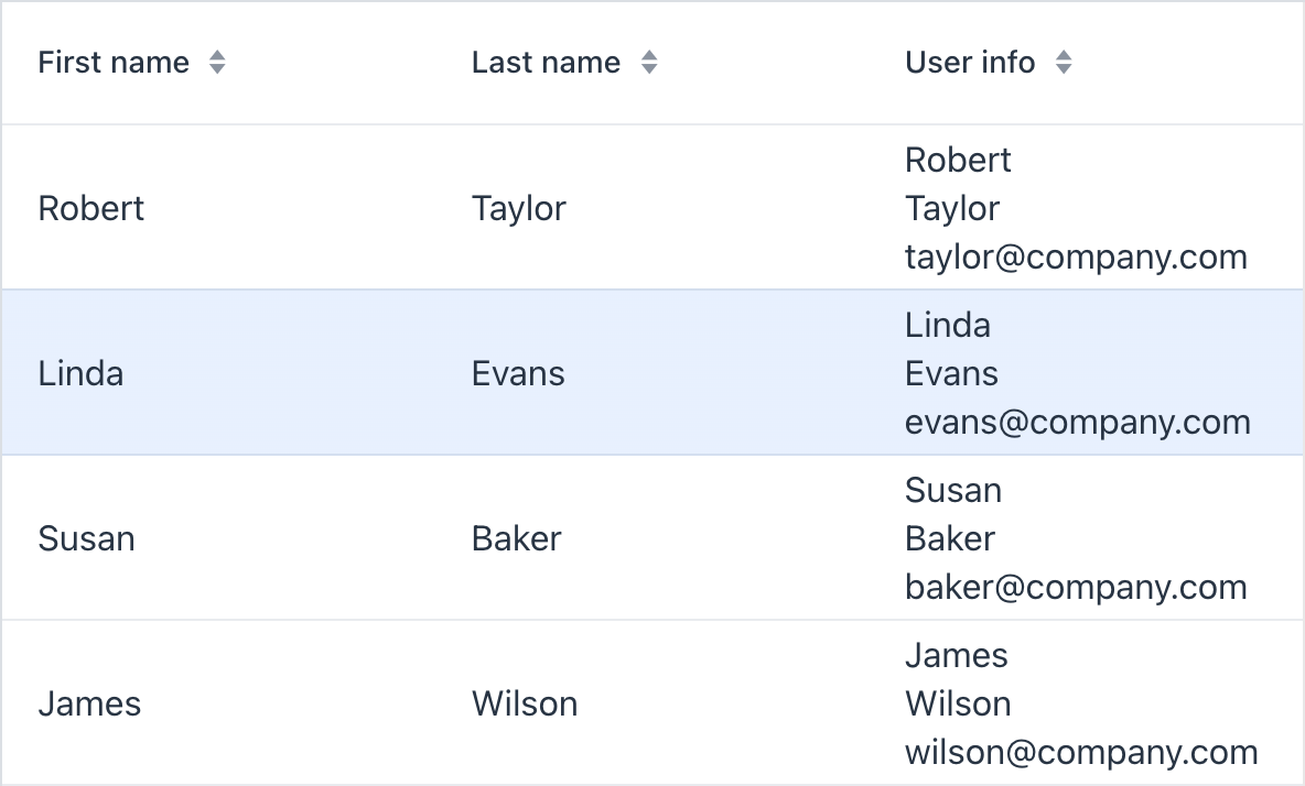
@Supply(to = "dataGridLit.userInfo", subject = "renderer")
private Renderer<User> dataGridLitUserInfoRenderer() {
    return LitRenderer.<User>of("${item.firstName}<br>${item.lastName}<br>${item.email}")
            .withProperty("firstName", User::getFirstName)
            .withProperty("lastName", User::getLastName)
            .withProperty("email", User::getEmail);
}
You can use LitRenderer in the following UI components:
Fragment Renderer
Renderers for virtualList, dataGrid and other components can be defined using fragments. A special fragmentRenderer XML element is used to declaratively describe a renderer.
Like regular fragments, a fragmentRenderer is defined using a descriptor and a Java controller.
-
Create FragmentRenderer XML-descriptor
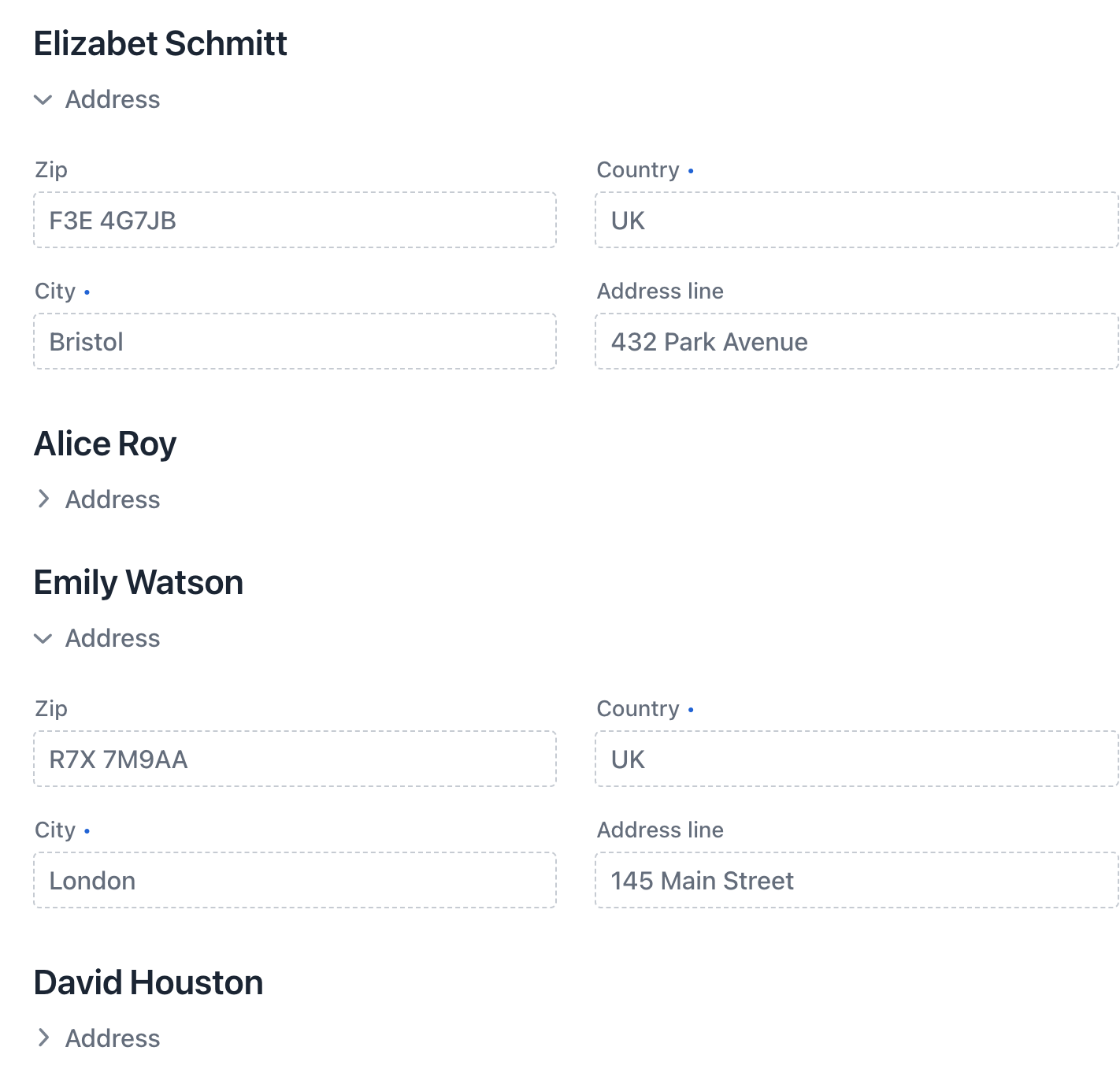
The descriptor can contain an optional instanceContainer for the entity that will be used by the renderer.
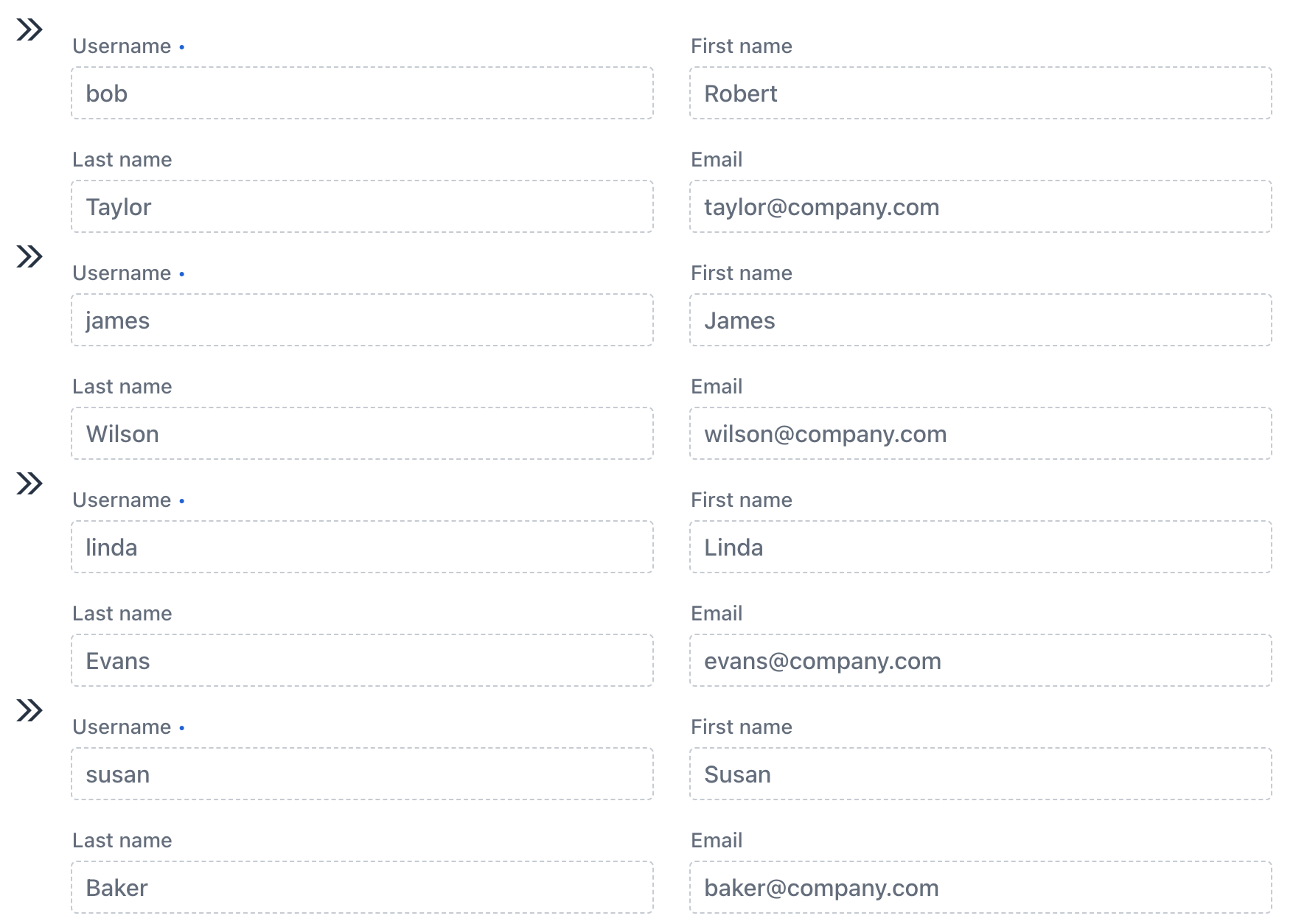
<fragment xmlns="http://jmix.io/schema/flowui/fragment">
    <data>
        <instance id="userDc" class="com.company.onboarding.entity.User">
            <loader id="userDl"/>
            <fetchPlan extends="_base"/>
        </instance>
    </data>
    <content>
        <hbox>
            <icon icon="ANGLE_DOUBLE_RIGHT"/>
            <formLayout id="form" dataContainer="userDc">
                <textField property="username" readOnly="true"/>
                <textField property="firstName" readOnly="true"/>
                <textField property="lastName" readOnly="true"/>
                <textField property="email" readOnly="true"/>
            </formLayout>
        </hbox>
    </content>
</fragment>
If the instance container is not defined, you can use the FragmentRenderer.getItem()method to handle rendering. -
Create FragmentRenderer Java Controller
The fragment renderer class should extend the
FragmentRendererbase class with type parameters indicating the root component and rendered entity, for example:@FragmentDescriptor("user-fragment.xml") (1) @RendererItemContainer("userDc") (2) public class UserFragment extends FragmentRenderer<HorizontalLayout, User> { }1 The @FragmentDescriptorannotation specifies a string value that is a path to an XML file which is used for the fragment initialization.2 The @RendererItemContainerannotation is used to specify the data container that accepts the rendered entity. -
Use FragmentRenderer in a View
Select the component where you want to render items and include the
fragmentRendererelement. This element requires aclassattribute specifying the fully qualified name (FQN) of a class extending the abstractio.jmix.flowui.fragmentrenderer.FragmentRendererclass.<virtualList itemsContainer="usersDc"> <fragmentRenderer class="com.company.onboarding.view.component.virtuallist.UserFragment"/> </virtualList>To add a
fragmentRendererin Jmix Studio, select the UI component in the view descriptor XML or in the Jmix UI structure panel and click on the Add→FragmentRenderer button in the Jmix UI inspector panel.The
fragmentRendererelement also supports loading properties, just like thefragmentelement.
You can use fragmentRenderer in the following UI components:
