3. Styling
In this chapter, you will create:
-
Actions to control the visibility of columns.
-
Visual styles for a component using properties.
-
Renderers for column footers.
Adding Column Action Buttons
The Kanban board component supports dynamic changes to the display and visibility settings of columns. To enable this feature, you need to set the columnActionsEnabled attribute. This attribute adds a column visibility control button to the header. To be able to collapse a column, you need to set the collapsible attribute.
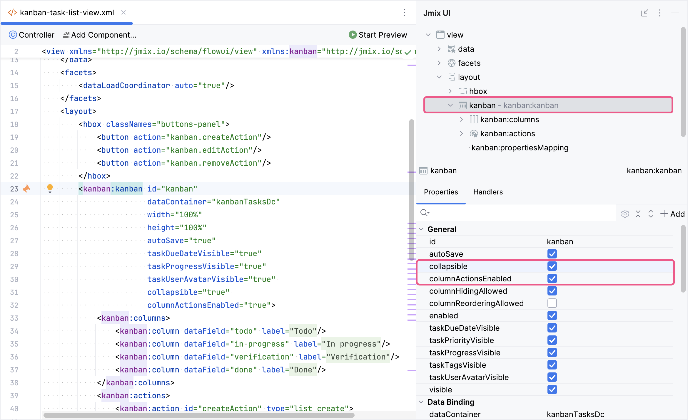
Locate kanban-task-list-view.xml in the Jmix tool window and double-click it. Select kanban within the Jmix UI hierarchy panel or in the XML descriptor. Next, check the collapsible and columnActionsEnabled boxes:

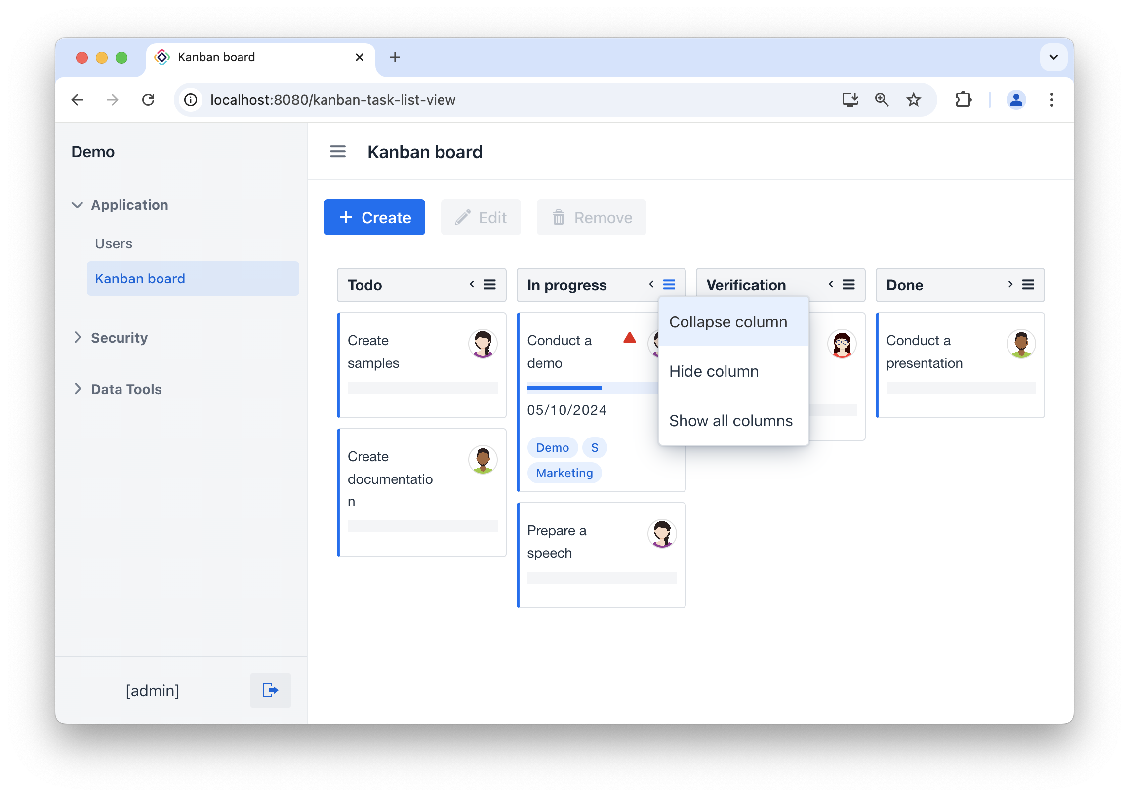
Press Ctrl/Cmd+S and switch to the running application. Open the Kanban board view. Column visibility controls are now available.
|
To save the state of the columns after closing the view, you can use the Settings Facet. |

Styling via Properties
There are many Kanban attributes that change the visual appearance of the component. You need to add the following attributes:
-
columnSummaryEnabled,columnFooterVisible- to display the summary. -
columnColorEntireSurfaceEnabled- to highlight the background of the columns with a contrasting color. -
dropPlaceholderAllowed- to add a placeholder when moving task cards. -
colorfor columns,applyColumnColorToTasks- for special highlighting of each column.
All these attributes can be added using the Jmix UI component inspector panel or using XML markup.
<kanban:kanban id="kanban"
               dataContainer="kanbanTasksDc"
               width="100%"
               height="100%"
               autoSave="true"
               taskDueDateVisible="true"
               taskProgressVisible="true"
               taskUserAvatarVisible="true"
               collapsible="true"
               columnActionsEnabled="true"
               applyColumnColorToTasks="true"
               columnFooterVisible="true"
               columnSummaryEnabled="true"
               columnColorEntireSurfaceEnabled="true"
               dropPlaceholderAllowed="true">
    <kanban:columns>
        <kanban:column dataField="todo"
                       label="msg://kanban.column.todo.label"
                       color="#006AF5"/>
        <kanban:column dataField="in-progress"
                       label="msg://kanban.column.in-progress.label"
                       color="#CA150C"/>
        <kanban:column dataField="verification"
                       label="msg://kanban.column.verification.label"
                       color="#FFCC00"/>
        <kanban:column dataField="done"
                       label="msg://kanban.column.done.label"
                       color="#192434"/>
    </kanban:columns>

    <!-- other elements -->
</kanban:kanban>
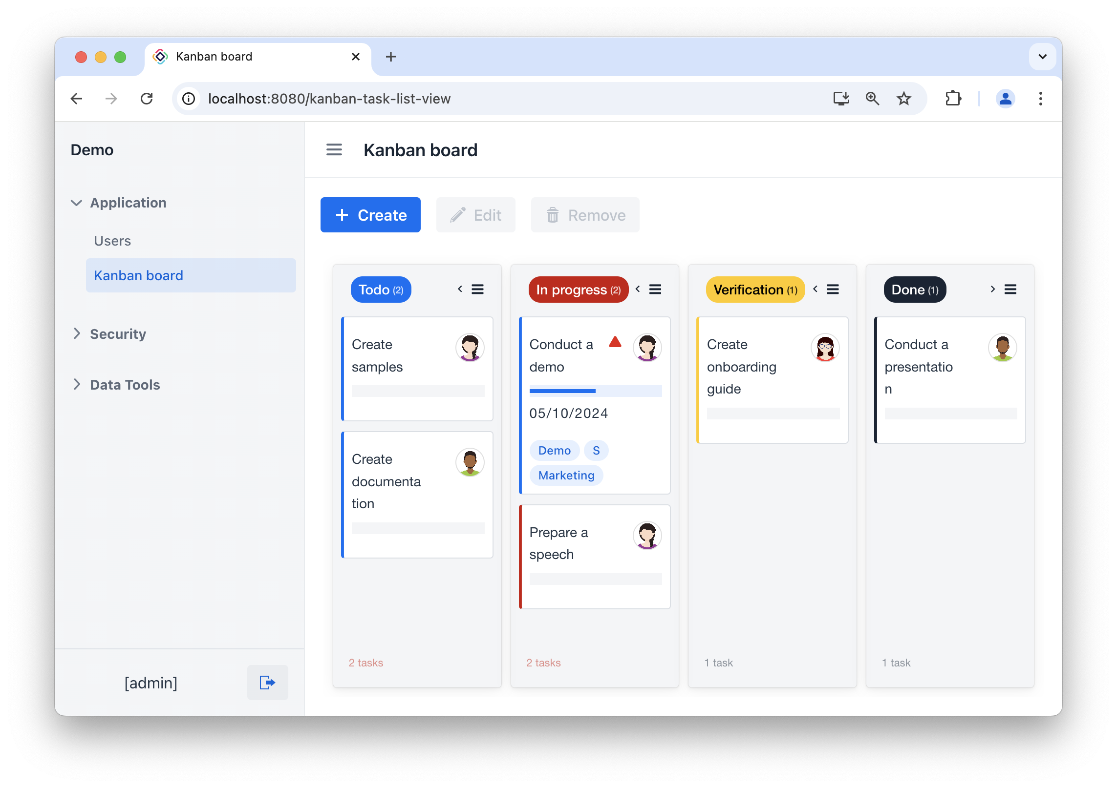
Press Ctrl/Cmd+S and switch to the running application. The appearance of the Kanban board will now change:

Rendering Column Footers
The kanban component supports custom JavaScript renderers to style and display the task cards and columns. See renderers section for more information.
To highlight a column that has too many tasks, you need to define a renderer for the column footer.
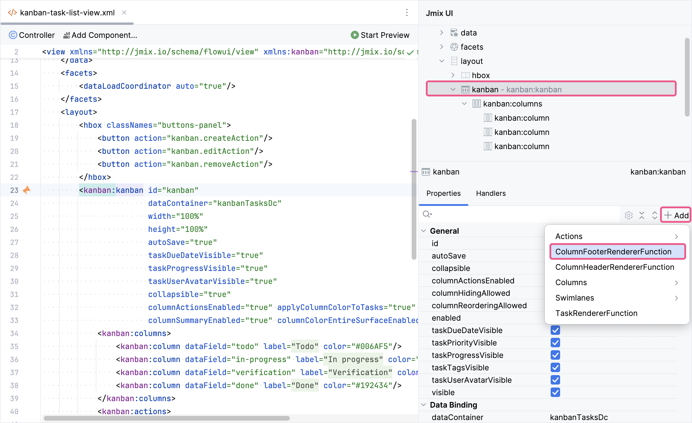
To do this, select kanban in the Jmix UI hierarchy panel or in the XML descriptor, then click the Add button in the component inspector panel. From the drop-down list, choose ColumnFooterRendererFunction:

ColumnFooterRendererFunction is defined by a callback function that can be used for customizing column footer rendering. The callback function has three arguments: the column footer HTML element, column data, and the column data field.
You need to implement a callback that will highlight the footer if there are more than one task in a column:
<kanban:columnFooterRendererFunction>
    <![CDATA[(footer, data, dataField) => {
            // gets numbers
            const digitsString = footer.textContent.match(/(\d+)/)[0];
            const number = Number(digitsString);

            if (number > 1) {
                footer.style.color = '#CA150C';
            } else {
                footer.style.color = 'var(--smart-surface-color)';
            }
        }]]>
</kanban:columnFooterRendererFunction>
Press Ctrl/Cmd+S and switch to the running application.

Summary
This section has explained how to customize the visual appearance of your Kanban board in Jmix.
-
Styling via Properties: You have discovered how to use built-in
kanbanadd-on properties to control various aspects of thekanbancomponent’s visual style, such as column colors, displaying the summary, and so on. -
Column Footer Renderers: You have explored how to define custom renderers for column footers, allowing you to display additional information or highlight important aspects of each column.
-
Adding Column Action Buttons: You have understood how to implement buttons that allow users to control the visibility or other actions for individual columns.
