Styling UI Components
Vaadin and Jmix components provide several ways to change their appearance. Start with the highest-level option that meets your needs and write custom CSS only when necessary.
Use the following order:
-
Customize the application theme.
-
Use a built-in component theme variant.
-
Apply custom CSS to components.
-
Change styles in Java.
Application Theme
The most consistent way to style an application and its integral parts is through its theme. Vaadin provides a visual theme editor for both Aura and Lumo to help configure their style properties.
See Customizing Aura and Customizing Lumo.
Component Theme Variants
Many components provide built-in theme variants that change color, size, or another part of their appearance. Apply component theme variants using the themeNames XML attribute or a Java API such as addThemeVariants() and addThemeNames().
<hbox>
    <button text="Primary" themeNames="primary"/>
    <button text="Success" themeNames="success"/>
    <button text="Tertiary" themeNames="tertiary"/>
</hbox>
| Aura and Lumo do not support exactly the same component theme variants. Component reference pages indicate whether each theme variant is supported by Aura, Lumo, or both. |
Applying CSS to Components
Use application CSS to set component style properties or write rules that target component elements and states.
For a Vaadin component, use its Styling page in the Vaadin component reference to find supported style properties and selectors. For a Jmix component, use browser developer tools to inspect the rendered structure. If it contains a vaadin-* element, use the Styling page for that Vaadin component. See the Vaadin styling overview.
|
Styling All Component Instances
Vaadin components provide CSS custom properties with the --vaadin- prefix. Vaadin calls them component style properties. They are the main API for changing component styles.
Set a component style property on the html element to change all instances that use it. Use a component selector to limit a shared style property to a component type:
html {
    --vaadin-button-border-radius: 1em;
}

vaadin-text-field {
    --vaadin-input-field-border-radius: 2em;
}
Styling Specific Component Instances
Use the classNames XML attribute or the addClassName() Java method to apply a CSS class to selected component instances:
<textField classNames="wide"/>vaadin-text-field.wide {
width: 24em;
}You can also scope rules to components inside a parent element with a custom class:
.button-row vaadin-button {
    flex: 1;
}
Component Parts
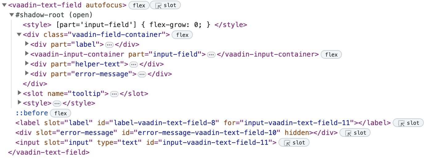
Vaadin and Jmix components are more complex than native HTML elements. Many internal elements are located in the shadow DOM. The shadow DOM prevents global CSS from changing internal elements by accident.
Root Elements
Each component has a root HTML element whose name usually starts with vaadin- or jmix-, for example vaadin-button or jmix-value-picker.
jmix-value-picker {
    margin-block: 1em;
}
Shadow Parts
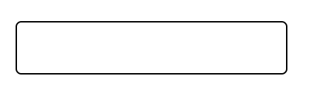
Shadow parts are elements inside the component shadow DOM. Use the ::part() selector. For example, use the input-field part to change the input surface of a text field:
vaadin-text-field::part(input-field) {
    background: white;
    border: 1px solid black;
}
| See the Text Field CSS selectors for all shadow parts exposed by the component. |
Regular Child Elements
Regular child elements are outside the component’s shadow DOM. Use the > selector to target a direct child. For example, the following rule targets icons placed inside buttons:
vaadin-button > vaadin-icon {
    color: blue;
}| See the Button CSS selectors for the CSS selectors supported by the component. |
Component States
Components expose states such as disabled, read-only, invalid, and focused. Most states are available as attributes on the component root element. State attribute selectors can be combined with part selectors:
vaadin-text-field[readonly]::part(input-field) {
    border-color: gray;
}
Native states such as hover use CSS pseudo-classes. They can be combined with exposed pseudo-elements. For example, Button exposes a ::before pseudo-element for its hover highlight:
vaadin-button:hover::before {
    background-color: blue;
}
Changing Styles in Java
Use the component Style API to set inline CSS properties from Java:
@ViewComponent
private JmixButton myBtn;

@Subscribe
public void onInit(final InitEvent event) {
    myBtn.getStyle().set("color", "white");
    myBtn.getStyle().set("background-color", "purple");
}| Inline styles apply only to the component root element. They cannot directly target component parts or apply conditionally based on component states. |
Another option is to use CSS custom properties. These can be built-in component or theme style properties, or properties defined by the application. Reference them from CSS rules and set their values from Java:
html {
    --my-button-text-color: darkblue;
    --my-button-bg-color: yellow;
}

vaadin-button.my-button {
    color: var(--my-button-text-color);
    background-color: var(--my-button-bg-color);
}<button id="myBtn"
text="Button"
classNames="my-button"/>@Subscribe
public void onInit(final InitEvent event) {
UI.getCurrent().getElement().getStyle()
.set("--my-button-text-color", "white");
UI.getCurrent().getElement().getStyle()
.set("--my-button-bg-color", "purple");
}The CSS rule remains in the application stylesheet, so it can target component parts and states. The same custom property can also be used by multiple rules.