Visual Components
Jmix views are built from visual components that have server-side Java interface and can be declared in XML using corresponding XML elements.
For example, the following XML descriptor defines a view which displays a text field, a button and a label:
<view xmlns="http://jmix.io/schema/flowui/view">
    <layout>
        <textField id="nameField"
                   placeholder="Enter your name"
                   datatype="string"/>
        <button id="helloButton" text="Say Hello"/>
        <div id="greetingsLabel"/>
    </layout>
</view>
In the Java class of the view, you can listen to the button click event, get the text field value and set it to the label:
@ViewComponent
private TypedTextField<String> nameField;

@ViewComponent
private Div greetingsLabel;

@Subscribe("helloButton")
private void onHelloButtonClick(ClickEvent<Button> event) {
    greetingsLabel.setText("Hello " + nameField.getTypedValue());
}
As you can see, the text field component is represented by the TypedTextField class in Java. TypedTextField extends the Vaadin’s TextField component and adds support for different value types, data binding and other Jmix-specific capabilities.
The label is the Vaadin’s Div component, which represents the HTML div element.
In general, each visual component in Jmix consists of the following parts:
-
Java class extending Component. It can be one of the Vaadin’s standard components, its extended version, or a completely new component based on Composite or created from scratch.
-
XML element for defining the component declaratively in view XML descriptors.
-
Loader that reads the XML element and instantiates the component.
Items 2 and 3 are optional: you can just instantiate any subclass of com.vaadin.flow.component.Component in your view and add it to a parent component to show on the browser page. But when the component has an XSD and a loader class, it’s much easier to use. Additionally, it can be exposed to Studio using a few annotations.
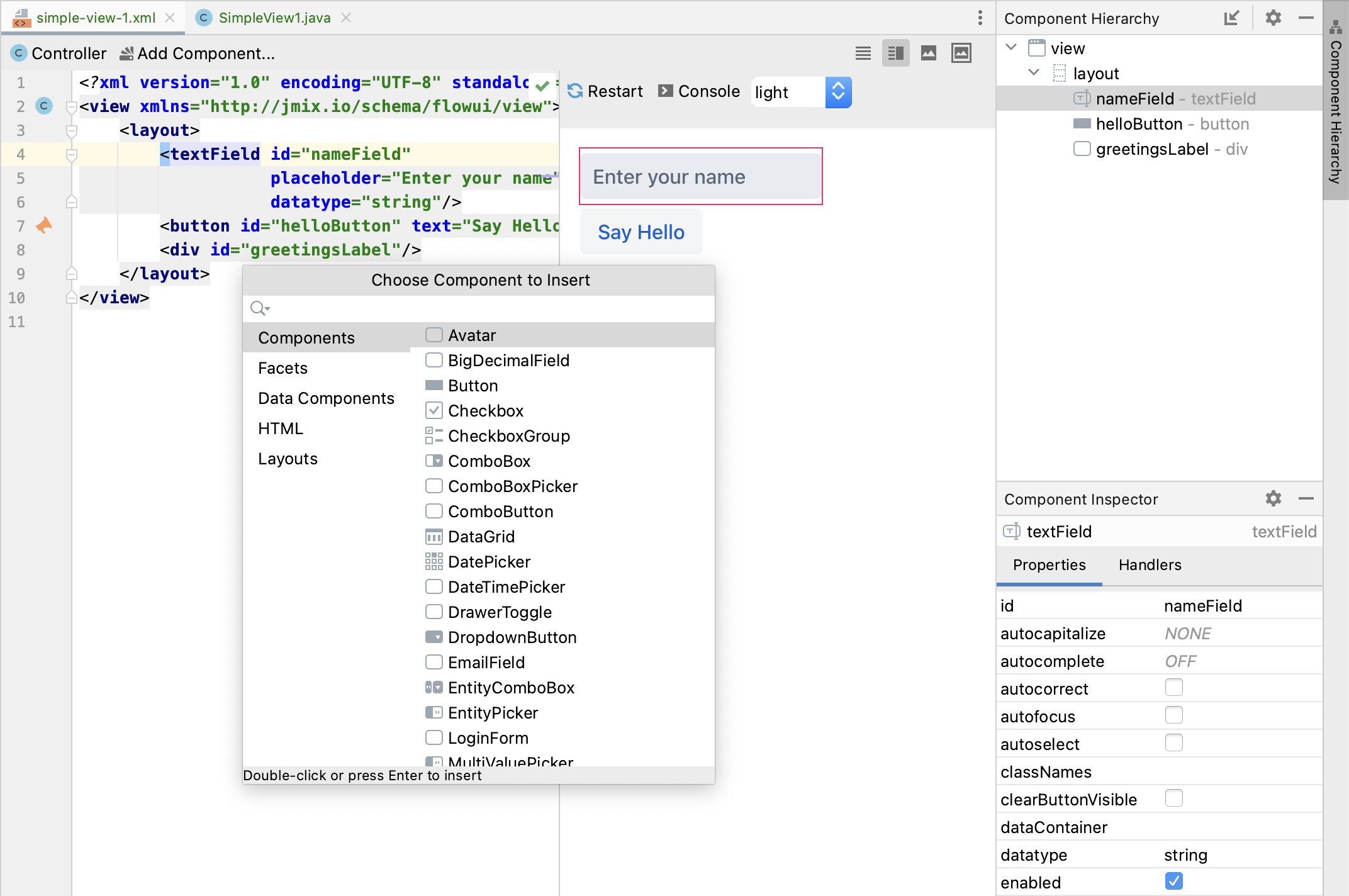
Studio allows you to build views in a visual designer with a preview, components structure and properties panels. When you click the Add Component button, Studio shows a palette of available components: