menuFilterField
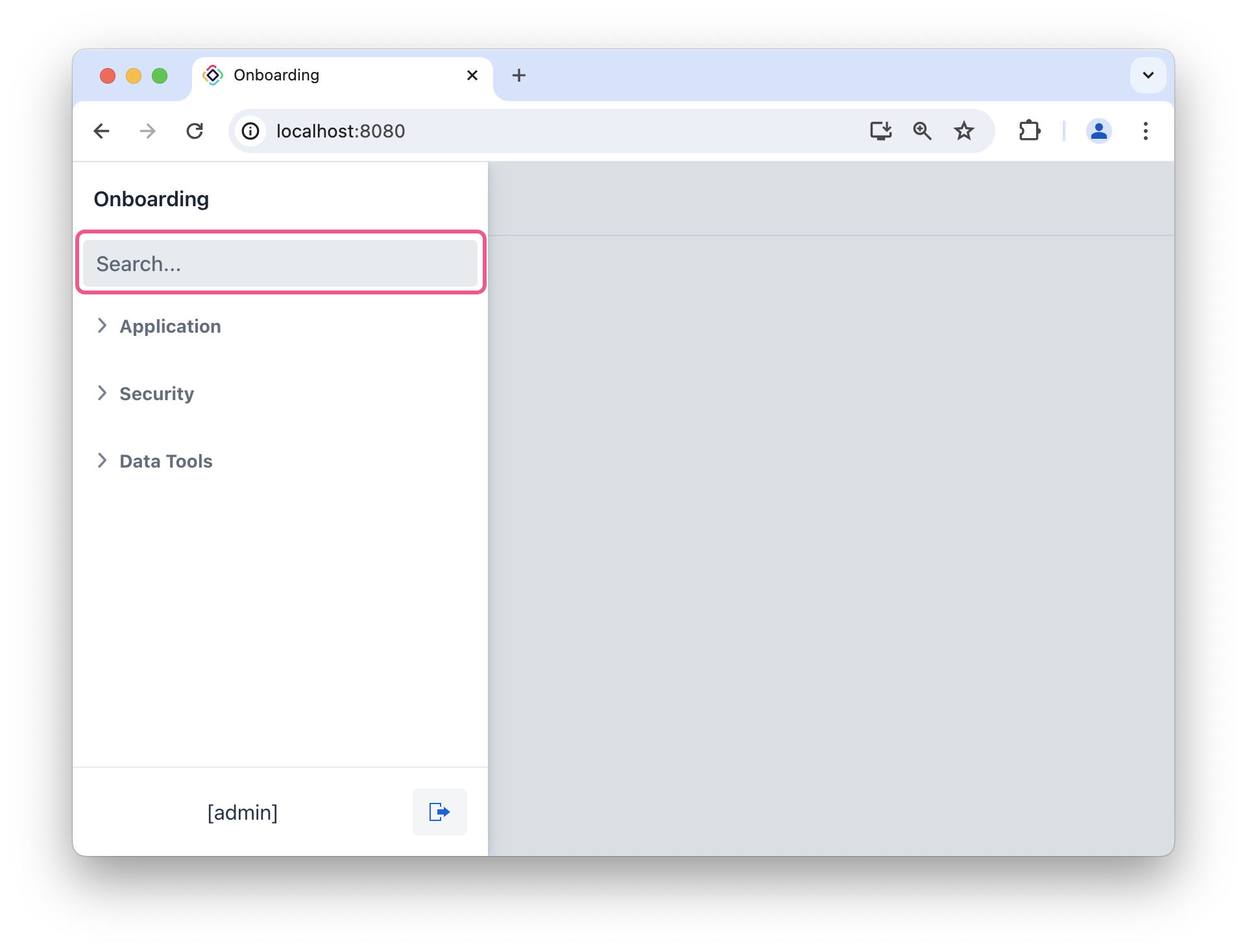
The menuFilterField component filters main-menu items by their text labels.
XML Element |
|
|---|---|
Java Class |
|
Basics
Place menuFilterField in the main view and set its required menu attribute to the id of the listMenu it should filter. As users type, the field limits the visible menu entries according to the configured filterMode:
<menuFilterField placeholder="Search..."
                 classNames="ms-s me-s"
                 menu="menu"/> (1)
<nav id="navigation"
     classNames="jmix-main-view-navigation"
     ariaLabel="msg://navigation.ariaLabel">
    <listMenu id="menu"/>
</nav>| 1 | References the listMenu component that supplies the items to filter. |
| The component does not support filtering horizontalMenu. |
Theme Variants
Use the themeNames attribute to change the field’s appearance.
| Variant | Description | Supported By |
|---|---|---|
|
Aligns the field value to the left side. |
Aura, Lumo |
|
Centers the field value. |
Aura, Lumo |
|
Aligns the field value to the right side. |
Aura, Lumo |
|
Aligns the field value to the start side, taking the current text direction into account. |
Aura |
|
Aligns the field value to the end side, taking the current text direction into account. |
Aura |
|
Renders the helper text above the field, below the label. |
Aura, Lumo |
|
Makes the component smaller. |
Aura, Lumo |
Attributes
The following attributes are specific to menuFilterField:
| Name | Description | Default |
|---|---|---|
Controls whether matching is case-sensitive. |
|
|
References the |
— |
|
Shows a button that clears the current value. |
|
|
Selects the complete value when the field receives focus. |
|
The following shared attributes are supported by menuFilterField:
id - label - placeholder - helperText - value - autofocus - readOnly - enabled - valueChangeMode - valueChangeTimeout - focusShortcut - tabIndex - themeNames - visible - width - height - minWidth - maxWidth - minHeight - maxHeight - alignSelf - colspan - classNames - css - ariaLabel - ariaLabelledBy - title