textArea
An area to enter multiple lines of text.
XML Element |
|
|---|---|
Java Class |
|
Attributes |
General: id - enabled - helperText - label - placeholder - readOnly - value - visible |
Data Binding: dataContainer - property |
|
Size: height - maxHeight - maxWidth - minHeight - minWidth - width |
|
Look & Feel: classNames - clearButtonVisible - css - maxRows - minRows - themeNames |
|
Validation: errorMessage - maxLength - minLength - pattern - required |
|
Other: allowedCharPattern - ariaLabel - ariaLabelledBy - autocapitalize - autocomplete - autocorrect - autofocus - autoselect - focusShortcut - tabIndex - trimEnabled |
|
Handlers |
AttachEvent - BlurEvent - ClientValidatedEvent - ComponentValueChangeEvent - CompositionEndEvent - CompositionStartEvent - CompositionUpdateEvent - DetachEvent - FocusEvent - InputEvent - KeyDownEvent - KeyPressEvent - statusChangeHandler - validator |
Elements |
Basics
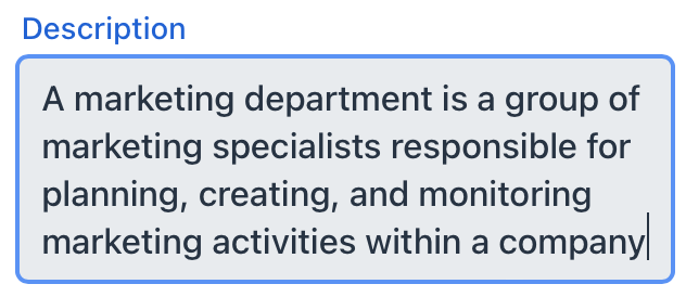
Use textArea when the expected input could span multiple lines such as commentary or descriptions.
<textArea label="Comment"
          value="Great job. This is excellent!"/>
Unless set to a fixed height, textArea adjusts its height automatically based on its content. The default and minimum height is two rows of text.
Data Binding
Data binding refers to linking a visual component to a data container. Changes in the visual component or corresponding data container can trigger updates to one another. See Using Data Components for more details.
The following example produces a data-aware textArea:
<textArea id="textArea" label="Order description"
          dataContainer="orderDc"
          property="description"/>
Ensure that the entity attribute you are binding to is of String type. Unlike textField, textArea is specifically designed to work with textual data.
Theme Variants
Use themeNames attribute to set a component theme.
| Variant | Description | Supported By |
|---|---|---|
|
Makes the component smaller. |
Aura, Lumo |
|
Aligns the field value to the left side. |
Aura, Lumo |
|
Centers the field value. |
Aura, Lumo |
|
Aligns the field value to the right side. |
Aura, Lumo |
|
Renders the helper text above the field, below the label. |
Aura, Lumo |
Attributes
Common attributes serve the same purpose for all components.
The following attributes are specific to textArea:
Name |
Description |
Default |
|---|---|---|
Set to |
– |
|
Sets the maximum number of rows. |
– |
|
Sets the minimum number of rows. |
2 |
|
If Configure this setting application-wide using the jmix.ui.component.default-trim-enabled property. |
– |
Handlers
Common handlers are configured in the same way for all components.
The following handlers are specific to textArea:
|
To generate a handler stub in Jmix Studio, use the Handlers tab of the Jmix UI inspector panel or the Generate Handler action available in the top panel of the view class and through the Code → Generate menu (Alt+Insert / Cmd+N). |
Name |
Description |
|---|---|
Adds a validator instance to the component. |
See Also
See the Vaadin Docs for more information.
