entityComboBox
An input field to select an entity instance from a drop-down list and perform relevant actions. These can be both predefined actions such as updating instance details, as well as custom actions to perform more specific tasks.
This component is, in fact, a hybrid of the comboBox and entityPicker components.
-
XML element:
entityComboBox -
Java class:
EntityComboBox
Basics
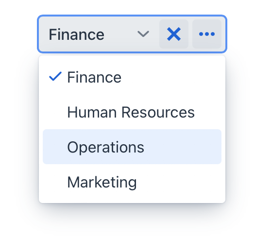
The entityComboBox component is commonly used when the field value must represent a reference to an entity. It enables users to select a particular entity instance with the ability to perform relevant actions.
Clicking the field or arrow button opens a drop-down list containing all existing instances of the entity:
|
|
Note that unless you have configured lazy loading, the component will load a list of all available instances into both the browser’s memory and the server’s memory. This can consume substantial system resources and may impact performance, especially for large number of items. Furthermore, users may find it challenging to search for a specific instance within a lengthy drop-down list.
| If the expected number of items is large, such as thousands or more, or if making a selection requires providing additional context about each item, it is recommended to use entityPicker. |
Quick Start
The following example demonstrates how to use the entityCombobox component to select the department the user belongs to:
<data>
    <instance class="com.company.onboarding.entity.User"
              id="userDc"> (1)
        <fetchPlan extends="_base"> (2)
            <property name="department" fetchPlan="_base"/>
        </fetchPlan>
        <loader id="userDl"/>
    </instance>
    <collection class="com.company.onboarding.entity.Department"
                id="departmentsDc"> (3)
        <fetchPlan extends="_base"/>
        <loader id="departmentsDl">
            <query>
                <![CDATA[select e from Department e]]>
            </query>
        </loader>
    </collection>
</data>
<facets>
    <dataLoadCoordinator auto="true"/> (4)
</facets>
<layout>
    <entityComboBox dataContainer="userDc"
                    property="department"
                    itemsContainer="departmentsDc"> (5)
        <actions>
            <action id="entityClear" type="entity_clear"/> (6)
        </actions>
    </entityComboBox>
</layout>| 1 | Data container to hold the User instance which is currently being edited. |
| 2 | Fetch plan extended to retrieve a collection of Department instances that will be available for selection. |
| 3 | Data container to hold a collection of all existing Department instances. |
| 4 | Data load coordinator to automatically supply the component with instances to select from. |
| 5 | Binding the component to a data container and property. Specifying the container that holds the list of items to be selected. |
| 6 | Adding a predefined action to clear the selection. |
For more interactive examples of the entityComboBox and its variations, see:
Data Binding
Data binding refers to linking a visual component to a data container. Changes in the visual component or corresponding data container can trigger updates to one another. See Using Data Components for more details.
Select an instance
If you simply need a way to select an instance of a specific entity, specify that entity using the metaClass attribute. To specify a collection of instances for selection use the itemsContainer attribute.
<entityComboBox metaClass="Department"
                itemsContainer="departmentsDc">
    // ...
</entityComboBox>
Select an instance to update a related attribute
Selecting an instance is often intended to update an attribute within another instance. In the example above, selecting a Department instance updates the User instance by associating it with the chosen department.
In such cases you will need to bind the component to the data container holding the instance and specify the attribute to be updated using the dataContainer and property attributes respectively. To specify a collection of instances for selection use the itemsContainer attribute.
<entityComboBox dataContainer="userDc"
                property="department"
                itemsContainer="departmentsDc">
    // ...
</entityComboBox>
Actions
Initially entityComboBox does not have any actions. You need to add them explicitly, for example:
<entityComboBox dataContainer="userDc"
                property="department"
                itemsContainer="departmentsDc">
    <actions>
        <action id="entityClear" type="entity_clear"/>
        <action id="entityLookup" type="entity_lookup"/>
        <action id="entityOpen" type="entity_open"/>
    </actions>
</entityComboBox>|
To add |
See detailed information on defining custom and predefined actions in the Actions section for entityPicker.
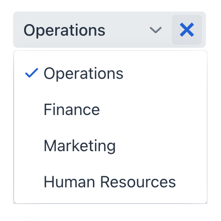
Lazy Loading
The component supports loading items in batches in response to user input, rather than loading all items at once. This helps to ensure a smooth user experience, even when dealing with a large number of items.
Declarative Configuration
To implement lazy loading in the view descriptor, instead of specifying the itemsContainer attribute configure the itemsQuery nested element. For example, to load at most 30 items and show them in the list, do the following:
<entityComboBox metaClass="Department" pageSize="30"> (1)
    <itemsQuery class="com.company.onboarding.entity.User"
                searchStringFormat="(?i)%${inputString}%"
                escapeValueForLike="true"
                fetchPlan="_instance_name"> (2)
        <query>
            <![CDATA[select e from Department e where e.name like :searchString order by e.name]]> (3)
        </query>
    </itemsQuery>
</entityComboBox>| 1 | The pageSize attribute defines the batch size when loading data from the database. It is 50 by default. |
| 2 | Attributes in the itemsQuery provide control over the fetching process. They are as follows:
|
| 3 | A JPQL query. |
|
The |
Programmatic Configuration
Items fetching can also be defined programmatically using the itemsFetchCallback handler. For example:
<entityComboBox id="departmentComboBox" metaClass="Department"/>@ViewComponent
private EntityComboBox<Department> departmentField;
@Install(to = "departmentComboBox", subject = "itemsFetchCallback")
private Stream<Department> departmentFieldItemsFetchCallback(final Query<Department, String> query) {
String param = query.getFilter().orElse("");
return dataManager.load(Department.class)
.condition(PropertyCondition.contains("name", param).skipNullOrEmpty())
.firstResult(query.getOffset())
.maxResults(query.getLimit())
.list()
.stream();
}In this example, data is fetched using DataManager, but you can use this approach to load from a custom service as well.
Custom Renderer
By default, instances displayed in a drop-down list are typically rendered as plain text. A custom renderer allows you to define a rendering logic for each item in the drop-down, enabling you to include various components, icons, or even layouts.
For example, define the following renderer to add an icon before a department name:
@Supply(to = "customRendererField", subject = "renderer")
private Renderer<Department> departmentRenderer() {
    return new ComponentRenderer<>(department -> {
        Icon icon = VaadinIcon.USERS.create();
        HorizontalLayout contentBox = uiComponents.create(HorizontalLayout.class);
        contentBox.setPadding(false);
        contentBox.add(icon);
        contentBox.add(department.getName());
        return contentBox;
    });
}
Alternatively, you can render items using a nested fragmentRenderer element. Refer to the Fragment Renderer section for more information.
Theme Variants
Use themeNames attribute to set a component theme.
| Variant | Description | Supported By |
|---|---|---|
|
Aligns the field value to the left side. |
Aura, Lumo |
|
Centers the field value. |
Aura, Lumo |
|
Aligns the field value to the right side. |
Aura, Lumo |
|
Aligns the field value to the start side, taking the current text direction into account. |
Aura |
|
Aligns the field value to the end side, taking the current text direction into account. |
Aura |
|
Renders the helper text above the field, below the label. |
Aura, Lumo |
|
Makes the component smaller. |
Aura, Lumo |
Attributes
id - alignSelf - allowCustomValue - ariaLabel - ariaLabelledBy - allowedCharPattern - autoOpen - autofocus - classNames - colspan - css - dataContainer - enabled - errorMessage - focusShortcut - height - helperText - itemsContainer - label - maxHeight - maxWidth - metaClass - minHeight - minWidth - opened - overlayClass - pageSize - pattern - placeholder - property - readOnly - required - requiredMessage - tabIndex - themeNames - title - visible - width
allowCustomValue
If the allowCustomValue attribute is true, the user can input string values that do not match any existing item labels, which will fire CustomValueSetEvent.
Note that entityComboBox doesn’t do anything with the custom value string automatically. Use CustomValueSetEvent to determine how the custom value should be handled.
Default is false.
itemsContainer
Sets the name of a data container which contains a list of items. The component will display the instance name of an entity instance.
Handlers
AttachEvent - BlurEvent - ComponentValueChangeEvent - CustomValueSetEvent - DetachEvent - FocusEvent - itemLabelGenerator - statusChangeHandler - validator - renderer
|
To generate a handler stub in Jmix Studio, use the Handlers tab of the Jmix UI inspector panel or the Generate Handler action available in the top panel of the view class and through the Code → Generate menu (Alt+Insert / Cmd+N). |
CustomValueSetEvent
com.vaadin.flow.component.combobox.ComboBoxBase.CustomValueSetEvent is fired when the user enters a non-empty value that does not match any of the existing items. To enable input custom values, set the allowCustomValue attribute to true.
<entityComboBox dataContainer="userDc"
                property="department"
                itemsContainer="departmentsDc"
                id="departmentField"
                allowCustomValue="true"/>
@ViewComponent
private CollectionContainer<Department> departmentsDc;
@ViewComponent
private EntityComboBox<Department> departmentField;
@Autowired
private DataManager dataManager;
@Subscribe("departmentField")
public void onDepartmentFieldCustomValueSet(ComboBoxBase.CustomValueSetEvent
<ComboBox<Department>> event) {
Department department = dataManager.create(Department.class); (1)
department.setName(event.getDetail()); (2)
departmentsDc.getMutableItems().add(department); (3)
departmentField.setValue(department);
}| 1 | Create a new instance and merge it into the context. |
| 2 | Set the name of the newly created department entity. |
| 3 | Add merged entity. |
Elements
actions - fragmentRenderer - itemsQuery - prefix - tooltip - validator
