flexLayout
The flexLayout component is a layout component that implements the CSS Flexbox model. It provides a flexible and responsive way to arrange and style child components within a container using CSS. flexLayout uses the default flex-direction and doesn’t have any predetermined width or height.
XML Element |
|
|---|---|
Java Class |
|
Attributes |
id - alignItems - alignSelf - classNames - clickShortcut - colspan - contentAlignment - css - enabled - expand - flexDirection - flexWrap - height - justifyContent - maxHeight - maxWidth - minHeight - minWidth - visible - width |
Handlers |
AttachEvent - clickListener - doubleClickListener - singleClickListener - DetachEvent |
Content Alignment
The contentAlignment attribute maps to the CSS align-content property. This property controls how lines within a flex container are aligned along the cross-axis when there’s extra space. It works similarly to how justify-content aligns individual items within the main axis.
This property only affects multi-line flex containers, where flex-wrap is set to either wrap or wrap-reverse. A single-line flex container (i.e., where flex-wrap is set to its default value, no-wrap) will not be affected by align-content.
|
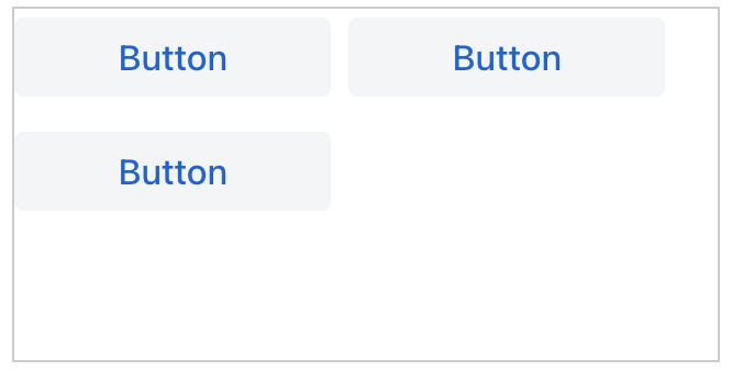
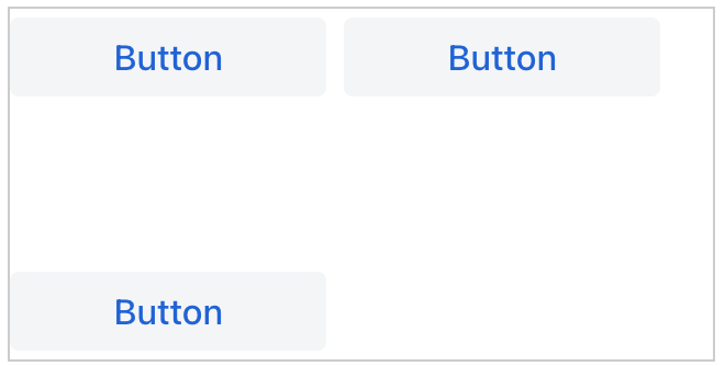
START
Items are positioned at the beginning of the container.
XML code
<flexLayout contentAlignment="START"
css="gap: 0.5em; border: 1px solid #ccc;"
width="20em"
minHeight="10em"
flexWrap="WRAP">
<button text="Button" width="9em"/>
<button text="Button" width="9em"/>
<button text="Button" width="9em"/>
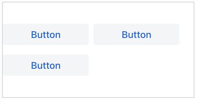
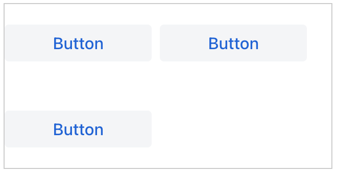
</flexLayout>CENTER
Items are positioned at the center of the container.
XML code
<flexLayout contentAlignment="CENTER"
css="gap: 0.5em; border: 1px solid #ccc;"
width="20em"
minHeight="10em"
flexWrap="WRAP">
<button text="Button" width="9em"/>
<button text="Button" width="9em"/>
<button text="Button" width="9em"/>
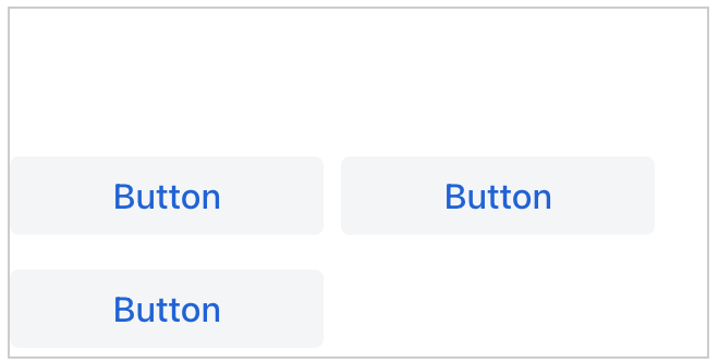
</flexLayout>END
Items are positioned at the end of the container.
XML code
<flexLayout contentAlignment="END"
css="gap: 0.5em; border: 1px solid #ccc;"
width="20em"
minHeight="10em"
flexWrap="WRAP">
<button text="Button" width="9em"/>
<button text="Button" width="9em"/>
<button text="Button" width="9em"/>
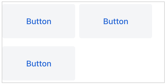
</flexLayout>STRETCH
Items are stretched to fit the container.
XML code
<flexLayout contentAlignment="STRETCH"
            css="gap: 0.5em; border: 1px solid #ccc;"
            width="20em" minHeight="10em"
            flexWrap="WRAP">
    <button text="Button" width="9em" height="AUTO"/>
    <button text="Button" width="9em" height="AUTO"/>
    <button text="Button" width="9em" height="AUTO"/>
</flexLayout>
SPACE_BETWEEN
Items are distributed evenly inside the container. The first item is flush with the start, the last is flush with the end.
XML code
<flexLayout contentAlignment="SPACE_BETWEEN"
            css="gap: 0.5em; border: 1px solid #ccc;"
            width="20em" minHeight="10em"
            flexWrap="WRAP">
    <button text="Button" width="9em"/>
    <button text="Button" width="9em"/>
    <button text="Button" width="9em"/>
</flexLayout>
SPACE_AROUND
Items are distributed evenly inside the container. Items have a half-size space on either end.
XML code
<flexLayout contentAlignment="SPACE_AROUND"
            css="gap: 0.5em; border: 1px solid #ccc;"
            width="20em" minHeight="10em"
            flexWrap="WRAP">
    <button text="Button" width="9em"/>
    <button text="Button" width="9em"/>
    <button text="Button" width="9em"/>
</flexLayout>
Expand
Specifies a component within the layout that should be expanded to use all available space.
<flexLayout id="flexLayout"
            flexDirection="COLUMN"
            expand="button"
            height="100%"
            width="100%">
    <button text="Button"/>
    <button id="button" text="Button"/>
    <button text="Button"/>
</flexLayout>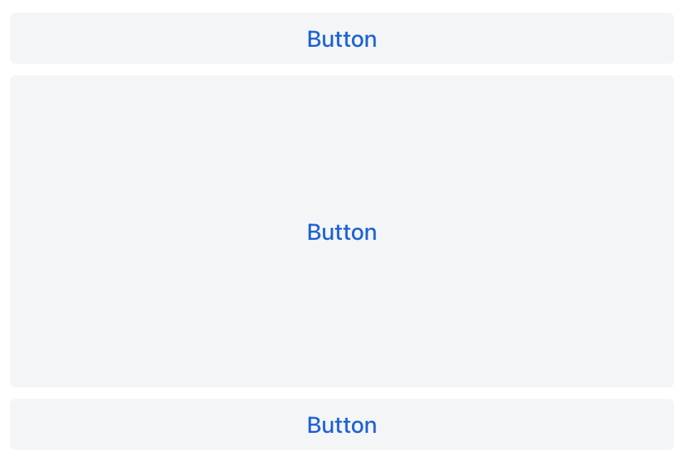
Flex Direction
The flexDirection attribute maps to the CSS flex-direction property. This property determines the direction flex items are placed within the flex container, which defines the main axis and the direction (normal or reversed).
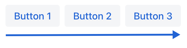
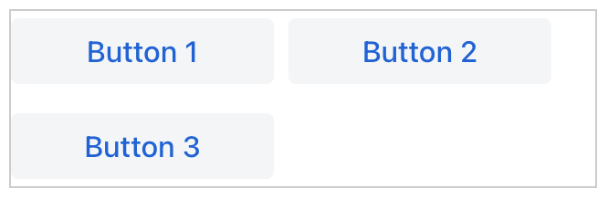
ROW
The items are displayed horizontally, as a row.
XML code
<flexLayout flexDirection="ROW"
            css="gap: 0.5em">
    <button text="Button 1"/>
    <button text="Button 2"/>
    <button text="Button 3"/>
</flexLayout>
ROW_REVERSE
The items are displayed horizontally, as a row in reverse order.
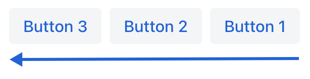
XML code
<flexLayout flexDirection="ROW_REVERSE"
css="gap: 0.5em">
<button text="Button 1"/>
<button text="Button 2"/>
<button text="Button 3"/>
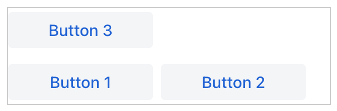
</flexLayout>COLUMN
The items are displayed vertically, as a column.
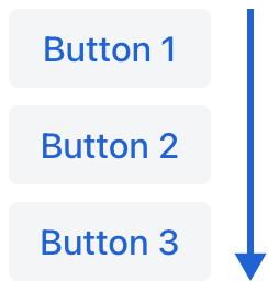
XML code
<flexLayout flexDirection="COLUMN">
    <button text="Button 1"/>
    <button text="Button 2"/>
    <button text="Button 3"/>
</flexLayout>
COLUMN_REVERSE
The items are displayed vertically, as a column in reverse order.
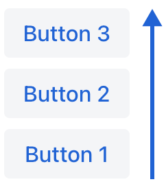
XML code
<flexLayout flexDirection="COLUMN_REVERSE">
    <button text="Button 1"/>
    <button text="Button 2"/>
    <button text="Button 3"/>
</flexLayout>
Flex Wrap
The flexWrap attribute maps to the CSS flex-wrap property. It determines whether flex items are forced onto a single line or can wrap onto multiple lines. If wrapping is allowed, it also sets the direction in which the lines are stacked.
NOWRAP
The flex items are laid out in a single line which may cause the flex container to overflow.
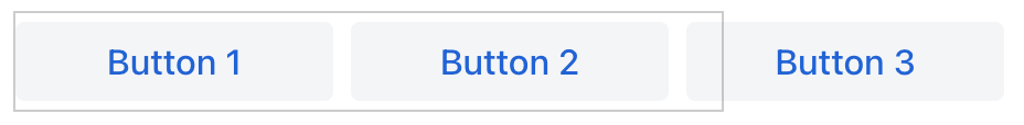
XML code
<flexLayout flexWrap="NOWRAP"
            css="gap: 0.5em; border: 1px solid #ccc;"
            width="20em">
    <button text="Button 1" width="9em"/>
    <button text="Button 2" width="9em"/>
    <button text="Button 3" width="9em"/>
</flexLayout>
WRAP
The flex items break into multiple lines.
XML code
<flexLayout flexWrap="WRAP"
            css="gap: 0.5em; border: 1px solid #ccc;"
            width="20em">
    <button text="Button 1" width="9em"/>
    <button text="Button 2" width="9em"/>
    <button text="Button 3" width="9em"/>
</flexLayout>
WRAP_REVERSE
The flex items break into multiple lines in reverse order.
XML code
<flexLayout flexWrap="WRAP_REVERSE"
            css="gap: 0.5em; border: 1px solid #ccc;"
            width="20em">
    <button text="Button 1" width="9em"/>
    <button text="Button 2" width="9em"/>
    <button text="Button 3" width="9em"/>
</flexLayout>
Justify Content
The justifyContent attribute maps to the CSS justify-content property. This property controls how space is distributed between and around content items along the main axis of a flex container.
| Value | Description |
|---|---|
|
Items are positioned at the beginning of the container. |
|
Items are positioned at the center of the container. |
|
Items are positioned at the end of the container. |
|
Items are positioned with space between the lines; first item is on the start line, last item on the end line. |
|
Items are evenly positioned in the line with equal space around them. Note that start and end gaps are half the size of the space between each item. |
|
Items are positioned so that the spacing between any two items (and the space to the edges) is equal. |
For usage examples visit the Layout Rules section.
Attributes
Common attributes serve the same purpose for all components.
The following attributes are specific to flexLayout.
Name |
Description |
Default |
|---|---|---|
Sets the default alignment to be used by all flex container’s lines. See Content Alignment. |
|
|
Specifies the id of component that can expand to take up any remaining space in a layout. See Expand. |
||
Sets the flex direction property of the layout. See Flex Direction. |
|
|
Sets the flex wrap property of the layout. See Flex Wrap. |
|
|
Sets the justify content mode used by this layout. See Justify Content. |
|
Handlers
Common handlers are configured in the same way for all components.
The following handlers are specific to flexLayout:
|
To generate a handler stub in Jmix Studio, use the Handlers tab of the Jmix UI inspector panel or the Generate Handler action available in the top panel of the view class and through the Code → Generate menu (Alt+Insert / Cmd+N). |
Name |
Description |
|---|---|
Fires the |
|
Fires the |
|
Fires the |
