split
split is a layout that creates two content areas divided by a draggable splitter. The default split orientation is vertical, but it can be changed to horizontal.
-
XML element:
split -
Java class:
JmixSplitLayout
Basics
split must contain two components or layouts to be placed on each side of the splitter. Initial splitter position depends on the size of components. Users can drag the splitter to change the split position.
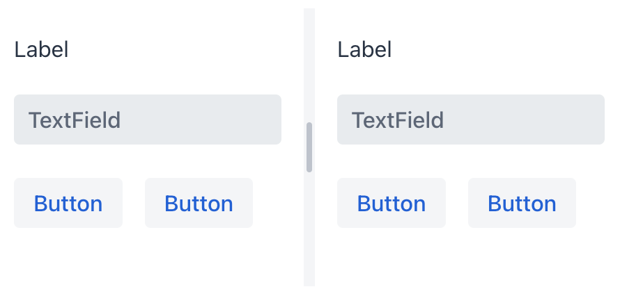
<split height="200px">
    <vbox height="100%">
        <label text="Label"/>
        <textField placeholder="TextField"/>
        <hbox spacing="true">
            <button text="Button"/>
            <button text="Button"/>
        </hbox>
    </vbox>
    <vbox height="100%">
        <label text="Label"/>
        <textField placeholder="TextField"/>
        <hbox spacing="true">
            <button text="Button"/>
            <button text="Button"/>
        </hbox>
    </vbox>
</split>
Theme Variants
Use themeNames attribute to set a component theme.
| Variant | Description | Supported By |
|---|---|---|
|
Hides the visual styling of the splitter. |
Aura, Lumo |
|
Uses a thinner splitter that becomes visible on hover. |
Aura, Lumo |
|
Adds spacing around the splitter. |
Aura, Lumo |
Attributes
id - alignSelf - classNames - colspan - css - height - maxHeight - maxWidth - orientation - splitterPosition - themeNames - visible - width
See Also
See Vaadin Docs for more information.
