sidePanelLayout
sidePanelLayout adds a panel that opens beside or over the main content.
A side panel can also be created programmatically using Side Dialog.
|
XML Element |
|
|---|---|
Java Class |
|
Basics
SidePanelLayout divides the content into two areas:
-
Main content – the primary layout area.
-
Side panel content – a panel that slides in from one side.
To define the component in XML, use the sidePanelLayout element and add exactly two direct child components.
<sidePanelLayout id="sidePanelLayout"
                 width="100%"
                 height="100%">

    <vbox id="contentBox">
        <!-- Main content -->
    </vbox>

    <vbox id="sidePanelBox" width="100%" height="100%">

        <hbox id="headerBox" width="100%"> (1)
            <h2 text="Customer information"/>
            <sidePanelLayoutCloser/>
        </hbox>

        <!-- Side panel content -->

    </vbox>
</sidePanelLayout>
A side panel typically includes a close button. Use the dedicated sidePanelLayoutCloser component to add that button.
Opening the Side Panel
The side panel opens in response to user actions such as clicking a button. Call the toggleSidePanel() method:
@ViewComponent
private SidePanelLayout sidePanelLayout;

@Subscribe(id = "toggleButton", subject = "clickListener")
public void onToggleButtonClick(final ClickEvent<JmixButton> event) {
    sidePanelLayout.toggleSidePanel();
}
Resizing the Side Panel
Since Jmix 3.1
Set the sidePanelResizable attribute to true to let users resize the side panel by dragging the handle on its inner edge.
<facets>
    <settings auto="true"/>
</facets>
    <sidePanelLayout id="sidePanelLayout"
                     width="100%"
                     height="100%"
                     sidePanelResizable="true">
        <!-- ... -->
    </sidePanelLayout>
</layout>
For the LEFT, RIGHT, INLINE_START, and INLINE_END positions, dragging changes the panel width. For the TOP and BOTTOM positions, it changes the panel height. The size remains within the limits defined by the corresponding minimum and maximum size attributes.
|
To save and restore the size selected by the current user, add the |
Side Panel Editor
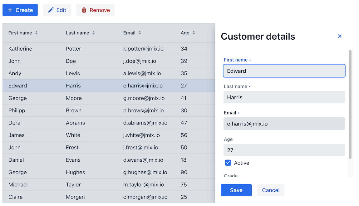
Use SidePanelLayout for a master-detail pattern where the main area contains a list of entities and the side panel edits the selected instance.
Styling
You can customize the appearance and size of SidePanelLayout using CSS variables and theme selectors.
Sizing with CSS Variables
The following variables define the side panel size. Set them globally or in a selector that targets a particular sidePanelLayout.
| Values set in XML or using the Java API override CSS variables. |
Horizontal side panels (LEFT, RIGHT, INLINE_START, INLINE_END):
Variable |
Description |
Default |
|---|---|---|
|
Preferred width of the side panel. |
|
|
Maximum width. |
|
|
Minimum width. |
|
Vertical side panels (TOP, BOTTOM):
Variable |
Description |
Default |
|---|---|---|
|
Preferred height of the side panel. |
|
|
Maximum height. |
|
|
Minimum height. |
|
Resize Handle
Since Jmix 3.1
The resize handle uses the following CSS variables. Their default values match the current theme’s SplitLayout splitter and can change when the resizer-small theme variant is applied.
Variable |
Description |
|---|---|
|
Width of a vertical splitter or height of a horizontal splitter. |
|
Size of the pointer target across the splitter. |
|
Splitter background. |
|
Thickness of the grip inside the splitter. |
|
Length of the grip inside the splitter. |
|
Grip background. |
Appearance
Variable |
Description |
Default |
|---|---|---|
|
Controls how long the open and close animation takes. |
|
Parts
SidePanelLayout exposes the following stylable parts:
Part |
Description |
|---|---|
|
Container for content, side panel, and modality curtain. |
|
Main layout content. |
|
Modality curtain. |
|
Panel that moves into and out of view. |
|
Side panel content container. |
|
Resize handle on the inner edge of the side panel. |
States
The component exposes the following states:
State |
Description |
|---|---|
|
Applied when the side panel is open. |
|
Applied when the side panel is modal. |
|
Matches the current side panel position ( |
|
Applied when the panel overlays content instead of pushing it. |
|
Applied when user resizing is enabled. |
|
Applied while the user is dragging the resize handle. |
Attributes
Common attributes serve the same purpose for all components. The following attributes are specific to sidePanelLayout.
| Name | Description | Default |
|---|---|---|
Defines the side from which the panel appears. Possible values are
|
|
|
Determines how the side panel interacts with the main content. If |
|
|
When |
|
|
When This attribute only has an effect when modal is enabled. |
|
|
Sets the accessible label for the overlay element. |
— |
|
If |
|
|
If Since Jmix 3.1 |
|
|
Defines the width of the side panel when its position is The value can be any valid CSS size such as |
|
|
Defines the minimum width of a horizontally positioned side panel. |
|
|
Defines the maximum width of a horizontally positioned side panel. |
|
|
Defines the vertical size of the side panel when it appears from the top or bottom. |
|
|
Defines the minimum vertical size of the side panel. |
|
|
Defines the maximum vertical size of the side panel. |
|
Handlers
Common handlers are configured in the same way for all components. The following handlers are specific to sidePanelLayout.
| Name | Description |
|---|---|
Fires when the user clicks the modality curtain. |
|
Fires before the side panel is displayed and before its opening animation starts. Use it to update content before the panel becomes visible. |
|
Fires after the side panel is fully open and its opening animation has finished. |
|
Fires when the side panel closes. |
|
Fires once after the user finishes dragging the resize handle and the panel size has changed. The Since Jmix 3.1 |
Elements
A sidePanelLayout contains exactly two root components: the main content and the side-panel content. Use sidePanelLayoutCloser inside the panel when it needs a dedicated close button.