Composite Component
A composite component is a component consisting of other components. Like fragments, composite components allow you to reuse some presentation layout and logic.
We recommend using composite components in the following cases:
-
The functionality of a component can be implemented as a combination of existing visual components.
If you need some non-standard features, integrate a JavaScript library or create a Web Component from scratch. -
The component is relatively simple and does not load or save data itself. Otherwise, consider creating a fragment.
Using Composite
In the example below, the ColorComponent component is created by combining the ColorPicker component, created in the Using the Element API section and a span that displays its value:
import com.vaadin.flow.component.Composite;
import com.vaadin.flow.component.html.Span;
import com.vaadin.flow.component.orderedlayout.FlexComponent;
import com.vaadin.flow.component.orderedlayout.HorizontalLayout;

public class ColorComponent extends Composite<HorizontalLayout> { (1)

    private final ColorPicker colorPicker;

    public ColorComponent() {
        colorPicker = new ColorPicker();
        Span valueLabel = new Span(colorPicker.getValue());

        colorPicker.addValueChangeListener(event ->
                valueLabel.setText(event.getValue()));

        getContent().add(colorPicker, valueLabel); (2)
    }

    @Override
    protected HorizontalLayout initContent() { (3)
        HorizontalLayout content = super.initContent();
        content.setAlignItems(FlexComponent.Alignment.CENTER);

        return content;
    }

    public String getValue() { (4)
        return colorPicker.getValue();
    }

    public void setValue(String value) {
        colorPicker.setValue(value);
    }
}| 1 | The Composite base class is parameterized by the type of the root component. |
| 2 | You can access the root component using the getContent() method. |
| 3 | The initContent() method is called when the content of this composite is requested for the first time. This method should initialize the component structure for the composite and return the root component. By default, this method uses reflection to instantiate the component based on the generic type of the subclass. |
| 4 | The public API of the composite component that delegates to the colorPicker component. |

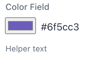
Using CustomField
CustomField is a base class for wrapping multiple components into a single field. It provides standard input field features such as label, helper, and validation. Use it to create custom input components.
The previous example can be rewritten as CustomField:
import com.vaadin.flow.component.customfield.CustomField;
import com.vaadin.flow.component.html.Span;
import com.vaadin.flow.dom.Style;

public class ColorField extends CustomField<String> {

    private final ColorPicker colorPicker;

    public ColorField() {
        colorPicker = new ColorPicker();
        Span valueLabel = new Span(colorPicker.getValue());
        valueLabel.getStyle().setMarginInlineStart("var(--lumo-space-s)");

        colorPicker.addValueChangeListener(event -> {
            valueLabel.setText(event.getValue());
        });

        add(colorPicker, valueLabel);
    }

    @Override
    protected String generateModelValue() {
        return colorPicker.getValue();
    }

    @Override
    protected void setPresentationValue(String presentationValue) {
        colorPicker.setValue(presentationValue);
    }
}
After a component is implemented it can be used in views, for example:
@Subscribe
public void onInit(final InitEvent event) {
    ColorField customField = new ColorField();
    customField.setLabel("Color Field");
    customField.setHelperText("Helper text");
    getContent().add(customField);
}