Declarative Actions
You can specify a set of actions in an XML view descriptor for any component that implements the HasActions interface (dataGrid, entityComboBox, entityPicker, and others), or in the view itself. You can do it in the actions element, which contains nested action elements.
In the example below, a set of actions is declared for a dataGrid.
<hbox>
    <button action="departmentsTable.create"/> (3)
    <button action="departmentsTable.edit"/>
    <button action="departmentsTable.sayHello"/>
</hbox>
<dataGrid id="departmentsTable" dataContainer="departmentsDc">
    <actions>
        <action id="create" type="list_create"/> (1)
        <action id="edit" type="list_edit"/>
        <action id="sayHello" text="Say hello" icon="SMILEY_O"/> (2)
    </actions>
    <columns>
        <column property="name"/>
        <column property="hrManager"/>
    </columns>
</dataGrid>| 1 | list_create and list_edit actions are standard actions. Their properties and behaviour are defined by their types. |
| 2 | sayHello action properties are defined in-place. Its handler is defined in the view controller. |
| 3 | Buttons associated with actions get their properties: text, icon, etc. |
The sayHello action handler should be defined in the view controller:
@Subscribe("departmentsTable.sayHello")
public void onDepartmentsTableSayHello(final ActionPerformedEvent event) {
notifications.create("Hello").show();
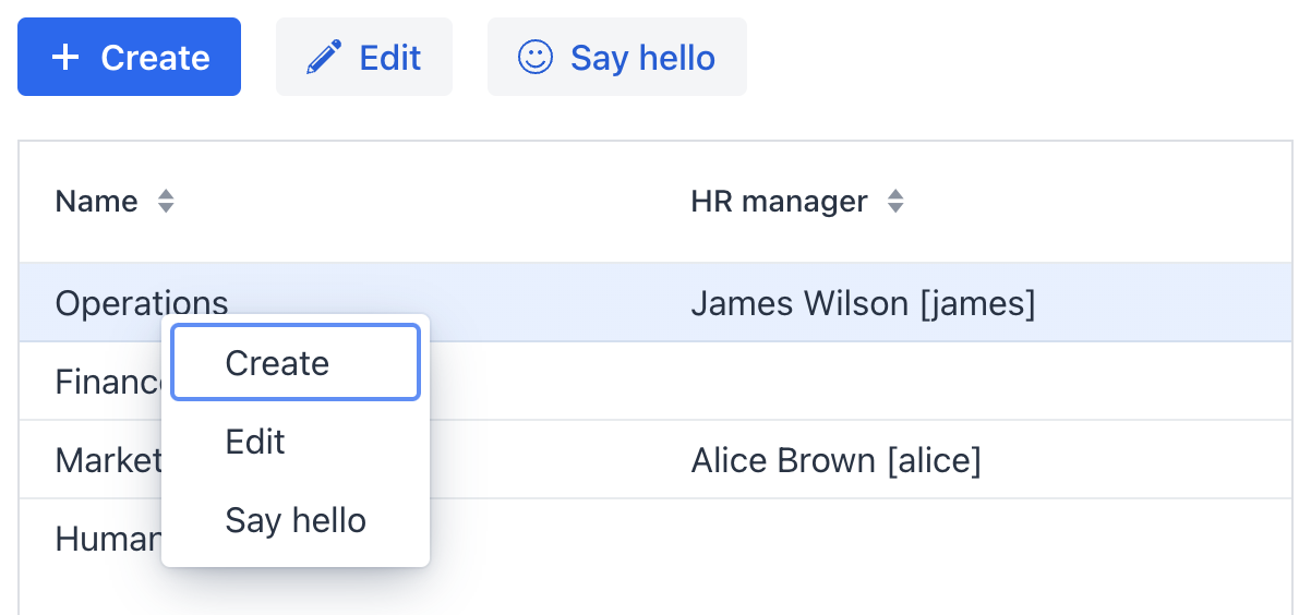
}The actions are displayed by the dataGrid as the context menu items:
Action Attributes
The action element can have the following attributes:
-
id- identifier, which should be unique within theHasActionscomponent. -
type- defines an action type.If this attribute is set, the framework finds a class having the
@ActionTypeannotation with the specified value, and uses it to instantiate the action. See Standard Actions for how to use action types provided by the framework and Custom Action Types for how to create your own types.If the
typeattribute is not set, the framework creates an instance of theBaseActionclass. -
text- action text. A linked button will use it to display the action. -
description- action description. A linked button will use its value for the title attribute. -
enabled- whether the action and linked button are enabled:true,false. -
visible- whether the action and linked button are visible:true,false. -
icon- action icon. A linked button will display it. -
actionVariant- defines a variant of the action and sets the variant of the linked button:DEFAULT,PRIMARY,DANGER,SUCCESS. -
shortcutCombination- a keyboard shortcut to execute the action. For example:<action id="someAction" text="Some action" shortcutCombination="CONTROL-ALT-M"/>
Action Elements
The action element may contain the following elements:
-
icon– adds a custom icon. A linked button will display it.
Obtaining Action in Controller
You can inject any declared in XML action into the view controller in the same way as other view components. It allows you to configure the action programmatically. For example:
@ViewComponent
private BaseAction someAction;

@ViewComponent("departmentsTable.sayHello")
private BaseAction departmentsTableSayHello;

@Subscribe
public void onInit(final InitEvent event) {
    someAction.setEnabled(false);
    departmentsTableSayHello.setVariant(ActionVariant.SUCCESS);
}