aiMessageList
The aiMessageList component shows the conversation of a chat. It renders user messages as plain text in a bubble and assistant messages as Markdown, with per-message actions, a thinking indicator, and an error banner.
XML Element |
|
|---|---|
Java Class |
|
aiChat embeds it and drives it for you. Use it on its own to display a stored conversation, or to build your own chat out of the base components. The application can drive the list from end to end, as described in Driving the Generation.
Basics
Declare the aichat namespace in the view’s XML descriptor:
<view xmlns="http://jmix.io/schema/flowui/view"
      xmlns:aichat="http://jmix.io/schema/aichat/ui"
title="msg://MessageListView.title">| Studio adds the namespace automatically when you add the component using the Add Component action in the top actions panel. See Component Palette. |
A list needs nothing but its element:
<aichat:aiMessageList id="transcriptList" width="100%"/>Messages
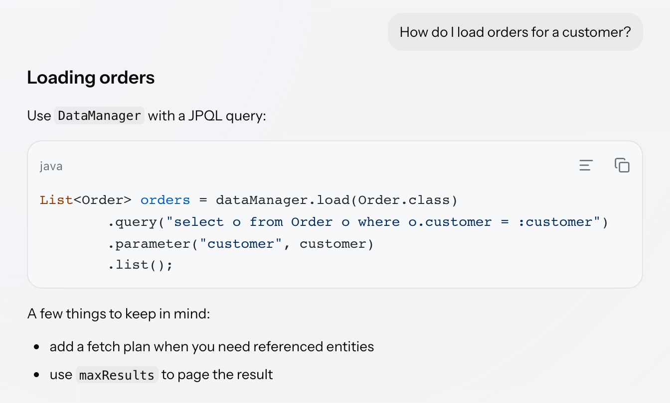
Messages are items built with the AiMessageListItem factory methods, not components you add to the list:
transcriptList.setItems(
        AiMessageListItem.user("How do I load orders for a customer?"),
        AiMessageListItem.assistant("""
                ## Loading orders

                Use `DataManager` with a JPQL query:

                ```java
                List<Order> orders = dataManager.load(Order.class)
                        .query("select o from Order o where o.customer = :customer")
                        .parameter("customer", customer)
                        .list();
                ```

                A few things to keep in mind:

                - add a fetch plan when you need referenced entities
                - use `maxResults` to page the result
                """),
        AiMessageListItem.user(LONG_QUESTION)
);
Assistant messages are rendered as Markdown: headings, lists, tables, links, and inline code. A fenced code block becomes a real aiCodeBlock, with its language label, highlighting, and its own copy and wrap actions. User messages are rendered as plain text in a bubble, so Markdown in a user message is shown as typed.
addItem appends a single message to a list that is already on screen:
@Subscribe("addItemButton")
public void onAddItemButtonClick(final ClickEvent<JmixButton> event) {
    transcriptList.addItem(AiMessageListItem.user("And how do I page the result?"));
}| An item instance belongs to one list and may appear in it only once. Adding the same instance twice, or to a second list, is rejected. |
Driving the Generation
An application can run a whole turn against the list itself, without aiChat. The sequence is: append the user message, append an empty assistant message to stream into, switch the list to GENERATING, append the answer as it arrives, then return the list to IDLE.
@Subscribe("generateButton")
public void onGenerateButtonClick(final ClickEvent<JmixButton> event) {
    drivenList.addItem(AiMessageListItem.user("What is a fetch plan?"));

    AiMessageListItem answer = AiMessageListItem.assistant("");
    drivenList.addItem(answer);
    drivenList.setState(GenerationState.GENERATING);

    backgroundWorker.handle(new AnswerTask(answer)).execute();
}

private class AnswerTask extends BackgroundTask<String, Void> {

    private final AiMessageListItem answer;

    private AnswerTask(AiMessageListItem answer) {
        super(30, TimeUnit.SECONDS, MessageListView.this);
        this.answer = answer;
    }

    @Override
    public Void run(TaskLifeCycle<String> taskLifeCycle) throws Exception {
        ThinkingStatusPublisher statuses = drivenList.getThinkingStatusPublisher();

        ThinkingStatusItem searching = statuses.start("Searching the documentation");
        Thread.sleep(1200);
        searching.complete("4 pages");

        ThinkingStatusItem writing = statuses.start("Writing the answer");

        for (String chunk : ANSWER_CHUNKS) {
            Thread.sleep(400);
            taskLifeCycle.publish(chunk);
        }

        writing.complete();
        return null;
    }

    @Override
    public void progress(List<String> chunks) { (1)
        chunks.forEach(answer::appendText);
    }

    @Override
    public void done(Void result) {
        drivenList.setState(GenerationState.IDLE);
        drivenList.getThinkingStatusPublisher().clear();
    }
}| 1 | progress runs on the UI thread, which is what appendText requires. The chunks are published from the background task and appended here. |
|
The two halves of a turn have different threading rules.
The thinking status feed described below is the exception: it takes the UI lock itself, so it can be called from any thread. |
|
The thinking indicator is attached to the message being generated. Setting the list to |
getActiveItem() returns that trailing assistant message while the list is generating, and null otherwise.
Thinking Indicator
While the list is generating and the answer is still empty, it shows an animated indicator of three pulsing dots, with a label beside it:

Replace the indicator with any component through the thinkingIndicator element. Only the animation is replaced; the label beside it stays:
<aichat:thinkingIndicator>
    <image id="customIndicator"
           resource="public/images/logo.png"
           alternateText="msg://customIndicator.alternateText"
           width="1.75em"
           height="1.75em"/>
</aichat:thinkingIndicator>
The label escalates the longer generation takes, so that a slow answer does not look like a stalled one. The thinkingStages element defines it. Each stage gives the delay after which its text replaces the previous one:
<aichat:thinkingStages>
    <aichat:thinkingStage delayMillis="600"
                          text="msg://thinkingStage.thinking"/>
    <aichat:thinkingStage delayMillis="4000"
                          text="msg://thinkingStage.stillThinking"/>
</aichat:thinkingStages>
Thinking Status Feed
The status feed reports what the assistant is doing, one line per step, rendered above the thinking indicator. Each line has a spinner that turns into a check mark when the step completes:
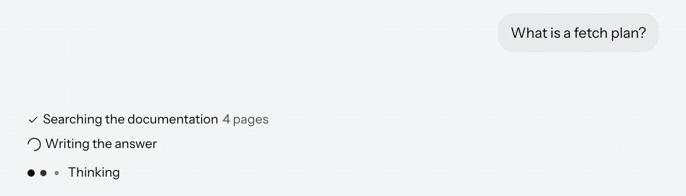
Obtain the publisher from the list, start a status when a step begins, and complete it when the step ends, optionally with a short result:
ThinkingStatusPublisher statuses = drivenList.getThinkingStatusPublisher();

ThinkingStatusItem searching = statuses.start("Searching the documentation");
Thread.sleep(1200);
searching.complete("4 pages");

ThinkingStatusItem writing = statuses.start("Writing the answer");
The publisher takes the UI lock itself, so these calls are safe from a background thread, as in the example above, where they run inside the task’s run method. Statuses are transient, so clear them when the turn ends.
Error and Retry
Setting the list to ERROR reveals a banner with a Retry button. The banner is the component’s own, and the application supplies no markup for it:

@Subscribe("failButton")
public void onFailButtonClick(final ClickEvent<JmixButton> event) {
    drivenList.addItem(AiMessageListItem.user("Why did that fail?"));
    drivenList.setState(GenerationState.ERROR);
}

private void registerRetryListener() {
    drivenList.addRetryListener(event -> {
        AiMessageListItem userMessage = event.getUserMessage();
        notifications.show(messageBundle.formatMessage("retry.notification",
                userMessage != null ? userMessage.getText() : "-"));
        drivenList.setState(GenerationState.IDLE);
    });
}|
|
Message Actions
Actions are declared per role and appear in a bar on the message, revealed on hover or focus:
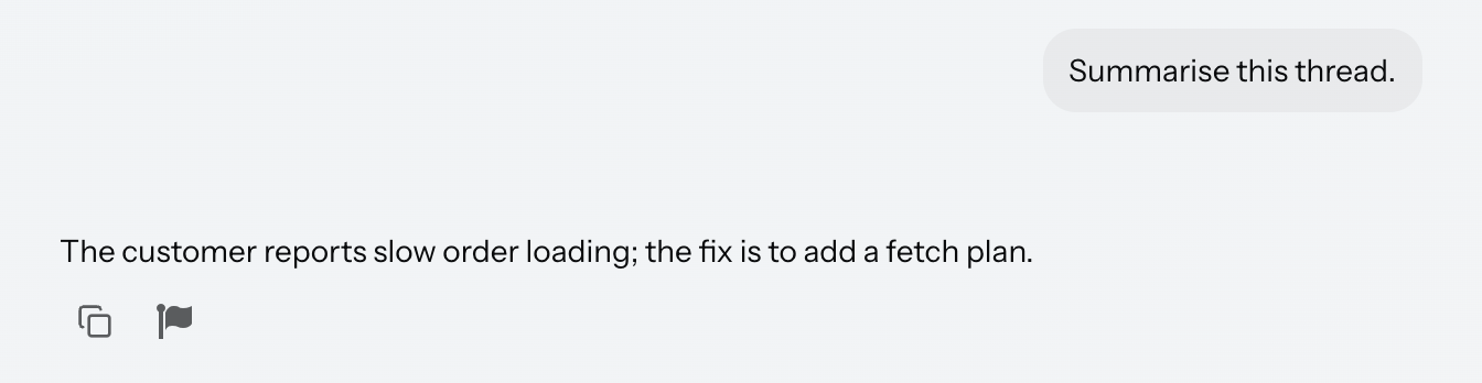
<aichat:aiMessageList id="actionsList" width="100%">
    <aichat:userActions>
        <aichat:action id="userCopy" type="aichat_messageCopy"/>
    </aichat:userActions>
    <aichat:assistantActions>
        <aichat:action id="assistantCopy" type="aichat_messageCopy"/>
        <aichat:action id="reportAction"
                       icon="FLAG"
                       description="msg://reportAction.description"/>
    </aichat:assistantActions>
</aichat:aiMessageList>
aichat_messageCopy is built in and copies the message source to the clipboard. Any other action is an ordinary Jmix action: give it an id, an icon, and a description, and handle it in the controller. The event carries the message the action was invoked on:
@Subscribe("actionsList.reportAction")
public void onReportAction(final AiMessageActionPerformedEvent event) {
    AiMessageListItem item = event.getItem();
    notifications.show(messageBundle.formatMessage("reportAction.notification",
            item.getText()));
}|
The other built-in action type, |
Long Messages
A long user message is collapsed to a fixed height with a fade and a Show more toggle. Assistant messages are never collapsed.
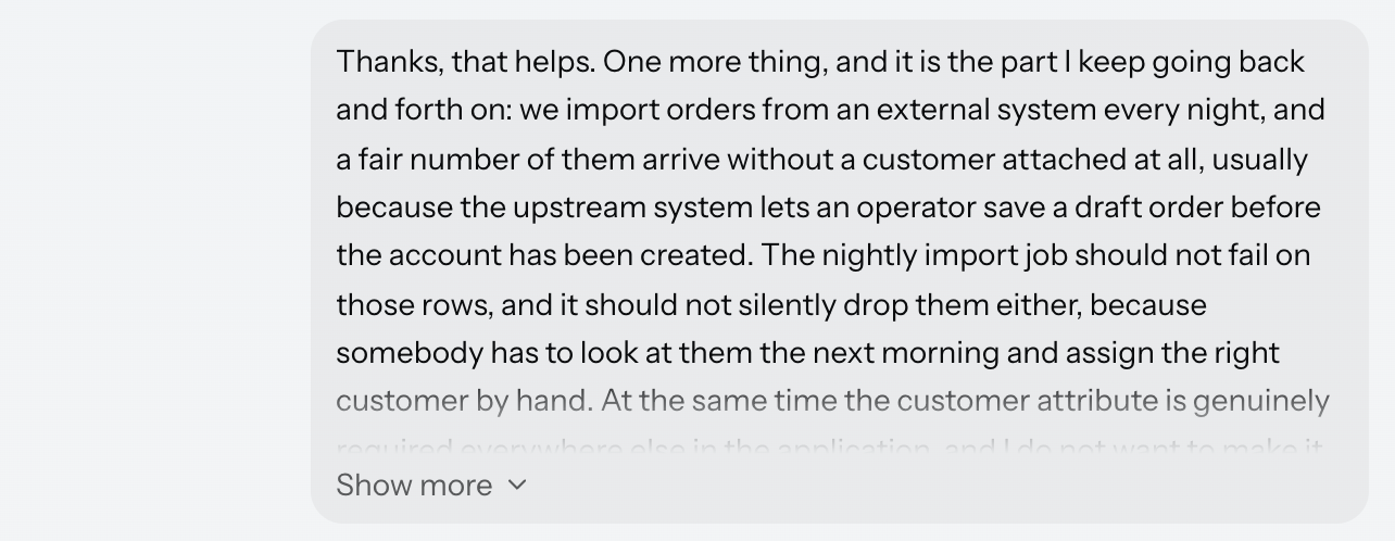
The threshold is a rendered height, not a number of characters, and a message only slightly over it is shown in full rather than collapsed for the sake of a few lines. The same text may therefore collapse in a narrow container and not collapse in a wide one, because the width decides how it wraps.
Scrolling
While an answer is streaming, the list keeps its viewport at the bottom so that new text stays in view.
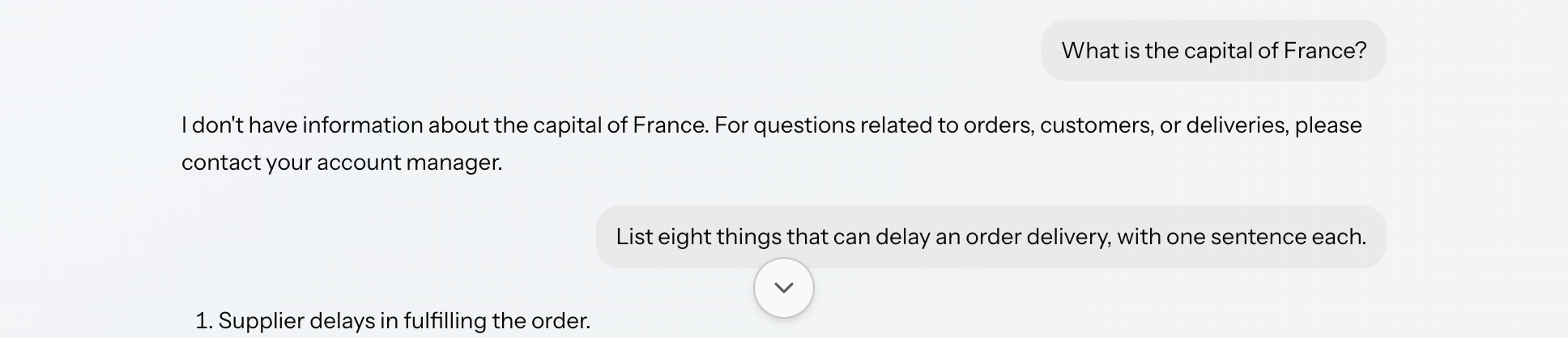
Scrolling up detaches that: the list stops following, and content is never pulled away from under the reader, however much arrives meanwhile. A circular button appears at the bottom of the list to go back; clicking it scrolls down and re-engages the following. Scrolling down by hand re-engages it as well, and programmatic scrolling never detaches it.
Arrow keys move focus from message to message, scrolling each into view, so the conversation can be read without a mouse.
Accessibility
Set announceMessages to make the list announce arriving messages to screen readers through an ARIA live region:
<aichat:aiMessageList id="announceList"
                      width="100%"
                      announceMessages="true"/>
Localization
The list’s own labels come from the add-on’s message bundle, under the aiMessageList.i18n.* keys: the error banner, the Retry button, the scroll-to-bottom button, the copy action, and the Show more / Show less toggle. Override them in the application’s message bundle to re-word every list.
To re-word a single list, add a nested i18n element. It carries a nested codeBlock element as well, which re-words the code blocks rendered inside the assistant messages of this list:
<aichat:aiMessageList id="i18nList" width="100%">
    <aichat:i18n showMore="msg://i18nList.showMore"
                 showLess="msg://i18nList.showLess">
        <aichat:codeBlock copy="msg://i18nList.codeCopy"/>
    </aichat:i18n>
</aichat:aiMessageList>com.company.demo.view.messagelist/i18nList.showMore=Read the whole question
com.company.demo.view.messagelist/i18nList.showLess=Collapse the question
com.company.demo.view.messagelist/i18nList.codeCopy=Copy this snippetSee Precedence for how the two levels combine.
Styling
The message list exposes its internals as shadow parts, addressable with the ::part() selector.
The following style properties can be used in CSS stylesheets to customize the appearance of this component.
| Name | Description |
|---|---|
|
Width the conversation column is centered within. |
|
Padding around the conversation. |
|
Color of the scrollbar. |
|
Size of the glyph in the scroll-to-bottom button. |
|
Glyph of the scroll-to-bottom button. |
|
Glyph shown in the error banner. |
|
Glyph of the Retry button. |
|
Glyph marking a completed thinking status. |
|
Color of message text. |
|
Font size of message text. |
|
Line height of message text. |
|
Padding inside a message. |
|
Color of the check mark that confirms a copy. |
|
Padding of a message action button. |
|
Size of a message action icon. |
|
Corner radius of a message action button. |
|
Glyph of the built-in copy action. |
|
Glyph shown while a copy is confirmed. |
|
Glyph of the built-in regenerate action. |
|
Glyph shown on an attachment that is not an image. |
|
Size of an image attachment thumbnail. |
|
Color of links in an assistant message. |
|
Height a long user message is collapsed to. See Long Messages. |
|
Glyph of the Show more toggle. |
|
Color of the thinking indicator. |
|
Gap between the dots of the thinking indicator. |
|
Duration of one pulse of the thinking indicator. |
|
Height the status feed grows to before it scrolls. See Thinking Status Feed. |
The icon properties hold an image applied as a mask, so overriding one replaces that glyph.
The components are styled for both Jmix themes, Aura and Lumo, and follow the theme’s own tokens for focus rings, borders, radii, and spacing, which is why the properties above have no single default value. Dark mode, high-contrast mode, and reduced motion are handled, and layout is expressed in direction-agnostic properties, so the components follow the text direction of the document.
Attachments
Messages can carry files, shown as thumbnails or chips under the message text. Attachments span several components, so they are described together in Attachments.
Attributes
The following attribute is specific to aiMessageList:
| Name | Description | Default |
|---|---|---|
Sets whether arriving messages are announced to screen readers. See Accessibility. |
|
The following shared attributes are supported by aiMessageList:
Handlers
The following handlers are specific to aiMessageList:
| Name | Description |
|---|---|
Fired when the user clicks an attachment in a message. Carries the message and the file. See Downloading from the Conversation. |
|
Fired when the user clicks Retry on the error banner. See Error and Retry. |
The following shared handlers are supported by aiMessageList:
Elements
An aiMessageList can include thinkingIndicator, thinkingStages, userActions, assistantActions, and i18n as its nested elements.
thinkingIndicator
The thinkingIndicator element holds one component that replaces the built-in indicator. See Thinking Indicator.
thinkingStages
The thinkingStages element contains thinkingStage elements, each with a required delayMillis and a required text, which define the escalating label beside the indicator. See Thinking Indicator.
userActions, assistantActions
These elements contain the action elements offered on user and assistant messages respectively. An action requires an id and accepts type, description, classNames, and icon attributes. See Message Actions.
i18n
The i18n element re-words this list. It supports the error, retry, scrollToBottom, copy, copied, showMore, and showLess attributes, each accepting a message key, and a nested codeBlock element for the code blocks rendered inside its messages. See Localization.