FullCalendar Component
FullCalendar is a UI component designed to display date ranges and calendar events.
It offers a wide range of features for managing calendar events and provides various display modes (day, week, month, etc.).
Basic
The FullCalendar component is available in the Add Component palette of the Studio View Designer as soon as you install the add-on in your project.
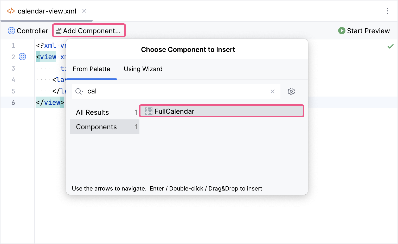
The new calendar:calendar element will be added in both the Jmix UI structure panel and in the XML. You can configure attributes like id, height, width, etc., in the same way as it is done for other UI components.
<calendar:calendar id="calendar"
                   height="100%"
                   width="100%"/>
If you don’t use the view designer, declare the calendar namespace in your view’s XML descriptor manually:
<view xmlns="http://jmix.io/schema/flowui/view"
      xmlns:calendar="http://jmix.io/schema/fullcalendar/ui"
      title="Calendar view">
If you need to show events, bind containerEventProvider to data container.
The following example demonstrates how a basic calendar is created:
<data>
    <collection id="eventsDc" class="com.company.fullcalendarsample.entity.Event">
        <loader id="eventsDl" readOnly="true">
            <query>
                <![CDATA[select e from Event e]]>
            </query>
        </loader>
        <fetchPlan extends="_base"/>
    </collection>
</data>
<facets>
    <dataLoadCoordinator auto="true"/>
</facets>
<layout>
    <calendar:calendar id="calendar"
                       height="100%"
                       width="100%">
        <calendar:dataProviders>
            <calendar:containerDataProvider dataContainer="eventsDc"
                                            title="title"
                                            startDateTime="startDate"
                                            endDateTime="endDate"/>
        </calendar:dataProviders>
    </calendar:calendar>
</layout>
Data Model
CalendarEvent
The base interface for events within the FullCalendar component is CalendarEvent. It provides a common set of properties for representing events. These properties are used for displaying and managing events within the calendar.
A unique identifier for the calendar event. It is used for identification on the client side. |
|
The group object that is shared among other events. Events with the same group ID will be dragged and resized together automatically. |
|
Determines whether event is shown in the 'all-day' section of the relevant display mode. By default, the component considers all events as non-all-day. A |
|
Defines the start date-time position of the event. It is of type |
|
Defines the end date-time position of the event. It is of type This value is exclusive. For instance, an event with an end date-time property of |
|
The text that will appear on the event. |
|
The text of the event description. |
|
Specifies whether events can be navigated using the TAB key. If this value is |
|
Specifies the class names, separated by spaces, that should be attached to the rendered event. |
|
Determines whether an event can be dragged within the calendar component. If this value is |
|
Determines whether an event can be resized within the calendar component. If this value is |
|
Defines the type of event rendering. If not specified, the |
|
Defines whether the event can be dragged or resized over other events. It also prevents other events from being dragged or resized over this event. If this value is |
|
Defines a shared group identifier. This property limits dragging and resizing to specific cells within the component. If this value is |
|
Specifies the background color for the event. Supported values include:
If this value is |
|
Specifies the border color for the event. Supported values include:
If this value is |
|
Specifies the text color for the event. Supported values include:
If this value is |
|
Defines additional properties and their values that will be available in various JavaScript functions that take an event as a parameter. |
|
Specifies the days of the week on which this event repeats. If omitted, the event is assumed to repeat every day. |
|
Specifies the date when the recurrences of this event start. If not specified, the recurrences will extend infinitely into the past. |
|
Specifies the date when the recurrences of this event end. If not specified, the recurrences will extend infinitely into the future. Note that this value is exclusive. For all-day recurring events, set the end date to the day after your desired last recurrence. |
|
Specifies the start time of a recurring event. If this is not defined, the event is considered an all-day event. Note that the calendar does not apply time zone conversion for this property. If the |
|
Specifies the end time of a recurring event. If this is not defined, the event will have the default duration as configured by the defaultTimedEventDuration property. |
EntityCalendarEvent
The implementation of CalendarEvent that works with JPA entities or DTOs.
When ContainerDataProvider is linked to a collection container, it automatically wraps loaded entities in EntityCalendarEvent objects and passes them to the component.
For example, all calendar events in this scenario would be instances of EntityCalendarEvent:
<data>
    <collection id="eventsDc" class="com.company.fullcalendarsample.entity.Event">
        <loader id="eventsDl" readOnly="true">
            <query>
                <![CDATA[select e from Event e]]>
            </query>
        </loader>
        <fetchPlan extends="_base"/>
    </collection>
</data>
<facets>
    <dataLoadCoordinator auto="true"/>
</facets>
<layout>
    <calendar:calendar id="calendar"
                       height="100%"
                       width="100%">
        <calendar:dataProviders>
            <calendar:containerDataProvider dataContainer="eventsDc"
                                            title="title"
                                            startDateTime="startDate"
                                            endDateTime="endDate"/>
        </calendar:dataProviders>
    </calendar:calendar>
</layout>
And you can safely cast to EntityCalendarEvent:
@Autowired
private Notifications notifications;

@Subscribe("calendar")
public void onCalendarEventClick(final EventClickEvent event) {
    EntityCalendarEvent<Event> entityEvent = event.getCalendarEvent();
    Event entity = entityEvent.getEntity();

    notifications.show(entity.getTitle() + " event is clicked");
}
SimpleCalendarEvent
The simple POJO class that implements the CalendarEvent interface. You can use this event class as an alternative to creating DTOs or for prototyping purposes. It also includes a builder class to simplify the creation of event instances.
@ViewComponent
private FullCalendar calendar;

@Subscribe
public void onInit(final InitEvent event) {
    SimpleCalendarEvent calendarEvent = SimpleCalendarEvent.create()
            .withTitle("Car service")
            .withStartDateTime(LocalDateTime.now())
            .build();

    calendar.addDataProvider(new ListCalendarDataProvider(List.of(calendarEvent)));
}
Recurring Events
Recurring events are events that occur multiple times at regular intervals, following a predefined schedule.
In FullCalendar, you can configure this schedule using the following properties within CalendarEvent:
If any of these recurrence properties are specified, FullCalendar assumes the event is recurring and ignores the startDateTime and endDateTime properties.
When the data provider specifies recurrence properties, the single repeating event in the container will be expanded into individual events instances with their own dates in FullCalendar.
However, the container will still contain the single recurring event.
You can specify recurrence properties in the data provider as shown below:
<calendar:calendar id="calendar"
                   height="100%"
                   width="100%">
    <calendar:dataProviders>
        <calendar:containerDataProvider dataContainer="eventsDc"
                                        title="title"
                                        recurringStartDate="recurringStartDate"
                                        recurringEndDate="recurringEndDate"
                                        recurringStartTime="recurringStartTime"
                                        recurringEndTime="recurringEndTime"
                                        recurringDaysOfWeek="recurringDaysOfWeek"/>
    </calendar:dataProviders>
</calendar:calendar>
Managing Recurring Events in FullCalendar
FullCalendar expands single recurring events into individual events instances.
These instances are treated as independent events, meaning changes to one instance won’t affect others by default.
Example: Moving Recurring Events
Let’s say you have a recurring meeting that happens every Tuesday. If you enable the eventStartEditable property, a user can drag and move a specific instance of that meeting (for example, the meeting on November 7th) to a different time slot. However, this change will only affect the November 7th instance. The meetings on other Tuesdays will remain at their original times.
Grouping Recurring Events
To move all instances of a recurring event together, you need to group them using the groupId property of CalendarEvent.
Here’s how it works:
-
Assign a Group ID: Set the same
groupIdvalue to all instances of the recurring event you want to move together. -
Enable Dragging: Ensure the
eventStartEditableproperty is set to true to allow dragging.
Now, when a user drags an instance of the recurring event, all instances within that group will move simultaneously, maintaining the defined recurrence pattern.
DaysOfWeek Datatype
The recurringDaysOfWeek property defines the list of days of the week. In order to store this data in JPA entities or DTOs, Jmix provides a dedicated data type called DaysOfWeek.
The Studio automatically provides this data type when you add an attribute to a JPA entity or DTO. You can then select the desired days of the week for your recurring event.
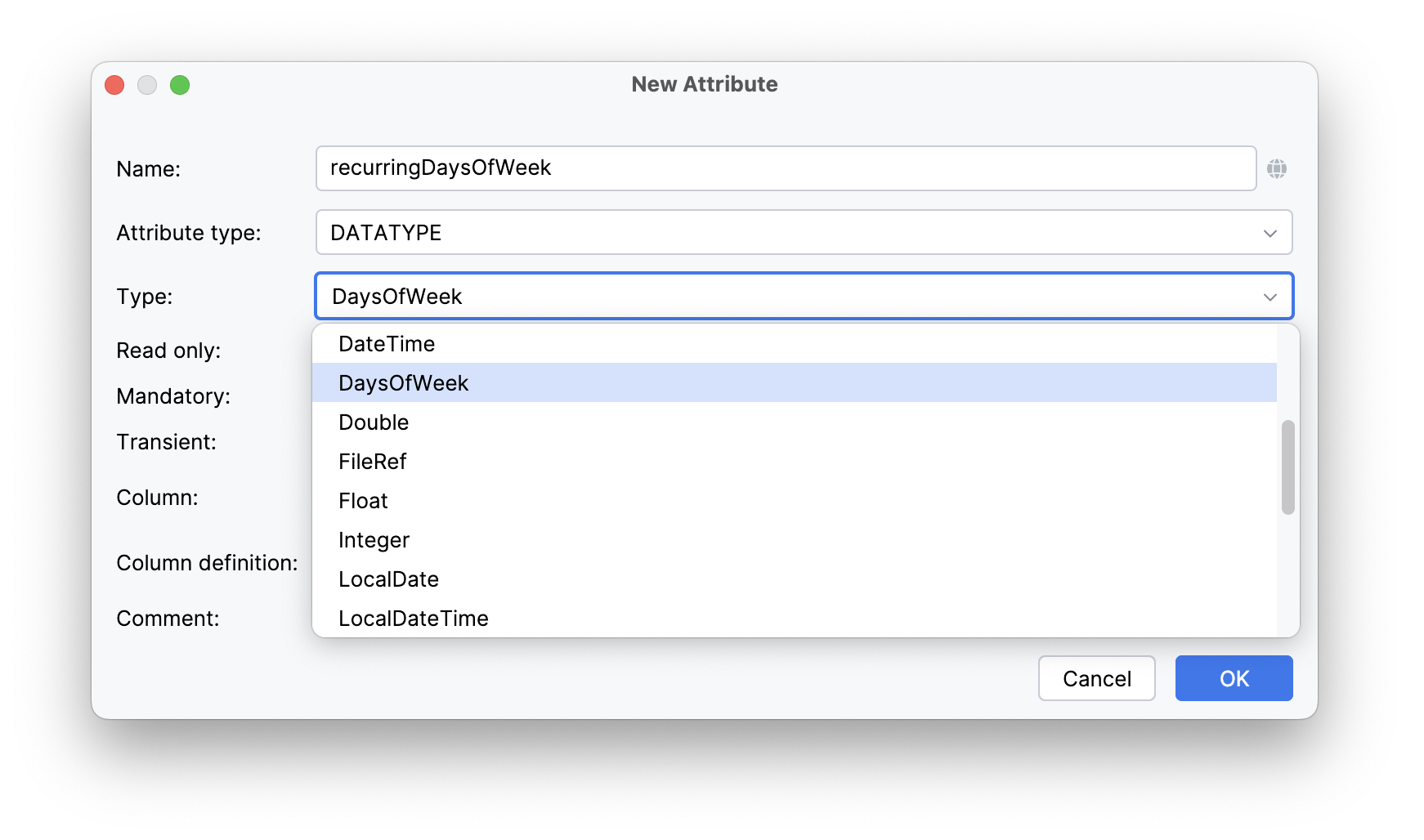
The DaysOfWeek data type is supported by both the valuePicker component and the DaysOfWeekEditAction. This allows you to easily edit the list of days of the week in your user interface.
<valuePicker id="recurringDaysOfWeekField" property="recurringDaysOfWeek">
    <actions>
        <action id="select" type="fcalen_daysOfWeekEdit"/>
        <action id="clear" type="value_clear"/>
    </actions>
</valuePicker>
Data Binding
The calendar component uses data providers to connect loaded data and display it visually. To be visible in the component, a data item must implement the CalendarEvent interface. For JPA or DTO entities, a ContainerDataProvider wraps the entity to create an EntityCalendarEvent.
The FullCalendar component allows you to add multiple data providers.
This allows you to display data from different data sources and services within a single calendar.
CalendarDataProvider
CalendarDataProvider is a base interface for all data providers used by the calendar.
There are two main types of calendar data providers:
-
Data providers that load all data at once. These providers retrieve all relevant data in a single operation.
-
CallbackCalendarDataProvider. These providers load data on demand, using a callback mechanism to retrieve partial data as needed.
ContainerDataProvider
The ContainerDataProvider works with Data Containers.
It reflects any changes made to the container (adding, removing, or modifying entities) and updates the FullCalendar UI accordingly.
To use the container data provider in FullCalendar, you should specify:
-
dataContainerproperty: a reference to an ID of an existing container in your view. -
Entity properties mapping. The container data provider wraps JPA or DTO entities into EntityCalendarEvent to make them compatible with the
FullCalendarcomponent. However, it doesn’t automatically know which properties from the JPA or DTO entity should be used for the CalendarEvent. Therefore, you must define property mappings to specify which entity properties correspond to specificCalendarEventproperties.
Here is an example of using the ContainerDataProvider:
<calendar:dataProviders>
    <calendar:containerDataProvider dataContainer="eventsDc"
                                    title="title"
                                    startDateTime="startDate"
                                    endDateTime="endDate"/>
</calendar:dataProviders>
To work with the container data provider programmatically, you can use the ContainerCalendarDataProvider class.
ListCalendarDataProvider
The ListCalendarDataProvider retrieves data from a provided list of items. It doesn’t require an XML definition and can be added programmatically.
Here’s a basic example of using a ListCalendarDataProvider:
@ViewComponent
private FullCalendar calendar;

@Subscribe
public void onInit(final InitEvent event) {
    SimpleCalendarEvent calendarEvent = SimpleCalendarEvent.create()
            .withTitle("Morning jog")
            .withStartDateTime(LocalDate.now(), LocalTime.of(8, 0))
            .build();

    ListCalendarDataProvider listDataProvider =
            new ListCalendarDataProvider(List.of(calendarEvent));

    calendar.addDataProvider(listDataProvider);
}
The list data provider automatically updates the FullCalendar UI when its data is modified through its API methods:
-
addItem(): adds an item to the UI. -
removeItem(): removes an item from the UI. -
updateItem(): updates an item in the UI.
ListDataProvider also provides other methods for managing the list of items.
CallbackCalendarDataProvider
The CallbackCalendarDataProvider is a base interface for data providers that load data on demand.
This interface defines a method called onItemsFetch() that is invoked whenever the component needs new data.
Data is loaded in the following situations:
-
When the user switches to a calendar display mode with a wider date range than the previous one. For example, if the user changes from a daily view to a weekly view, the component will need to fetch data for the entire week.
-
When the navigation methods of the
FullCalendarcomponent are invoked. This includes methods likenavigateToNext(),navigateToPrevious(), and other methods that move the calendar view forward or backward in time. -
When the time zone of the
FullCalendarcomponent is changed. The component will need to fetch new data to reflect the updated time zone.
CallbackDataProvider
The data provider that loads data using a JPQL query and a DataManager.
Similar to ContainerDataProvider, it requires you to define property mappings to specify how entity properties map to CalendarEvent properties.
Additionally, you must provide a JPQL query that defines the data to be loaded.
Here’s an example of property mappings within the callbackDataProvider element:
<calendar:dataProviders>
    <calendar:callbackDataProvider title="title"
                                   startDateTime="startDate"
                                   endDateTime="endDate"/>
</calendar:dataProviders>
To load data using a JPQL query, you should specify an itemsQuery element within the data provider. This element requires the fully qualified name of the entity class used in the JPQL query.
The items query allows you to define a FetchPlan in the fetchPlan attribute or within a separate fetchPlan element.
<calendar:callbackDataProvider title="title"
                               startDateTime="startDate"
                               endDateTime="endDate">
    <calendar:itemsQuery class="com.company.fullcalendarsample.entity.Event"/>
</calendar:callbackDataProvider>
In the JPQL query you can use two parameters:
-
fetchStartDate- the left border of visible date range in theFullCalendar -
fetchEndDate- the right border of visible date range in theFullCalendar.
The fetchEndDate value is exclusive.
For instance, if the visible date range is from 2024-09-29 to 2024-11-09 the actual value of the fetchEndDate will be 2024-11-10.
|
The full example of using callbackDataProvider:
<calendar:dataProviders>
    <calendar:callbackDataProvider title="title"
                                   startDateTime="startDate"
                                   endDateTime="endDate">
        <calendar:itemsQuery class="com.company.fullcalendarsample.entity.Event">
            <calendar:fetchPlan extends="_base"/>
            <calendar:query>
                <![CDATA[select e from Event e
                            where e.startDate >= :fetchStartDate
                                and e.endDate < :fetchEndDate]]>
            </calendar:query>
        </calendar:itemsQuery>
    </calendar:callbackDataProvider>
</calendar:dataProviders>
This JPQL query assumes that the startDate and endDate values are not null.
If they might be null, you’ll need to add a null check to the query.
|
To work programmatically with the callback data provider, use the EntityCalendarDataRetriever class.
This class is a Spring bean with prototype scope, so you should initialize it carefully using Spring’s dependency injection mechanisms.
CallbackDataProvider and Load Delegate
In situations where complex business logic requires building intricate JPQL queries with numerous conditions, writing the query directly in an XML descriptor can become cumbersome. To address this, you can set a load delegate for the CallbackDataProvider.
@Autowired
private EventService eventService;

@Install(to = "calendar.myDataProvider", subject = "loadDelegate")
private List<CalendarEvent> calendarMyDataProviderLoadDelegate(final ItemsFetchContext context) {
    return eventService.fetchCalendarEvents(context.getStartDate(), context.getEndDate());
}
myDataProvider is the ID of the data provider. You can specify it using the id attribute in the XML definition.
|
| If your implementation of the load delegate returns a list of EntityCalendarEvent, you will need to specify property mappings within the data provider. |
CalendarDataRetriever
The CalendarDataRetriever is a simple data provider that is similar to the callbackDataProvider with a load delegate. However, it lacks an XML definition. This data provider can be used in conjunction with services to load data, providing a more flexible and programmatic approach to data management within the calendar component.
@ViewComponent
private FullCalendar calendar;

@Autowired
private TaskEventService taskEventService;

@Subscribe
public void onInit(final InitEvent event) {
    calendar.addDataProvider(new CalendarDataRetriever() {
        @Override
        public List<CalendarEvent> onItemsFetch(ItemsFetchContext context) {
            return taskEventService.fetchCalendarEvents(context);
        }
    });
}
Calendar Display Modes
In FullCalendar, a display mode represents a specific way of visualizing calendar data. It allows users to view events across different timeframes, like days, weeks, or months. This flexibility helps users interact with the calendar in various formats, depending on their needs. For example, you might prefer a detailed view of a single day or a broader overview of an entire month.
FullCalendar provides a range of built-in display modes:
-
Day-grid modes display calendar events in a grid format, similar to traditional paper calendars. Each cell within the day-grid represents a single day.
-
DAY_GRID_DAY- focuses on a single day, offering a detailed view of events scheduled for that specific day. -
DAY_GRID_WEEK- a full week’s worth of days, ideal for focusing on upcoming events. -
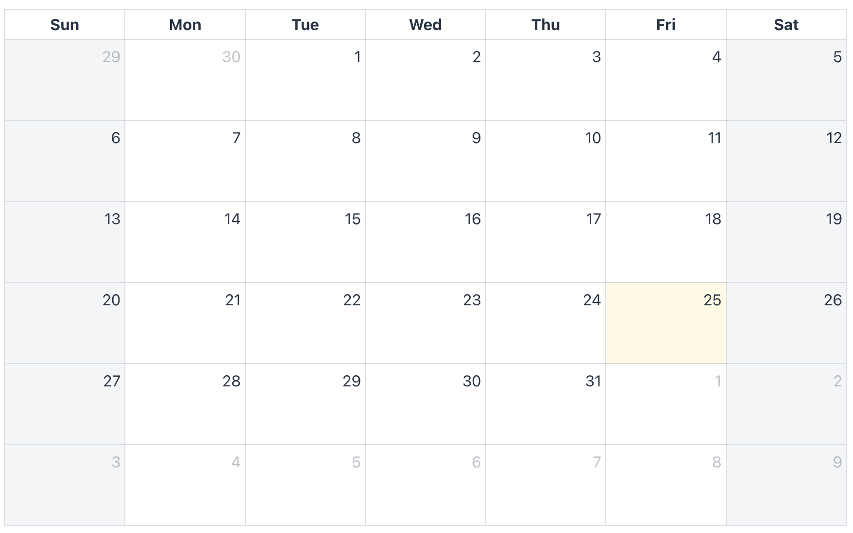
DAY_GRID_MONTH- displays an entire month at a glance, enabling users to see all days and their associated events. -
DAY_GRID_YEAR- presents an entire year, providing a high-level overview.You can use the initialDisplayMode attribute to set the initial day-grid mode for your
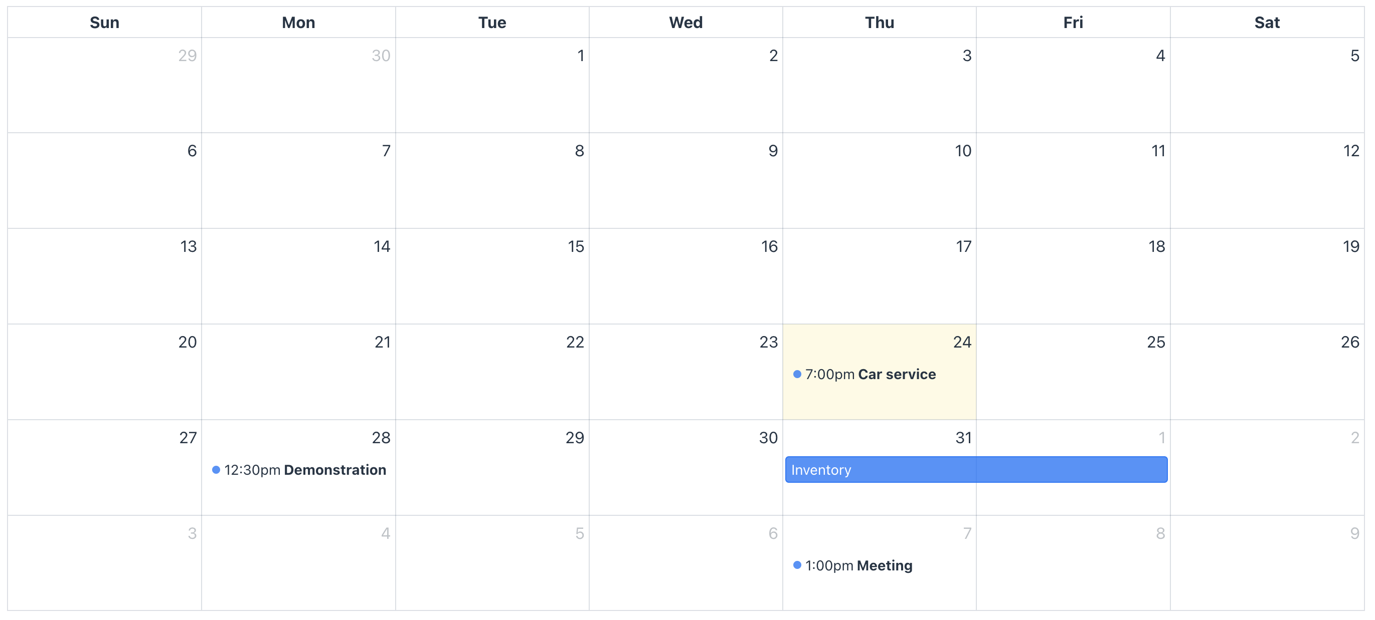
FullCalendarinstance:<calendar:calendar id="calendar" initialDisplayMode="DAY_GRID_WEEK" height="100%" width="100%"/>The screenshot below demonstrates a day-grid month display mode:
-
-
Time-grid modes offer time-oriented layouts for displaying events across one or more days. These formats are especially useful for users who need to manage their schedules with a strong focus on specific times throughout the day.
FullCalendarprovides two time-grid modes:-
TIME_GRID_DAY- displays a single day in detail, allowing users to see all events scheduled for that day along with their specific start and end times. -
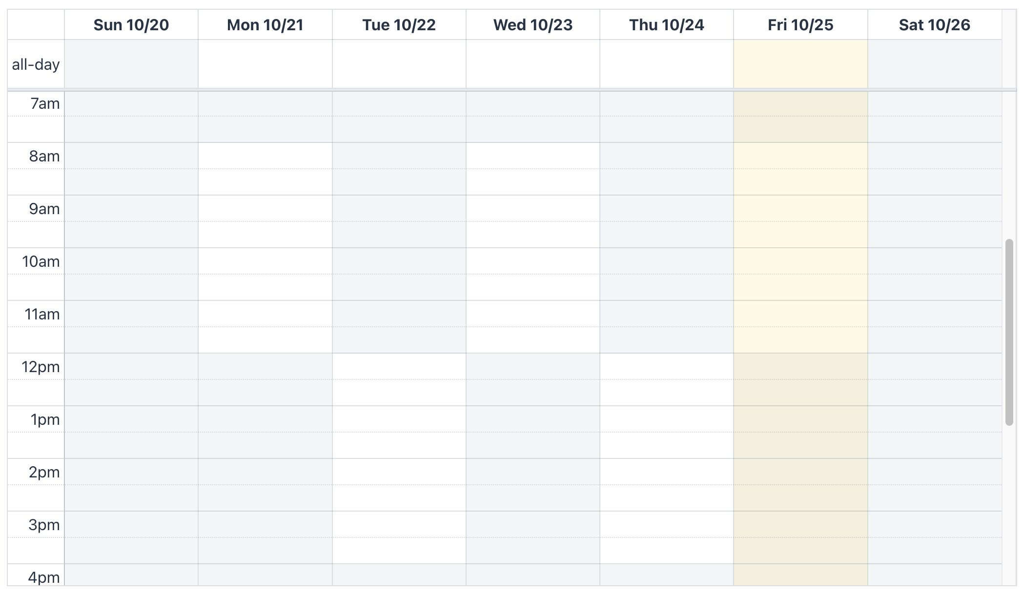
TIME_GRID_WEEK- shows an entire week, providing a broader view while still maintaining the time slots for each day. This mode is ideal for visualizing weekly schedules or planning meetings across multiple days.You can use the initialDisplayMode attribute to set the initial time-grid mode for your
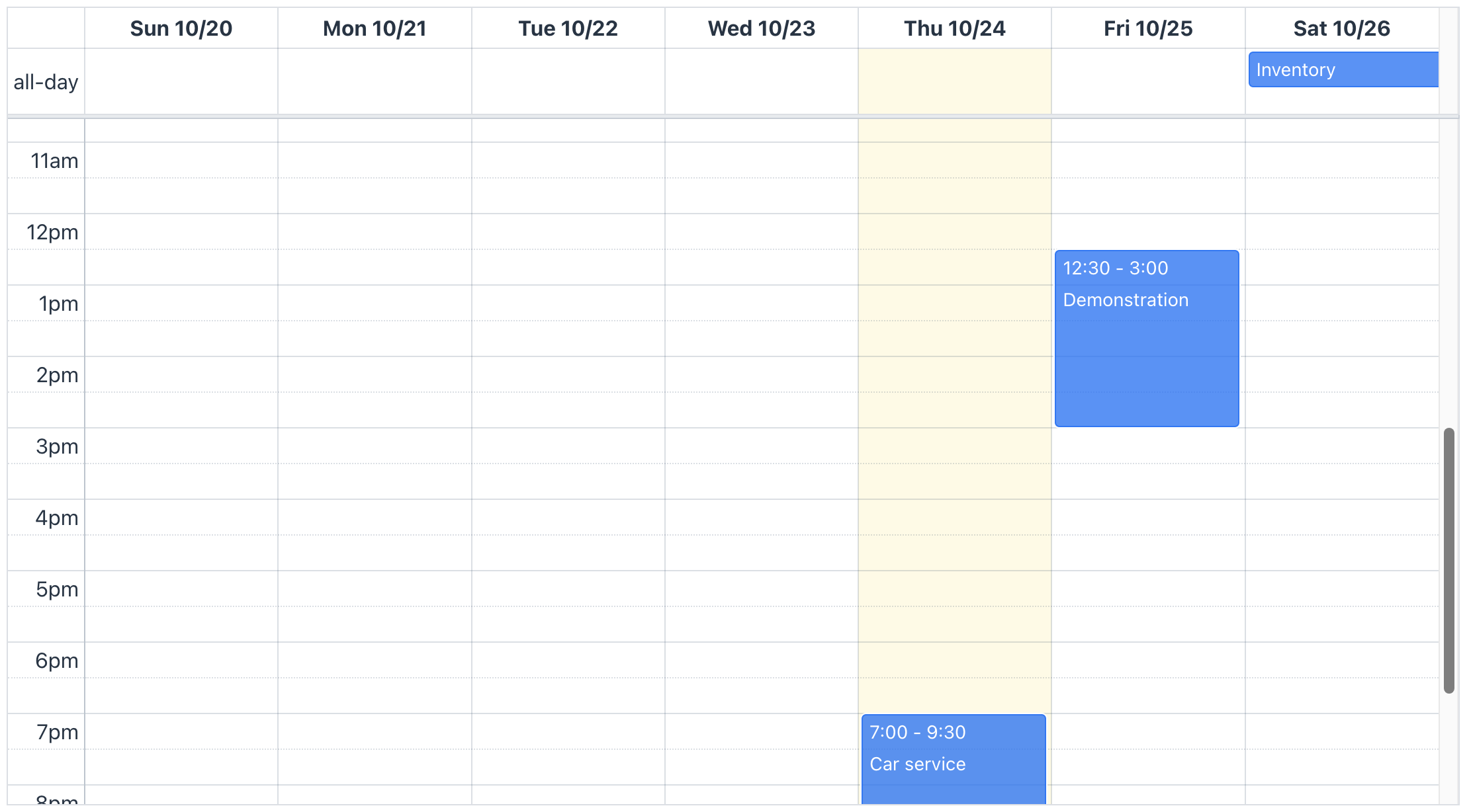
FullCalendarinstance:<calendar:calendar id="calendar" initialDisplayMode="TIME_GRID_WEEK" height="100%" width="100%"> </calendar:calendar>The screenshot below demonstrates a time-grid week display mode:
-
-
List modes present events in a straightforward vertical format, making it easy for users to view and manage their schedules over a specified period. This layout is ideal for users who prefer a simple, text-based representation of their events.
FullCalendaroffers various list modes:-
LIST_DAY- displays all events for a single day. -
LIST_WEEK- displays events for an entire week. -
LIST_MONTH- lists events for the entire month. -
LIST_YEAR- provides an overview of events throughout the year.You can use the initialDisplayMode attribute to set the initial list mode for your
FullCalendarinstance:<calendar:calendar id="calendar" initialDisplayMode="LIST_WEEK" height="100%" width="100%"/>The screenshot below demonstrates a list week display mode:
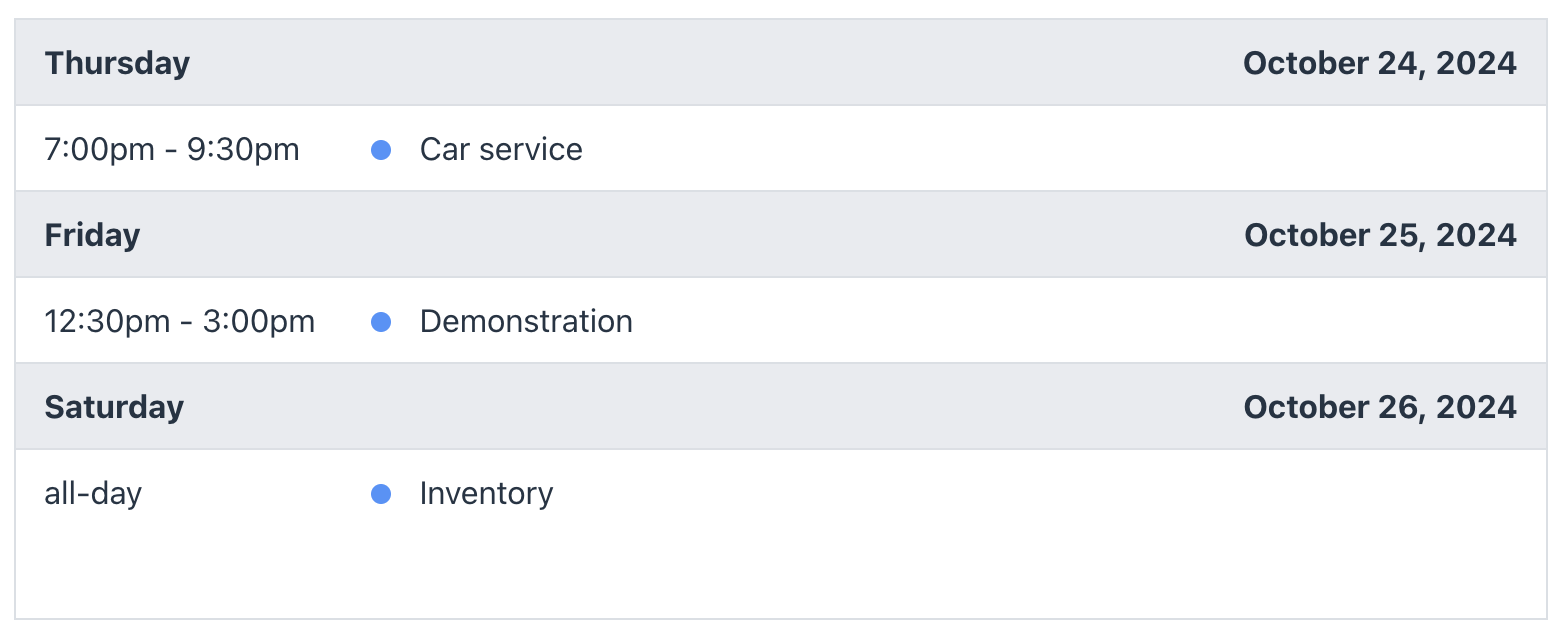
-
-
Multi-month year mode provides a comprehensive way to visualize several months at once, offering a high-level overview of events across a longer period.
-
MULTI_MONTH_YEARdisplays a grid of months, allowing users to see all 12 months of the year in a single view. This is useful for planning and tracking events that span across multiple months.You can use the initialDisplayMode attribute to set the initial multi-month year mode for your
FullCalendarinstance:<calendar:calendar id="calendar" initialDisplayMode="MULTI_MONTH_YEAR" height="100%" width="100%"/>The screenshot below demonstrates a multi-month year display mode:
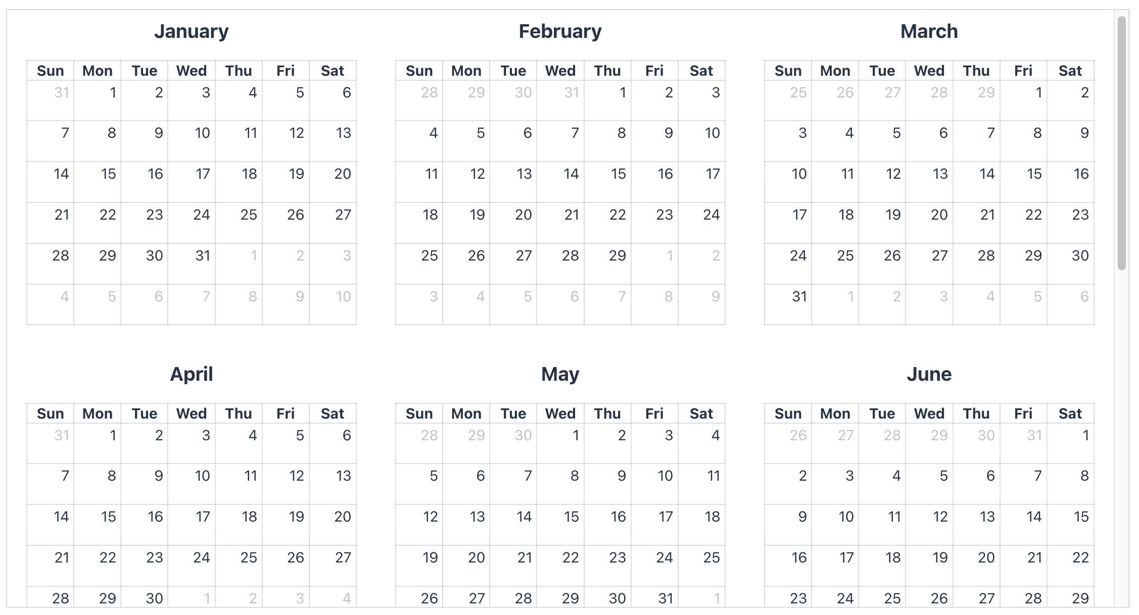
-
Display Mode Properties
Each predefined display mode has its own set of properties. Some properties are specific to a particular display mode, while others are general.
For example, you can configure dayHeaderFormat only for the day-grid day mode, and other modes won’t affect its format.
<calendar:calendar id="calendar" height="100%" width="100%">
    <calendar:displayModeProperties>
        <calendar:dayGridDay dayHeaderFormat="dddd D"/>
    </calendar:displayModeProperties>
</calendar:calendar>
FullCalendar also allows you to override properties in the calendar component using properties configured from the display mode.
For instance, imagine the component enables the weekNumbersVisible property. However, if you need to disable this feature for the day-grid month display mode, you should use the properties tag within the display mode properties.
<calendar:calendar id="calendar"
                   height="100%"
                   width="100%"
                   weekNumbersVisible="true">
    <calendar:displayModeProperties>
        <calendar:dayGridMonth>
            <calendar:properties>
                <calendar:property name="weekNumbers" value="false"/>
            </calendar:properties>
        </calendar:dayGridMonth>
    </calendar:displayModeProperties>
</calendar:calendar>
In the name attribute, you should specify the property name as it is defined in FullCalendar.js.
Refer to the FullCalendar.js documentation to find the correct property name.
Use this feature carefully; FullCalendar might ignore this display mode property setup if you change the same property in the component at runtime.
|
Custom Calendar Display Mode
If the predefined display modes don’t meet your needs, you can create your own custom display mode with a specific date range. There are two ways to create a custom display mode:
-
Programmatically, using the
CustomCalendarDisplayModeclass. -
Declaratively, using the customDisplayModes element in an XML.
Custom display modes should be based on one of four base types: day-grid, time-grid, list, and multi-month.
For example, you can define a time-oriented display mode declaratively using the following code:
<calendar:calendar id="calendar"
                   initialDisplayMode="timeGridThreeDays"
                   height="100%"
                   width="100%">
    <calendar:customDisplayModes>
        <calendar:displayMode id="timeGridThreeDays" type="TIME_GRID" dayCount="3">
        </calendar:displayMode>
    </calendar:customDisplayModes>
</calendar:calendar>
The dayCount attribute sets the exact number of days displayed in a custom display mode, regardless of the weekendsVisible or hiddenDays properties.
|
You can also use the duration element instead of the dayCount attribute to specify the date range:
<calendar:displayMode id="timeGridThreeDays" type="TIME_GRID">
    <calendar:duration days="3"/>
</calendar:displayMode>
When a date range is specified using duration, hidden days will be omitted, and the display mode will stretch to fill the missing space.
However, if you specify dayCount, you are guaranteed to see a specific number of days.
|
For programmatic creation of custom display modes, use CustomCalendarDisplayMode.
@ViewComponent
private FullCalendar calendar;

@Subscribe
public void onInit(final InitEvent event) {
    calendar.addCustomCalendarDisplayMode(
            new CustomCalendarDisplayMode("dayGridTwoDays")
                    .withDayCount(2));

    calendar.setInitialCalendarDisplayMode(() -> "dayGridTwoDays");
}
The default display mode is the day grid, but you can customize it by choosing a different type from the GenericCalendarDisplayModes enumeration.
|
Display Mode and Visible Range
You can further customize the date range displayed in a calendar by using the visibleRange property. This property should be used in conjunction with the options from the GenericCalendarDisplayModes enumeration.
It’s important to note that visibleRange does not have an XML definition and can only be configured programmatically.
For example, you can configure the calendar to display the day grid like this:
<calendar:calendar id="calendar"
                   initialDisplayMode="DAY_GRID"
                   height="100%"
                   width="100%"/>
The GenericCalendarDisplayModes enum provides the following display options in XML: DAY_GRID, TIME_GRID, LIST, and MULTI_MONTH.
|
Set the required visible range in the view controller:
@ViewComponent
private FullCalendar calendar;

@Subscribe
public void onInit(final InitEvent event) {
    calendar.setVisibleRange(
            LocalDate.now(), LocalDate.now().plusDays(3));
}| The last date is exclusive. For example, a visible range of October 1, 2024, to October 3, 2024, will display only two days (October 1st and 2nd). |
When a visible range is set, navigation methods like navigateToNext() will not function.
|
Calendar Event Editing
FullCalendar lets you edit calendar events by dragging and dropping to change the start date, and resizing to adjust the duration. To handle these changes, you should add the following event listeners: EventDropEvent and EventResizeEvent.
The component can modify only three properties of the CalendarEvent based on event changes:
Drag and Drop
To enable the drag and drop feature, set the eventStartEditable property to true.
<calendar:calendar id="calendar"
                   eventStartEditable="true"
                   height="100%"
                   width="100%"/>
Event Drop Event
To handle changes when a calendar event is dropped, subscribe to the EventDropEvent.
This event is emitted by the FullCalendar component when a user moves a calendar event to a different position.
| Before proceeding with an event to the listeners, the component applies changes to the calendar event in the data provider. |
The event contains the following information:
-
The dropped calendar event
-
The calendar event’s data provider
-
Old values
-
Information about the current display mode
-
The delta (duration) between the old start date and the new start date
-
Related calendar events that were also dropped with the dropped calendar event
The example below demonstrates how to immediately save changes to an entity calendar event:
@Autowired
private DataManager dataManager;

@Subscribe("calendar")
public void onCalendarEventDrop(final EventDropEvent event) {
    EntityCalendarEvent<Event> calendarEvent = event.getCalendarEvent();

    dataManager.save(calendarEvent.getEntity());
}
Resizable
To enable calendar event resizing, set the eventDurationEditable property to true. This allows users to change the duration (size) of a calendar event by modifying its end date.
To resize the calendar event by modifying its start date, set the eventResizableFromStart property to true:
<calendar:calendar id="calendar"
                   eventDurationEditable="true"
                   eventResizableFromStart="true"
                   height="100%"
                   width="100%"/>
Event Resize Event
To handle changes when a calendar event is resized, subscribe to the EventResizeEvent.
This event is triggered by the FullCalendar component when a user resizes a calendar event.
| Before proceeding with an event to the listeners, the component applies changes to the calendar event in the data provider. |
The event contains the following information:
-
The resized calendar event
-
The calendar event’s data provider
-
Old values
-
Information about the current display mode
-
The start delta (duration) between the old start date and the new start date
-
The end delta (duration) between the old end date and the new old date
-
Related calendar events that were also resized with the dropped calendar event
The example below demonstrates how to immediately save changes to an entity calendar event:
@Autowired
private DataManager dataManager;

@Subscribe("calendar")
public void onCalendarEventResize(final EventResizeEvent event) {
    EntityCalendarEvent<Event> calendarEvent = event.getCalendarEvent();

    dataManager.save(calendarEvent);
}
Calendar Event Constraints
FullCalendar allows you to configure limitations for dragging and resizing events.
You can restrict event changes in three ways:
-
Event Constraint Group ID:
Set an eventConstraintGroupId value. If this property is set, events that are being dragged or resized must be fully contained within at least one of the events linked to the specified group ID.
-
Default Business Hours:
Enable the default business hours using the eventConstraintBusinessHoursEnabled property. Events that are being dragged or resized must be fully contained within the week’s business hours. If defaultBusinessHoursEnabled is set, the default business hours are Monday to Friday, 9 AM to 5 PM. Custom business hours are also respected.
-
Custom Business Hours:
Set custom business hours. As with the default business hours, events must be contained within the defined custom business hours.
Event Overlap
The eventOverlap attribute provides another way to limit dragging and resizing calendar events. It controls whether events can overlap each other while being dragged or resized. By default, overlapping is enabled.
For more granular control, you can use a JavaScript function to define custom overlap rules.
The following example demonstrates how to allow all-day calendar events to overlap only with other all-day events:
@ViewComponent
private FullCalendar calendar;

@Subscribe
public void onInit(final InitEvent event) {
    calendar.setEventOverlapJsFunction(new JsFunction("""
            function(stillEvent, movingEvent) {
                return stillEvent.allDay && movingEvent.allDay;
            }"""));
}| The JavaScript function definition for event overlap takes precedence over the eventOverlap property. |
You can access all available properties of events in the FullCalendar.js documentation. Within the JavaScript function, you can utilize additionalProperties available under the extendedProps object of an event. For example, if a calendar event has an additional property called myEventStatus, you can retrieve its value like this: stillEvent.extendedProps.myEventStatus.
|
Selection
The selection feature in FullCalendar allows users to select multiple days or time slots by clicking or dragging their mouse. To enable this feature, set the selectionEnabled property to true:
<calendar:calendar id="calendar"
                   selectionEnabled="true"
                   height="100%"
                   width="100%"/>
Select Event
To handle selection events, subscribe to the SelectEvent.
This event is triggered by the FullCalendar component when a user selects multiple days or time slots.
The event contains the following information:
-
The start date and time.
-
The end date and time.
-
The
allDayproperty. Indicates whether the selected dates are day cells or time slots. -
Information about the current display mode.
-
Information about the mouse click.
The example of subscribing to select event:
@Autowired
private Notifications notifications;

@Subscribe("calendar")
public void onCalendarSelect(final SelectEvent event) {
    notifications.show(String.format("Selected dates: from %s to %s",
            event.getStartDateTime(), event.getEndDateTime()));
}
The end date and time are exclusive. For example, if the selection is all-day and the last date value is 2024-10-15, the value of the end date property will be 2024-10-16.
|
Unselect Event
To handle the clearing of a selection, subscribe to the UnselectEvent.
This event is triggered by the FullCalendar component when a selection is cleared.
It is fired in the following cases:
-
User clicks away from the current selection: This happens unless the unselectAuto property is disabled.
-
User makes a new selection: The event is fired before the new selection occurs.
-
User moves forward or backward in the calendar view or switches to a different mode.
-
The
unselect()method is called.
The event contains the following information:
-
Information about the current display mode.
-
Information about the mouse click.
The example of subscribing to unselect event:
@Autowired
private Notifications notifications;

@Subscribe("calendar")
public void onCalendarUnselect(final UnselectEvent event) {
    notifications.show("Selection is cleared");
}
Select Constraints
Selection constraints in FullCalendar are similar to Calendar Event Constraints, but they apply to the selection area. These constraints limit the selectable area based on the following options:
-
The selectConstraintGroupId property: if this property is set, only dates or time slots containing events with the specified group ID can be selected.
-
The selectConstraintBusinessHoursEnabled property: the selection can only be made within the week’s business hours. If defaultBusinessHoursEnabled is set, the default business hours are Monday to Friday, 9 AM to 5 PM. Custom business hours are also respected.
-
Custom business hours: as with the default business hours, selections must be made within the custom business hours.
Select Overlap
The selectOverlap attribute provides another way to limit selection in FullCalendar. It controls whether the selection area can overlap with existing calendar events. By default, overlap is allowed.
For more fine-grained control, you can use a JavaScript function definition to check whether a selection can overlap with a calendar event.
The following example demonstrates how to allow selection in cells that contain background calendar events:
@ViewComponent
private FullCalendar calendar;

@Subscribe
public void onInit(final InitEvent event) {
    calendar.setSelectOverlapJsFunction(new JsFunction("""
            function(event) {
                return event.display === 'background';
            }"""));
}| The JavaScript function definition for selection overlap takes precedence over the selectOverlap property. |
You can find all available properties of events in the FullCalendar.js documentation.
Within the JavaScript function, you can utilize additionalProperties available under the extendedProps object of an event.
For example, if a calendar event has an additional property called myEventStatus, you can retrieve its value like this: event.extendedProps.myEventStatus.
|
Programmatic Selection Control
FullCalendar provides the following methods for programmatically selecting or unselecting a date range:
-
select(): Selects a date range. -
unselect(): Clears the current selection.
The following code selects a date range of two days, including the current day:
@ViewComponent
private FullCalendar calendar;

@Subscribe
public void onInit(final InitEvent event) {
    calendar.select(LocalDate.now(), LocalDate.now().plusDays(2));
}| The end date in the example above is excluded, effectively selecting the current and next days. |
Controlling Selection with a JavaScript Function
You can control selection behavior for each cell using a JavaScript function. For example, the following function enables selection only for yesterday, today, and tomorrow:
@ViewComponent
private FullCalendar calendar;

@Subscribe
public void onInit(final InitEvent event) {
    calendar.setSelectAllowJsFunction(
            new JsFunction(String.format("""
                            function(selectionInfo) { (1)
                                return selectionInfo.start >= new Date('%s')
                                && selectionInfo.end <= new Date('%s');
                            }""",
                    convertToStrDate(LocalDate.now().minusDays(1)), (2)
                    convertToStrDate(LocalDate.now().plusDays(2)))));
}

protected String convertToStrDate(LocalDate date) { (3)
    TimeZone timeZone = calendar.getTimeZone() == null
            ? TimeZone.getDefault()
            : calendar.getTimeZone();
    return date.atStartOfDay(timeZone.toZoneId()).toOffsetDateTime().toString();
}| 1 | The selectionInfo parameter in this function contains the following properties:
|
| 2 | The start and end dates are applicable to the selection. |
| 3 | This method converts LocalDate to ISO format with the component’s time zone. |
Business Hours
Business hours define the specific times during which calendar events can be scheduled or displayed. There are two ways to configure business hours in the FullCalendar component:
-
The defaultBusinessHoursEnabled property.
-
Custom list of business hours definitions. Allows you to specify custom business hours, overriding the defaults.
Here is an example of how to configure business hours with the defaultBusinessHoursEnabled property:
<calendar:calendar id="calendarDefault"
                   defaultBusinessHoursEnabled="true"
                   height="100%"
                   width="100%"/>
When business hours are defined, they are visually emphasized on the calendar.
For more fine-grained control over business hours, you can set a list of custom business hours. This allows you to configure different hours for different days of the week or even split hours into segments (like morning and afternoon shifts).
Let’s set up a duty schedule as an example. On Monday, Wednesday, and Friday, work hours are from 8 AM to 12 PM, while on Tuesday and Thursday, they are from 12 PM to 6 PM:
<calendar:calendar id="calendar"
                   initialDisplayMode="TIME_GRID_WEEK"
                   height="100%"
                   width="100%">
    <calendar:businessHours>
        <calendar:entry startTime="PT8h" endTime="PT12h">
            <calendar:day name="MONDAY"/>
            <calendar:day name="WEDNESDAY"/>
            <calendar:day name="FRIDAY"/>
        </calendar:entry>
        <calendar:entry startTime="PT12h" endTime="PT16h">
            <calendar:day name="TUESDAY"/>
            <calendar:day name="THURSDAY"/>
        </calendar:entry>
    </calendar:businessHours>
</calendar:calendar>
The startTime and endTime properties follow the ISO-8601 duration format, which is the same format used by the java.time.Duration class.
|
Context Menu
The FullCalendar component provides a context menu through the FullCalendarContextMenu class.
You can customize the content of this menu based on the clicked day cell or calendar event.
However, there are limitations on where the context menu can be opened:
-
Calendar Events: Available in all display modes.
-
Day Cells: Available in all day-grid display modes and the multi-month year mode.
-
Time Slots: Not available.
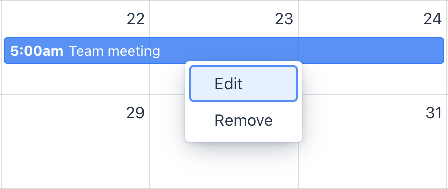
The example of dynamic context menu handling:
@ViewComponent
private CollectionContainer<Event> eventsDc;
@ViewComponent
private FullCalendar calendar;

@Autowired
private DialogWindows dialogWindows;

@Subscribe
public void onInit(final InitEvent event) {
    FullCalendarContextMenu contextMenu = calendar.getContextMenu(); (1)
    contextMenu.setContentMenuHandler(context -> { (2)
        EntityCalendarEvent<Event> calendarEvent = context.getCalendarEvent();
        if (calendarEvent != null) {
            contextMenu.removeAll(); (3)

            contextMenu.addItem("Edit", clickEvent -> { (4)
                dialogWindows.detail(this, Event.class)
                        .editEntity(calendarEvent.getEntity())
                        .open();
            });
            contextMenu.addItem("Remove", clickEvent -> {
                eventsDc.getMutableItems().remove(calendarEvent.getEntity());
            });

            return true; (5)
        }
        return false;
    });
}| 1 | Gets the context menu instance from the FullCalendar component. |
| 2 | Sets the context menu handler, allowing you to configure the menu items. |
| 3 | Removes all menu items that were previously in the context menu. |
| 4 | Adds a new menu item with a click listener. |
| 5 | Returns true to indicate that the context menu can be opened. |
Styling
You can style the calendar and its events with CSS. Use your browser’s developer tools to inspect the DOM tree of the calendar and write CSS selectors.
For example, the following selectors change the background color of Saturday and Sunday in day-grid modes:
.fc-day-sat.fc-daygrid-day,
.fc-day-sun.fc-daygrid-day {
    background-color: #FF9191AD;
}
There are CSS variables that FullCalendar.js provides for customization:
html jmix-full-calendar {
    --fc-small-font-size: var(--lumo-font-size-s);
    --fc-page-bg-color: var(--lumo-base-color);
    --fc-neutral-bg-color: var(--lumo-contrast-10pct);
    --fc-neutral-text-color: var(--lumo-secondary-text-color);
    --fc-border-color: var(--lumo-contrast-20pct);

    --fc-event-bg-color: var(--lumo-primary-color-50pct);
    --fc-event-border-color: var(--lumo-primary-color-50pct);
    --fc-event-text-color: var(--lumo-primary-contrast-color);
    --fc-event-selected-overlay-color: var(--lumo-primary-color-10pct);;

    --fc-more-link-bg-color: #a6a6a6;
    --fc-more-link-text-color: inherit;

    --fc-event-resizer-thickness: 8px;
    --fc-event-resizer-dot-total-width: 8px;
    --fc-event-resizer-dot-border-width: 1px;

    --fc-non-business-color: var(--lumo-contrast-5pct);
    --fc-bg-event-color: rgb(143, 223, 130);
    --fc-bg-event-opacity: 0.3;
    --fc-highlight-color: var(--lumo-primary-color-10pct);
    --fc-today-bg-color: rgba(255, 220, 40, 0.15);
    --fc-now-indicator-color: red;
}
Component and Event Properties
The FullCalendar component and calendar events have properties that define event colors.
For instance, the following example sets colors for all calendar events:
<calendar:calendar id="calendar"
                   eventTextColor="#5CCCCC"
                   eventBorderColor="#679B00"
                   eventBackgroundColor="#006363"
                   height="100%"
                   width="100%"/>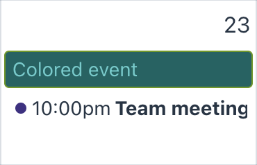
Individual calendar events have properties that can override the component’s color definitions:
CalendarEvent calendarEvent = SimpleCalendarEvent.create()
        .withTitle("Colored event")
        .withAllDay(true)
        .withStartDateTime(LocalDateTime.now())
        .withTextColor("#80EA69")
        .withBorderColor("#A6A200")
        .withBackgroundColor("#188A00")
        .build();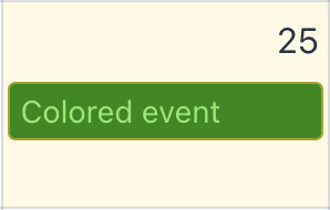
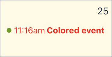
Another way to style calendar events is by assigning a class name to an event. This allows you to apply custom CSS styles to specific events.
CalendarEvent redCalendarEvent = SimpleCalendarEvent.create()
        .withTitle("Colored event")
        .withStartDateTime(LocalDateTime.now())
        .withClassNames("red-text-event")
        .build();
The CSS selector:
.fc-event.red-text-event {
    color: red;
}
Class Names Generators
Class name generators help generate class names for calendar UI elements, based on the context of their generation.
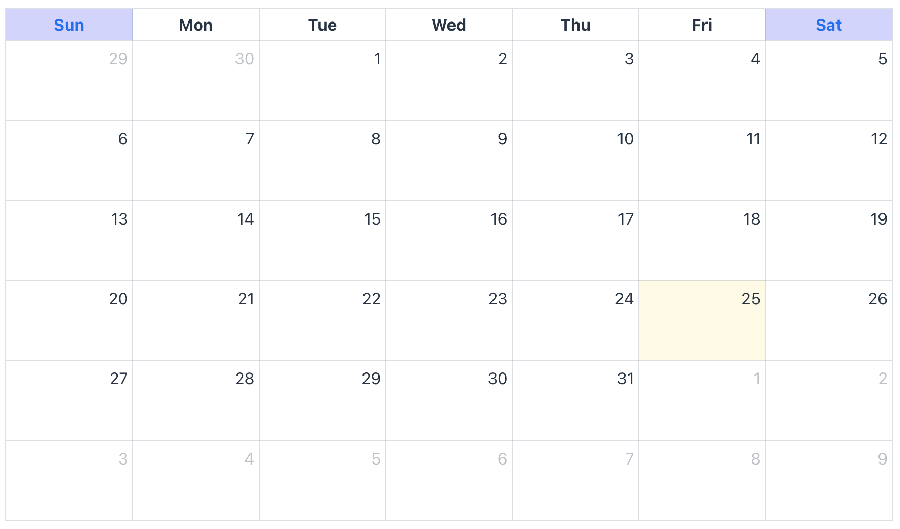
For instance, let’s highlight weekends using dayHeaderClassNamesGenerator:
@Install(to = "calendar", subject = "dayHeaderClassNamesGenerator")
private List<String> calendarDayHeaderClassNamesGenerator(final DayHeaderClassNamesContext context) {
    if (context.getDayOfWeek() == DayOfWeek.SATURDAY
            || context.getDayOfWeek() == DayOfWeek.SUNDAY) {
        return List.of("weekend");
    }
    return null;
}
To style the background and text colors, add two CSS selectors:
.fc-col-header-cell.weekend {
    background-color: rgba(195, 195, 255, 0.73);
}

.fc-col-header-cell.weekend a {
    color: var(--lumo-primary-color)
}
Refer to the Handlers section for a complete list of class name generators.
Formatting
The FullCalendar component provides extensive capabilities to customize the appearance of dates, times, and text throughout its interface.
Default Format Properties
The component offers a set of global default properties that define formatting for common elements. These are especially useful for establishing a consistent base format across all calendar views.
-
defaultDayHeaderFormat: Defines the text format for the calendar’s column headings.
-
defaultDayPopoverFormat: Defines the date format for the title of the popover that appears when the "more" link is clicked in a cell.
-
defaultEventTimeFormat: Defines the format for the time text displayed on each calendar event.
-
defaultSlotLabelFormat: Sets the format of the text that will be displayed within a time slot.
-
defaultWeekNumberFormat: Defines the display format for the week number, which is shown when the weekNumbersVisible property is enabled.
By default, component sets localized format from messages when is created.
Format Precedence
The default format properties serve as a fallback for all standard display modes (dayGridDay, timeGridWeek, etc.) and any custom modes (CustomCalendarDisplayMode) until a more specific format is defined at the display mode level.
However, each display mode’s property object explicitly specifies its own formats by default. Consequently, these display-mode-specific settings override the global default properties.
For example, configuring dayHeaderFormat within the dayGridDay properties will override the global defaultDayHeaderFormat for that specific view.
<calendar:calendar id="calendar"
                   initialDisplayMode="DAY_GRID_DAY"
                   height="100%"
                   width="100%">
    <calendar:displayModeProperties>
        <calendar:dayGridDay dayHeaderFormat="dddd, MMMM D, YYYY"/>
    </calendar:displayModeProperties>
</calendar:calendar>
Formatting Rules
This component uses the moment plugin for FullCalendar. Therefore, all format strings must adhere to the formatting rules defined in the Moment.js Documentation.
For example, using the token dd will produce a 2-letter weekday value like "Mo", while dddd will produce the full name like "Monday".
|
Changes to these properties (for example, updating |
Examples
The following examples demonstrate how to configure date and time formatting for different display modes.
Example 1: TimeGrid Week View
This example configures a calendar in the weekly time grid view (TIME_GRID_WEEK). It defines a 24-hour format for time slot labels and a custom format for the day column headers.
<calendar:calendar id="calendar_1"
                   initialDisplayMode="TIME_GRID_WEEK"
                   height="100%"
                   width="100%">
    <calendar:displayModeProperties>
        <calendar:timeGridWeek slotLabelFormat="HH:mm"
                               dayHeaderFormat="dddd, Do MMM"/>
    </calendar:displayModeProperties>
</calendar:calendar>
Example 2: List Week View
This example configures a calendar in the list view for a week (LIST_WEEK). It customizes the date format for each item in the list.
<calendar:calendar id="calendar_1"
                   initialDisplayMode="LIST_WEEK"
                   height="100%"
                   width="100%">
    <calendar:displayModeProperties>
        <calendar:listWeek listDayFormat="dd"/>
    </calendar:displayModeProperties>
</calendar:calendar>
Localization
Localization can be changed locally for a single FullCalendar component or globally using the messages mechanism.
To configure the localization of a single component, use component properties and the FullCalendarI18n object.
The FullCalendarI18n object contains locale-dependent properties, some of which can affect the component’s behavior, such as firstDayOfWeek, direction, and others.
For instance, let’s change the first day of the week and the direction:
<calendar:calendar id="calendar"
                   firstDayOfWeek="MONDAY"
                   direction="RTL"
                   height="100%"
                   width="100%"/>
Programmatically you can do the following:
@ViewComponent
private FullCalendar calendar;

@Subscribe
public void onInit(final InitEvent event) {
    calendar.setI18n(new FullCalendarI18n()
            .withFirstDayOfWeek(DayOfWeek.MONDAY)
            .withDirection(FullCalendarI18n.Direction.RTL));
}
To change localization globally, add message keys from the FullCalendar add-on to your messages bundle. You can find the complete list of available messages in jmix/fullcalendarflowui/messages.properties.
For example, you can translate the default names for months:
io.jmix.fullcalendarflowui.component/months=January, February, March, April, May, June, July, August, September, October, November, December
io.jmix.fullcalendarflowui.component/monthsShort=Jan, Feb, Mar, Apr, May, Jun, Jul, Aug, Sep, Oct, Nov, Dec
io.jmix.fullcalendarflowui.component/weekdays=Sunday, Monday, Tuesday, Wednesday, Thursday, Friday, Saturday
io.jmix.fullcalendarflowui.component/weekdaysShort=Sun, Mon, Tue, Wed, Thu, Fri, Sat
io.jmix.fullcalendarflowui.component/weekdaysMin=Su, Mo, Tu, We, Th, Fr, Sa| Make sure the translated names are in the same order as the original names because the parser expects weekdays from Sunday to Saturday and months from January to December. |
Attributes
Common attributes serve the same purpose for all components.
The following attributes are specific to calendar:
| Name | Description | Default |
|---|---|---|
Determines how an event’s duration should be mutated when it is dragged from a timed section to an all-day section or vice versa.
|
|
|
Sets the all-day text. The text is visible in time-grid display modes. |
- |
|
Sets the hint for the close button in the popover when you click the "more" link. |
- |
|
Sets the first visible date of CustomCalendarDisplayMode. When a custom calendar display mode is being used, and you’d like to guarantee that the calendar begins at a certain interval, like the start-of-week or start-of-month, specify a value like If a display mode’s range is explicitly defined by visible date range, this property will be ignored. |
- |
|
Sets whether the day headers should appear. It works for day-grid, time-grid and month display modes. |
|
|
Sets rows count of events in day-grid display modes and in "all-day" section in time-grid display modes. Note that "more" row is included to count. For instance, if the value is |
- |
|
Sets rows count of events in day-grid display modes and in "all-day" section in time-grid display modes. Note that "+ more" row is not included to count. For instance, if the value is |
- |
|
The rule how to define the first week of the year. For instance, if the first day of the week is |
- |
|
Sets the default value for each calendar event’s allDay property when it is unspecified. If the property is set to Note, in this case, events without allDay property will be shown as all-day events. If such event will be changed by dragging or resizing, and you have listeners for these events, the component will apply changes to a calendar event, which can lead to modifying entity/ DTO instance. |
|
|
Sets the default duration of all-day events if they don’t specify endDateTime property. For instance, the property is set to 2 days. The event that has allDay property equals to Note, calendar event’s endDateTime property will remain unset, unless forceEventDuration has been set to This property only affects events with allDay property equals to |
|
|
Enables default business hours. The default business hour is: |
|
|
Sets the format of the text that will be displayed on the calendar’s column headings. For instance, the See Formatting. |
- |
|
Limits the maximum number of stacked events within a given day.
This property is applied for day-grid display modes and in all-day cells. |
|
|
Limits the maximum number of stacked events within a given day.
This property is applied for day-grid display modes and in all-day cells. |
|
|
Sets the date format of title of the popover that is shown when "more" link is clicked. For instance, the See Formatting. |
- |
|
Sets the format of the time-text that will be displayed on each event. For instance, the See Formatting. |
- |
|
Sets the format of the text that will be displayed within a time slot. For instance, the See Formatting. |
- |
|
Sets the default duration for timed events if they don’t specify endDateTime property. For instance, the property is set to 2 hours. The event that has allDay` property equals to Note, calendar event’s endDateTime property will remain unset, unless forceEventDuration has been set to This property only affects events with |
|
|
Sets the format of the week number that will be displayed when weekNumbersVisible is For instance, the See Formatting. |
- |
|
The direction in which text should be written. It also reorganizes the component layout. |
- |
|
Determines visibility of time text of each event. The property applies to timed-events (not all-day). If set to |
|
|
Sets the time it takes for an event to revert to its original position after an unsuccessful drag. |
|
|
Enables to automatically scroll the scroll-containers during event drag-and-drop and date selecting. The property change is not applied after component attached to the UI. |
|
|
Sets the background color for all events on the calendar. Note, calendar events can override this value if they specify backgroundColor property. Supported values are:
|
- |
|
Sets the border color for all events on the calendar. Note, calendar events can override this value if they specify borderColor property. Supported values are:
|
- |
|
Sets whether events being dragged or resized must be fully contained within the week’s business hours. It also respects custom business hours. |
|
|
Sets a group ID to limit the dragging and resizing of events. Events that are being dragged or resized must be fully contained by at least one of the events linked to by the given group ID. Takes precedence over eventConstraintBusinessHoursEnabled. The group ID can be an entity instance, string, enum or other types. |
- |
|
Sets the display mode that controls the appearance of all events that do not specify display mode. To control the display of specific events, use the display property of calendar event. |
|
|
Sets how many pixels the user’s mouse/touch must move before an event drag activates. |
|
|
Enables to edit event duration using resizing. This property can be overridden on per-event by durationEditable property. |
|
|
Sets for list display modes' non-visible table header the name of the column with event names. |
- |
|
Enables to edit event duration using resizing This property can be overridden on per-event by interactive property. |
|
|
Sets the amount of time, in milliseconds, that the user must hold down before an event becomes draggable on touch devices. |
|
|
Sets the maximum number of events that stack top-to-bottom for time-grid display modes. |
- |
|
Sets the list of calendar event properties that should participate in sorting. It is also available to specify properties from event’s additionalProperties property. For most calendar display modes, this property determines the vertical ordering of events within the same day. For time-grid display modes however, it determines the horizontal ordering of events within the same time slot. The default value puts earlier events first. If tied, it puts longer events first. If still tied, it puts all-day events first. If still tied, orders events by title, alphabetically. If putting a lower-precedent event before a higher-precedent improves compactness, the algorithm will do so. To disable this behavior, set eventOrderStrict to The provided properties are sorted in ascending order. If a property is prefixed with a minus sign like |
|
|
Enables the component to strictly follow the specified event order. The |
|
|
Allows events to overlap each other during dragging and resizing. |
|
|
Enables to resize an event from its starting date. |
|
|
Specifies the delay (in milliseconds) before a single-click event is triggered. This threshold is used to distinguish a single click from a double-click action. Please note, this attribute is supported in Jmix 2.7.2 and later. |
|
|
Enables to edit event start time using dragging. This property can be overridden on per-event by startEditable property. |
|
|
Sets the text color for all events on the calendar. Note, calendar events can override this value if they specify textColor property. Supported values are:
The color applies in time-grid display modes and for all-day events in day-grid display modes. |
- |
|
Enables to expand rows of time-grid display modes if they don’t take up the entire height. |
|
|
Sets the day that each week begins. The default value is taken from locale. |
- |
|
Makes the component to assign endDateTime property value to events if they do not have it. Note, if event does not specify endDateTime property, the component will set it explicitly. If such event will be changed by dragging or resizing, and you have listeners for these events, the component will set new value to calendar event endDateTime property, which can lead to modifying entity/ DTO instance. |
|
|
Sets the initial date that will be displayed when the component is attached to UI. If not specified, the current date will be used. The property change is not applied after component attached to the UI. |
- |
|
Sets initial calendar display mode that will be shown after attaching component to th UI. The property change is not applied after component attached to the UI. |
|
|
Sets CSS class names that should be added to "more" link. |
- |
|
Sets the calendar display mode that should be shown when "more" link is clicked. |
- |
|
Sets the "more" link hint. The provided text can be a JavaScript Template string. This template takes the count parameter that has Number type, for instance: It also takes a string definition of JavaScript function that takes count as a parameter. For instance: |
- |
|
Sets the "more" link text. The provided text can be a JavaScript Template string. This template takes the It also takes a string definition of JavaScript function that takes the |
- |
|
Sets the hint text of navigation links. The provided text can be a JavaScript Template string. This template takes the date parameter that has String type, for instance: It also takes a string definition of JavaScript function that takes the |
- |
|
Enables navigation to date using day names and week names. |
|
|
Sets the minimum time that event’s endDateTime property should achieve to render event as it if were on that day. For instance, the property is set to
So, the event spans to another day, but it will be rendered as a one-day event, because the Only affects timed events that appear on whole-days cells. Whole-day cells occur in day-grid display modes and the all-day slots in the time-grid display modes. Note that this property is ignored when event’s allDay property is set to |
- |
|
Sets text that will be shown when no events are displayed in list display modes |
- |
|
Enables displaying a marker indicating the current time. The property applies in time-grid display modes. The property change is not applied after component attached to the UI. |
|
|
Enables rendering of events from the data provider as soon as the events are loaded.
|
|
|
Sets the initial scroll position to a specific time. Users will be able to scroll back to see events before this time. If you want to prevent users from doing this, use the slotMinTime instead. By default, the scroll time is reapplied to the calendar whenever the date range changes. To disable this, set scrollTimeReset to The property change is not applied after component attached to the UI. |
|
|
Sets whether the calendar should scroll to scrollTime every time the date range changes. By default, whenever the date range changes, either via calendar methods or user actions, the scroll is reset. To disable this behavior, set the property to |
|
|
Sets whether the selection must be fully contained within the week’s business hours. It also respects custom business hours. This property will be applied if selectionEnabled is enabled. |
|
|
Sets a group ID to limit selection. If group ID is set, only cells with events that contain the same group ID can be selected. Takes precedence over the selectConstraintBusinessHoursEnabled. This property will be applied if selectionEnabled is enabled. |
||
Sets the amount of time the user must hold down before a date becomes selectable on touch devices. |
|
|
Sets the minimum distance the user’s mouse must travel after a mousedown, before a selection is allowed. A non-zero value is useful for differentiating a selection from a date click event. This property is only applicable to mouse-related interaction. For touch interaction, see selectLongPressDelay. The property change is not applied after component attached to the UI. |
|
|
Enables the drawing of a placeholder event while the user is dragging. This property applies to time-grid display modes. |
|
|
Enables to select cells that contains events. |
|
|
Allows the user to highlight multiple days or timeslots by clicking and dragging. |
|
|
Sets the interval at which time slots are displayed. In XML component definition, the attribute value should follow the ISO-8601 duration format, which is used by the |
|
|
Sets the frequency for labeling time slots with text. If not specified, a reasonable value will be automatically computed based on slotDuration. When specifying this property, give the In XML component definition, the attribute value should follow the ISO-8601 duration format, which is used by the |
- |
|
Sets the last time slot that will be displayed for each day. The specified value represents the exclusive end time, meaning the time slot ending at this value will not be included. The property determines the last slot, even when the scrollbars have been scrolled all the way back. In XML component definition, the attribute value should follow the ISO-8601 duration format, which is used by the |
|
|
Sets the first time slot that will be displayed for each day. The property determines the first time slot, even when the scrollbars have been scrolled all the way back. In XML component definition, the attribute value should follow the ISO-8601 duration format, which is used by the |
|
|
Sets a value that determines the time interval at which a dragged event will snap to the time axis. This also affects the granularity at which selections can be made. In XML component definition, the attribute value should follow the ISO-8601 duration format, which is used by the |
|
|
Sets for list display modes' non-visible table header the name of the column with days and times |
- |
|
Sets whether clicking elsewhere on the page will clear the current selection. Works only if selectionEnabled is The property change is not applied after component attached to the UI. |
|
|
Sets the CSS selector that will ignore the unselectAuto property. For instance:
The property change is not applied after component attached to the UI. |
- |
|
Sets whether week numbers should be displayed on the calendar. |
|
|
The long name of the week. |
- |
|
Sets whether to include Saturday and Sunday columns in any of the calendar display modes. |
|
|
Sets the delay, in milliseconds, that the calendar will wait before adjusting its size after a window resize occurs. |
|
Handlers
Common handlers are configured in the same way for all components.
The following handlers are specific to calendar:
|
To generate a handler stub in Jmix Studio, use the Handlers tab of the Jmix UI inspector panel or the Generate Handler action available in the top panel of the view class and through the Code → Generate menu (Alt+Insert / Cmd+N). |
| Name | Description |
|---|---|
|
|
The calendar’s dates can change any time the user does the following:
The dates can also change when the current-date is manipulated via the API. |
|
Fired when the user clicks on day heading navigation link. The navigation link can be activated by the navigationLinksEnabled property. |
|
The calendar click event includes
|
|
Please note, this functionality is supported in Jmix 2.7.2 and later.
|
|
|
|
|
|
|
|
|
|
Please note, this functionality is supported in Jmix 2.7.2 and later.
|
|
|
|
Selection mode can be enabled by selectionEnabled property. |
|
|
|
Fired when the user clicks on the week number navigation link. The navigation link can be activated by the navigationLinksEnabled property. |
|
Generates CSS class names for day cell’s bottom text. Note, the generator will be invoked only if cell’s bottom text is not null. |
|
Generates the bottom text for day cells. It applies only for day-grid month and year and display modes. Note that in some cases, events in a cell can overlap the text at the bottom. To avoid this, it is recommended to limit the visible number of events. For instance, you can use the dayMaxEvents property. |
|
Generates CSS class names for day cells. The day cell appears in day-grid and time-grid display modes as an all-day cell. |
|
Generates CSS class names for day headers. The day header is a cell that shows day of week and date in some display modes. |
|
Generates CSS class names for "more" link. The generator takes precedence over other methods that set CSS class names. |
|
Generates CSS class names for a now-indicator. The now-indicator consists of two parts: the line and the axis. The now-indicator can be enabled by nowIndicatorVisible property. |
|
Generates CSS class names for the slot label, which appears as a cell with a time label in time-grid display modes. |
Elements
Elements of the calendar provide a wide range of options to control the appearance, behavior, formatting, data binding and other functionalities.
|
To add an element to a selected component click the Add button in the Jmix UI inspector panel. |
businessHours
The businessHours is a group element that contains business hours entries.
XML Element |
|
|---|---|
Elements |
entry
The business hours definition.
XML Element |
|
|---|---|
Elements |
Name |
Description |
Default |
|---|---|---|
endTime |
The end time of business hours. The value of time must be in ISO-8601 duration format, which is used by the
|
- |
startTime |
The start time of business hours. The value of time must be in ISO-8601 duration format, which is used by the
|
- |
customDisplayModes
The customDisplayModes is a group element that contains definitions of custom display modes that the component can use.
XML Element |
|
|---|---|
Elements |
displayMode
The definition of custom display mode.
XML Element |
|
|---|---|
Elements |
Name |
Description |
Default |
|---|---|---|
id |
Required attribute, the ID can be used to set as initial or current display mode. |
- |
type |
The type on which custom display mode will be based. See Custom Calendar Display Mode for details. |
|
dayCount |
The exact number of days displayed in a custom display mode. |
- |
duration
Describes the duration of custom calendar display mode.
XML Element |
|
|---|---|
Elements |
- |
Name |
Description |
Default |
|---|---|---|
days |
Sets days for a duration. |
0 |
hours |
Sets hours for a duration |
0 |
milliseconds |
Sets milliseconds for a duration |
0 |
minutes |
Sets minutes for a duration |
0 |
months |
Sets months for a duration |
0 |
seconds |
Sets seconds for a duration |
0 |
weeks |
Sets weeks for a duration |
0 |
years |
Sets years for a duration |
0 |
dataProviders
The dataProviders is a group element that contains definitions of data providers that the component uses.
XML Element |
|
|---|---|
Elements |
containerDataProvider
The containerDataProvider is a data provider that binds to data containers. It contains attributes for mapping properties from an entity to a calendar event.
XML Element |
|
|---|---|
Elements |
- |
Name |
Description |
Default |
|---|---|---|
id |
The data provider identifier. |
- |
dataContainer |
The ID of a data container that is defined in the same view. Attribute is required. |
- |
additionalProperties |
The additional properties from an entity. The properties must be split by comma or space. Refer to additionalProperties of a calendar event. |
- |
allDay |
The Refer to allDay of a calendar event. |
- |
backgroundColor |
The Refer to backgroundColor of a calendar event. |
- |
borderColor |
The Refer to borderColor of a calendar event. |
- |
classNames |
The Refer to classNames of a calendar event. |
- |
constraint |
The Refer to constraint of a calendar event. |
- |
description |
The Refer to description of a calendar event. |
- |
display |
The Refer to display of a calendar event. |
- |
durationEditable |
The Refer to durationEditable of a calendar event. |
- |
endDateTime |
The Refer to endDateTime of a calendar event. |
- |
groupId |
The Refer to groupId of a calendar event. |
- |
interactive |
The Refer to interactive of a calendar event. |
- |
overlap |
The Refer to overlap of a calendar event. |
- |
recurringDaysOfWeek |
The Refer to recurringDaysOfWeek of a calendar event. |
- |
recurringEndDate |
The Refer to recurringEndDate of a calendar event. |
- |
recurringEndTime |
The Refer to recurringEndTime of a calendar event. |
- |
recurringStartDate |
The Refer to recurringStartDate of a calendar event. |
- |
recurringStartTime |
The Refer to recurringStartTime of a calendar event. |
- |
startDateTime |
The Refer to startDateTime of a calendar event. |
- |
startEditable |
The Refer to startEditable of a calendar event. |
- |
textColor |
The Refer to textColor of a calendar event. |
- |
title |
The Refer to title of a calendar event. |
- |
callbackDataProvider
The callbackDataProvider is a data provider that loads entities using a JPQL query or a load delegator. It contains attributes for mapping properties from an entity to a calendar event.
XML Element |
|
|---|---|
Elements |
Name |
Description |
Default |
|---|---|---|
id |
The data provider identifier. |
- |
additionalProperties |
The additional properties from an entity. The properties must be split by comma or space. Refer to additionalProperties of a calendar event. |
- |
allDay |
The Refer to allDay of a calendar event. |
- |
backgroundColor |
The Refer to backgroundColor of a calendar event. |
- |
borderColor |
The Refer to borderColor of a calendar event. |
- |
classNames |
The Refer to classNames of a calendar event. |
- |
constraint |
The Refer to constraint of a calendar event. |
- |
description |
The Refer to description of a calendar event. |
- |
display |
The Refer to display of a calendar event. |
- |
durationEditable |
The Refer to durationEditable of a calendar event. |
- |
endDateTime |
The Refer to endDateTime of a calendar event. |
- |
groupId |
The Refer to groupId of a calendar event. |
- |
interactive |
The Refer to interactive of a calendar event. |
- |
overlap |
The Refer to overlap of a calendar event. |
- |
recurringDaysOfWeek |
The Refer to recurringDaysOfWeek of a calendar event. |
- |
recurringEndDate |
The Refer to recurringEndDate of a calendar event. |
- |
recurringEndTime |
The Refer to recurringEndTime of a calendar event. |
- |
recurringStartDate |
The Refer to recurringStartDate of a calendar event. |
- |
recurringStartTime |
The Refer to recurringStartTime of a calendar event. |
- |
startDateTime |
The Refer to startDateTime of a calendar event. |
- |
startEditable |
The Refer to startEditable of a calendar event. |
- |
textColor |
The Refer to textColor of a calendar event. |
- |
title |
The Refer to title of a calendar event. |
- |
Name |
Description |
|---|---|
Sets load delegate that will be used for loading events. |
itemsQuery
The itemsQuery element describes a JPQL query for loading entities.
XML Element |
|
|---|---|
Elements |
- |
Name |
Description |
Default |
|---|---|---|
class |
The fully qualified name of the entity class. |
- |
fetchPlan |
The fetch plan that should be used for loading the entity graph. |
- |
query |
The JPQL query. |
- |
displayModeProperties
The displayModeProperties is a group element that contains all predefined display mode elements to configure their properties.
XML Element |
|
|---|---|
Elements |
dayGridDay - dayGridWeek - dayGridMonth - dayGridYear - timeGridDay - timeGridWeek - listDay - listWeek - listMonth - listYear - multiMonthYear - |
dayGridDay
The properties of the dayGridDay display mode.
XML Element |
|
|---|---|
Elements |
Name |
Description |
Default |
|---|---|---|
dayHeaderFormat |
Sets the format for a day header specifically for this display mode. The format rules are the same as for defaultDayHeaderFormat. See Formatting. |
- |
dayPopoverFormat |
Sets the format for a popover specifically for this display mode. The format rules are the same as for defaultDayPopoverFormat. See Formatting. |
- |
displayEventEnd |
Determines an event’s end time visibility. |
|
eventTimeFormat |
Sets the format for an event time specifically for this display mode. The format rules are the same as for defaultEventTimeFormat. See Formatting. |
- |
weekNumberFormat |
Sets the format for a week specifically for this display mode. The format rules are the same as for defaultWeekNumberFormat. See Formatting. |
- |
dayGridWeek
The properties of the dayGridWeek display mode.
XML Element |
|
|---|---|
Elements |
Name |
Description |
Default |
|---|---|---|
dayHeaderFormat |
Sets the format for a day header specifically for this display mode. The format rules are the same as for defaultDayHeaderFormat. See Formatting. |
- |
dayPopoverFormat |
Sets the format for a popover specifically for this display mode. The format rules are the same as for defaultDayPopoverFormat. See Formatting. |
- |
displayEventEnd |
Determines an event’s end time visibility. |
|
eventTimeFormat |
Sets the format for an event time specifically for this display mode. The format rules are the same as for defaultEventTimeFormat. See Formatting. |
- |
weekNumberFormat |
Sets the format for a week specifically for this display mode. The format rules are the same as for defaultWeekNumberFormat. See Formatting. |
- |
dayGridMonth
The properties of the dayGridMonth display mode.
XML Element |
|
|---|---|
Elements |
Name |
Description |
Default |
|---|---|---|
dayHeaderFormat |
Sets the format for a day header specifically for this display mode. The format rules are the same as for defaultDayHeaderFormat. See Formatting. |
- |
dayPopoverFormat |
Sets the format for a popover specifically for this display mode. The format rules are the same as for defaultDayPopoverFormat. See Formatting. |
- |
displayEventEnd |
Determines an event’s end time visibility. |
|
eventTimeFormat |
Sets the format for an event time specifically for this display mode. The format rules are the same as for defaultEventTimeFormat. See Formatting. |
- |
fixedWeekCount |
Determines the number of displayed weeks. If |
|
showNonCurrentDates |
Determines displaying dates from previous and next months. |
|
weekNumberFormat |
Sets the format for a week specifically for this display mode. The format rules are the same as for defaultWeekNumberFormat. See Formatting. |
- |
dayGridYear
The properties of the dayGridYear display mode.
XML Element |
|
|---|---|
Elements |
Name |
Description |
Default |
|---|---|---|
dayHeaderFormat |
Sets the format for a day header specifically for this display mode. The format rules are the same as for defaultDayHeaderFormat. See Formatting. |
- |
dayPopoverFormat |
Sets the format for a popover specifically for this display mode. The format rules are the same as for defaultDayPopoverFormat. See Formatting. |
- |
displayEventEnd |
Determines an event’s end time visibility. |
|
eventTimeFormat |
Sets the format for an event time specifically for this display mode. The format rules are the same as for defaultEventTimeFormat. See Formatting. |
- |
monthStartFormat |
Sets the format of the text format for the first cell of each month. For instance, the "MMMM" produces See Formatting. |
- |
weekNumberFormat |
Sets the format for a week specifically for this display mode. The format rules are the same as for defaultWeekNumberFormat. See Formatting. |
- |
timeGridDay
The properties of the timeGridDay display mode.
XML Element |
|
|---|---|
Elements |
Name |
Description |
Default |
|---|---|---|
allDaySlotVisible |
Determines if the all-day slots are displayed at the top of the calendar. |
|
dayHeaderFormat |
Sets the format for a day header specifically for this display mode. The format rules are the same as for defaultDayHeaderFormat. See Formatting. |
- |
dayPopoverFormat |
Sets the format for a popover specifically for this display mode. The format rules are the same as for defaultDayPopoverFormat. See Formatting. |
- |
displayEventEnd |
Determines an event’s end time visibility. |
|
eventMinHeight |
Sets the minimum height that an event can have. |
|
eventShortHeight |
Sets the height threshold for when an event has a "short" style. |
- |
eventTimeFormat |
Sets the format for an event time specifically for this display mode. The format rules are the same as for defaultEventTimeFormat. See Formatting. |
- |
slotEventOverlap |
Determines if timed events should visually overlap each other. |
|
slotLabelFormat |
Sets the format for slot labels specifically for this display mode. The format rules are the same as for defaultSlotLabelFormat. See Formatting. |
- |
weekNumberFormat |
Sets the format for a week specifically for this display mode. The format rules are the same as for defaultWeekNumberFormat. See Formatting. |
- |
timeGridWeek
The properties of the timeGridWeek display mode.
XML Element |
|
|---|---|
Elements |
Name |
Description |
Default |
|---|---|---|
allDaySlotVisible |
Determines if the all-day slots are displayed at the top of the calendar. |
|
dayHeaderFormat |
Sets the format for a day header specifically for this display mode. The format rules are the same as for defaultDayHeaderFormat. See Formatting. |
- |
dayPopoverFormat |
Sets the format for a popover specifically for this display mode. The format rules are the same as for defaultDayPopoverFormat. See Formatting. |
- |
displayEventEnd |
Determines an event’s end time visibility. |
|
eventMinHeight |
Sets the minimum height that an event can have. |
|
eventShortHeight |
Sets the height threshold for when an event has a "short" style. |
- |
eventTimeFormat |
Sets the format for an event time specifically for this display mode. The format rules are the same as for defaultEventTimeFormat. See Formatting. |
- |
slotEventOverlap |
Determines if timed events should visually overlap each other. |
|
slotLabelFormat |
Sets the format for slot labels specifically for this display mode. The format rules are the same as for defaultSlotLabelFormat. See Formatting. |
- |
weekNumberFormat |
Sets the format for a week specifically for this display mode. The format rules are the same as for defaultWeekNumberFormat. See Formatting. |
- |
listDay
The properties of the listDay display mode.
XML Element |
|
|---|---|
Elements |
Name |
Description |
Default |
|---|---|---|
listDayFormat |
Sets the format of the text on the left side of the day headings. For instance, the "dd" produces See Formatting. |
- |
listDaySideFormat |
Sets the format of the text on the right side of the day headings. For instance, the "dd" produces See Formatting. |
- |
listDaySideVisible |
Sets the visibility of the text on the right side of the day headings. |
|
listDayVisible |
Sets the visibility of the text on the left side of the day headings. |
|
listWeek
The properties of the listWeek display mode.
XML Element |
|
|---|---|
Elements |
Name |
Description |
Default |
|---|---|---|
listDayFormat |
Sets the format of the text on the left side of the day headings. For instance, the "dd" produces See Formatting. |
- |
listDaySideFormat |
Sets the format of the text on the right side of the day headings. For instance, the "dd" produces See Formatting. |
- |
listDaySideVisible |
Sets the visibility of the text on the right side of the day headings. |
|
listDayVisible |
Sets the visibility of the text on the left side of the day headings. |
|
listMonth
The properties of the listMonth display mode.
XML Element |
|
|---|---|
Elements |
Name |
Description |
Default |
|---|---|---|
listDayFormat |
Sets the format of the text on the left side of the day headings. For instance, the "dd" produces See Formatting. |
- |
listDaySideFormat |
Sets the format of the text on the right side of the day headings. For instance, the "dd" produces See Formatting. |
- |
listDaySideVisible |
Sets the visibility of the text on the right side of the day headings. |
|
listDayVisible |
Sets the visibility of the text on the left side of the day headings. |
|
listYear
The properties of the listYear display mode.
XML Element |
|
|---|---|
Elements |
Name |
Description |
Default |
|---|---|---|
listDayFormat |
Sets the format of the text on the left side of the day headings. For instance, the "dd" produces See Formatting. |
- |
listDaySideFormat |
Sets the format of the text on the right side of the day headings. For instance, the "dd" produces See Formatting. |
- |
listDaySideVisible |
Sets the visibility of the text on the right side of the day headings. |
|
listDayVisible |
Sets the visibility of the text on the left side of the day headings. |
|
multiMonthYear
The properties of the multiMonthYear display mode.
XML Element |
|
|---|---|
Elements |
Name |
Description |
Default |
|---|---|---|
fixedWeekCount |
Determines the number of displayed weeks. If |
|
multiMonthMaxColumns |
Sets the maximum columns of months that the display mode will attempt to render. By default, the display mode will attempt to display 3 columns of mini-months. If there is insufficient space, requiring each month to be smaller than |
|
multiMonthMinWidth |
Sets the minimum width of each mini-month. The component will not allow mini-month to be become smaller than this value. If the available width requires each mini-month to become smaller than this pixel value, the mini-months will wrap to subsequent rows instead. |
|
multiMonthTitleFormat |
Sets the format of the text above each month. For instance, the "MMM" produces See Formatting. |
|
showNonCurrentDates |
Determines displaying dates from previous and next months. |
|
hiddenDays
The hiddenDays is a group element that contains the days of the week that should be hidden in the FullCalendar component.
XML Element |
|
|---|---|
Elements |
See Also
See the FullCalendar Docs for more information.
