PivotTable Component
The pvttbl element represents a PivotTable UI component. The component provides drag-and-drop functionality that enables turning a data set into a summary table and manipulating it using 2D drag-and-drop UI.
XML Element |
|
|---|---|
Java Class |
|
Attributes |
id - alignSelf - autoSortUnusedProperties - classNames - colspan - columnOrder - css - dataContainer - emptyDataMessage - enabled - height - maxHeight - maxWidth - menuLimit - minHeight - minWidth - renderer - rowOrder - showColumnTotals - showRowTotals - showUI - visible - unusedPropertiesVertical - width |
Handlers |
AttachEvent - DetachEvent - PivotTableCellClickEvent - PivotTableRefreshEvent - |
Elements |
aggregation - aggregationProperties - aggregations - columns - derivedProperties - exclusions - filterFunction - hiddenFromAggregations - hiddenFromDragDrop - hiddenProperties - inclusions - properties - rendererOptions - renderers - rows - sortersFunction - |
Basics
To create the component, use the pivotTable XML element and bind it to data container. To do this, you can use Jmix Studio.
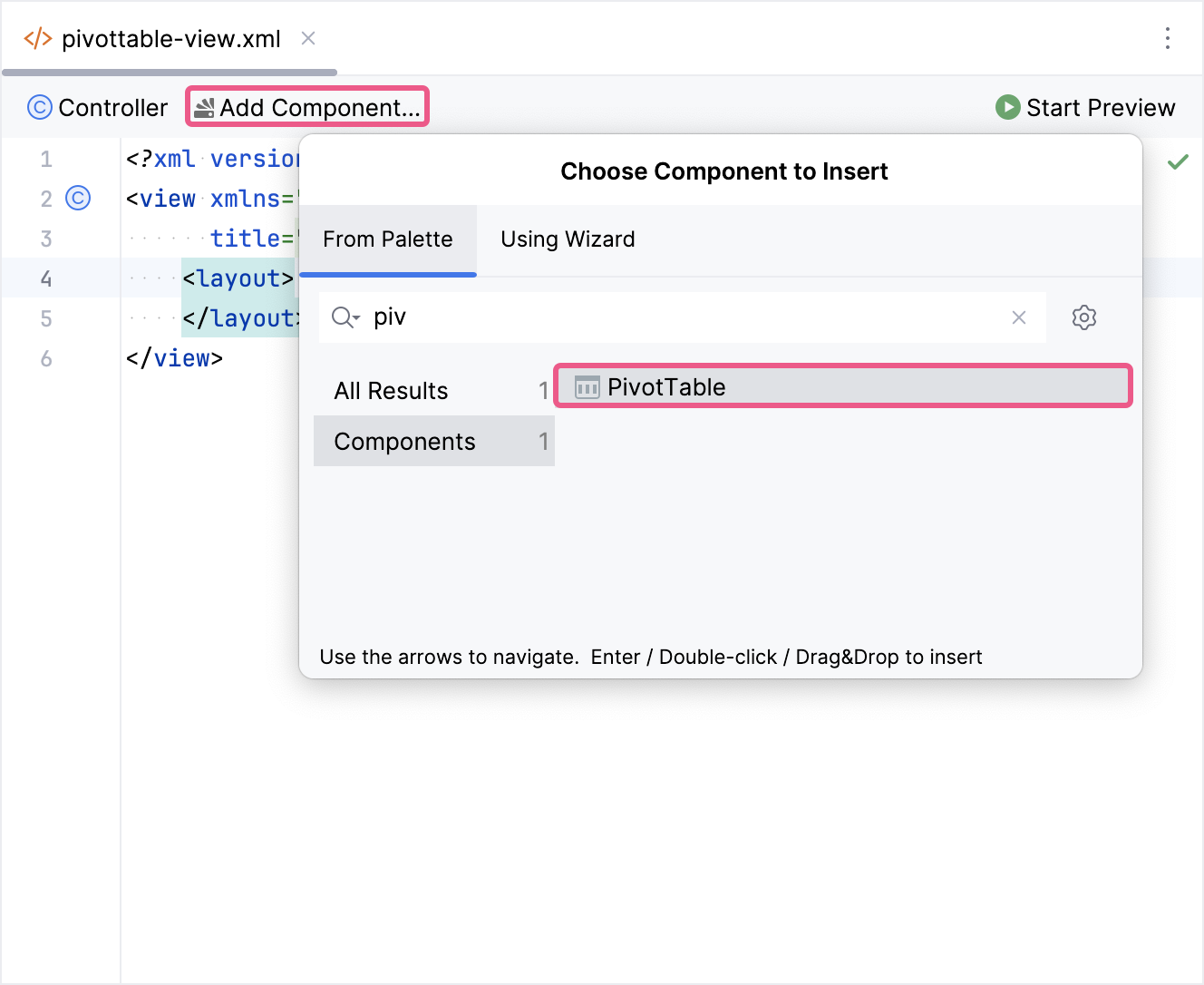
The new pivotTable element will be added in both the Jmix UI structure panel and in the XML. You can configure attributes like id, height, width, etc., in the same way as for other UI components.
<pvttbl:pivotTable id="pivotTable"
                  height="100%"
                  width="100%"/>
If you don’t use the view designer, declare the pvttbl namespace in your view’s XML descriptor manually:
<view xmlns="http://jmix.io/schema/flowui/view"
      xmlns:pvttbl="http://jmix.io/schema/pvttbl/ui"
      title="msg://com.company.ex1.view.pivottable/pivotTableView.title">
To set up the component, we need to provide a data container and specify the properties we want to show in the table. Here’s how to define data for the component:
<data>
    <collection id="tipsDc"
                class="com.company.ex1.entity.TipInfo">
        <fetchPlan extends="_local"/>
        <loader id="tipsLoader">
            <query>
                <![CDATA[select e from TipInfo e]]>
            </query>
        </loader>
    </collection>
</data>
<facets>
    <dataLoadCoordinator auto="true"/>
</facets>
The following example demonstrates how to configure a basic pivotTable:
<pvttbl:pivotTable id="pivotTable"
                  dataContainer="tipsDc">
    <pvttbl:properties>
        <pvttbl:property name="totalBill"/>
        <pvttbl:property name="tip"/>
        <pvttbl:property name="sex"/>
        <pvttbl:property name="smoker"/>
        <pvttbl:property name="day"/>
        <pvttbl:property name="time"/>
        <pvttbl:property name="size"/>
    </pvttbl:properties>
    <pvttbl:columns>
        <pvttbl:column value="day"/>
        <pvttbl:column value="time"/>
    </pvttbl:columns>
    <pvttbl:rows>
        <pvttbl:row value="sex"/>
        <pvttbl:row value="smoker"/>
    </pvttbl:rows>
</pvttbl:pivotTable>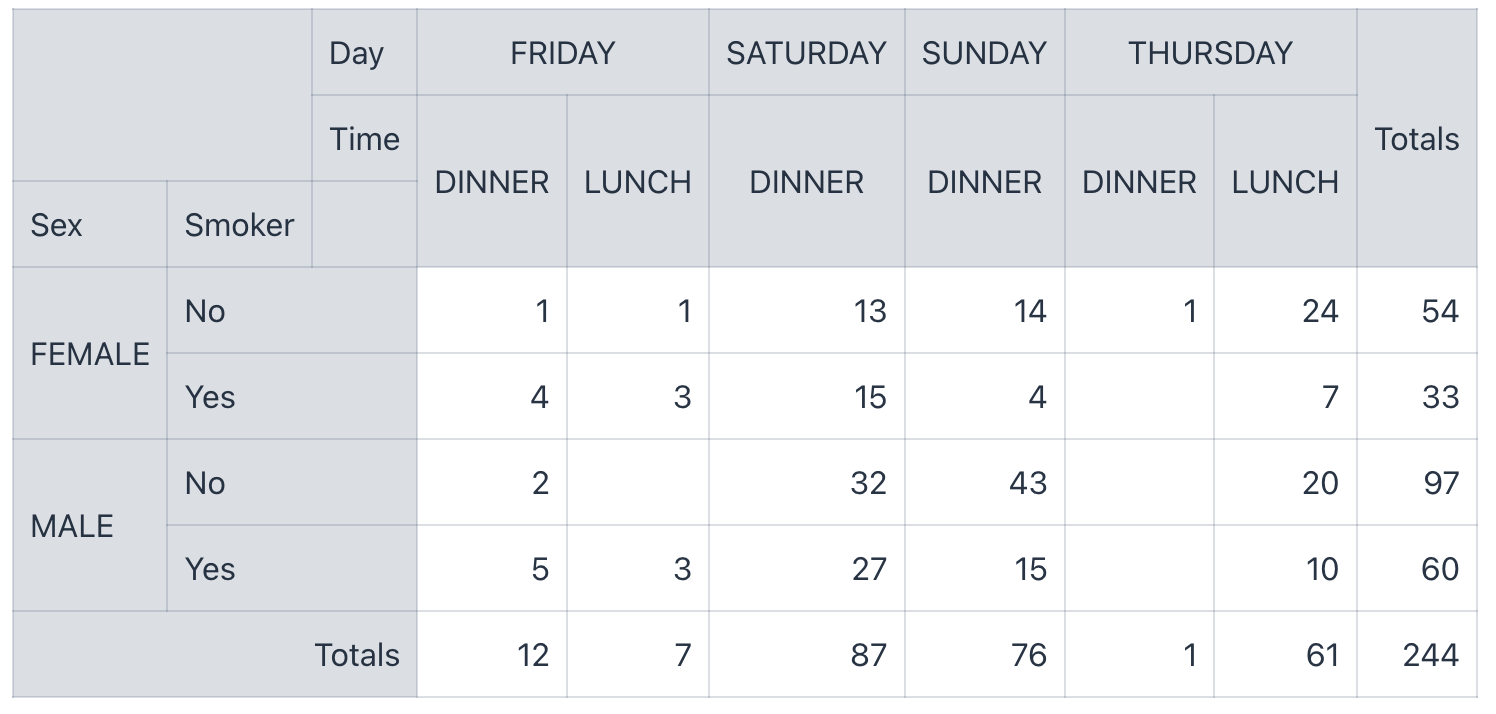
|
The You can find an example of using |
Data Binding
Collection Container
Typically, you bind a pivotTable to data declaratively in the XML descriptor using the dataContainer attribute. This attribute should refer to a collection container, that holds the data you want to display. Please see the relevant example in the previous section.
Using Custom Data Model
You can also define a custom data model and use it within the pivot table component. Here’s how you can achieve this:
-
Create a simple POJO:
Start by creating a Plain Old Java Object (POJO) to represent your data structure. This POJO will serve as the foundation for your custom data model.
Show code
public class Shape { private Long id; private String shape; private String color; private String size; public Shape(Long id, String shape, String color, String size) { this.id = id; this.shape = shape; this.color = color; this.size = size; } public Long getId() { return id; } public void setId(Long id) { this.id = id; } public String getShape() { return shape; } public void setShape(String shape) { this.shape = shape; } public String getColor() { return color; } public void setColor(String color) { this.color = color; } public String getSize() { return size; } public void setSize(String size) { this.size = size; } } -
Implement JmixPivotTableItems:
Next, implement the
JmixPivotTableItemsinterface. This interface is crucial for providing the pivot table component with the necessary information about your custom data model.Create a class that implements the
JmixPivotTableItemsinterface. For demonstration purposes, only the primary methods will be implemented. For example:Show code
public class ShapeListPivotTableItems implements JmixPivotTableItems<Shape> { private List<Shape> items; public ShapeListPivotTableItems(List<Shape> items) { this.items = items; } @Override public Collection<Shape> getItems() { return items; } @Override public Shape getItem(Object itemId) { return null; } @Nullable @Override public Object getItemValue(Shape item, String propertyPath) { if ("shape".equals(propertyPath)) { return item.getShape(); } else if ("color".equals(propertyPath)) { return item.getColor(); } else if ("size".equals(propertyPath)) { return item.getSize(); } return ""; } @Nullable @Override public Object getItemId(Shape item) { return item.getId(); } @Override public void setItemValue(Shape item, String propertyPath, @Nullable Object value) { } @Override public Shape getItem(String stringId) { return items.stream().filter(i -> i.getId().toString().equals(stringId)).findFirst().orElse(null); } @Override public void updateItem(Shape item) { } @Override public boolean containsItem(Shape item) { return false; } @Override public Registration addItemsChangeListener(Consumer listener) { return null; } } -
Set Up PivotTable in the Descriptor:
In the view XML descriptor, configure the
pivotTablecomponent to use your custom data model. For example:Show code
<pvttbl:pivotTable id="pivotTable" showUI="true"> <pvttbl:properties> <pvttbl:property name="shape" localizedName="Shape"/> <pvttbl:property name="color" localizedName="Color"/> <pvttbl:property name="size" localizedName="Size"/> </pvttbl:properties> <pvttbl:rows> <pvttbl:row value="shape"/> <pvttbl:row value="color"/> </pvttbl:rows> <pvttbl:columns> <pvttbl:column value="size"/> </pvttbl:columns> <pvttbl:hiddenFromAggregations> <pvttbl:property name="size"/> </pvttbl:hiddenFromAggregations> </pvttbl:pivotTable> -
Create Items and Set to Component:
Finally, create instances of your custom data objects and set them to the pivot table component.
Show code
@Subscribe
public void onInit(final InitEvent event) {
    pivotTable.setItems(new ShapeListPivotTableItems(List.of(
            new Shape(1L, "Circle", "Blue", "Middle"),
            new Shape(2L, "Circle", "Green", "Small"),
            new Shape(3L, "Ellipse", "Yellow", "Small"),
            new Shape(4L, "Ellipse", "Green", "Big"),
            new Shape(5L, "Square", "Blue", "Middle"),
            new Shape(6L, "Square", "Green", "Big"),
            new Shape(7L, "Rhombus", "Blue", "Big"),
            new Shape(8L, "Rhombus", "Yellow", "Small"),
            new Shape(8L, "Circle", "Yellow", "Small"),
            new Shape(8L, "Square", "Green", "Small"))));
}
UI Mode
The showUI attribute enables the pivot table to be displayed in UI mode.
When the pivot table is in UI mode, users can see the elements for manipulating data.
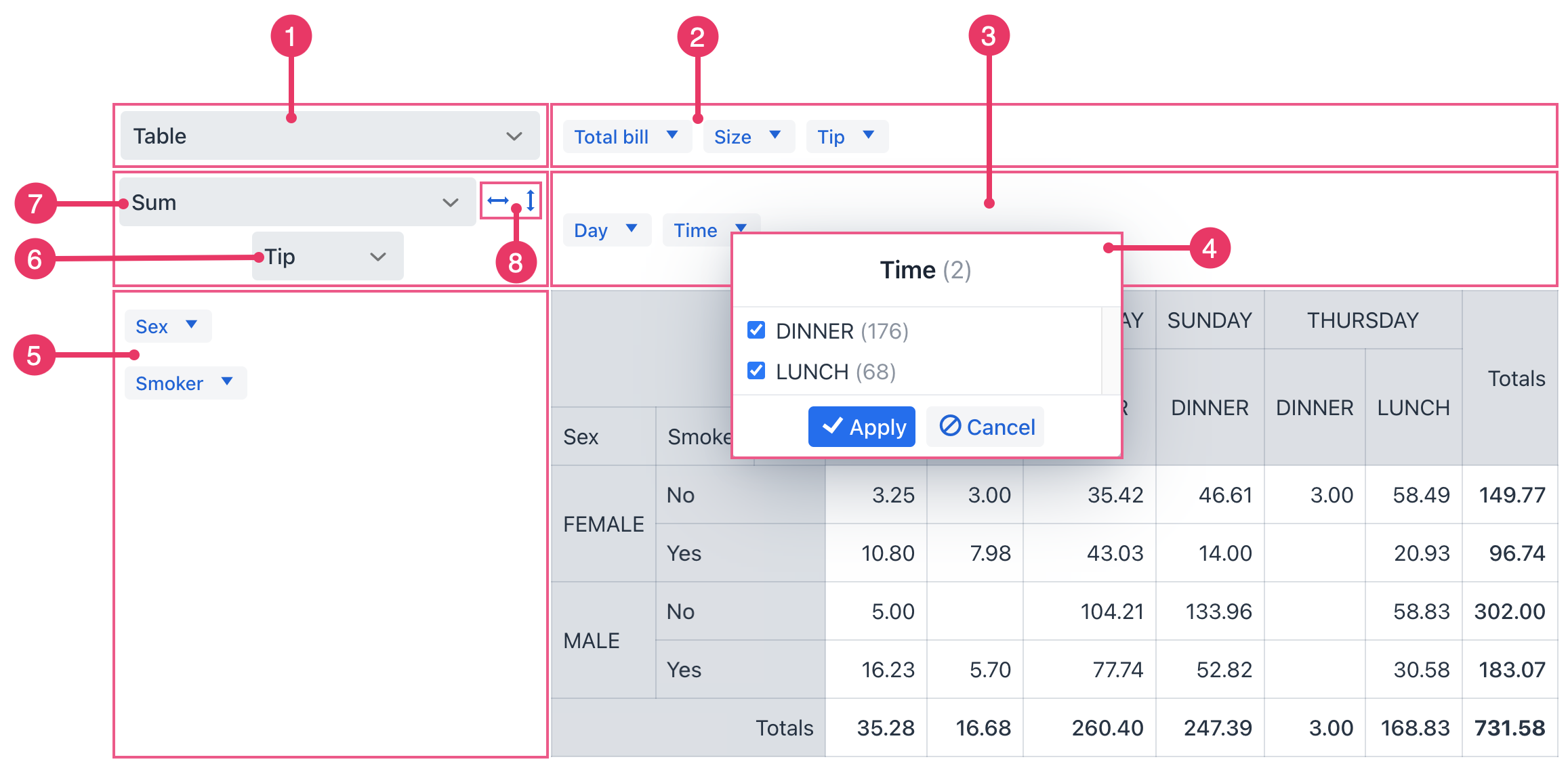
-
Renderer Selector - specifies how data is displayed in the pivot table.
-
Unused Properties. Drag and drop these properties to the column or row area, and back again. As you change the table’s structure (by dragging properties), the data automatically re-aggregates and updates to reflect the new arrangement.
-
Column Properties. Drag properties to this area to use them as columns.
-
Filters. Use filters to focus on specific subsets of your data. The blue arrow opens a dialog that shows all the values for this property. You can uncheck values to exclude them from the table calculations.
-
Row Properties. Drag properties to this area to use them as rows.
-
Aggregation Properties - properties used in aggregation.
-
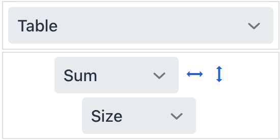
Aggregation Selector - select the data aggregation operation, such as count, minimum, maximum, etc.
-
Sorting within the table: by rows and by columns.
The autoSortUnusedProperties attribute controls whether unused properties are automatically sorted in a predefined order. This attribute is applicable if showUI is set to true.
When the attribute is set to true, unused properties displayed in a panel for dragging into the pivot table will be automatically sorted. This helps users quickly find the properties they need.
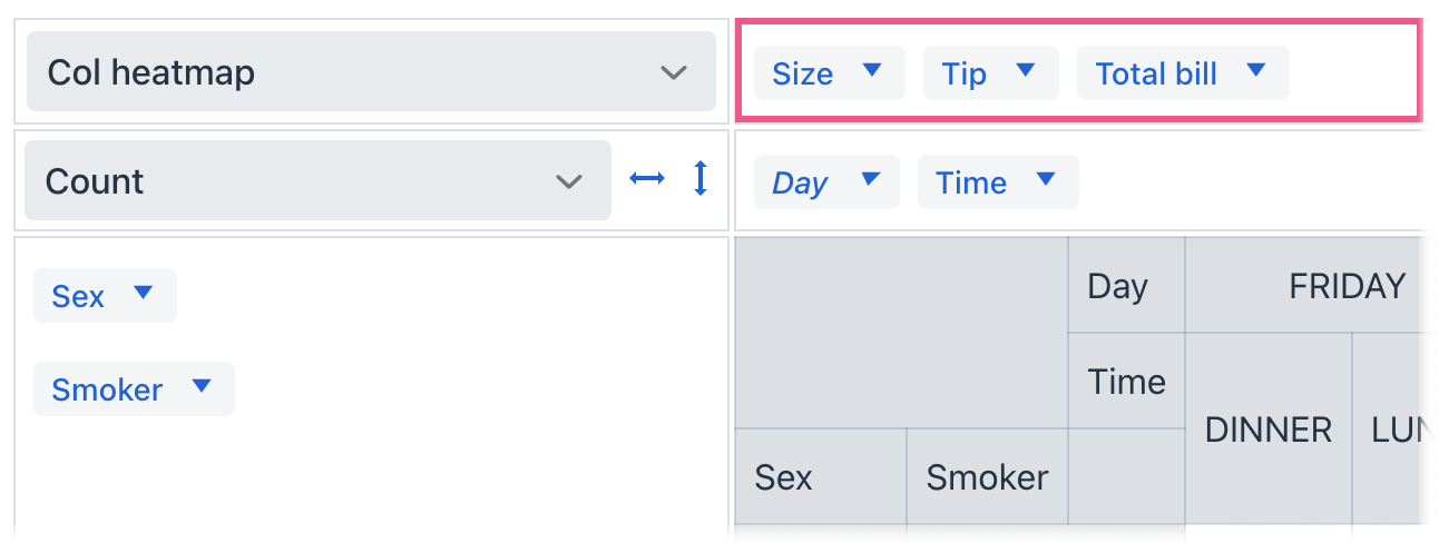
The unusedPropertiesVertical attribute controls the alignment of the unused properties.
When unusedPropertiesVertical is set to true, the unused attributes area is always displayed vertically.
When unusedPropertiesVertical is set to false, the unused attributes area is always displayed horizontally.
If set to a number (as is the default), the unused attributes are displayed vertically if the combined length of their names in characters exceeds the specified number. Otherwise, they are displayed horizontally.
Using Renderers
Without a renderer, the pivot table uses basic formatting, typically showing numbers or text. A renderer defines how data is displayed within the cells of the pivot table. The add-on provides the following predefined renderers:
-
TABLE: This is the default renderer, displaying your pivot table data in a standard table format. -
TABLE_BAR_CHART: This renderer combines a table view with a bar chart, providing a more interactive and visual way to present data. -
HEATMAP: This renderer creates a heatmap, where values are represented by colors. It’s great for quickly identifying patterns, trends, or areas of high or low values in your data. -
COL_HEATMAP: This renderer displays a heatmap, but the heatmap coloring is applied across columns, showing the relationship of values within each column. Useful for highlighting trends or outliers within columns. -
ROW_HEATMAP: Similar toCOL_HEATMAP, this renderer displays a heatmap, but coloring is applied across rows, emphasizing relationships within rows. -
LINE_CHART: This renderer displays a line chart, connecting data points with lines. It’s perfect for showing trends over time or across continuous data ranges. -
BAR_CHART: This renderer creates a standard bar chart, ideal for comparing values across different categories or groups. The height of each bar represents the value it represents. -
STACKED_BAR_CHART: This renderer creates a stacked bar chart, showing the breakdown of values within each category, with bars stacked on top of each other. -
HORIZONTAL_BAR_CHART: This renderer creates a bar chart with bars oriented horizontally, instead of vertically. This can be useful for improving readability or fitting more labels within a confined space. -
HORIZONTAL_STACKED_BAR_CHART: This renderer creates a stacked bar chart with bars oriented horizontally. It shows the breakdown of values within each category, where the bars stack on top of each other. -
AREA_CHART: This renderer displays your data as an area chart, showing trends over time or across categories. It’s useful for visualizing cumulative values or emphasizing overall growth or decline. -
SCATTER_CHART: This renderer creates a scatter plot, where each data point is represented by a dot. Useful for showing the relationship between two variables and identifying potential correlations. -
TREEMAP: This renderer creates a treemap, where data is represented by rectangles, with the size of each rectangle proportional to the value it represents. Effective for showing hierarchical data or proportions. -
TSV_EXPORT: This is not a visualization renderer but a functionality renderer. It allows users to export the data from the pivot table in a tab-separated value (TSV) format, which is easily importable into other spreadsheet programs.
When the pivot table is in UI Mode, you can define a collection of renderers that will be displayed in a dropdown menu of available renderers in the user interface. This is done using the renderers element, which contains inner renderer elements.
<pvttbl:pivotTable id="pivotTable"
                  dataContainer="tipsDc"
                  showUI="true">
    <pvttbl:properties>
        <pvttbl:property name="totalBill"/>
        <pvttbl:property name="tip"/>
        <pvttbl:property name="sex"/>
        <pvttbl:property name="smoker"/>
        <pvttbl:property name="day"/>
        <pvttbl:property name="time"/>
        <pvttbl:property name="size"/>
    </pvttbl:properties>
    <pvttbl:columns>
        <pvttbl:column value="day"/>
        <pvttbl:column value="time"/>
    </pvttbl:columns>
    <pvttbl:rows>
        <pvttbl:row value="sex"/>
        <pvttbl:row value="smoker"/>
    </pvttbl:rows>
    <pvttbl:renderers selected="LINE_CHART">
        <pvttbl:renderer type="LINE_CHART"/>
        <pvttbl:renderer type="AREA_CHART"/>
        <pvttbl:renderer type="BAR_CHART"/>
    </pvttbl:renderers>
</pvttbl:pivotTable>
If the pivot table is not in UI Mode, you can declaratively specify a renderer for displaying data in the table using the renderer attribute.
The columnOrder attribute sets the order in which column data is provided to the renderer. Ordering by value orders by column total.
The rowOrder attribute sets the order in which row data is provided to the renderer. Ordering by value orders by row total.
Available values:
-
KEYS_ASCENDING("key_a_to_z"): This sorting value indicates that you want to sort rows or columns alphabetically in ascending order (A to Z) based on the keys used in the pivot table. -
VALUES_ASCENDING("value_a_to_z"): This sorting value instructspivotTableto sort rows or columns alphabetically in ascending order (A to Z) based on the values aggregated in each row or column. These values are the results of calculations or aggregations (for example, sum, average, count) applied to your data. -
VALUES_DESCENDING("value_z_to_a"): This sorting value sorts rows or columns alphabetically in descending order (Z to A) based on the aggregated values in each row or column.
Data Aggregation
By using special elements and attributes, the pivot table component allows you to define how data is aggregated within each cell. This functionality combines and summarizes values, providing the foundation for insightful analysis.
The add-on provides the following predefined aggregation functions:
-
COUNT: This function counts the number of non-empty values in a cell. -
COUNT_UNIQUE_VALUES: This function counts the number of distinct (unique) values in a cell. -
LIST_UNIQUE_VALUES: This function returns a list of the unique values in a cell. -
SUM: This function calculates the sum of all values in a cell. -
INTEGER_SUM: This function calculates the sum of all values in a cell, assuming they are integers. -
AVERAGE: This function calculates the average of all values in a cell. -
MINIMUM: This function finds the minimum value in a cell. -
MAXIMUM: This function finds the maximum value in a cell. -
SUM_OVER_SUM: This function calculates the sum of values in a cell divided by the sum of values in a specified second column. -
UPPER_BOUND_80: This function calculates the 80th percentile of values in a cell. It helps identify the upper limit of the distribution. -
LOWER_BOUND_80: This function calculates the 20th percentile of values in a cell. It helps identify the lower limit of the distribution. -
SUM_AS_FRACTION_OF_TOTAL: This function calculates the sum of values in a cell as a percentage of the total sum of values in the entire table. -
SUM_AS_FRACTION_OF_ROWS: This function calculates the sum of values in a cell as a percentage of the total sum of values in the same row. -
SUM_AS_FRACTION_OF_COLUMNS: This function calculates the sum of values in a cell as a percentage of the total sum of values in the same column. -
COUNT_AS_FRACTION_OF_TOTAL: This function calculates the count of values in a cell as a percentage of the total count of values in the entire table. -
COUNT_AS_FRACTION_OF_ROWS: This function calculates the count of values in a cell as a percentage of the total count of values in the same row. -
COUNT_AS_FRACTION_OF_COLUMNS: This function calculates the count of values in a cell as a percentage of the total count of values in the same column.
When the pivot table is in UI Mode, you can define a collection of aggregation functions that will be displayed in a dropdown menu of available aggregators in the user interface. This is done using the aggregations element, which contains inner aggregation elements.
<pvttbl:pivotTable id="pivotTable"
                   dataContainer="tipsDc"
                   showUI="true">
    <pvttbl:properties>
        <pvttbl:property name="totalBill"/>
        <pvttbl:property name="tip"/>
        <pvttbl:property name="sex"/>
        <pvttbl:property name="smoker"/>
        <pvttbl:property name="day"/>
        <pvttbl:property name="time"/>
        <pvttbl:property name="size"/>
    </pvttbl:properties>
    <pvttbl:columns>
        <pvttbl:column value="day"/>
        <pvttbl:column value="time"/>
    </pvttbl:columns>
    <pvttbl:rows>
        <pvttbl:row value="sex"/>
        <pvttbl:row value="smoker"/>
    </pvttbl:rows>
    <pvttbl:aggregations>
        <pvttbl:aggregation mode="AVERAGE"/>
        <pvttbl:aggregation mode="COUNT"/>
        <pvttbl:aggregation mode="SUM"/>
        <pvttbl:aggregation mode="MAXIMUM"/>
        <pvttbl:aggregation mode="MINIMUM"/>
    </pvttbl:aggregations>
</pvttbl:pivotTable>
You can also set a default aggregation function, as well as the attributes that are used in this aggregation function.
<pvttbl:pivotTable dataContainer="tipsDc"
                   showUI="true">
    <pvttbl:aggregations selected="SUM"> (1)
        <pvttbl:aggregation mode="AVERAGE"/>
        <pvttbl:aggregation mode="COUNT"/>
        <pvttbl:aggregation mode="SUM"/>
        <pvttbl:aggregation mode="MAXIMUM"/>
        <pvttbl:aggregation mode="MINIMUM"/>
    </pvttbl:aggregations>
    <pvttbl:aggregationProperties> (2)
        <pvttbl:property name="size"/>
    </pvttbl:aggregationProperties>
</pvttbl:pivotTable>| 1 | The selected attribute sets the default aggregation function to SUM in the dropdown list. |
| 2 | The aggregationProperties element and its nested property element are used to set the size attribute for use in the aggregation function. |
<pvttbl:pivotTable dataContainer="tipsDc"
                   showUI="true">
    <pvttbl:properties>
        <pvttbl:property name="totalBill"/>
        <pvttbl:property name="tip"/>
        <pvttbl:property name="sex"/>
        <pvttbl:property name="smoker"/>
        <pvttbl:property name="day"/>
        <pvttbl:property name="time"/>
        <pvttbl:property name="size"/>
    </pvttbl:properties>
    <pvttbl:columns>
        <pvttbl:column value="day"/>
        <pvttbl:column value="time"/>
    </pvttbl:columns>
    <pvttbl:rows>
        <pvttbl:row value="sex"/>
        <pvttbl:row value="smoker"/>
    </pvttbl:rows>
    <pvttbl:hiddenFromAggregations>
        <pvttbl:property name="tip"/>
        <pvttbl:property name="totalBill"/>
    </pvttbl:hiddenFromAggregations>
</pvttbl:pivotTable>
If the pivot table is not in UI Mode, you can declaratively specify an aggregation function for displaying data in the table using the aggregation element.
<pvttbl:pivotTable dataContainer="tipsDc">
    <pvttbl:properties>
        <pvttbl:property name="totalBill"/>
        <pvttbl:property name="tip"/>
        <pvttbl:property name="sex"/>
        <pvttbl:property name="smoker"/>
        <pvttbl:property name="day"/>
        <pvttbl:property name="time"/>
        <pvttbl:property name="size"/>
    </pvttbl:properties>
    <pvttbl:columns>
        <pvttbl:column value="day"/>
        <pvttbl:column value="time"/>
    </pvttbl:columns>
    <pvttbl:rows>
        <pvttbl:row value="sex"/>
        <pvttbl:row value="smoker"/>
    </pvttbl:rows>
    <pvttbl:aggregation mode="SUM">
        <pvttbl:property name="tip"/>
    </pvttbl:aggregation>
</pvttbl:pivotTable>
Attributes
Common attributes serve the same purpose for all components.
The following attributes are specific to pivotTable:
Name |
Description |
Default |
|---|---|---|
Sets whether unused attributes are kept sorted in the UI. This attribute is applicable if |
|
|
Sets the order in which column data is provided to the renderer. Ordering by value orders by column total. See available values in Using Renderers. The state of this attribute can be saved in the user settings. |
|
|
The |
||
Sets the maximum number of values to list in the attribute values dialog. This attribute is applicable if |
|
|
The |
|
|
Sets the order in which row data is provided to the renderer. Ordering by value orders by row total. See available values in Using Renderers. The state of this attribute can be saved in the user settings. |
|
|
If the |
|
|
The |
|
|
The |
|
|
Controls the orientation of the unused attributes area in the pivot table. This attribute is applicable if |
Horizontal alignment ( |
Handlers
Common handlers are configured in the same way for all components.
The following handlers are specific to pivotTable:
|
To generate a handler stub in Jmix Studio, use the Handlers tab of the Jmix UI inspector panel or the Generate Handler action available in the top panel of the view class and through the Code → Generate menu (Alt+Insert / Cmd+N). |
Name |
Description |
|---|---|
The See live demo. |
|
The The following values are available from the See live demo. |
Elements
Elements of pivotTable provide a wide range of options to control the appearance, behavior, and functionality of columns and rows both collectively and individually.
|
To add an element to a selected component click the Add button in the Jmix UI inspector panel. |
aggregation
The aggregation element sets up a function which will aggregate results per cell. This element is applicable if showUI is set to false. See Data Aggregation.
XML Element |
|
|---|---|
Attributes |
|
Elements |
Name |
Description |
Default |
|---|---|---|
This attribute provides a localized value for display in the user interface. |
– |
|
Setting this to |
– |
|
Enables setting one of the predefined aggregation functions. |
|
aggregationProperties
Sets attribute names to prepopulate in the dropdown list of aggregation properties. See Data Aggregation.
This element is applicable to pivot tables in UI Mode.
The state of this element can be saved in the user settings.
aggregations
Defines the collection of aggregation functions that should be displayed in the dropdown list of available aggregators in the UI. This element is applicable if showUI is set to true. See Data Aggregation.
XML Element |
|
|---|---|
Attributes |
|
Elements |
Name |
Description |
Default |
|---|---|---|
This attribute allows you to choose one of the predefined aggregation functions. The selected function will be used as the default when the component loads. The state of this attribute can be saved in the user settings. |
– |
aggregation
This element allows you to specify one of the predefined aggregation functions using its mode attribute. See Data Aggregation.
columns
A list of attributes to be used as table columns. The value can be either a properties key or the name of a generated attribute.
The state of this element can be saved in the user settings.
derivedProperties
It can be used to add new attributes to the original data container derived from the existing ones. This element is a key-value map, where the key is the name of the generated attribute, and the value is the JavaScript function that generates this attribute.
-
The enclosed
derivedPropertyelements should have thecaptionattribute defined, as the caption’s value will be used as the key. -
The
functionelement is used as the value for thederivedProperty.
<pvttbl:pivotTable id="pivotTable"
                   dataContainer="tipsDc"
                   showUI="true">
    <pvttbl:properties>
        <pvttbl:property name="totalBill"/>
        <pvttbl:property name="tip"/>
        <pvttbl:property name="sex"/>
        <pvttbl:property name="smoker"/>
        <pvttbl:property name="day"/>
        <pvttbl:property name="time"/>
        <pvttbl:property name="size"/>
    </pvttbl:properties>
    <pvttbl:derivedProperties>
        <pvttbl:derivedProperty caption="Derived Property">
            <pvttbl:function>
                function(item) {
                return item.Size - item.Size % 10;
                }
            </pvttbl:function>
        </pvttbl:derivedProperty>
    </pvttbl:derivedProperties>
</pvttbl:pivotTable>
exclusions
A key-value map where the key is the name of an attribute (either a properties key or the name of a generated attribute), and the value is a list of attribute values to be excluded from rendering.
This element is applicable to pivot tables in UI Mode.
The state of this element can be saved in the user settings.
filterFunction
A JavaScript function that is called for each record. It returns false if the record should be excluded from the input before rendering, or true otherwise.
hiddenFromAggregations
The hiddenFromAggregations element is used to specify which attributes should be excluded from aggregations. The list of attributes is defined using the nested property element. See Data Aggregation.
This element is applicable to pivot tables in UI Mode.
hiddenFromDragDrop
The hiddenFromDragDrop element controls which attributes are excluded from the drag-and-drop functionality in the pivot table UI.
hiddenProperties
This element defines a list of attributes that should not be displayed in the UI. Its value can be either a properties key or the name of a generated attribute, such as a key from the derivedProperties element.
This element is applicable when showUI is set to true.
inclusions
A key-value map where the key is the name of an attribute (either a properties key or a generated attribute’s name), and the value is a list of attribute values to be rendered.
This element is applicable when showUI is set to true.
The state of this element can be saved in the user settings.
properties
A key-value map containing properties to be used in the pivot table. The key is the attribute name from the data container, and the value is its localized caption.
If the pivot table is in UI Mode, the attributes specified in the properties element are used to form the Column Properties and Row Properties.
rendererOptions
The rendererOptions element provides a way to customize the specific settings of the selected renderer. Only two renderer types can be customized:
-
All kinds of
heatmap. The cell colors can be set by the Javascript code.The
colorScaleGeneratorFunctionelement is used to set a function that is used in color scale generator of heatmap renderer. -
All kinds of charts. Options can be used to set the chart’s size.
renderers
Controls the dropdown menu of rendering functions presented to users in the UI. This element is applicable if showUI is set to true. See Using Renderers.
XML Element |
|
|---|---|
Attributes |
|
Elements |
Name |
Description |
Default |
|---|---|---|
This attribute allows you to choose one of the predefined renderers. The selected renderer will be used as the default when the component loads. The state of this attribute can be saved in the user settings. |
– |
renderer
This element allows you to specify one of the predefined renderers using its type attribute. See Using Renderers.
rows
A list of attributes to be used as table rows. The value can be either a properties key or the name of a generated attribute.
The state of this element can be saved in the user settings.
sortersFunction
A JavaScript function that is called with an attribute name and can return a function that can be used as an argument to Array.sort for output purposes. If no function is returned, the default sorting mechanism is a built-in "natural sort" implementation. This is useful for sorting attributes like month names.
See Also
See the PivotTable Docs for more information.
