nativeLabel
nativeLabel represents the label HTML element that creates a caption for a component.
-
XML element:
nativeLabel -
Java class:
NativeLabel
Basics
The nativeLabel component can serve as an alternative for the label attribute that is present in the majority of UI components in Jmix.
To set a label on a component, pass that component’s id to the setFor attribute of the label. For example, to set the label on a checkbox component:
<div>
    <checkbox id ="checkbox"/>
    <nativeLabel text="Enable Notifications" setFor="checkbox"/>
</div>
Having the label associated with a component makes the label text correctly interpreted by assistive technologies, such as screen readers.
To add text that is not associated to a component, use the span or div components.
Dynamic Label
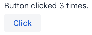
To dynamically set or update text in nativeLabel, first specify its id attribute:
<nativeLabel id="dynamicLabel" setFor="button"/>
<button id="button" text="Click"/>
Use this id to reference the label in the view controller and update the text with the setText() method:
@ViewComponent
private NativeLabel dynamicLabel;

@Subscribe("button")
public void onButtonClick(final ClickEvent<JmixButton> event) {
    dynamicLabel.setText("Button clicked " + event.getClickCount() + " times.");
}
Theme Variants
Use the themeNames attribute to customize component’s color, size, and shape. Start by transforming the component into a badge using themeNames = "badge". Then, apply supplementary themes to enhance different visual aspects.
Color
Choose among four color variants to convey the component’s visual intent: default, success, error, and contrast.

XML code
<nativeLabel text="default" themeNames="badge"/>
<nativeLabel text="success" themeNames="badge, success"/>
<nativeLabel text="error" themeNames="badge, error"/>
<nativeLabel text="contrast" themeNames="badge, contrast"/>
Combine the color variants with the primary theme to add extra emphasis:

XML code
<nativeLabel text="default" themeNames="badge, primary"/>
<nativeLabel text="success" themeNames="badge, success, primary"/>
<nativeLabel text="error" themeNames="badge, error, primary"/>
<nativeLabel text="contrast" themeNames="badge, contrast, primary"/>
Shape
Applying the pill theme creates a badge with rounded corners. Use it independently or combine with color themes:

XML code
<nativeLabel text="default" themeNames="badge, pill"/>
<nativeLabel text="success" themeNames="badge, success, pill"/>
<nativeLabel text="error" themeNames="badge, error, pill"/>
<nativeLabel text="contrast" themeNames="badge, contrast, pill"/>Attributes
id - alignSelf - classNames - colspan - css - enabled - height - maxHeight - maxWidth - minHeight - minWidth - setFor - text - themeNames - title - visible - whiteSpace - width
Handlers
|
To generate a handler stub in Jmix Studio, use the Handlers tab of the Jmix UI inspector panel or the Generate Handler action available in the top panel of the view class and through the Code → Generate menu (Alt+Insert / Cmd+N). |
See Also
See MDN Docs for more information.

