Styling UI Components
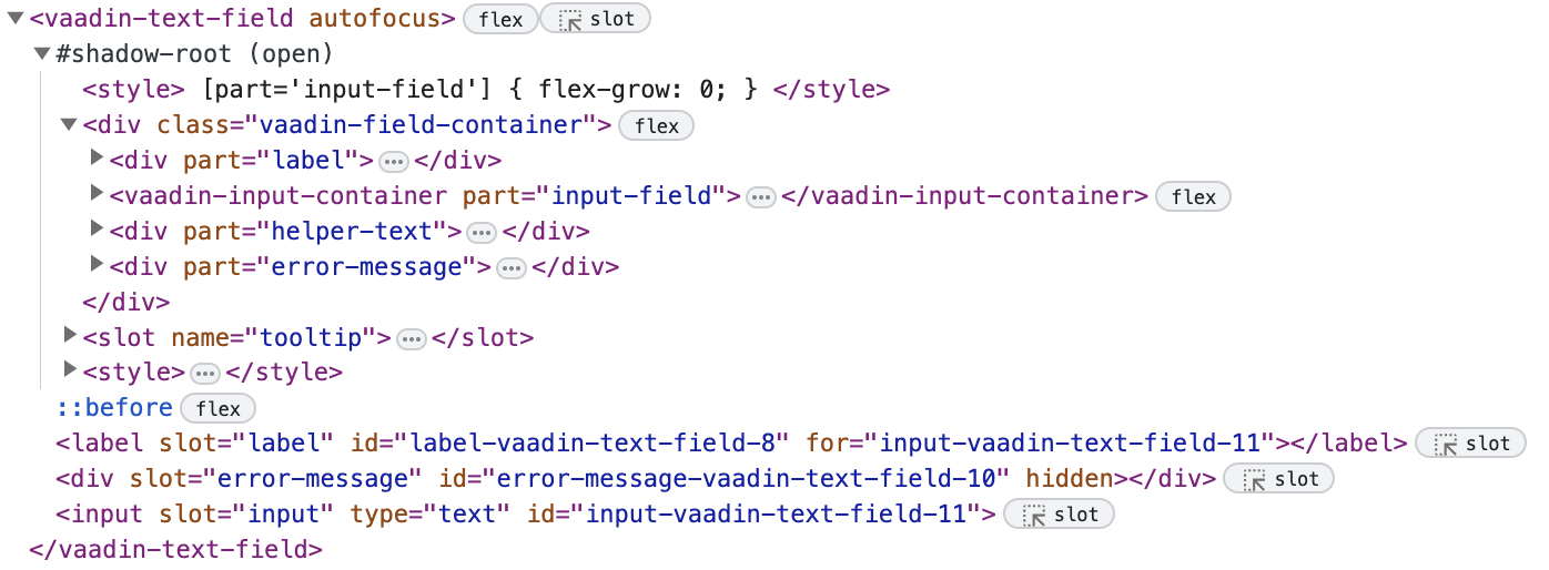
Jmix UI components provide additional features (for example label, helper text, error message, tooltip, etc.), which make them more complex than native HTML elements. They also utilize an HTML feature called shadow DOM, which encapsulates their internal HTML structure, and isolates it from the page’s global CSS.

Because of this, UI components cannot be styled using native HTML element selectors like input {…} and button {…}. Instead, each component exposes a number of parts and states that can be used as selectors in CSS style blocks.
For example, if you want to apply a background color and a border to a textField, you need to apply styles to the shadow part called input-field:
vaadin-text-field::part(input-field) {
  background: white;
  border: 1px solid black;
}
Stylable Parts of Components
There are several primary types of parts, each of which is associated with a different type of CSS selector.
Root Elements
Each UI component has a root HTML element whose name begins with the vaadin- or jmix- prefix, for example vaadin-button or jmix-value-picker. For example, the background color of a button can be changed as follows:
vaadin-button {
  background: gray;
}Component States
Most states of component root elements and their various parts are exposed through state attributes and styled using attribute selectors of the form component-name[state]. For example, disabled buttons are identified by the [disabled] selector:
vaadin-button[disabled] {
  background: lightgray;
  color: darkgray;
}
Component Style Variants
Many UI components come with built-in style variants, that can be used to change the color, size or other visual aspects of individual component instances through the addThemeVariants()/addThemeNames() Java API or the themeNames XML attribute:
<hbox>
    <button text="Primary" themeNames="primary"/>
    <button text="Success" themeNames="success"/>
    <button text="Tertiary" themeNames="tertiary"/>
</hbox>
These variants are applied to the theme attribute of the root elements of components, and can be targeted using CSS attribute selectors:
vaadin-button[theme~="primary"] {
    background-color: purple;
}
Styling Component Instances
In you need to apply styles to a specific component instance, you can use the classNames attribute, for example:
<textField classNames="bordered"/>vaadin-text-field.bordered::part(input-field) {
background: white;
border: 1px solid black;
}Generating Styles Dynamically
If you need to dynamically generate styles based on some custom logic, you can use the Style API.
One approach is to set inline CSS properties on the root element of the component, for example:
@ViewComponent
private JmixButton myBtn;

@Subscribe
public void onInit(final InitEvent event) {
    myBtn.getStyle().set("color", "white");
    myBtn.getStyle().set("background-color", "purple");
}
A drawback with this approach is that it’s not possible to apply styles to parts of components, or based on their states.
Another option is to use CSS properties – either the built-in Lumo properties or custom ones – that are statically applied using CSS, but whose values are set through application logic:
html {
    --my-button-text-color: darkblue;
    --my-button-bg-color: yellow;
}

vaadin-button.my-button {
  color: var(--my-button-text-color);
  background-color: var(--my-button-bg-color);
}
<button id="myBtn" text="Button" classNames="my-button"/>@Subscribe
public void onInit(final InitEvent event) {
UI.getCurrent().getElement().getStyle().set("--my-button-text-color", "white");
UI.getCurrent().getElement().getStyle().set("--my-button-bg-color", "purple");
}The benefit of this approach is that you can target component parts and multiple components using the same style property. This can be used for example to allow users to customize UI styles, save them in a database, and load them when they log in.
