CheckBoxGroup
CheckBoxGroup allows you to select multiple values from a list of options using checkboxes. If you need to choose only one value from the list, you should use the RadioButtonGroup component.
Component’s XML-name: checkBoxGroup.
Basics
The component can take a list of options from a data container. You can use the optionsContainer attribute, for example:
<data>
<collection id="countriesDc" class="ui.ex1.entity.Country">
<fetchPlan extends="_local"/>
<loader id="countriesDl">
<query>
<![CDATA[select e from uiex1_Country e]]>
</query>
</loader>
</collection>
</data>
<layout>
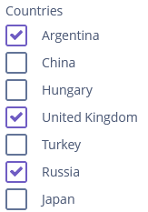
<checkBoxGroup optionsContainer="countriesDc"
caption="Countries"/>
</layout>In this case, the CheckBoxGroup component will display instance names of the Country entity, located in the countriesDc data container, and its getValue() method will return the Collection of selected entity instances.
Also, you can do the same thing programmatically:
<data>
    <collection id="countriesDc" class="ui.ex1.entity.Country">
        <fetchPlan extends="_local"/>
        <loader id="countriesDl">
            <query>
                <![CDATA[select e from uiex1_Country e]]>
            </query>
        </loader>
    </collection>
</data>
<layout>
    <checkBoxGroup id="countriesCheckBoxGroup"
                   caption="Countries"/>
</layout>
Please note that in the XML descriptor above, we did not assign an optionsContainer to the countriesCheckBoxGroup check box group; we will do this programmatically in the controller:
@Autowired
private CheckBoxGroup<Country> countriesCheckBoxGroup;
@Autowired
private CollectionContainer<Country> countriesDc;

@Subscribe
protected void onInit(InitEvent event) {
    countriesCheckBoxGroup.setOptions(new ContainerOptions<>(countriesDc));
}
With the help of the captionProperty attribute, you can choose another entity attribute to display in the component.
The orientation attribute defines the orientation of group elements. By default, elements are arranged vertically. The horizontal value sets the horizontal orientation.
Options
setOptions()
The setOptions() method takes one of the implementations of the Options interface and enables working with all types of options:
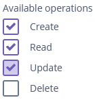
@Autowired
private CheckBoxGroup<Operation> checkBoxGroup;

@Subscribe
protected void onInit(InitEvent event) {
    checkBoxGroup.setOptions(new EnumOptions<>(Operation.class));
}setOptionsEnum(), setOptionsList() and setOptionsMap() work in the same way as in the ComboBox component.
Validation
To check values entered into the CheckBoxGroup component, you can use a validator in a nested validators element.
The following predefined validators are available for CheckBoxGroup:
In the example below, we will show a SizeValidator usage for validatedCheckBoxGroup:
<checkBoxGroup id="validatedCheckBoxGroup"
               optionsContainer="customersDc"
               caption="The number of customers is limited from 2 to 5">
    <validators>
        <size min="2" max="5"/>
    </validators>
</checkBoxGroup>
Events and Handlers
|
To generate a handler stub in Jmix Studio, select the component in the screen descriptor XML or in the Jmix UI hierarchy panel and use the Handlers tab of the Jmix UI inspector panel. Alternatively, you can use the Generate Handler button in the top panel of the screen controller. |
OptionDescriptionProvider
The option description provider generates tooltip descriptions for the options of the CheckBoxGroup component.
In the example below, we will show an OptionDescriptionProvider usage for the checkBoxGroupDesc:
@Install(to = "checkBoxGroupDesc", subject = "optionDescriptionProvider")
protected String checkBoxGroupDescOptionDescriptionProvider(Customer customer) {
    return "Email: " + customer.getEmail();
}
To register the option lookup handler programmatically, use the setOptionDescriptionProvider() component method.
OptionIconProvider
See OptionIconProvider.
Validator
Adds a validator instance to the component. The validator must throw ValidationException if the value is not valid.
If you are not satisfied with the predefined validators, add your own validator instance:
@Install(to = "validCheckBoxGroup", subject = "validator")
protected void validCheckBoxGroupValidator(Collection<EducationalStage> value) {
    if (value.contains(EducationalStage.NO) & value.size() > 1)
        throw new ValidationException("You cannot select the No Education " +
                "value together with other values");
}
ValueChangeEvent
See ValueChangeEvent.
CheckBoxGroup XML Attributes
|
You can view and edit attributes applicable to the component using the Jmix UI inspector panel of the Studio’s Screen Designer. |
align - caption - captionAsHtml - captionProperty - colspan - contextHelpText - contextHelpTextHtmlEnabled - css - dataContainer - description - descriptionAsHtml - editable - enable - box.expandRatio - height - htmlSanitizerEnabled - icon - id - optionsContainer - optionsEnum - orientation - property - required - requiredMessage - responsive - rowspan - stylename - tabIndex - visible - width
