Components XML Attributes
align
Defines the component position relative to the parent container. Possible values are:
-
TOP_RIGHT -
TOP_LEFT -
TOP_CENTER -
MIDDLE_RIGHT -
MIDDLE_LEFT -
MIDDLE_CENTER -
BOTTOM_RIGHT -
BOTTOM_LEFT -
BOTTOM_CENTER
box.expandRatio
In vbox and hbox containers, components are placed in slots. The box.expandRatio attribute specifies the expand ratio for each slot. The ratio must be greater than or equal to 0.
<hbox width="500px" expand="button1" spacing="true">
    <button id="button1" box.expandRatio="1"/>
    <button id="button2" width="100%" box.expandRatio="3"/>
    <button id="button3" width="100%" box.expandRatio="2"/>
</hbox>
If we specify box.expandRatio=1 to one component and its height or width is 100% (depends on layout), this component will be expanded to use all available space in the direction of component placement.
By default, all slots for components have equal width or height (i.e. box.expandRatio = 1). If another value is set for at least one component, all implicit values are ignored, and only explicitly assigned values are considered.
See also the expand attribute.
buffered
Sets the buffered mode. The default mode is non-buffered (the false value).
When in buffered mode, an internal buffer will be used to store changes until commit() is called. Calling discard() will revert the internal buffer to the value of the data source.
When in non-buffered mode, both read and write operations will be done directly on the data source. In this mode, the commit() and discard() methods serve no purpose.
caption
Sets the component’s caption.
The attribute value can either be a message or a key in a message pack. In case of a key, the value should begin with the msg:// prefix.
There are two ways of setting a key:
-
A short key – in this case the message will be searched in the package of the current screen:
caption="msg://infoField.caption" -
Full key including package name:
caption="msg://com.company.sample.gui.screen/infoField.caption"
captionAsHtml
Defines whether HTML is enabled in the component’s caption. If set to true, the captions are rendered in the browser as HTML, and the developer is responsible for ensuring no harmful HTML is used. If set to false, the content is rendered in the browser as plain text.
Possible values − true, false. Default is false.
captionProperty
Defines the name of an entity attribute which is displayed by a component. captionProperty can only be used for entities contained in a data container (for example, defined by the optionsContainer property of the EntityComboBox component).
If captionProperty is not defined, instance name is shown.
colspan
Sets the number of grid columns that the component should occupy (default is 1).
This attribute can be defined for any component located immediately within a GridLayout container.
contextHelpText
Sets the context help text. If set, then a special ? icon will be added to a field. If the field has an external caption, i.e. either caption or icon attribute is set, then the context help icon will be displayed next to the caption text, otherwise next to the field itself. The context help tooltip appears when the users hovers over the ? icon.
contextHelpTextHtmlEnabled
Defines if context help text can contain HTML.
css
Provides a declarative way to set CSS properties for UI components. This attribute can be used together with the stylename attribute, see an example below.
<cssLayout css="display: grid; grid-gap: 10px; grid-template-columns: 33% 33% 33%"
           stylename="demo"
           width="100%"
           height="100%">
    <label value="A" css="grid-column: 1 / 3; grid-row: 1"/>
    <label value="B" css="grid-column: 3; grid-row: 1 / 3;"/>
    <label value="C" css="grid-column: 1; grid-row: 2;"/>
    <label value="D" css="grid-column: 2; grid-row: 2;"/>
</cssLayout> .demo > .v-label {
display: block;
background-color: #444;
color: #fff;
border-radius: 5px;
padding: 20px;
font-size: 150%;
}dataContainer
Sets a data container defined in the data section of the screen XML descriptor.
When you set some instance container as a value of the dataContainer attribute, you should also set the property attribute.
dataLoader
Sets a data loader defined for a data container in the data section of the screen XML descriptor.
datatype
Sets a data type of a component’s content. Possible values:
-
boolean, -
byteArray, -
date, -
dateTime, -
decimal, -
double, -
int, -
localDate, -
localDateTime, -
localTime, -
long, -
offsetDateTime, -
offsetTime, -
string, -
time, -
uuid
description
Defines a hint which is displayed in a popup when a user hovers the mouse cursor over or clicks on the component area.
descriptionAsHtml
Defines whether HTML is allowed in the component’s description. If set to true, the captions are rendered in the browser as HTML, and the developer is responsible for ensuring no harmful HTML is used. If set to false, the content is rendered in the browser as plain text.
Possible values − true, false. Default is false.
editable
Indicates that the component’s content can be edited (do not confuse with enable).
Possible values − true, false. The default value is true.
The security subsystem also influences the ability to edit the content of a component bound to data. If the security subsystem information indicates that the component should not be editable, the value of its editable attribute is ignored.
enable
Defines the component’s enabled/disabled state.
If a component is disabled, it does not accept input focus. Disabling a container disables all of its components as well. Possible values are true, false. By default all components are enabled.
expand
Defines a component within the container that should be expanded to use all available space in the direction of component placement.
For a container with vertical placement, this attribute sets 100% height to a component; for the containers with horizontal placement - 100% width. Additionally, resizing a container will resize the expanded component.
See also box.expandRatio.
height
Sets the component’s height. Can be set in pixels or in percents of the parent container height. For example: 100px, 100%, 50. If it is specified without units, pixels are assumed.
Setting a value in % means that the component will occupy the corresponding height within an area provided by the parent container.
When set to AUTO or -1px, a default value will be used for the component height. For a container, default height is defined by the content: it is the sum of the heights of all nested components.
htmlSanitizerEnabled
Defines whether HTML sanitization is enabled for the component’s content (caption, description, contextHelpText attributes). If the htmlSanitizerEnabled is set to true and appropriate attributes (captionAsHtml, descriptionAsHtml, contextHelpTextHtmlEnabled) are set to true, then the value of caption, description, and contextHelpText attributes will be sanitized.
htmlSanitizerEnabled attribute overrides the value of global jmix.ui.component.htmlSanitizerEnabled application property.
icon
Sets a component icon.
To set the icon value in Jmix Studio, select the icon attribute in the Component Inspector and open the Choose icon dialog.
The attribute value should contain a path to an icon file relative to the themes folder:
icon="icons/create.png"or the icon name in an icon set:
icon="CREATE_ACTION"If different icons should be displayed depending on the user’s locale, you can set paths to the icons in the message pack and specify a message key in the icon attribute, for example:
icon="msg://addIcon"Font elements of Font Awesome can be used instead of files in web client with Halo theme (or derived from it). For this, specify the name of the required constant of the com.vaadin.server.FontAwesome class in the icon property with the font-icon: prefix, for example:
icon="font-icon:BOOK"For more details on the usage of icons see the Icons section.
id
Sets an identifier of the component.
It is recommended to create identifiers according to the rules for Java-identifiers and use camelСase, for example: userGrid, filterPanel. The id attribute can be specified for any component and should be unique within a screen.
inputPrompt
Defines an example text or a question that prompts the user what to do or type in the field.
<comboBox id="iconComboBox"
          inputPrompt="Select a file type"/>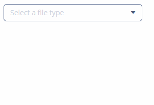
As a ComboBox has a fixed set of items, words like Select or Choose are used for prompts. For text fields, the prompting string often begins with a call to action: Enter, Type, Search. End the string with the noun the input is describing, for instance Enter city or Enter an address.
margin
Defines indentation between the outer borders and the container content. It can take value of two types:
-
margin="true"− enables margins for all sides. -
margin="true,false,true,false"− enables only the top and the bottom margin (the value format is "top, right, bottom, left").
By default, margins are disabled.
metaClass
Defines the columns type of the table component if no dataContainer attribute is defined declaratively. Defining the metaClass attribute in XML is equivalent to setting empty items for DataGrid, GroupTable, Table, TreeDataGrid, or TreeTable, thus you can set the items programmatically in a screen controller.
optionsContainer
Sets the name of a data container which contains a list of options. The component will display the instance name of an entity instance.
The captionProperty attribute can be used together with optionsContainer.
optionsEnum
Sets the enumeration class name which contains a list of options.
property
Sets the name of an entity attribute, which value will be displayed and edited by this visual component.
property is always used together with the dataContainer attribute.
required
Indicates that this field requires a value.
Possible values − true, false. Default is false.
The requiredMessage attribute can be used together with required.
requiredMessage
Used together with the required attribute. It sets a message that will be displayed to a user when the component has no value.
The attribute can contain a message or a key from a message pack, for example:
requiredMessage="msg://infoTextField.requiredMessage"responsive
Indicates that the component should react on change in the available space. Reaction can be customized with the help of styles.
Possible values − true, false. Default is false.
rowspan
Sets the number of grid lines that the component should occupy (default is 1).
This attribute can be set for any component located immediately within a GridLayout container.
spacing
Sets spacing between components within a container. Possible values - true, false. Default is false.
stylename
Defines a style name for a component. See Themes for details.
There are several predefined styles in halo theme available for the components:
-
huge- sets the field size to 160% of its default size.
-
large- sets the field size to 120% of its default size.
-
small- sets the field size to 85% of its default size.
-
tiny- sets the field size to 75% of its default size.
tabIndex
Specifies whether the component is focusable and sets the relative order of the component in the sequence of focusable components on the screen.
It can take integer values of positive or negative range:
-
negative valuemeans that the component should be focusable, but should not be reachable via sequential keyboard navigation; -
0means that the component should be focusable and reachable via sequential keyboard navigation, but its relative order follows its relative position on the screen; -
positive valuemeans the component should be focusable and reachable via sequential keyboard navigation; its relative order is defined by the value of the attribute: the sequential follows the increasing number of thetabIndex. If several components share the sametabIndexvalue, their relative order follows their relative position on the screen.
visible
Sets visibility of the component. Possible values − true, false.
If a container is invisible all its components are invisible. By default all components are visible.
width
Defines component’s width.
The value can be set in pixels or in percents of the width of the parent container. For example: 100px, 100%, 50. If specified without units, pixels are assumed. Setting a value in % means that the component will occupy the corresponding width within an area provided by the parent container.
When set to AUTO or -1px, a default value will be used for a component width. For a container, the default width is defined by the content: it is the sum of the widths of all nested components.
