SimplePagination
SimplePagination is a component used to load data by pages. It is designed to be used inside the Table, DataGrid, and other list components.
Component’s XML-name: simplePagination.
Basics
SimplePagination has a simple view with a count of rows and navigation buttons. As opposed to Pagination, it can’t show pages with specific numbers.
SimplePagination can also have a drop-down list for the number of items per page.
By default, Jmix Studio generates the SimplePagination component when creating browser and master-detail screens for an entity.
Data Binding
To create SimplePagination connected to data, use the containerProvider or loaderProvider nested element.
|
You don’t need to use loader and container providers when |
The example of the simplePagination declaration as a part of table is provided below.
<data>
<collection id="customersDc" class="ui.ex1.entity.Customer">
<fetchPlan extends="_base"/>
<loader id="customersDl">
<query>
<![CDATA[select e from uiex1_Customer e]]>
</query>
</loader>
</collection>
</data>
<layout expand="customersTable">
<table id="customersTable" width="100%" dataContainer="customersDc">
<actions>
<action id="create" type="create"/>
<action id="edit" type="edit"/>
<action id="remove" type="remove"/>
</actions>
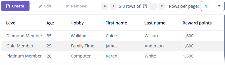
<simplePagination itemsPerPageVisible="true"
itemsPerPageOptions="2, 4, 6"
itemsPerPageDefaultValue="4"/>
<columns>
<column id="level"/>
<column id="age"/>
<column id="hobby"/>
<column id="firstName"/>
<column id="lastName"/>
<column id="rewardPoints"/>
</columns>
<buttonsPanel id="buttonsPanel" alwaysVisible="true">
<button id="createBtn" action="customersTable.create"/>
<button id="editBtn" action="customersTable.edit"/>
<button id="removeBtn" action="customersTable.remove"/>
</buttonsPanel>
</table>
</layout>Auto Load
SimplePagination shows the current items count and the label with a question mark  . If you click on it, the component will load the total count of items.
The autoLoad attribute sets whether the items count should be loaded automatically. When the autoLoad is false, the component doesn’t know the total count of items and shows a button with [?]. When autoLoad = "true", the component makes a query to get the total count of items and shows it. The default value is false.
Events and Handlers
|
To generate a handler stub in Jmix Studio, select the component in the screen descriptor XML or in the Jmix UI hierarchy panel and use the Handlers tab of the Jmix UI inspector panel. Alternatively, you can use the Generate Handler button in the top panel of the screen controller. |
AfterRefreshEvent
See AfterRefreshEvent.
BeforeRefreshEvent
See BeforeRefreshEvent.
TotalCountDelegate
See TotalCountDelegate.
All XML Attributes
|
You can view and edit attributes applicable to the component using the Jmix UI inspector panel of the Studio’s Screen Designer. |
