Tree
Basics
A typical tree is shown below:
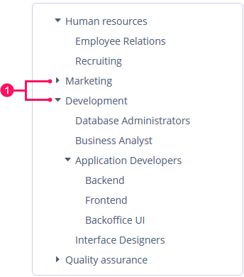
-
Toggles for expanding and collapsing tree nodes
The dataContainer attribute of the Tree component should contain a reference to a collection container.
The hierarchyProperty attribute defines the name of the entity attribute, which refers to the same entity.
Below is an example of component description in a screen XML descriptor:
<data>
    <collection id="departmentsDc" class="ui.ex1.entity.Department">
        <fetchPlan extends="_base">
            <property name="parentDept" fetchPlan="_base"/>
            <property name="manager" fetchPlan="_base"/>
        </fetchPlan>
        <loader id="departmentsDl">
            <query>
                <![CDATA[select e from uiex1_Department e]]>
            </query>
        </loader>
    </collection>
</data>
<layout spacing="true">
    <tree id="simpleTree"
          dataContainer="departmentsDc"
          hierarchyProperty="parentDept"
          width="100%"/>
</layout>
Tree renders all records available in the data container at once, so you shouldn’t use it to display a large amount of data.
|
Content Modes
The contentMode attribute defines how the tree element captions should be displayed. There are three predefined content modes:
-
TEXT- textual values are displayed as plain text. -
PREFORMATTED- textual values are displayed as preformatted text. In this mode, newlines are preserved when rendered on the screen. -
HTML- textual values are interpreted and displayed as HTML. When using HTML, don’t forget to escape data to prevent code injection.
The default content mode is TEXT.
Selection Modes
The selectionMode attribute defines the rows selection mode. There are three predefined selection modes:
-
SINGLE- a selection mode that supports only single rows to be selected at a time. -
MULTI- a selection mode that supports multiple selections. -
NONE- disables selection of rows.
The default selection mode is SINGLE.
Row Height
The rowHeight attribute sets the height of a row in pixels. If the value is -1, the row height is calculated based on the theme for an empty row before the tree is displayed.
The default value is -1.
Methods of Tree Interface
-
collapseTree()- collapses all tree nodes.
-
expandTree()- expands all tree nodes.
Events and Handlers
|
To generate a handler stub in Jmix Studio, select the component in the screen descriptor XML or in the Jmix UI hierarchy panel and use the Handlers tab of the Jmix UI inspector panel. Alternatively, you can use the Generate Handler button in the top panel of the screen controller. |
CollapseEvent
An event that is fired when an item is collapsed.
Example of subscribing to the event for the tree defined in the screen XML with the deptTree id:
@Subscribe("deptTree")
public void onDeptTreeCollapse(Tree.CollapseEvent<Department> event) {
    notifications.create()
            .withCaption("Collapsed: " + event.getCollapsedItem().getName())
            .show();
}
To register the event handler programmatically, use the addCollapseListener() component method.
DescriptionProvider
The description provider generates tooltip descriptions for items when the user hovers over a tree item.
In the example below, we will show a DescriptionProvider usage for the simpleTree:
@Install(to = "simpleTree", subject = "descriptionProvider")
private String simpleTreeDescriptionProvider(Department department) {
    return "The manager of the " + department.getName() +
            " department is " + department.getManager().getName();
}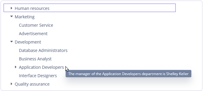
To register the description provider programmatically, use the setDescriptionProvider() component method. The description provider can render HTML if the ContentMode.HTML value is passed to the contentMode parameter.
ExpandEvent
ExpandEvent is fired when an item is expanded.
Example of subscribing to the event for the tree defined in the screen XML with the deptTree id:
@Subscribe("deptTree")
public void onDeptTreeExpand(Tree.ExpandEvent<Department> event) {
    notifications.create()
            .withCaption("Expanded: " + event.getExpandedItem().getName())
            .show();
}
To register the event handler programmatically, use the addExpandListener() component method.
IconProvider
See IconProvider.
ItemCaptionProvider
The item caption provider allows you to change the displayed caption for each item of the tree:
@Install(to = "departmentTree", subject = "itemCaptionProvider")
private String departmentTreeItemCaptionProvider(Department department) {
    return "Department: " + department.getName() +
            ", manager: " + department.getManager().getName();
}
To register the event handler programmatically, use the setItemCaptionProvider() component method.
LookupSelectHandler
See LookupSelectHandler.
SelectionEvent
See SelectionEvent.
StyleProvider
See StyleProvider.
All XML Attributes
|
You can view and edit attributes applicable to the component using the Jmix UI inspector panel of the Studio’s Screen Designer. |
align - caption - captionAsHtml - captionProperty - colspan - contentMode - contextHelpText - contextHelpTextHtmlEnabled - css - dataContainer - description - descriptionAsHtml - enable - box.expandRatio - height - hierarchyProperty - htmlSanitizerEnabled - icon - id - responsive - rowHeight - rowspan - selectionMode - showOrphans - stylename - tabIndex - visible - width
