DatePicker
Attributes
resolution
The resolution attribute allows you to define date accuracy. It accepts the following values:
-
DAY- default value, to within a day. -
MONTH -
YEAR
<datePicker resolution="MONTH"/>rangeStart and rangeEnd
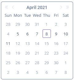
You can specify available dates by using these two attributes. If a range is set, all dates outside the range will be disabled. You can set range dates in the "year-month-date" format in XML or programmatically using corresponding setters.
<datePicker rangeStart="2021-04-05"
            rangeEnd="2021-04-11"/>
Events and Handlers
|
To generate a handler stub in Jmix Studio, select the component in the screen descriptor XML or in the Jmix UI hierarchy panel and use the Handlers tab of the Jmix UI inspector panel. Alternatively, you can use the Generate Handler button in the top panel of the screen controller. |
Validator
See Validator.
ValueChangeEvent
See ValueChangeEvent.
DatePicker XML Attributes
|
You can view and edit attributes applicable to the component using the Jmix UI inspector panel of the Studio’s Screen Designer. |
align - box.expandRatio - buffered - caption - captionAsHtml - colspan - contextHelpText - contextHelpTextHtmlEnabled - css - dataContainer - datatype - description - descriptionAsHtml - editable - enable - height - htmlSanitizerEnabled - icon - id - property - rangeEnd - rangeStart - resolution responsive - rowspan - stylename - tabIndex - visible - width
