ValuesPicker
The ValuesPicker component works with a list of values of any type. It consists of the text field and the set of buttons defined by actions.
ValuesPicker is convenient to use if you need to edit the list of values through actions, not in the text field.
ValuesPicker is a base class for TagPicker. Has the same API as ValuePicker.
Component’s XML-name: valuesPicker.
Basics
ValuesPicker can have a caption, description, and both custom and predefined actions:
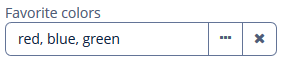
An example of defining ValuesPicker with a caption retrieved from localized messages and two actions:
<valuesPicker id="stringsValuesPicker"
              caption="Favourite colors">
    <actions>
        <action id="select" type="values_select">
            <properties>
                <property name="javaClass" value="java.lang.String"/>
            </properties>
        </action>
        <action id="clear" type="value_clear"/>
    </actions>
</valuesPicker>
Actions
You can define custom and predefined actions for ValuesPicker displayed as buttons on the right.
You can do it either in the XML descriptor using the actions nested element or programmatically in the controller using the addAction() method.
|
To add |
Predefined Actions
The framework provides value_clear and values_select predefined actions.
The values_select action sets a value to ValuesPicker using a value selection screen. The value selection screen generates a specific component to select or create a value depending on the passed value type.
The values_select action can be used to select any type of value, for example:
-
Java types, like
String,Integer,Long,Double,BigDecimal,Date,LocalDate,LocalTime,LocalDateTime,OffsetTime,OffsetDateTime,Date,Time,UUIDandjava.sql.Date,java.sql.Time.Use the
javaClassproperty to set the Java class used as the type of selected value.In the previous example, the
values_selectaction uses thejava.lang.StringJava type. When the user clicks on the value selection button, the Select Value screen appears. The user can create and add some value to a result list on this screen or remove a value from the list. The user can add a value either by clicking the Add button or by pressing Enter.
For the
UUIDJava type,MaskedFieldis generated on the Select Value screen.For the date types,
DateFieldis generated.Use the
resolutionproperty to set the resolution of theDateFieldcomponent:<action id="select" type="values_select"> <properties> <property name="javaClass" value="java.util.Date"/> <property name="resolution" value="MONTH"/> </properties> </action>Use the
timeZoneproperty to set the time zone of theDateFieldcomponent.For the time types,
TimeFieldis generated.For other types,
TextFieldis generated. -
Enum values
Use the
enumClassproperty to set the enumeration class used as the type of selected value.<valuesPicker id="valuePicker" caption="Hobbies"> <actions> <action id="select" type="values_select"> <properties> <property name="enumClass" value="ui.ex1.entity.Hobby"/> </properties> </action> <action id="clear" type="value_clear"/> </actions> </valuesPicker>For enum values,
ComboBoxis generated on the Select Value screen.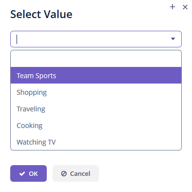
-
Entity instances
Use the
entityNameproperty to set the entity name used as the type of selected value.<valuesPicker id="valuePickerEnt"> <actions> <action id="select" type="values_select"> <properties> <property name="entityName" value="uiex1_User"/> <property name="useComboBox" value="true"/> </properties> </action> <action id="clear" type="value_clear"/> </actions> </valuesPicker>The
useComboBoxproperty specifies whetherComboBoxshould be used in the value selection screen. The default value isfalse.The
lookupScreenIdproperty sets the lookup screen id to be passed into the value selection screen to select entity values.
The value selection screen implements the SelectValueController interface.
Use the selectValueScreenId property to set the id of a screen that implements the SelectValueController interface.
Use the selectValueScreenClass property to set the class of a screen that implements the SelectValueController interface.
Custom Actions
Custom actions for ValuesPicker are similar to custom actions for ValuePicker.
Validation
To check values entered into the ValuesPicker component, you can use a validator in a nested validators element.
The following predefined validators are available for ValuesPicker:
In the example below, we will show a SizeValidator usage for validatedCheckBoxGroup:
<checkBoxGroup id="validatedCheckBoxGroup"
               optionsContainer="customersDc"
               caption="The number of customers is limited from 2 to 5">
    <validators>
        <size min="2" max="5"/>
    </validators>
</checkBoxGroup>
Events and Handlers
|
To generate a handler stub in Jmix Studio, select the component in the screen descriptor XML or in the Jmix UI hierarchy panel and use the Handlers tab of the Jmix UI inspector panel. Alternatively, you can use the Generate Handler button in the top panel of the screen controller. |
FieldIconProvider
See FieldIconProvider.
Formatter
See Formatter.
Validator
Adds a validator instance to the component. The validator must throw ValidationException if the value is not valid.
If you are not satisfied with the predefined validators, add your own validator instance:
@Install(to = "validCheckBoxGroup", subject = "validator")
protected void validCheckBoxGroupValidator(Collection<EducationalStage> value) {
    if (value.contains(EducationalStage.NO) & value.size() > 1)
        throw new ValidationException("You cannot select the No Education " +
                "value together with other values");
}
ValueChangeEvent
See ValueChangeEvent.
ValuesPicker XML Attributes
|
You can view and edit attributes applicable to the component using the Jmix UI inspector panel of the Studio’s Screen Designer. |
align - caption - captionAsHtml - css - description - descriptionAsHtml - enable - box.expandRatio - fieldEditable - htmlSanitizerEnabled - icon - id - inputPrompt - stylename - tabIndex - visible - width
