SplitPanel
SplitPanel is a container divided into two areas by a movable separator.
Component’s XML-name: split.
Basics
The SplitPanel must contain two nested containers or components. They will be displayed on both sides of the separator.
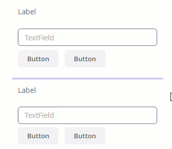
For example:
<split height="300px"
       width="100%">
    <vbox height="100%"
          margin="true">
        <label value="Label"/>
        <textField inputPrompt="TextField"/>
        <hbox spacing="true">
            <button caption="Button"/>
            <button caption="Button"/>
        </hbox>
    </vbox>
    <vbox height="100%"
          margin="true">
        <label value="Label"/>
        <textField inputPrompt="TextField"/>
        <hbox spacing="true">
            <button caption="Button"/>
            <button caption="Button"/>
        </hbox>
    </vbox>
</split>
Attributes
orientation
orientation attribute defines component orientation. Possible values:
-
vertical– nested components are placed vertically. This is the default value. -
horizontal– nested components are placed horizontally.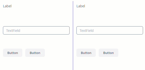
dockable
dockable attribute enables or disables the SplitPanel dock button. The default value is false.
|
Docking is available only for horizontally-oriented |
dockMode
dockMode attribute defines the docking direction. Works when dockable="true". Possible values:
-
LEFT- by default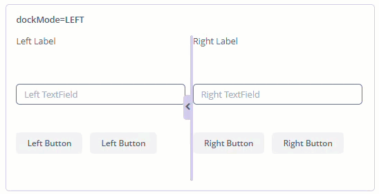
-
RIGHT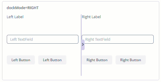
pos
pos attribute allows you to define the percentage of the first component area compared to the second one. For example, pos="30" means that the area ratio is 30/70. By default, pos="50".
reversePosition
reversePosition attribute indicates that the pos attribute specifies a position of the splitter from the opposite side of the component. For example, if pos=30 and reversePosition="true", the area ratio is 70/30. By default, reversePosition="false".
locked
If the locked attribute is set to true, users cannot change the separator position. By default, locked="false".
minSplitPosition and maxSplitPosition
minSplitPosition and maxSplitPosition attributes define a range of the available position of the split, which you can specify in pixels or percents.
For example, you can restrict moving the splitter between 100 and 300 pixels from the left side of the component as follows:
<split minSplitPosition="100px"
       maxSplitPosition="300px"
       orientation="horizontal"
       pos="200px"
       height="100%"
       width="100%">
    <vbox height="100%" width="100%">
        <label value="Label"/>
        <textField inputPrompt="TextField"/>
        <hbox spacing="true">
            <button caption="Button"/>
            <button caption="Button"/>
        </hbox>
    </vbox>
    <vbox height="100%" width="100%">
        <label value="Label"/>
        <textField inputPrompt="TextField"/>
        <hbox spacing="true">
            <button caption="Button"/>
            <button caption="Button"/>
        </hbox>
    </vbox>
</split>
All XML Attributes
align - box.expandRatio - caption - captionAsHtml - colspan - contextHelpText - contextHelpTextHtmlEnabled - css - description - descriptionAsHtml - dockMode - dockable - enable - height - htmlSanitizerEnabled - icon - id - locked - maxSplitPosition - minSplitPosition - orientation - pos - responsive - reversePosition - rowspan - stylename - visible - width
