PopupButton
Basics
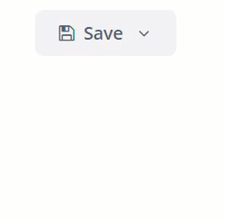
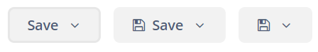
PopupButton can contain text specified in the caption and icon attributes, or both. You can define a tooltip in the description attribute. The figure below shows different types of buttons:
Elements
actions
This element specifies the drop-down actions list.
Only the caption, enable, and visible properties are displayed. The description and shortcut properties are ignored. Handling of the icon property depends on the showActionIcons attribute of the component. By default, showActionIcons=false.
Below is an example of a PopupButton with a drop-down list containing two actions:
<popupButton id="popupButton1"
             caption="Save"
             showActionIcons="true">
    <actions>
        <action id="popupAction1"
                caption="Save as .doc"
                icon="FILE_WORD_O"/>
        <action id="popupAction2"
                caption="Save as .pdf"
                icon="FILE_PDF_O"/>
    </actions>
</popupButton>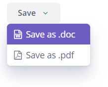
|
To add an action in Jmix Studio, select the |
You can create the actions from scratch or use the actions already defined for any element in the current screen. In the example below, the personsPopupButton component uses actions defined in personsTable:
<groupTable id="personsTable"
            width="100%"
            dataContainer="personsDc">
    <columns>
        <column id="name"/>
        <column id="image"/>
    </columns>
    <actions>
        <action id="create" type="create"/>
        <action id="edit" type="edit"/>
        <action id="remove" type="remove"/>
    </actions>
</groupTable>

<popupButton id="personsPopupButton"
             caption="Person">
    <actions>
        <action id="personsTable.create"/>
        <action id="personsTable.edit"/>
        <action id="personsTable.remove"/>
    </actions>
</popupButton>
popup
This element sets custom inner content for the PopupButton. Actions are ignored if a custom popup content is set.
Below is an example of a custom popup layout:
<popupButton id="customPopupButton"
             caption="Settings"
             icon="GEARS"
             popupOpenDirection="BOTTOM_CENTER">
    <popup>
        <vbox margin="true"
              spacing="true"
              width="260px">
            <label align="MIDDLE_CENTER"
                   stylename="h2"
                   value="Settings"/>
            <progressBar caption="Progress"
                         width="100%"/>
            <textField id="textField"
                       caption="Comment"
                       width="100%"/>
            <comboBox id="comboBox"
                      caption="Status"
                      optionsEnum="ui.ex1.entity.Status"
                      width="100%"/>
            <hbox spacing="true">
                <button id="saveAndCloseButton"
                        caption="Save"
                        icon="SAVE"/>
                <button id="cancelAndCloseButton"
                        caption="Cancel"
                        icon="REMOVE"/>
            </hbox>
        </vbox>
    </popup>
</popupButton>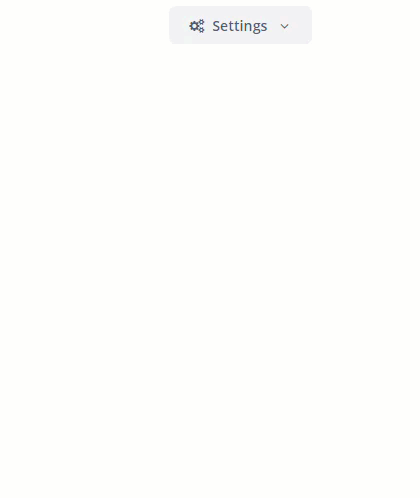
Attributes
-
autoClose- defines if the popup should be closed automatically after the action triggering.
-
closePopupOnOutsideClick- if set totrue, clicking outside the popup closes it. This does not affect clicking on the button itself.
-
showActionIcons- enables displaying icons for action buttons.
-
togglePopupVisibilityOnClick- defines whether a sequential click on the popup should toggle popup visibility.
-
popupOpenDirection- sets the opening direction for the popup. Possible values:-
BOTTOM_LEFT -
BOTTOM_RIGHT -
BOTTOM_CENTER
-
Tracking Popup Visibility
You can track the popup visibility changes by subscribing to the corresponding event:
@Autowired
protected Notifications notifications;

@Subscribe("popupButton")
public void onPopupButtonPopupVisibility(PopupButton.PopupVisibilityEvent event) {
    notifications.create()
            .withCaption("Popup visibility changed")
            .show();
}
Also, you can add a listener for this event using the component’s API, for example:
@Autowired
protected PopupButton popupButton;
@Autowired
protected Notifications notifications;

@Subscribe
protected void onInit(InitEvent event) {
    popupButton.addPopupVisibilityListener(popupVisibilityEvent ->
            notifications.create()
                    .withCaption("Popup visibility changed")
                    .show());
}
Appearance
The PopupButton component’s appearance can be customized using SCSS variables with $jmix-popupbutton-* prefix. You can change these variables in the visual editor after creating a theme extension or a custom theme.
All XML Attributes
align - autoClose - box.expandRatio - caption - captionAsHtml - closePopupOnOutsideClick - colspan - css - description - descriptionAsHtml - enable - height - htmlSanitizerEnabled - icon - id - menuWidth - popupOpenDirection - responsive - rowspan - showActionIcons - stylename - tabIndex - togglePopupVisibilityOnClick - visible - width
