ComboBox
ComboBox allows users to select a single item from a drop-down list. It supports filtering of items based on user input.
Component’s XML-name: comboBox.
Basics
Use ComboBox if:
-
Users need to select a single option.
-
The list should be compact. It can be handy when the list of options is too long for RadioButtonGroup or SingleSelectList.
-
Users need filtering functionality.
See also EntityComboBox.
By default, Jmix Studio generates ComboBox when creating an entity editor screen with an enum attribute. For example, a Customer entity has a hobby attribute of the Hobby type, which is an enumeration.
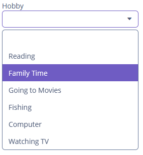
In the following example, the screen defines the customerDc data container for the Customer entity having the hobby attribute. In the comboBox element, the dataContainer attribute contains a link to the customerDc data container, and the property attribute refers to the hobby entity attribute. In this case, the entity attribute is an enumeration, and the drop-down list displays localized names of all enumeration values.
<data>
    <instance id="customerDc" class="ui.ex1.entity.Customer">
        <fetchPlan extends="_base"/>
    </instance>
</data>
<layout>
    <vbox spacing="true">
        <comboBox id="hobbyField"
                  dataContainer="customerDc"
                  property="hobby"
                  caption="msg://ui.ex1.entity/Customer.hobby"/>
    </vbox>
</layout>
Custom Options
You can specify the list of ComboBox options using the setOptionsList(), setOptionsMap() and setOptionsEnum() methods.
setOptionsList()
-
The
setOptionsList()method allows you to specify a list of component options programmatically.First, declare a component in the XML descriptor:
<comboBox id="maritalStatusField"
          dataContainer="customerDc"
          property="maritalStatus"
          caption="msg://ui.ex1.entity/Customer.maritalStatus"/>
Then inject the component into the controller and specify a list of options in the
onInit()method:@Autowired private ComboBox<String> maritalStatusField; @Subscribe public void onInit(InitEvent event) { List<String> list = new ArrayList<>(); list.add("Married"); list.add("Widowed"); list.add("Separated"); list.add("Divorced"); list.add("Single"); maritalStatusField.setOptionsList(list); }In the component’s drop-down list, the values
"Married","Widowed","Separated","Divorced"and"Single"will be displayed. The selected status will be put into themaritalStatusattribute of an entity located in thecustomerDcdata container.
setOptionsMap()
-
The
setOptionsMap()method allows you to specify a string caption for each option value explicitly.First, declare a component in the XML descriptor:
<comboBox id="ratingField"
          dataContainer="orderDc"
          property="rating"
          caption="msg://ui.ex1.entity/Order.rating"/>
Then inject the component into the controller and specify an options map in
onInit():@Autowired private ComboBox<Integer> ratingField; @Subscribe public void onInit(InitEvent event) { Map<String, Integer> map = new LinkedHashMap<>(); map.put("Poor", 2); map.put("Average", 3); map.put("Good", 4); map.put("Excellent", 5); ratingField.setOptionsMap(map); }In the component’s drop-down list,
"Poor","Average","Good","Excellent"strings will be displayed. However, the value of the component will be a number that corresponds to the selected option. It will be put into theratingattribute of an entity located in theorderDcdata container.
setOptionsEnum()
-
The
setOptionsEnum()method takes the class of an enumeration as a parameter. The drop-down list will show localized names of enum values; the component’s value will be an enum value.The simplest way to set options from the enum class is to use the
optionsEnumattribute in the XML descriptor:<comboBox id="hobbyComboBox" dataContainer="customerDc" property="hobby" optionsEnum="ui.ex1.entity.Hobby" caption="msg://ui.ex1.entity/Customer.hobby"/>
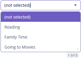
Managing Null Option
nullName
If the ComboBox component is not required, and the related entity attribute is not declared as required, the list of component options has an empty item. If this item is selected, the component returns null. The nullName attribute allows you to specify an item to be displayed in this case instead of an empty one. Below is an example:
<comboBox id="comboBox"
          dataContainer="customerDc"
          property="hobby"
          nullName="(not selected)"/>
In this case, instead of an empty item (not selected) will be displayed. If this item is selected, null will be set to a related entity attribute.
If you specify a list of options programmatically using setOptionsList(), you can pass one of the options into the setNullSelectionCaption() method. Then, if the user selects it, the component value will be null.
Filtering Modes
ComboBox supports filtering. The filterMode attribute sets the filtering type for the user input:
-
NO-ComboBoxdoes not use a filter. -
STARTS_WITH-ComboBoxshows values which captions start with the entered text. -
CONTAINS-ComboBoxshows values which captions contain the entered text (is used by default).
Use the textInputAllowed attribute to disable filtering:
<comboBox id="comboBoxNoFilter"
          dataContainer="customerDc"
          property="hobby"
          textInputAllowed="false"/>
It can be convenient for short lists. The default value is true.
Paging
ComboBox supports a paging mechanism that helps break a long list of items into multiple separate pages. The number of pages is determined by the page size and the number of items in the drop-down list.
Use the pageLength attribute to set the number of items you wish to display per page.
Setting the pageLength to 0 will disable suggestion popup paging (all items are visible).
The default value is specified in the jmix.ui.component.comboBoxPageLength property.
Setting Popup Width
Use the setPopupWidth() method to set the drop-down list’s width, which is passed to the method as a string. Using relative units (for example, "50%") it’s possible to set the drop-down list’s width relative to ComboBox itself. By default, this width is set to null so that the drop-down list’s width can be greater than a component width to fit the content of all displayed items. Setting the value to "100%" the drop-down list’s width will be equal to the width of ComboBox.
Validation
To check values entered into the ComboBox component, you can use a validator in a nested validators element.
The following predefined validators are available for ComboBox:
In the example below, we will show a NotEmptyValidator usage for hobbyValidField:
<comboBox id="hobbyValidField"
          dataContainer="customerDc"
          property="hobby"
          caption="msg://ui.ex1.entity/Customer.hobby">
    <validators>
        <notEmpty/>
    </validators>
</comboBox>
Handling User Input
Use the setEnterPressHandler() method to let users enter a value that is not in the initial drop-down list and to save it to select the item later without entering it again:
@Subscribe
public void onInit(InitEvent event) {
    List<String> list = new ArrayList<>();
    list.add("Married");
    list.add("Widowed");
    list.add("Separated");
    list.add("Divorced");
    list.add("Single");
    maritalStatusField.setOptionsList(list);
    maritalStatusField.setEnterPressHandler(enterPressEvent -> {
        String text = enterPressEvent.getText();
        list.add(text);
        maritalStatusField.setOptionsList(list);
    });
}
setEnterPressHandler() is invoked if the user enters a value and presses Enter. In this case, a new value is added to the list of options and becomes available for later use.
Events and Handlers
|
To generate a handler stub in Jmix Studio, select the component in the screen descriptor XML or in the Jmix UI hierarchy panel and use the Handlers tab of the Jmix UI inspector panel. Alternatively, you can use the Generate Handler button in the top panel of the screen controller. |
EnterPressHandler
See the example of programmatic registration in the Handling User Input section for ComboBox.
EnterPressHandler can be provided declaratively using the @Install annotation in the screen controller. See this example in the Handling User Input section for EntityComboBox.
OptionsCaptionFilter
OptionsCaptionFilter is used to test whether an item with the given caption matches the given search string.
In the following example, the user entered search string is checked to match the case-sensitive caption of the item.
@Install(to = "hobbyField", subject = "optionsCaptionFilter")
private boolean hobbyFieldOptionsCaptionFilter(ComboBox.OptionsCaptionFilteringContext
                                                       optionsCaptionFilteringContext) {
    return optionsCaptionFilteringContext.getItemCaption()
            .contains(optionsCaptionFilteringContext.getSearchString());
}
To set a predicate programmatically, use the setOptionsCaptionFilter() component method.
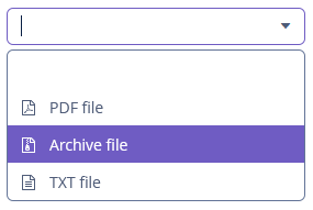
OptionIconProvider
Each drop-down list item can have an icon on the left by creating an implementation of the HasOptionIconProvider interface:
@Autowired
private ComboBox iconComboBox;

@Subscribe
public void onInit(InitEvent event) {
    Map<String, FontAwesome> iconMap = new HashMap<>();
    iconMap.put("Archive file", FontAwesome.FILE_ARCHIVE_O);
    iconMap.put("PDF file", FontAwesome.FILE_PDF_O);
    iconMap.put("TXT file", FontAwesome.FILE_TEXT_O);
    iconComboBox.setOptionsMap(iconMap);
}

@Install(to = "iconComboBox", subject = "optionIconProvider")
private String iconComboBoxOptionIconProvider(FontAwesome icon) {
    return "font-icon:" + icon;
}
To set a function that provides an icon for options programmatically, use the setOptionIconProvider() component method.
OptionImageProvider
OptionImageProvider delegate method allows you to define images for the options displayed by the ComboBox component:
private Image imageResource;

@Subscribe
public void onInit(InitEvent event) {
    imageResource = uiComponents.create(Image.NAME);
}

@Install(to = "comboBoxWithImages", subject = "optionImageProvider")
private Resource comboBoxWithImagesOptionImageProvider(Hobby hobby) {
    return imageResource.setSource(ThemeResource.class).setPath("icons/check-mark.png");
}
This delegate returns one of the resource types.
To register the options image provider programmatically, use the setOptionImageProvider() component method.
OptionStyleProvider
See OptionStyleProvider.
Validator
Adds a validator instance to the component. The validator must throw ValidationException if the value is not valid.
If you are not satisfied with the predefined validators, add your own validator instance:
@Install(to = "iconComboBox", subject = "validator")
protected void iconComboBoxValidator(FontAwesome icon) {
    if (icon != null)
        if (icon == FontAwesome.FILE_PDF_O)
            throw new ValidationException("The file type you selected " +
                    "is not currently supported");
}
ValueChangeEvent
See ValueChangeEvent.
ComboBox XML Attributes
|
You can view and edit attributes applicable to the component using the Jmix UI inspector panel of the Studio’s Screen Designer. |
align - buffered - caption - captionAsHtml - colspan - contextHelpText - contextHelpTextHtmlEnabled - css - dataContainer - description - descriptionAsHtml - editable - enable - box.expandRatio - filterMode - height - htmlSanitizerEnabled - inputPrompt - icon - id - nullName - nullOptionVisible - optionsEnum - pageLength - property - required - requiredMessage - responsive - rowspan - stylename - textInputAllowed - tabIndex - visible - width
