Creating and Using Widgets Add-On
A widgets add-on provides custom UI components to reuse them in different applications.
The following conditions must be met:
-
The JAR file contains
DemoaddonWidgets.gwt.xml. -
The JAR manifest must specify the path to
*.gwt.xml:jar { // pack client Java sources with copySpec { from sourceSets.main.allJava include "com/company/demoaddon/**" duplicatesStrategy = DuplicatesStrategy.WARN } // register exported widgetset manifest { attributes(['Vaadin-Widgetsets': 'com.company.demoaddon.DemoaddonWidgets', 'Vaadin-Stylesheets': 'VAADIN/addons/demoaddon/demoaddon.scss']) } }
The widgetset will be generated automatically based on all JARs with the Vaadin-Widgetsets key in the Manifest. It allows you to use Vaadin add-ons conveniently.
You don’t need to compile widgets in add-ons.
Creating the Widgets Add-on Using Studio
Follow the steps below to create a widgets add-on using Jmix Studio:
-
Create a new project. Select a UI Widgets Add-On template. Enter the name of the project, for example,
"demoaddon". It will be a simple Java project that has the following structure: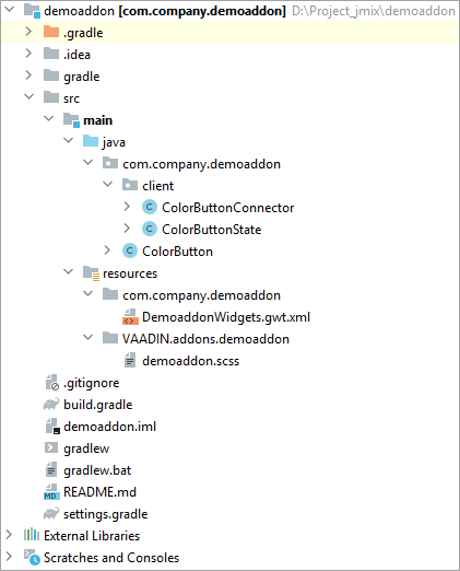
JMIX studio supplies an example of a widgets add-on based on the
ColorButtonGWT component. You can create your own component instead of aColorButton. -
Open the
demoaddon.scssfile and define your theme style modifications. -
Build and publish the add-on to the local maven repository using the following command:
./gradlew clean publishToMavenLocal
Using the Widgets Add-on
-
Open the project you want to apply the widgets add-on.
-
Create a custom theme, for example, with the
helium-extendedname. -
Open the
build.gradlefile and make the following changes:-
Add
mavenLocal()to repositories. -
Remove
implementation 'io.jmix.ui:jmix-ui-widgets-compiled'dependency. -
Include the add-on dependency to the project’s
implementationandwidgetsconfigurations, for example:implementation 'com.company:demoaddon:0.0.1-SNAPSHOT' widgets 'com.company:demoaddon:0.0.1-SNAPSHOT' implementation 'io.jmix.ui:jmix-ui-widgets' widgets 'io.jmix.ui:jmix-ui-widgets' -
Add the compileWidgets task (change paths according to your application base package):
compileWidgets {
    generate "com.company.sample.widget.CustomWidgetSet"
    includePaths('**/io/jmix/**/widget/**', '**/com/company/sample/widget/**')
}
-
-
Add the
jmix.ui.widget-setproperty to yourapplication.propertiesfile (adjust location according to thecompileWidgetstask above):jmix.ui.widget-set=com.company.sample.widget.CustomWidgetSet -
Reload the project.
-
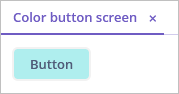
Let’s create a new
color-button-screento demonstrate how the component works.Open the
ColorButtonScreen.javascreen controller and add the code that puts the component to the screen:ColorButtonScreen.java@UiController("sample_ColorButtonScreen") @UiDescriptor("color-button-screen.xml") public class ColorButtonScreen extends Screen { @Subscribe protected void onInit(InitEvent event) { ColorButton button = new ColorButton(); (1) button.setCaption("Button"); button.setColor("#AFEEEE"); getWindow().unwrap(Layout.class).addComponent(button); (2) } }1 Initializes a color button component instance. 2 Retrieves a link to the Vaadin container using the unwrap()method and adds the new component to it. -
Start the application and see the result: