TabSheet
TabSheet is a container that allows switching between the components with tabs. The tabs are organized as a tab bar at the top of the TabSheet. Clicking on a tab opens its contained component in the main display area of the layout. If there are more tabs than fit in the tab bar, navigation buttons will appear.
Component’s XML-name: tabSheet.
Basics
Usage example:
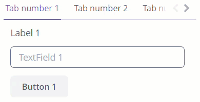
<tabSheet width="300px">
    <tab id="tab_1"
         caption="Tab number 1"
         margin="true"
         spacing="true">
        <label value="Label 1"/>
        <textField inputPrompt="TextField 1"/>
        <button caption="Button 1"/>
    </tab>
    <tab id="tab_2"
         caption="Tab number 2"
         margin="true"
         spacing="true">
        <label value="Label 2"/>
        <textField inputPrompt="TextField 2"/>
        <button caption="Button 2"/>
    </tab>
</tabSheet>
TabSheet component should contain nested tab elements describing tabs. Each tab is a container with a vertical component’s layout similar to vbox.
|
To add |
TabSheet Attributes
-
tabCaptionsAsHtml- defines whether HTML is allowed in thetabcaptions. Possible values:-
true- the captions are rendered in the browser as HTML, and the developer is responsible for ensuring no harmful HTML is used. -
false- by default. The content is rendered in the browser as plain text.
-
-
tabsVisible- sets whether the tab selection part should be shown in the UI. Possible values:-
true- by default -
false
-
Tab Element Attributes
-
closable- defines whether the button for closing thetabis displayed. The default value isfalse. -
id- sets an identifier of the tabPlease note that tabs are not components, and their IDs are used only within a
TabSheetto work with tabs from the controller.
TabSheet Styles
-
centered-tabs- centers the tabs inside the tab bar. It works best if all the tabs fit entirely in the tab bar, without scrolling. -
compact-tabbar- reduces the whitespace around the tabs in the tab bar. -
equal-width-tabs- gives an equal amount of space to all tabs in the tab bar. The tab captions will be truncated if they do not fit into the tab. Tab scrolling will be disabled, and all tabs will be visible simultaneously. -
framed- adds a border around the whole component and individual tabs in the tab bar. -
icons-on-top- displays tab icons on top of the tab captions. Вy default, the icons are placed on the left side of the caption. -
only-selected-closable- only the selected tab has the close button visible. It does not prevent closing the tab programmatically; it only hides the button from the user. -
padded-tabbar- adds a small amount of padding around the tabs in the tab bar so that they don’t touch the outer edges of the component.
The appearance of the TabSheet can be customized using SCSS variables with $jmix-tabsheet-* prefix. You can change these variables in the visual editor after creating a theme extension or a custom theme.
Lazy Loading Tab Content
By default, tabs are not lazy, which means that all their content is loaded when a screen is opened.
To enable lazy loading for tab content, you should set the lazy attribute of the tab element to true.
Lazy tabs do not load their content when the screen is opened. This approach reduces the number of components in memory. Components within a tab are loaded only when a user selects the tab.
|
Please note that the components located on a lazy |
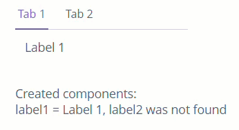
For example, let’s create a TabSheet with a single lazy tab. To understand what state the lazy tab content is in, we will use label with id="info".
<tabSheet id="tabSheet"
          width="200"
          height="100">
    <tab id="tab1"
         caption="Tab 1"
         margin="true">
        <label id="label1"
               value="Label 1"/>
    </tab>
    <tab id="tab2"
         caption="Tab 2"
         margin="true"
         lazy="true">
        <label id="label2"
               value="Label 2"/>
    </tab>
</tabSheet>

<label id="info" align="MIDDLE_LEFT"/>
@Autowired
private Label<String> info;
@Autowired
private TabSheet tabSheet;
@Subscribe
public void onInit(InitEvent event) {
checkComponents();
}
@Subscribe("tabSheet")
protected void onTabSheetSelectedTabChange(TabSheet.SelectedTabChangeEvent event) {
if (event.getSelectedTab().getName().equals("tab2")) {
checkComponents();
}
}
private void checkComponents() {
StringBuilder sb = new StringBuilder("Created components:\n");
sb.append("label1 = ");
Label<String> label1 = (Label<String>) tabSheet.getComponentNN("label1");
sb.append(label1.getValue());
try{
Label<String> label2 = (Label<String>) tabSheet.getComponentNN("label2");
sb.append(", label2 = ");
sb.append(label2.getValue());
} catch (IllegalArgumentException e){
sb.append(", label2 was not found");
}
info.setValue(sb.toString());
}In the example above, at the time of screen initialization, the checkComponents() method is called. Because label2 is in the lazy tab, we can’t get label2 using the getComponentNN() method. But when the user selects tab2, SelectedTabChangeEvent is triggered, and we get into the checkComponents() method again, and now we can get the label2 value, specified in the XML.
All XML Attributes
align - box.expandRatio - caption - captionAsHtml - colspan - contextHelpText - contextHelpTextHtmlEnabled - css - description - descriptionAsHtml - enable - height - htmlSanitizerEnabled - icon - id - responsive - rowspan - stylename - tabCaptionsAsHtml - tabIndex - tabsVisible - visible - width
