Slider
Slider is a vertical or horizontal bar that allows users to choose a numeric value within a defined range by dragging a bar handle with the mouse. The value is shown when dragging the handle.
Component’s XML-name: slider.
Basics
The default data type of the slider is double. Using the datatype attribute, you can set the following numeric data type for the component:
-
int -
long -
double -
decimal
Slider can be bound to a data container using the dataContainer and property attributes. In this case, the component will take the data type from the entity field contained in the property attribute.
Usage example:
<data>
    <instance id="productDc"
              class="ui.ex1.entity.Product"
              fetchPlan="_base"/>
</data>
<layout>
    <slider id="slider"
            dataContainer="productDc"
            property="price"/>
</layout>
Attributes
Slider has the following specific attributes:
-
max- defines the maximum value of the range. The default value is100.
-
min- defines the minimum value of the range. The default value is0.
-
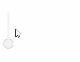
orientation- defines horizontal or vertical placement of the slider. The default value ishorizontal.
-
resolution- defines a number of digits after the decimal point. The default is0.
-
updateValueOnClick- defines whether the slider can be updated by clicking on the bar. The default value isfalse.
<slider max="20"
        min="10"
        resolution="2"
        updateValueOnClick="true"
        orientation="vertical"/>
Events and Handlers
|
To generate a handler stub in Jmix Studio, select the component in the screen descriptor XML or in the Jmix UI hierarchy panel and use the Handlers tab of the Jmix UI inspector panel. Alternatively, you can use the Generate Handler button in the top panel of the screen controller. |
Validator
Adds a validator instance to the component. The validator must throw ValidationException if the value is not valid.
ValueChangeEvent
See ValueChangeEvent.
All XML Attributes
|
You can view and edit attributes applicable to the component using the Jmix UI inspector panel of the Studio’s Screen Designer. |
align - box.expandRatio - caption - captionAsHtml - contextHelpText - contextHelpTextHtmlEnabled - css - dataContainer - datatype - description - descriptionAsHtml - editable - enable - expand - height - htmlSanitizerEnabled - icon - id - max - min - orientation - property - required - requiredMessage - resolution - responsive - stylename - updupdateValueOnClick - visible - width
