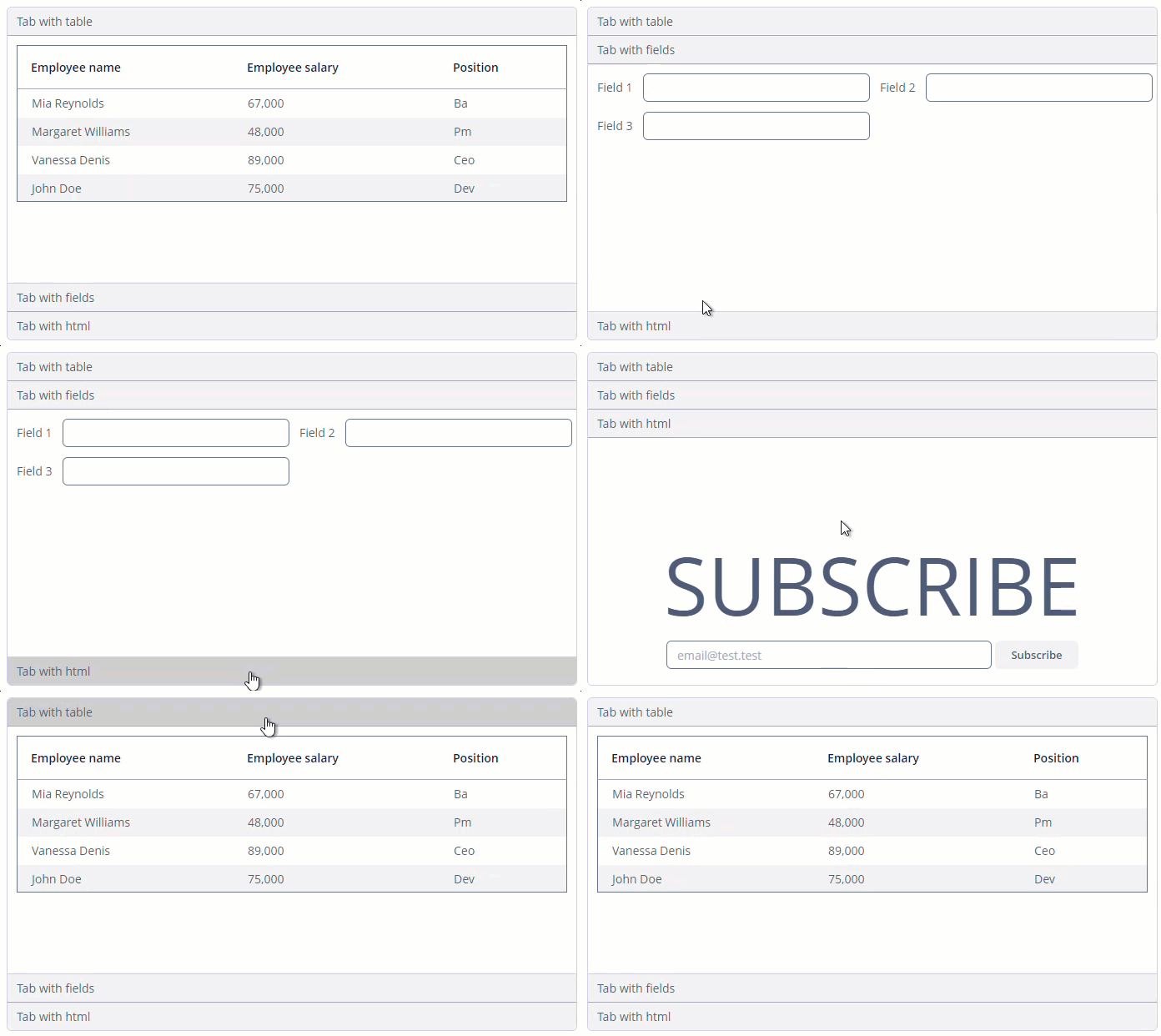
Accordion
Accordion is a container for collapsible content that allows you to toggle between hiding and showing a large amount of content.

Component’s XML-name: accordion.
Basics
Use Accordion container if the application page is limited in space or the tab title is too long to be displayed in the TabSheet.
The accordion component should contain nested tab elements describing tabs. Each tab is a container with a vertical component’s layout similar to vbox. You can learn more about the tab element on the TabSheet page.
|
To add |
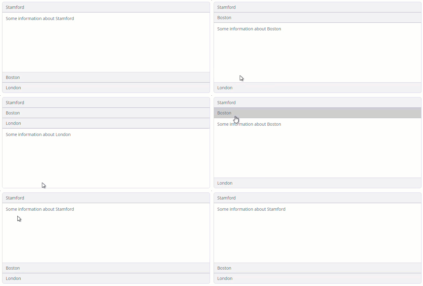
You can put any component or container in the tab element. To demonstrate a simple accordion, let’s add labels to each tab:
<accordion id="accordion"
           height="300px">
    <tab id="tabStamford"
         caption="Stamford"
         margin="true"
         spacing="true">
        <label value="Some information about Stamford"/>
    </tab>
    <tab id="tabBoston"
         caption="Boston"
         margin="true"
         spacing="true">
        <label value="Some information about Boston"/>
    </tab>
    <tab id="tabLondon"
         caption="London"
         margin="true"
         spacing="true">
        <label value="Some information about London"/>
    </tab>
</accordion>
All XML Attributes
align - box.expandRatio - caption - captionAsHtml - colspan - contextHelpText - contextHelpTextHtmlEnabled - css - description - descriptionAsHtml - enable - height - htmlSanitizerEnabled - icon - id - responsive - rowspan - stylename - tabCaptionsAsHtml - tabIndex - tabsVisible - visible - width
