Dialogs
The Dialogs interface is designed to display standard dialog windows. A dialog window is a small window that you can use to present information and user interface elements in an overlay.
The createMessageDialog(), createOptionDialog() and createInputDialog() methods are the entry points to the fluent API that allows you to construct and show dialogs.
The appearance of the dialogs can be customized using SCSS variables with $jmix-window-modal-* prefix. You can change these variables in the visual editor after creating a custom theme.
Message Dialog
The most basic use case for a message dialog is showing some message to the user.

In the following example, a message dialog is shown when the user clicks a button:
@Autowired
private Dialogs dialogs;

@Subscribe("msgDialogBtn")
public void onMsgDialogBtnClick(Button.ClickEvent event) {
    dialogs.createMessageDialog()
            .withCaption("Success")
            .withMessage("Your invitation successfully send")
            .show();
}
To set the caption of a dialog, use the withCaption() method.
Use the withMessage() method to pass the message text.
Using withContentMode() method, you can define how the message text should be displayed. There are three predefined content modes:
-
ContentMode.TEXT- textual values are displayed as plain text. -
ContentMode.PREFORMATTED- textual values are displayed as preformatted text. In this mode, newlines are preserved when rendered on the screen. -
ContentMode.HTML- textual values are interpreted and displayed as HTML. When using HTML, don’t forget to escape data to prevent code injection.
You can use \n characters for line breaks in messages. In order to show HTML, use the withContentMode() method with ContentMode.HTML parameter.
You can pass true to the withHtmlSanitizer() method to enable HTML sanitization for the dialog content. In this case, ContentMode.HTML parameter must be passed to the withContentMode() method.
protected static final String UNSAFE_HTML = "<i>Jackdaws </i><u>love</u> " +
        "<font size=\"javascript:alert(1)\" " +
        "color=\"moccasin\">my</font> " +
        "<font size=\"7\">big</font> <sup>sphinx</sup> " +
        "<font face=\"Verdana\">of</font> <span style=\"background-color: " +
        "red;\">quartz</span><svg/onload=alert(\"XSS\")>";

@Autowired
private Dialogs dialogs;

@Subscribe("msgDialogOnBtn")
public void onMsgDialogOnBtnClick(Button.ClickEvent event) {
    dialogs.createMessageDialog()
            .withCaption("MessageDialog with Sanitizer")
            .withMessage(UNSAFE_HTML)
            .withContentMode(ContentMode.HTML)
            .withHtmlSanitizer(true)
            .show();
}

@Subscribe("msgDialogOffBtn")
public void onMsgDialogOffBtnClick(Button.ClickEvent event) {
    dialogs.createMessageDialog()
            .withCaption("MessageDialog without Sanitizer")
            .withMessage(UNSAFE_HTML)
            .withContentMode(ContentMode.HTML)
            .withHtmlSanitizer(false)
            .show();
}
The value passed to the withHtmlSanitizer() method overrides the value of global jmix.ui.component.html-sanitizer-enabled configuration property.
The following methods allow you to customize the look and behavior of the message dialog:
-
withModal()- iffalseis passed, the dialog is shown as non-modal, which allows a user to interact with the other parts of the application. Dialogs are modal by default.
-
withCloseOnClickOutside()- whentrueis passed, and the dialog is modal, it allows a user to close the dialog by clicking on the application window outside the dialog.
-
withWindowMode()- sets the mode of the dialog window. There are two predefined window modes:-
WindowMode.NORMAL- the window size and position is determined by the window state. -
WindowMode.MAXIMIZED- the window is positioned in the top left corner and fills the whole screen.
-
-
Using the
withStyleName()method you can set the custom CSS style name for the dialog. See Creating New Styles for details.
-
withWidth(),withHeight()allow you to specify the desired dialog geometry.
For example:
@Autowired
private Dialogs dialogs;

@Subscribe("showDialogBtn")
public void onShowDialogBtnClick(Button.ClickEvent event) {
    dialogs.createMessageDialog()
            .withCaption("Information")
            .withMessage("<i>Message<i/>")
            .withContentMode(ContentMode.HTML)
            .withCloseOnClickOutside(true)
            .withWidth("100px")
            .withHeight("300px")
            .show();
}
Option Dialog
The option dialog displays a message and a set of buttons for user reaction.
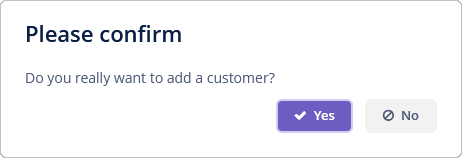
Use the withActions() method to provide actions, each of which is represented by a button in the dialog. For example:
@Autowired
private Dialogs dialogs;

@Subscribe("optDialogBtn")
public void onOptDialogBtnClick(Button.ClickEvent event) {
    dialogs.createOptionDialog()
            .withCaption("Please confirm")
            .withMessage("Do you really want to add a customer?")
            .withActions(
                    new DialogAction(DialogAction.Type.YES, Action.Status.PRIMARY)
                            .withHandler(e -> doSomething()),
                    new DialogAction(DialogAction.Type.NO)
            )
            .show();
}
When a button is clicked, the dialog closes and invokes the actionPerform() corresponding action method.
The DialogAction base class is designed to create actions with standard names and icons. Five types of actions, defined by the DialogAction.Type enum, are supported: OK, CANCEL, YES, NO, CLOSE. Names of corresponding buttons are extracted from the main message pack.
The second parameter of the DialogAction constructor is used to assign a special visual style for a button representing the action. Status.PRIMARY highlights the corresponding button and makes it selected, which is provided by the jmix-primary-action style. If multiple actions with Status.PRIMARY are defined for the dialog, only the first action’s button will get the style and focus.
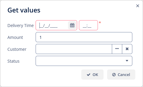
Input Dialog
Input dialog is a versatile tool that allows you to construct input forms using API and often saves you from creating screens for trivial data input. It enables entering values of different types, validates the input, and provides different actions to be selected by the user.
Let’s consider some examples.
Standard Parameters
In the following example, an input dialog is shown with parameters of standard types and standard OK/Cancel actions:
@Autowired
private Dialogs dialogs;

@Subscribe("inputDialogBtn")
public void onInputDialogBtnClick(Button.ClickEvent event) {
    dialogs.createInputDialog(this)
            .withCaption("Get values")
            .withParameters(
                    InputParameter.dateTimeParameter("deliveryTime")
                            .withCaption("Delivery Time")
                            .withRequired(true),(1)
                    InputParameter.doubleParameter("amount")
                            .withCaption("Amount")
                            .withDefaultValue(1.0),(2)
                    InputParameter.entityParameter("customer", Customer.class)
                            .withCaption("Customer"),(3)
                    InputParameter.enumParameter("status", Status.class)
                            .withCaption("Status")(4)
            )
            .withActions(DialogActions.OK_CANCEL)(5)
            .withCloseListener(closeEvent -> {
                if (closeEvent.closedWith(DialogOutcome.OK)) {(6)
                    String name = closeEvent.getValue("name");(7)
                    Double quantity = closeEvent.getValue("quantity");
                    Customer customer = closeEvent.getValue("customer");
                    Status status = closeEvent.getValue("status");
                    // process entered values...
                }
            })
            .show();
}| 1 | Specifies a mandatory string parameter. |
| 2 | Specifies a double parameter with the default value. |
| 3 | Specifies an entity parameter. |
| 4 | Specifies an enumeration parameter. |
| 5 | Specifies a set of actions represented by buttons at the bottom of the dialog. |
| 6 | In the close listener, we can check what action was used by the user. |
| 7 | The close event contains entered values that can be obtained using parameter identifiers. |
Custom Parameters
@Autowired
private Dialogs dialogs;

@Autowired
private UiComponents uiComponents;

@Subscribe("inpDlgParamsBtn")
public void onInpDlgParamsBtnClick(Button.ClickEvent event) {
    dialogs.createInputDialog(this)
            .withCaption("Enter some values")
            .withParameters(
                    InputParameter.stringParameter("name").withCaption("Name"),
                    InputParameter.parameter("customer")(1)
                            .withField(() -> {
                                EntityComboBox<Customer> field = uiComponents.create(
                                        EntityComboBox.of(Customer.class));
                                field.setOptionsList(dataManager.load(Customer.class).all().list());
                                field.setCaption("Customer");(2)
                                field.setWidthFull();
                                return field;
                            })
            )
            .withActions(DialogActions.OK_CANCEL)
            .withCloseListener(closeEvent -> {
                if (closeEvent.closedWith(DialogOutcome.OK)) {
                    String name = closeEvent.getValue("name");
                    Customer customer = closeEvent.getValue("customer");(3)
                    // process entered values...
                }
            })
            .show();
}| 1 | Specifies a custom parameter. |
| 2 | A caption for the custom parameter is specified in the created component. |
| 3 | The value of the custom parameter is obtained in the same way as for standard parameters. |
Custom Actions
@Autowired
private Dialogs dialogs;

@Subscribe("inpDlgActionsBtn")
public void onInpDlgActionsBtnClick(Button.ClickEvent event) {
    dialogs.createInputDialog(this)
            .withCaption("Enter some values")
            .withParameters(
                    InputParameter.stringParameter("name").withCaption("Name")
            )
            .withActions((1)
                    InputDialogAction.action("confirm")
                            .withCaption("Confirm")
                            .withPrimary(true)
                            .withHandler(actionEvent -> {
                                InputDialog dialog = actionEvent.getInputDialog();
                                String name = dialog.getValue("name");(2)
                                dialog.closeWithDefaultAction();(3)
                                // process entered values...
                            }),
                    InputDialogAction.action("refuse")
                            .withCaption("Refuse")
                            .withValidationRequired(false)
                            .withHandler(actionEvent ->
                                    actionEvent.getInputDialog().closeWithDefaultAction())
            )
            .show();
}| 1 | The withActions() method can accept an array of custom actions. |
| 2 | In the action handler, you can get a parameter value from the dialog. |
| 3 | Custom action does not close the dialog itself, so you should do it at some moment. |
Custom Validator
@Autowired
private Dialogs dialogs;

@Subscribe("inpDlgValidBtn")
public void onInpDlgValidBtnClick(Button.ClickEvent event) {
    dialogs.createInputDialog(this)
            .withCaption("Enter some values")
            .withParameters(
                    InputParameter.stringParameter("name").withCaption("Name"),
                    InputParameter.entityParameter("customer", Customer.class).withCaption("Customer")
            )
            .withValidator(context -> {(1)
                String name = context.getValue("name");(2)
                Customer customer = context.getValue("customer");
                if (Strings.isNullOrEmpty(name) && customer == null) {
                    return ValidationErrors.of("Enter name or select a customer");
                }
                return ValidationErrors.none();
            })
            .withActions(DialogActions.OK_CANCEL)
            .withCloseListener(closeEvent -> {
                if (closeEvent.closedWith(DialogOutcome.OK)) {
                    String name = closeEvent.getValue("name");
                    Customer customer = closeEvent.getValue("customer");
                    // process entered values...
                }
            })
            .show();
}| 1 | The custom validator is needed to ensure at least one parameter is entered. |
| 2 | In the validator, parameter values can be obtained from the context object. |
Exception Dialog
It is a special dialog for displaying exceptions containing a collapsable area with the complete exception stack trace.
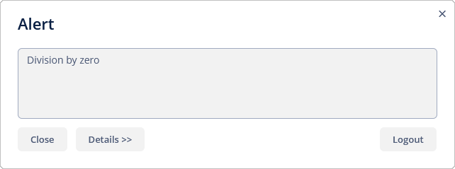
This dialog is used in the default handler, but you can use it for your exceptions, too, for example:
@Autowired
private Dialogs dialogs;

@Subscribe("expDlgBtn")
public void onExpDlgBtnClick(Button.ClickEvent event) {
    try {
        int d = 0;
        int a = 42 / d;
    }
    catch (ArithmeticException e) {
        dialogs.createExceptionDialog()
                .withCaption("Alert")
                .withMessage("Division by zero")
                .withThrowable(e.fillInStackTrace())
                .show();
    }
}