Components API
|
To generate a handler stub in Jmix Studio, select the component in the screen descriptor XML or in the Jmix UI hierarchy panel and use the Handlers tab of the Jmix UI inspector panel. Alternatively, you can use the Generate Handler button in the top panel of the screen controller. |
ContextHelpIconClickHandler
It is a handler that is invoked when the user clicks on a special ? icon near the field. Click handler has priority over the context help text. That is, no tooltip with context help text will be shown if the handler is set.
In the following example, we will consider creating an input dialog that is called in the ContextHelpIconClickHandler. The dialog collects data to form an address string.
@Autowired
private TextField<String> addressField;

@Autowired
private Dialogs dialogs;

@Install(to = "addressField", subject = "contextHelpIconClickHandler")
private void addressFieldContextHelpIconClickHandler(
        HasContextHelp.ContextHelpIconClickEvent event) {
    dialogs.createInputDialog(this)
            .withCaption("Get values")
            .withParameters(
                    InputParameter.entityParameter("city", City.class)
                            .withCaption("City:")
                            .withRequired(true),
                    InputParameter.stringParameter("street")
                            .withCaption("Street:"),
                    InputParameter.stringParameter("building")
                            .withCaption("Building:"),
                    InputParameter.intParameter("zip")
                            .withCaption("Zip:")
            )
            .withActions(DialogActions.OK_CANCEL)
            .withCloseListener(closeEvent -> {
                if (closeEvent.closedWith(DialogOutcome.OK)) {
                    City city = closeEvent.getValue("city");
                    String street = closeEvent.getValue("street");
                    String building = closeEvent.getValue("building");
                    Integer zip = closeEvent.getValue("zip");
                    addressField.setValue(city + ", " + street + ", " +
                            building + ", " + zip);
                }
            })
            .show();
}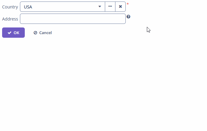
To register the event handler programmatically, use the setContextHelpIconClickHandler() component method.
EnterPressEvent
EnterPressListener is sent when the user press Enter button:
@Autowired
private Notifications notifications;

@Subscribe("textField")
public void onTextFieldEnterPress(TextInputField.EnterPressEvent event) {
    notifications.create()
            .withCaption("Enter pressed")
            .show();
}
Programmatic registration of the event handler: use the addEnterPressListener() component method.
ExpandedStateChangeEvent
ExpandedStateChangeEvent is sent when the component’s expanded state is changed.
Example of subscribing to the event for filter defined in the screen XML with the filter id:
@Subscribe("filter")
public void onFilterExpandedStateChange(Collapsable.ExpandedStateChangeEvent event) {
    notifications.create()
            .withCaption("Expanded: " + event.isExpanded())
            .show();
}
Programmatic registration of the event handler: use the addExpandedStateChangeListener() component method.
OptionCaptionProvider
OptionCaptionProvider delegate method allows you to change displayed caption of items in the component:
@Install(to = "twinColumn", subject = "optionCaptionProvider")
private String twinColumnOptionCaptionProvider(Employee employee) {
    return employee.getName() + ", salary: " + employee.getSalary();
}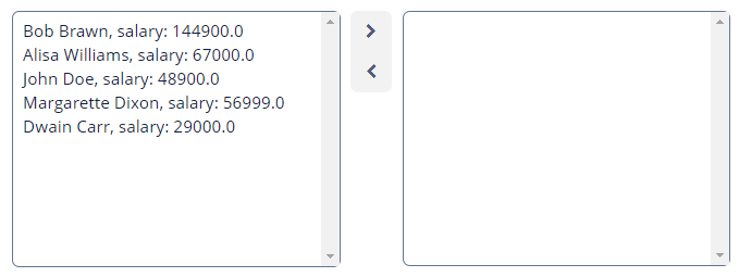
Programmatic usage: call the setOptionCaptionProvider() component method.
OptionStyleProvider
OptionsStyleProvider delegate method allows you to manage additional style names for options displayed by component:
@Install(to = "ratingField", subject = "optionStyleProvider")
private String ratingFieldOptionStyleProvider(Integer rating) {
    if (rating != null) {
        switch (rating) {
            case 2:
                return "poor";
            case 3:
                return "average";
            case 4:
                return "good";
            case 5:
                return "excellent";
        }
    }
    return null;
}
Then you should define the item styles set in the application theme. Detailed information on creating a theme is available in Themes. Style names representing in the controller, together with prefixes identifying each item, form CSS selectors. For example:
.v-filterselect-item-poor {
    background-color: #f4f1ec;
    color: black;
}

.v-filterselect-item-average {
    background-color: #e5ddce;
    color: black;
}

.v-filterselect-item-good {
    background-color: #ecd7d2;
    color: black;
}

.v-filterselect-item-excellent {
    background-color: #c69c96;
    color: black;
}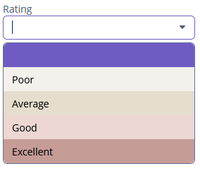
To register the options style provider programmatically, use the setOptionStyleProvider() component method.
ValueChangeEvent
ValueChangeEvent is sent when the user finished the manipulations with component. For example, after the Enter press or when the component loses focus. An event has the following methods:
-
getPrevValue()returns the value of the component before the change. -
getValue()returns the current value of the component.
@Autowired
private Notifications notifications;

@Subscribe("textField")
public void onTextFieldValueChange(HasValue.ValueChangeEvent event) {
    notifications.create()
            .withCaption("Before: " + event.getPrevValue() +
                    ". After: " + event.getValue())
            .show();
}
To register the event handler programmatically, use the addValueChangeListener() component method.
